Posts from August 2014 (52)

August 30, 2014

Funding vs disease burden: two graphics

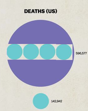
You have probably seen the graphic from vox.comhyU8ohq


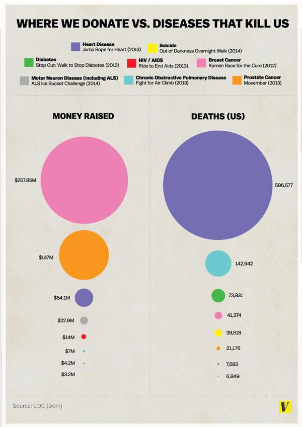
There are several things wrong with it. From a graphics point of view it doesn’t make any of the relevant comparisons easy. The diameter of the circle is proportional to the deaths or money, exaggerating the differences. And the donation data are basically wrong — the original story tries to make it clear that these are particular events, not all donations for a disease, but it’s the graph that is quoted.

For example, the graph lists $54 million for heart disease, based on the ‘Jump Rope for Heart’ fundraiser. According to Forbes magazine’s list of top charities, the American Heart Association actually received $511 million in private donations in the year to June 2012, almost ten times as much.  Almost as much again came in grants for heart disease research from the National Institutes of Health.

There’s another graph I’ve seen on Twitter, which shows what could have been done to make the comparisons clearer:

BwNxOzdCIAAyIZS


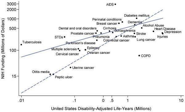
It’s limited, because it only shows government funding, not private charity, but it shows the relationship between funding and the aggregate loss of health and life for a wide range of diseases.

There are a few outliers, and some of them are for interesting reasons. Tuberculosis is not currently a major health problem in the US, but it is in other countries, and there’s a real risk that it could spread to the US.  AIDS is highly funded partly because of successful lobbying, partly because it — like TB — is a foreign-aid issue, and partly because it has been scientifically rewarding and interesting. COPD and lung cancer are going to become much less common in the future, as the victims of the century-long smoking epidemic die off.

Depression and injuries, though?


Update: here’s how distorted the areas are: the purple number is about 4.2 times the blue number

four-to-one

Flying vs driving costs

To complement the Herald’s flying Air New Zealand vs driving costs for various NZ cities, I thought I’d work out similar comparisons for the Pacific Northwest, where I used to live.  It’s a reasonable comparison — both have relatively sparsely spaced cities, though the roads are better there.

I used Alaska Airlines for the flying costs; they are the main local airline in the region. The costs are the cheapest flight on a random weekday in September — there will be some days and seasons when it’s cheaper or more expensive.  The driving cost  is based on the actual driving distance, not the straight-line distance, and uses the cost per mile specified for business tax deductions.

from to distance (km) US$flying US$driving NZ$flying NZ$driving
1 Seattle Portland 278 368 97 438 116
2 Seattle Spokane 449 398 157 474 187
3 Seattle Calgary 1146 455 401 542 478
4 Seattle Kelowna 507 440 177 524 211
5 Portland Kelowna 785 487 275 580 327
6 Spokane Calgary 698 581 244 692 291


The results aren’t that different from NZ, except that the impact of competition is clearer: the Seattle–Calgary flight is much less expensive that you’d predict from the others, probably because there lots of one-stop alternatives via Vancouver.

August 29, 2014

Getting good information to government

On the positive side: there’s a conference of science advisers and people who know about the field here in Auckland at the moment. There’s a blog, and there will soon be videos of the presentations.

On the negative side: Statistics Canada continues to provide an example of how a world-class official statistics agency can go downhill with budget cuts and government neglect.  The latest story is the report on how the Labour Force Survey (which is how unemployment is estimated) was off by 42000 in July. There’s a shorter writeup in Maclean’s magazine, and their archive of stories on StatsCan is depressing reading.

August 28, 2014

Bogus polls

This is a good illustration of why they’re meaningless…

Bogus polls

Age, period, um, cohort

A recurring issue with trends over time is whether they are ‘age’ trends, ‘period’ trends, or ‘cohort’ trends.  That is, when we complain about ‘kids these days’, is it ‘kids’ or ‘these days’ that’s the problem? Mark Liberman at Language Log has a nice example using analyses by Joe Fruehwald.


If you look at the frequency of “um” in speech (in this case in Philadelphia), it decreases with age at any given year

Fruehwald1


On the other hand, it increases over time for people in a given age cohort (for example, the line that stretches right across the graph is for people born in the 1950s)

Fruehwald2


It’s not that people say “um” less as they get older, it’s that people born a long time ago say “um” less than people born recently.

Briefly

‘Dodgy use of data’ edition [Background: the Washington Post is the serious DC paper. The Washington Times, not so much]

  • From the Washington Post  “But really, is it possible that more than 1 in 6 people in France could “back” Islamic State? When you look at the numbers closely, something doesn’t add up.”
  • From journalism/editing blog HeadsUp: “Too bad a clear conscience and a pure heart can’t turn correlation into cause, no matter what your first named source says.”
  • From economics blog TVHE:  For example, [Tourism Industry Association New Zealand] claims that 15%of Upper Hutt residents’ jobs depend on the tourism industry, while only 9% of residents’ jobs in Queenstown-Lakes District depend on tourism.”


August 26, 2014

NRL Predictions for Round 25

Team Ratings for Round 25

The basic method is described on my Department home page. I have made some changes to the methodology this year, including shrinking the ratings between seasons.

Here are the team ratings prior to this week’s games, along with the ratings at the start of the season.

Current Rating Rating at Season Start Difference
Roosters 11.22 12.35 -1.10
Rabbitohs 10.50 5.82 4.70
Cowboys 10.23 6.01 4.20
Storm 7.48 7.64 -0.20
Sea Eagles 5.54 9.10 -3.60
Broncos 4.60 -4.69 9.30
Warriors 1.54 -0.72 2.30
Panthers 1.15 -2.48 3.60
Dragons 0.25 -7.57 7.80
Bulldogs -2.89 2.46 -5.40
Knights -4.94 5.23 -10.20
Eels -4.96 -18.45 13.50
Titans -6.12 1.45 -7.60
Raiders -9.08 -8.99 -0.10
Sharks -11.55 2.32 -13.90
Wests Tigers -14.75 -11.26 -3.50


Performance So Far

So far there have been 176 matches played, 99 of which were correctly predicted, a success rate of 56.2%.

Here are the predictions for last week’s games.

Game Date Score Prediction Correct
1 Bulldogs vs. Wests Tigers Aug 21 30 – 10 15.40 TRUE
2 Eels vs. Sea Eagles Aug 22 22 – 12 -9.50 FALSE
3 Broncos vs. Knights Aug 23 48 – 6 8.40 TRUE
4 Rabbitohs vs. Cowboys Aug 23 10 – 22 8.40 FALSE
5 Warriors vs. Roosters Aug 24 12 – 46 0.60 FALSE
6 Sharks vs. Raiders Aug 24 12 – 22 4.70 FALSE
7 Dragons vs. Titans Aug 24 34 – 6 7.20 TRUE
8 Panthers vs. Storm Aug 25 10 – 24 0.90 FALSE


Predictions for Round 25

Here are the predictions for Round 25. The prediction is my estimated expected points difference with a positive margin being a win to the home team, and a negative margin a win to the away team

Game Date Winner Prediction
1 Bulldogs vs. Rabbitohs Aug 28 Rabbitohs -8.90
2 Broncos vs. Dragons Aug 29 Broncos 8.90
3 Knights vs. Eels Aug 30 Knights 4.50
4 Raiders vs. Wests Tigers Aug 30 Raiders 10.20
5 Roosters vs. Storm Aug 30 Roosters 8.20
6 Warriors vs. Titans Aug 31 Warriors 12.20
7 Sea Eagles vs. Panthers Aug 31 Sea Eagles 8.90
8 Cowboys vs. Sharks Sep 01 Cowboys 26.30


ITM Cup Predictions for Round 3

Team Ratings for Round 3

Here are the team ratings prior to Round 3, along with the ratings at the start of the season. I have created a brief description of the method I use for predicting rugby games. Go to my Department home page to see this.

Here are the team ratings prior to this week’s games, along with the ratings at the start of the season.

Current Rating Rating at Season Start Difference
Canterbury 19.69 18.09 1.60
Tasman 9.09 5.78 3.30
Wellington 8.20 10.16 -2.00
Auckland 3.31 4.92 -1.60
Counties Manukau 2.19 2.40 -0.20
Hawke’s Bay 1.75 2.75 -1.00
Waikato 0.77 -1.20 2.00
Otago -1.29 -1.45 0.20
Taranaki -3.68 -3.89 0.20
Southland -5.25 -5.85 0.60
Bay of Plenty -8.38 -5.47 -2.90
Northland -9.09 -8.22 -0.90
Manawatu -9.45 -10.32 0.90
North Harbour -9.93 -9.77 -0.20


Performance So Far

So far there have been 14 matches played, 10 of which were correctly predicted, a success rate of 71.4%.

Here are the predictions for last week’s games.

Game Date Score Prediction Correct
1 North Harbour vs. Southland Aug 21 21 – 25 -0.70 TRUE
2 Waikato vs. Canterbury Aug 22 27 – 58 -14.90 TRUE
3 Hawke’s Bay vs. Taranaki Aug 22 29 – 26 9.40 TRUE
4 Northland vs. Wellington Aug 23 35 – 5 -13.30 FALSE
5 Counties Manukau vs. Otago Aug 23 29 – 25 7.50 TRUE
6 Manawatu vs. Auckland Aug 24 7 – 35 -8.80 TRUE
7 Bay of Plenty vs. Tasman Aug 24 27 – 56 -8.90 TRUE


Predictions for Round 3

Here are the predictions for Round 3. The prediction is my estimated expected points difference with a positive margin being a win to the home team, and a negative margin a win to the away team.

Game Date Winner Prediction
1 Waikato vs. Taranaki Aug 27 Waikato 8.50
2 Canterbury vs. Northland Aug 28 Canterbury 32.80
3 Wellington vs. Manawatu Aug 29 Wellington 21.60
4 Counties Manukau vs. Hawke’s Bay Aug 30 Counties Manukau 4.40
5 Southland vs. Otago Aug 30 Southland 0.00
6 North Harbour vs. Waikato Aug 30 Waikato -6.70
7 Taranaki vs. Bay of Plenty Aug 31 Taranaki 8.70
8 Auckland vs. Tasman Aug 31 Tasman -1.80


Currie Cup Predictions for Round 4

Team Ratings for Round 4

The basic method is described on my Department home page. I have made some changes to the methodology this year, including shrinking the ratings between seasons.

Here are the team ratings prior to this week’s games, along with the ratings at the start of the season.

Current Rating Rating at Season Start Difference
Western Province 5.29 3.43 1.90
Sharks 4.37 5.09 -0.70
Lions 2.37 0.07 2.30
Cheetahs -0.28 0.33 -0.60
Blue Bulls -3.43 -0.74 -2.70
Griquas -8.02 -7.49 -0.50
Pumas -8.15 -10.00 1.80
Kings -11.47 -10.00 -1.50


Performance So Far

So far there have been 12 matches played, 11 of which were correctly predicted, a success rate of 91.7%.

Here are the predictions for last week’s games.

Game Date Score Prediction Correct
1 Pumas vs. Griquas Aug 22 33 – 15 3.00 TRUE
2 Blue Bulls vs. Kings Aug 23 30 – 25 14.20 TRUE
3 Western Province vs. Lions Aug 23 27 – 14 7.10 TRUE
4 Sharks vs. Cheetahs Aug 23 19 – 16 10.60 TRUE


Predictions for Round 4

Here are the predictions for Round 4. The prediction is my estimated expected points difference with a positive margin being a win to the home team, and a negative margin a win to the away team.

Game Date Winner Prediction
1 Pumas vs. Sharks Aug 29 Sharks -7.50
2 Griquas vs. Cheetahs Aug 30 Cheetahs -2.70
3 Blue Bulls vs. Western Province Aug 30 Western Province -3.70
4 Kings vs. Lions Aug 30 Lions -8.80


Briefly

Infographic edition

1. Thomson Reuters illustrated the importance of fine detail in graphic in one of their ads. It looks like a Venn diagram. Oops.

venn-diagram


Removing the transparent overlap and changing the colours makes it less Venn-ish

BvqfiafIUAEEoun


2. Kevin Schaul in the Washington Post came up with this neat graphical summary of state data

Bv0wVbgIIAADOHp


Because the basic outline of the US is so familiar (especially to people who live there), the huge spatial distortions aren’t actually all that disturbing.  Mark Monmonier, a geographer, seems to have been the first person to move in this direction (eg). I suggested to Kevin, on Twitter, that this technique would also allow Alaska to be moved from the tropical Pacific to its proper home in the north, and he agreed.


3. That’ll wake you up

quakewake

Jawbone, who make products that tell you if you are awake and walking around, looked at the impact of this week’s Napa earthquake. The data resolution isn’t quite fine enough to see the time taken for the ground waves to propagate — compare XKCD on the Twitter event horizon

seismic_waves