Posts from December 2014 (46)

December 14, 2014

Statistics about the media: Lorde edition

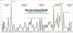
From @andrewbprice on Twitter: number of articles in the NZ Herald each day about the musician Lorde

lorde

The scampi industry, which brings in similar export earnings (via Matt Nippert), doesn’t get anything like the coverage (and fair enough).

More surprisingly, Lorde seems to get more coverage than the mother of our next head of state but two.  It may seem that the royal couple is always in the paper, but actually whole weeks can sometimes go past without a Will & Kate story.

December 13, 2014

Barchart of the week

Venezuelan-election-chart-e1418319765834

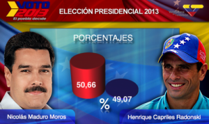
Via SkepChick, this chart from Venezolana de Televisión (Venezuelan national TV) during the 2013 elections almost makes Fox News look good.

Blaming mothers again

Q: Did you see that pregnant women are supposed to stop wearing lipstick now?

A: <sigh>

Q: But didn’t the study find lipstick lowered kids IQ?

A: What study?

Q: Um. This one that was “undertaken in the United States”

A: The United States is a big place. They’re probably doing several studies. Can you be more precise?

Q: <looks frantically for more info in the story> Um, no?

A: Perhaps you mean this paper, which is open access and easily linked.

Q: That looks right. What does it say about lipstick?

A: Nothing. The word “lipstick” doesn’t appear in the paper.

Q: You don’t need to be such a pedant. Do they call it “cosmetics” or “beauty products” or something?

A: Nope.

Q: Ok, so what is the paper about?

A: Mothers with higher exposure to some (but not others) of a class of chemicals called ‘phthlates’ had children with lower IQ scores.

Q: How much lower?

A: The average for the lowest 25% was about 7 points higher than the highest 25%.

Q: Is 7 points a lot?

A: It’s not trivial, but not huge. It’s the difference between the 60th and 40th percentile of IQ.

Q: How much uncertainty is there in that?

A: Good question. The lower limit is less than two points, the upper limit is nearly 12, but that’s assuming there wasn’t any cherry-picking in the analysis.

Q: Where does the research say phthlates come from?

A: “Exposures to phthalates are ubiquitous”. That is, they are everywhere.

Q: Not just in lipstick?

A: No.

Q: Mostly from lipstick?

A: No.

Q: If these pollutants are everywhere, could there be socioeconomic factors that affect exposure? I mean, rich people usually don’t put up with as much pollution as poor people.

A: That’s been looked at, and phthlates are one of the pollutants with environmental justice concerns, though the evidence isn’t clear on whether there’s a general socioeconomic status correlation or just a correlation with minority ethnicity.

Q: So should we worry about phthlates?

A: I don’t know. It’s not clear. It might be a good idea to reduce phthlate use in industrial processes, but it depends on what the alternatives are.

Q: Should we worry about lipstick?

A: Probably not.

Q: Should we worry about newspaper headlines blaming mothers for their children’s problems?

A: You could do worse.
December 12, 2014

Diversity maps

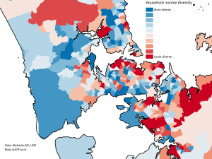
From Aaron Schiff, household income diversity at the census area level, for Auckland

AKL-income-diversity-better

The diversity measure is based on how well the distribution of income groups in the census area unit matches the distribution across the entire Auckland region, so in a sense it’s more a representativeness measure —  an area unit with only very high and very low incomes would have low diversity in this sense (but there aren’t really any). The red areas are low diversity and include the wealthy suburbs on the Waitemātā harbour and the Gulf, and the poor suburbs of south Auckland. This is an example of something that can’t be a dot map: diversity is intrinsically a property of an area, not an individual


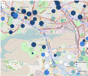
From Luis Apiolaza, ethnic diversity in schools across the country

luis-school-diversity


This screenshot shows an area in south Auckland, and it illustrates that ‘diversity’ really means ‘diversity’, it’s not just a code word for non-white. The low-diversity schools (white circles) in the lower half of the shot include Westmount School (99% Pākehā), but also Te Kura Māori o Ngā Tapuwae (99% Māori), and St Mary MacKillop Catholic School (90% Pasifika).  The high-diversity schools in the top half of the shot don’t have a majority of students from any ethnic group.

December 11, 2014

Very like a whale

We see patterns everywhere, whether they are there or not. This gives us conspiracy theories, superstition, and homeopathy. It’s really hard to avoid drawing conclusions about patterns, even when you know they aren’t really there.

Some of the most dramatic examples are visual

HAMLET
Do you see yonder cloud that’s almost in shape of a camel?

LORD POLONIUS
By the mass, and ’tis like a camel, indeed.

HAMLET
Methinks it is like a weasel.

LORD POLONIUS
It is backed like a weasel.

HAMLET
Or like a whale?

LORD POLONIUS
Very like a whale.

Hamlet was probably trolling, but he got away with it because seeing shapes in the clouds is a common experience.

Just as we’re primed to see causal relationships whether they are there or not, we are also primed to recognise shapes whether they are there or not. The compulsion is perhaps strongest for faces, as in this bitter melon (karela) from Reddit

ByuOkJuIIAARd-z

and this badasss mop

BZs7gHTIcAAHAuC

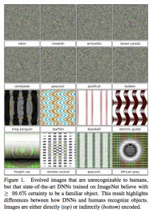
It turns out that computers can be taught similar illusions, according to new research from the University of Wyoming.  The researchers took software that had been trained to recognise certain images. They then started off with random video snow or other junk patterns and made repeated random changes, evolving images that the computer would recognise.

B4aMt24CcAAOeZv

These are, in a sense, computer optical illusions. We can’t see them, but they are very convincing to a particular set of artificial neural networks.

There are two points to this. The first is that when you see a really obvious pattern it isn’t necessarily there. The second is that even if computers are trained to classify a particular set of examples accurately, they needn’t do very well on completely different sets of examples.

In this case the computer was looking for robins and pandas, but it might also have been trained to look for credit card fraud or terrorists.


December 10, 2014

Briefly

Spin and manipulation in science reporting

From The Independent

“Although it is common to blame media outlets and their journalists for news perceived as exaggerated, sensationalised, or alarmist, our principle findings were that most of the inflation detected in our study did not occur de novo in the media but was already present in the text of the press release produced by academics and their establishments,” the researchers write in the BMJ.

The study seems to be arguing that press offices are to blame for the spin, not journalists.

Ed Yong, a well-known freelance journalist and science writer, interpreted it differently on Twitter

Blame is not a zero-sum game. If exaggerations or inaccuracies end up in science/health reporting, then the journalist should always take 100% of the blame, even if the errors originated with scientists or press releases. Errors can arise anywhere; they are meant to end with us. We are meant to be bullshit filters. That is our job

It can be a hard job, with many systemic factors—editorial demands, time pressures, lack of expertise—that stop us from doing it properly. These are reasons for empathy, but they change nothing. If we publish misleading information, and try to apportion blame to our sources, we implicitly admit that we are mere stenographers—and thus useless. If we claim to matter, we must take blame.

I’d agree the blame isn’t zero-sum, and I think the scientists also deserve a lot of it.  Ben Goldacre has previously suggested that press releases should bear the name of one of the researchers as a responsible person and should appear in the journal next to the paper (easy for online journals).

In a way, the press offices of the universities and journals are the only people not really at fault, even if most of the spin originates there. They are the only people involved without a professional responsibility for getting the story accurate and in proportion. Making lemonade out of lemons is their job.

I would link to the paper and to Ben Goldacre’s commentary in the BMJ, but it isn’t available yet. You can read the Science Media Centre notes, which are based on the actual paper. The journal seem to have timed their media information releases so that there is plenty of media commentary and online discussion without the facts from the research being available.

The irony, it burns.


[Update: research paper is now available]

[Further update: and the research paper puts the blame more clearly on the researchers than the story in the Independent does — see comments]

Not net tax

A recurring bad statistic 

But Finance Minister Bill English told Morning Report that was is not the answer, and half of all New Zealand households pay no net tax at all.

In some ways this is an improvement over one of the other version of the statistics, where it’s all households with income under $110,000 who collectively paid no net tax. It’s still misleading.  It seems to be modelled on the similar figure for the US, but the NZ version is less accurate. On the other hand, the NZ version is less pernicious — unlike Mitt Romney, Bill English isn’t saying the 50% are lazy and irresponsible.

In the US figure, ‘net tax’ meant ‘net federal income tax’, ie, federal income tax minus the subset of benefits that are delivered through the tax system.  In New Zealand, the figure appears to mean national income tax minus benefits delivered through the tax system (eg Working For Families tax credits) and also minus cash benefits delivered by other means.  In both cases, though, the big problem is the taxes that aren’t included.  In New Zealand, that’s GST.

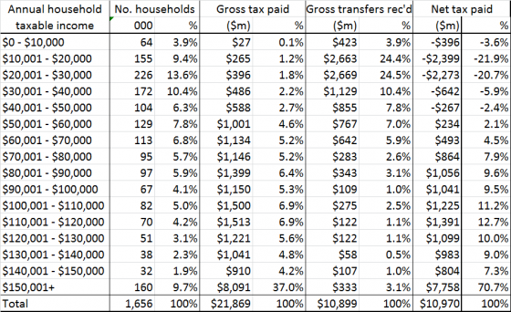
The median household income in New Zealand is about $68,000. If we assume Mr English has done his sums correctly, this is where the ‘net tax’ starts (though the original version of the claim was 43% rather than ‘half’, which would push the cutpoint down to $50,000).  Suppose the household is paying 30% of income on housing (higher than the national average), which is GST-exempt, and that they’re saving 3%, eg, through Kiwisaver (also higher than the national average). By assumption, they get back what they pay in income tax, so they spend the rest. GST on what they spend is $6834: their tax rate net of transfers is about 10%. To get a negative “net tax” you need to include some things that aren’t taxes and leave out some things that are taxes.

If you use this table from 2011, which David Farrar at Kiwiblog attributed to English’s office, it looks like many people in the $30k-$40k band will also pay tax net of transfers

nettaxpaid-560x342

If everyone in that band was at the midpoint, and they had no tax deductions (so that the $35k taxable income is all the non-transfer income they have), the total taxable income plus gross transfers for that band is about $7150 million, and 15% of 60% of that is $643 million, so they’d have to use 40% of their money in GST-exempt ways to pay no tax net of transfers.  Presumably the switch from positive to negative tax net of transfers is somewhere in this band. So, somewhere between 27% and 37% of New Zealand households pay less in tax than they receive in transfers.

Of course, cash benefits aren’t the only thing you get from the government, and more detailed modelling of where taxes are actually paid and the value of education and health benefits estimates that the lower 60% of households (adjusted for household size) get more in direct benefits and social services than they pay in direct and indirect taxes — but a lot of that is ‘getting what you pay for’, not redistribution.

Most importantly of all, there isn’t an obvious target value for the proportion of households who pay no tax net of transfers. There’s nothing obviously special about the claimed 50% or the actual 30ish%. The question is whether increasing taxes and transfers to reduce inequality would be good or bad overall, and this statistic really isn’t relevant.


Previously for this set of statistics

December 9, 2014

Health benefits and natural products

The Natural Health and Supplementary Products Bill is back from the Health Committee. From the Principles section of the Bill:

(c) that natural health and supplementary products should be accompanied by information that—

   (i)is accurate; and

   (ii)tells consumers about any risks, side-effects, or benefits of using the product:

(d)that health benefit claims made for natural health and supplementary products should be supported by scientific or traditional evidence.

There’s an unfortunate tension between (c)(i) and (d), especially since (for the purposes of the Bill) the bar for ‘traditional evidence’ is set very low: evidence of traditional use is enough.

Now, traditional use obviously does convey some evidence as to safety and effectiveness. If you wanted a herbal toothache remedy, you’d be better off looking in Ngā Tipu Whakaoranga and noting traditional Māori use of kawakawa, rather than deciding to chew ongaonga.

For some traditional herbal medicines there is even good scientific evidence of a health benefit. Foxglove, opium poppy, pyrethrum, and willowbark are all traditional herbal products that really are effective. Extracts from two of them are on the WHO essential medicines list, as are synthetic adaptions of the other two. On the other hand, these are the rare exceptions — these are the  ones where a vendor wouldn’t have to rely only on traditional evidence.

It’s hard to say how much belief in a herbal medicine is warranted by traditional use, and different people would have different views. It would have been much better to allow the fact of traditional use to be advertised itself, rather than allowing it to substitute for evidence of benefit.  Some people will find “traditional Māori use” a good reason to buy a product, others might be more persuaded by “based on Ayurvedic principles”.  We can leave that evaluation up to the consumer, and reserve claims of ‘health benefit’ for when we really have evidence of health benefit.

This isn’t treating science as privileged, but it is treating science as distinguished. There are some questions you really can answer by empirical study and repeatable experiment (as the Bill puts it), and one of them is whether a specific treatment does or does not have (on average) a specific health benefit in a specific group of people.


Diversity and segregation

A very nice interactive game and simulation by Vi Hart and Nicky Case, showing how very high levels of segregation can result even from just a preference for not being overwhelming outnumbered.

On the positive side, a fairly small active preference for diversity can overcome this problem.