Posts from December 2014 (46)

December 22, 2014

How unrepresentative bogus polls can be

From @davejac on Twitter, clipped from Stuff

stuff-home


Since this is on the Census, we have good population data. If you include family-trust properties as ‘own’, which seems to be the intent, just over a quarter own mortgage-free, just under a third own but are paying a mortgage, and about a third are paying rent. The rest are more complicated.

The poll under-represents renters and over-represents owners, and it quite dramatically under-represents “Other”.

[update: those figures are for households, but the broad pattern of differences would be similar for people — there are more single-person households renting, but also large ones]

Solstice, Christmas, and the Phantom Time Hypothesis

Today (in NZ) is the summer solstice, the time when the sun is the highest in the sky, and the longest day. In the northern hemisphere it’s the winter solstice, the darkest day of winter.

The date of Christmas, as every school child knows, wasn’t even in theory chosen as the anniversary of a particular night when shepherds were abiding in the fields. Views differ on whether it was chosen to match the Roman solstice celebration on December 25th, or nine months after the equinox on March 25th. In either case, though, we seem to be off by a few days. Today is the solstice and nine months after the equinox, but Christmas isn’t until Thursday. Why could that be?

One possibility, advanced by German historian Heribert Illig, is that the date isn’t really 2014 this year. It’s really only 1717, so we haven’t had enough missing leap years since the year 1 CE and the Gregorian calendar is off by a few days. That is, according to Illig, the period from 614 CE to 911 CE didn’t happen. The evidence adduced for this gap, in addition to the date of Christmas, is a shortage of buildings in Constantinople (now Istanbul) in that period, and a gap in Christian theological development.

Back in consensus reality, the Phantom Time Hypothesis provides a nice illustration of how data in different fields interlocks like a crossword puzzle.  For example, the times of historical eclipses and sightings of Halley’s Comet match the standard calendar, and don’t match if you assume there are three missing centuries, and the same is true of tree ring counts, and the last big eruption at Lake Taupo. And while the history of Rome and Constantinople is arguably tidier in some ways, there’s a hole blown in the middle of  the Tang Dynasty, including important events such as the Battle of Talas.

So, is there a better explanation of why today isn’t Christmas? In fact, yes. When the Gregorian calendar was devised, it didn’t try to go all the way back to 1CE, which people already realised was a slightly iffy date at best. It was designed to match the Julian calendar in 325CE: the date of the Council of Nicea, when the formula for the date of Easter was agreed on (and where Nicholas of Myra, aka Santa Claus, was thrown in jail for slapping Arius during a debate)

StatsChat wishes you a happy summer or winter solstice.  Try to refrain from slapping anyone, whatever the provocation.

December 21, 2014

Briefly

  • At Flowing Data, Nathan Yau’s picks for best data visualisation projects in 2014: “One unintentional theme: All of my picks are interactive or animated or both. Telling for where we’re headed, I guess.”
  • At Simply Statistics, Jeff Leek’s “non-comprehensive list of awesome things other people did in 2014″
  • Also at Simply Statistics, an interview with (awesome) economist Emily Oster.
  • We haven’t had the ACC’s Christmas Sermon yet this year, but the Herald has a story on food/cooking-related injuries. It’s notable for the fact that these injuries really are higher on Christmas Day than during the rest of summer, by about 50%.  A nice change.
December 20, 2014

Not enough pie

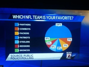
From James Lee Gilbert on Twitter, a pie chart from WXII News (Winston-Salem, North Carolina)

pie

This is from a (respectable, if pointless) poll conducted in North Carolina. As you can clearly see, half of the state favours the local team. Or, as you can clearly see from the numbers, one-third of the state does.

If you’re going to use a pie chart (which you usually shouldn’t), remember that the ‘slices of pie’ metaphor is the whole point of the design. If the slices only add up to 70%, you need to either add the “Other”/”Don’t Know”/”Refused” category, or choose a different graph.

If your graph makes it easy to confuse 1/3 and 1/2, it’s not doing its job.

December 19, 2014

Moving the goalposts

A century ago there was no useful treatment for cancer, nothing that would postpone death. A century ago, there wasn’t any point in screening for cancer; you might as well just wait for it to turn up. A century ago, it would still have been true that early diagnosis would improve 1-year survival.

Cancer survival is defined as time from diagnosis to death. That’s not a very good definition, but there isn’t a better one available since the start of a tumour is not observable and not even very well defined.  If you diagnose someone earlier, and do nothing else helpful, the time from diagnosis to death will increase. In particular, 1-year survival is likely to increase a lot, because you don’t have to move diagnosis much earlier to get over the 1-year threshold.  Epidemiologists call this “lead-time bias.”

The Herald has a story today on cancer survival in NZ and Australia that completely misses this issue. It’s based on an article in the New Zealand Medical Journal that also doesn’t discuss the issue, though the editorial commentary in the journal does, and also digs deeper:

If the average delay from presentation to diagnosis was 4 weeks longer in New Zealand due to delay in presentation by the patient, experimentation with alternative therapy, or difficulty in diagnosis by the doctor, the 1-year relative survival would be about 7% poorer compared to Australia. The range of delay among patients is even more important and if even relatively few patients have considerable delay this can greatly influence overall relative survival due to a lower chance of cure. Conversely, where treatment is seldom effective, 1-year survival may be affected by delay but it may have little influence on long-term survival differences. This was apparent for trans-Tasman differences in relative survival for cancers of the pancreas, brain and stomach.  However, relative survival for non-Hodgkin lymphoma was uniformly poorer in New Zealand suggesting features other than delay in diagnosis are important.

That is, part of the difference between NZ and Australian cancer survival rates is likely to be lead-time bias — Australians find out they have incurable cancer earlier than New Zealanders do — but part of it looks to be real advantages in treatment in Australia.

Digging deeper like this is important. You can always increase time from diagnosis to death by earlier diagnosis. That isn’t as useful as increasing it by better treatment.

[update: the commentary seems to have become available only to subscribers while I was writing this]

December 18, 2014

Tidings of modest joy

good story in the Herald about a potentially-important randomised trial conducted in New Zealand.

There’s an anti-smoking pill that was first produced in Bulgaria in 1964, using cytisine, a toxin found in several trees and bushes of the pea family (including common broom and kōwhai).  Cytisine is a partial agonist for the same receptors in the brain that nicotine targets. At the right dose, it keeps nicotine away from the receptors and turns them on, but not all the way. The net effect is that it reduces nicotine craving but isn’t actually enjoyable. The New Zealand trial found offering cytisine was superior to offering nicotine patches or gum for people recruited through Quitline.

Cytisine is similar in mechanism to the much-newer drug varenicline (Champix in NZ, Chantrix in USA). In fact cytisine was the starting point for the development of varenicline, and while the newer drug is superior in some lab tests involving rats, I don’t think they have ever been directly compared in humans.

The disadvantage of cytisine is that it’s less thoroughly studied than varenicline, so less is known about its rare side effects (yes, it was used in communist Europe, but personally I wouldn’t give much for their population mental health data).  The quoted advantage in the Herald story is that it’s much cheaper than alternatives: about a dollar a day. That’s not entirely compelling, since Pharmac pays only $2.40/day, but the price advantage might be more relevant in Brazil or India for the four years left on the varenicline patent.

The other advantage given by the researchers (though not in the Herald story) is more interesting. Because cytisine is a natural product, and because it is present in kōwhai (although that isn’t and wouldn’t be the commercial source), they thought it might be more acceptable to Māori as something that would fit into traditional healing practices (rongoā). The idea was supported by a study involving semi-structured interviews with people identifying as Māori.

Clearly, kōwhai wasn’t traditionally used to treat tobacco addiction, since tobacco addiction wasn’t traditionally a problem. No-one’s suggesting that cytisine should be advertised as actually traditional, and the scenario in the interview was that the drug would only be used if there was proper scientific evidence of safety and effectiveness. This isn’t ‘traditional use’ as a substitute for evidence; it’s traditional use as affiliation.

It’s beginning to look a lot like Christmas

In particular, we have the Christmas issue of the BMJ,  which is devoted to methodologically sound papers about silly things (examples including last year’s on virgin birth in the National Longitudinal Study of Youth, and the classic meta-analysis of randomised trials of parachute use)

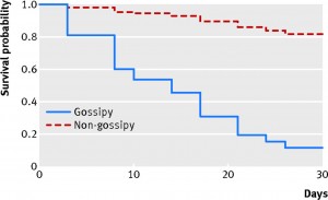
University of Auckland researchers have a paper this year looking at the survival rate of magazines in doctors’ waiting rooms

We defined a gossipy magazine as one that had five or more photographs of celebrities on the front cover and a most gossipy magazine as one that had up to 10 such images. The Economist and Time magazine were deemed to be non-gossipy. The rest of the magazines did not meet the gossipy threshold as they specialised in, for example, health, the outdoors, the home, and fashion. Practice staff placed 87 magazines in three piles in the waiting room and removed non-study magazines. To blind potential human vectors to the study, BA marked a unique number on the back cover of each magazine. Twice a week the principal investigator arrived at work 30 minutes early to record missing magazines.

And what did they find?

F1.large


December 17, 2014

Good news, bad percentages

In the New York Times, a story reporting on new Ebola research, which suggests there are fewer unreported cases and less transmission in the general community than was previously thought. This is good news both because there aren’t as many cases, and also because control might be easier.

One unfortunate feature of the NYT story:

By looking at virus samples gathered in Sierra Leone and contract-tracing data from Liberia, the scientists working on the new study estimated that about 70 percent of cases in West Africa go unreported. That is far fewer than earlier estimates, which assumed that up to 250 percent did.

It’s hard to see how the scientific community could have assumed 250% of cases were unreported. Mark Lieberman at Language Log looks at the research paper to find, firstly, that the ‘70%’ and ‘250%’ are the unreported cases as a fraction of the reported cases. That is, 70% unreported means that for every 100 reported cases there are 70 unreported, which one would usually call 41% unreported.  He also notes that 70% is the upper bound of a range estimated the paper, with the best estimate being 17% (that is, 17/117, or 14.5% unreported). What seems to have happened is that the word ‘underreported’ was changed to ‘unreported.’

What Language Log doesn’t look at is the transmission of these percentages.  There’s a story (and press release)at Yale News, home of most of the researchers, which has an intermediate mutation

Researchers were also able to estimate that for every Ebola case reported, fewer than one went unreported. This estimate, that up to 70% of cases were not reported, is significantly lower than previous estimates. “For Sierra Leone, underreporting is lower than some more speculative estimates that ran as high as 250%,” Townsend noted.

with ‘underreporting’ in the direct quotation and ‘unreported’ in the main text. From there, it’s easy to see how the distinction could have been tidied away at the NYT and at TheHill.com

December 16, 2014

Briefly


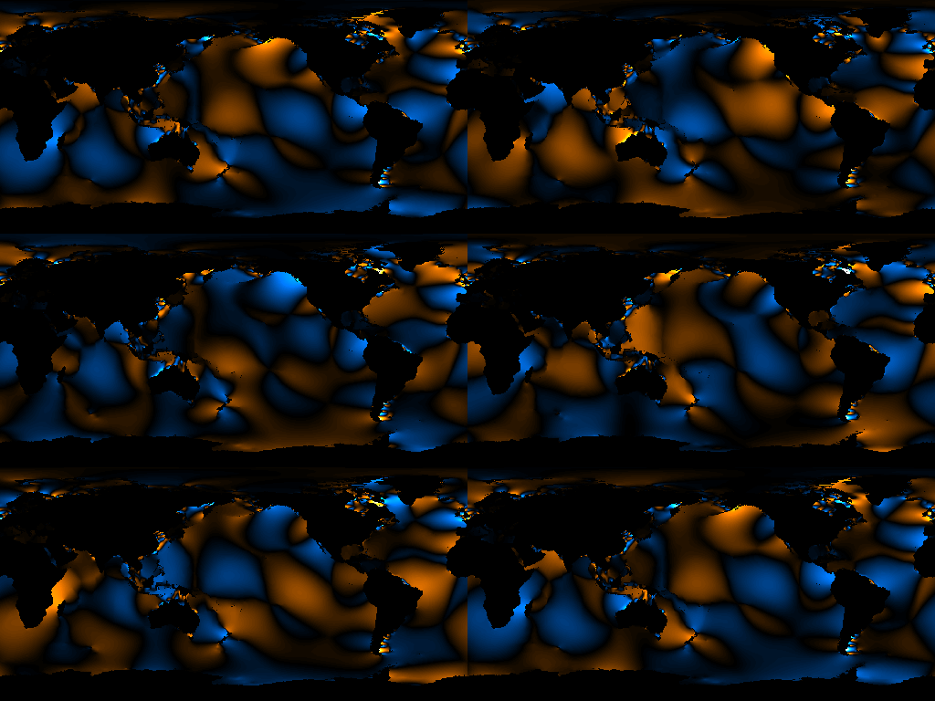
  • From Calculated Images (via Wonkblog), the tides.  Look at how the two tide peaks sweep clockwise around New Zealand

K1M2Ani_180_Opt

December 15, 2014

Interactive city statistics from UK

From the Centre for Advanced Spatial Analysis, at University College London, beautiful and informative maps:

LuminoCity3D.org is a mapping platform designed to explore the performance and dynamics of cities in Great Britain. The site brings together a wide range of key city indicators, including population, growth, housing, travel behaviour, employment, business location and energy use. These indicators are mapped using a new 3D approach that highlights the size and density of urban centres, and allows relationships between urban form and city performance to be analysed.

The credits are also interesting:

Maps created using TileMill opensource software by Mapbox. Website design uses the following javascript libraries- leaflet.js, mapbox.js and dimple.js (based on d3.js).

Source data Crown © Office for National Statistics, National Records of Scotland, DEFRA, Land Registry, DfT and Ordnance Survey 2014.

All the datasets used are government open data. Websites such as LuminoCity would not be possible without recent open data initiatives and the release of considerable government data into the public domain. Links to the specific datasets used in each map are provided to the bottom right of the page under “Source Data”.

The proliferation of interesting interactive graphics relies very heavily on open-source software (so designers don’t have to be expert programmers) and open data (to give something to display).