Posts from January 2015 (38)

January 21, 2015

Tired foreign drivers

This one makes sense as a possibility

However, road safety campaigner Clive Matthew-Wilson today slammed the new website a “dangerous waste of time”.

He has repeatedly called for tourist drivers to be banned from driving vehicles within 24 hours of arriving in the country.

“Driving tired is as dangerous as driving drunk,” said Mr Matthew-Wilson.

Obviously it matters how tired vs how drunk, but fatigue certainly is unhealthy in drivers.

There’s also the issue that almost 50% of foreign tourists have only come from Australia, not a terribly arduous trip, and that there are almost as many Kiwis returning from Foreign Parts as there are Foreigners visiting. Still, banning car rentals within 24 hours of a sufficiently long flight is something that wouldn’t need to be restricted to foreigners and so wouldn’t require withdrawing from the UN Conventions on Road Traffic.

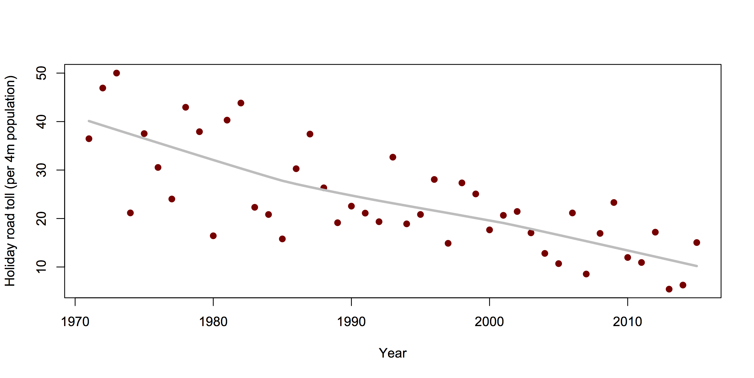
It would be surprising if tired foreign drivers weren’t at somewhat higher risk of a crash. We’d still want data to see how many crashes we’re talking about. Is this rule going to prevent 10 fatal crashes per year, or 1 per decade?

We can get an initial idea from the National Crash Map built by Richard Law and Andrew Parnell and feature in the Herald Data Blog on Christmas Day.

Here are all the crashes from December 2013 to July 2014 where both fatigue and being a foreign driver were judged to be contributing causes. It’s an overestimate, since it includes fatigue from all causes rather than just from recent arrival, and in a multi-car collision even includes fatigue in someone other than the foreign driver. Also, it’s based on police judgment and maybe they overestimate or underestimate fatigue as a cause.

It’s a start.

tired-foreign


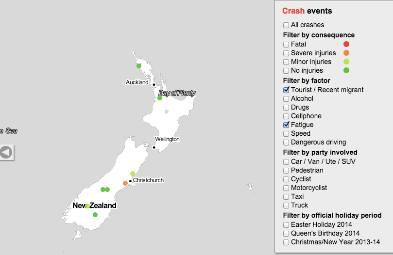
Over this eight-month period there were no fatal crashes, one serious-injury crash, and two minor-injury crashes satisfying these criteria.

This is just two-thirds of one year, and a proper analysis would look at the data back to 2007 (or the more-limited data even further back). It’s still more data than the story provided.


Meet Statistics summer scholar Alexander van der Voorn

Alex van der VoornEvery year, the Department of Statistics offers summer scholarships to a number of students so they can work with staff on real-world projects. Alexander, right, is undertaking a statistics education research project with Dr Marie Fitch and Dr Stephanie Budgett. Alexander explains:

“Essentially, what this project involves is looking at how bootstrapping and re-randomisation being added into the university’s introductory statistics course have affected students’ understanding of statistical inference, such as interpreting P-values and confidence intervals, and knowing what can and can’t be justifiably claimed based on those statistical results.

“This mainly consists of classifying test and exam questions into several key categories from before and after bootstrapping and re-randomisation were added to the course, and looking at the change (if any) in the number of students who correctly answer these questions over time, and even if any common misconceptions become more or less prominent in students’ answers as well.

“This sort of project is useful as traditionally, introductory statistics education has had a large focus on the normal distribution and using it to develop ideas and understanding of statistical inference from it. This results in a theoretical and mathematical approach, which means students will often be restricted by the complexity of it and will therefore struggle to be able to use it to make clear inference about the data.

“Bootstrapping and re-randomisation are two techniques that can be used in statistical analysis and were added into the introductory statistics course at the university in 2012. They have been around for some time, but have only become prominent and practically useful recently as they require many repetitions of simulations, which obviously is better-suited to a computer rather than a person. Research on this emphasises how using these techniques allow key statistical ideas to be taught and understood without a lot of fuss, such as complicated assumptions and dealing with probability distributions.

“In 2015, I’ll be completing my third year of a BSc in Statistics and Operations Research, and I’ll be looking at doing postgraduate study after that. I’m not sure why statistics appeals to me, I just found it very interesting and enjoyable at university and wanted to do more of it. I always liked maths at school, so it probably stemmed from that.

“I don’t have any plans to go away anywhere so this summer I’ll just relax, enjoy some time off in the sun and spend time around home. I might also focus on some drumming practice, as well as playing with my two dogs.”

January 20, 2015

Is it misleading to say a majority of US public school kids live in poverty?

Yes.

Well, no.

Ok, yes, maybe.

This was the Washington Post headline: “Majority of U.S. public school students are in poverty“. It hasn’t made the NZ media, but some of you probably read about the rest of the world occasionally and might have seen it.

The original source, a report from the Southern Education Foundation, is careful not to use the word “poverty”.  They say 51% of public school students are low-income, defined as receiving free or subsidised school meals.  There’s a standard US government definition of poverty, used in defining eligibility for social programs, and by that definition 51% of public school students come from households with income less than 1.85 times the threshold for poverty.  The report also says what proportion get free school meals, for which the threshold is 1.35 times the poverty line, and it’s 44%.

They don’t give the proportion under the official poverty line. If the exact figure mattered for this post I could probably work it out from the American Community Survey, but since only about 10% of US kids are in private schools after kindergarten and before college, it’s going to be in the same ballpark as the proportion for all children — 22%.   It’s hard to see it being more than 30%.

On the other hand, the US has an unusual official definition of poverty.  In most Western countries, the poverty line is a set fraction (often 60%) of the median household income (adjusted somehow for household size). The US uses the price of a fixed set of foodstuffs and an estimate of what fraction of income goes on food, defined in 1963-4 and then updated using the CPI (actually, that’s what the Census Bureau uses, the rest of the government uses a simplified version of the same thing).  If you defined poverty by 60% of median household income, you’d come pretty close to the subsidized-meals threshold.  That is, defining poverty the way most other Western countries do, the headline is close to being correct.

On the other other hand, the Washington Post is a  US newspaper.  If you’re writing for the Post and you think it’s unreasonable to define ‘poverty’ to exclude a US family of three with an income (including cash benefits) of $20,000, I have some sympathy for your position. I still think you need to say your definition is different from the official one and wasn’t used by your source.

Ask a silly question, get a silly answer

The monthly US FoodDemand survey added some questions about government policies this time around. Mostly these were reasonable (eg, do you support a tax on sugared sodas, which got 39% ‘Yes”, the same as here; do you support a ban on sale of marijuana, 46% yes)

However, one question was

“Do you support mandatory labeling for foods containing DNA?”

There’s no way this is a sensible question about government policies: it isn’t a reasonable policy or one that has been under public debate.  Most foods will contain DNA, the exceptions being distilled spirits, some candy, and (if you don’t measure too carefully) white rice and white flour. Nevertheless, 80% of people were in favour.

There was also a question “Do you support mandatory labeling for foods produced with genetic engineering”. This got 82% support.

It seems most likely that many respondents interpreted these questions as basically the same: they wanted labelling for food containing DNA that was added or modified by genetic engineering.  This isn’t what the researchers meant, since they write

A large majority (82%) support mandatory labels on GMOs, but curiously about the same amount (80%) also support mandatory labels on foods containing DNA.

If you ask a question that is nuts when interpreted precisely, but is basically similar to a sensible question, people are going to answer the question they think you meant to ask. People are helpful that way, even when it isn’t helpful.

January 19, 2015

10 out of 38 ain’t bad!

From our friends at Simply Stats: A non-comprehensive list of awesome things other people did in 2014. See number 10 of the 36 in particular (aw, thanks, guys) and any one of the many on the list that talks about R and its loin fruit. R was born in the mid-90s at the Department of Statistics at the University of Auckland and has since turned into a monster. I never ever get tired of telling people that. And speaking of R, a feature praising the little letter that did has been published in Nature.


January 16, 2015

Women are from Facebook?

A headline on Stuff: “Facebook and Twitter can actually decrease stress — if you’re a woman”

The story is based on analysis of a survey by Pew Research (summary, full report). The researchers said they were surprised by the finding, so you’d want the evidence in favour of it to be stronger than usual. Also, the claim is basically for a difference between men and women, so you’d want to see summaries of the evidence for a difference between men and women.

Here’s what we get, from the appendix to the full report. The left-hand column is for women, the right-hand column for men. The numbers compare mean stress score in people with different amounts of social media use.

pew

The first thing you notice is all the little dashes.  That means the estimated difference was less than twice the estimated standard error, so they decided to pretend it was zero.

All the social media measurements have little dashes for men: there wasn’t strong evidence the correlation was non-zero. That’s not we want, though. If we want to conclude that women are different from men we want to know whether the difference between the estimates for men and women is large compared its uncertainty.  As far as we can tell from these results, the correlations could easily be in the same direction in men and women, and could even be just as  strong in men as in women.

This isn’t just a philosophical issue: if you look for differences between two groups by looking separately for a correlation each group rather than actually looking for differences, you’re more likely to find differences when none really exist. Unfortunately, it’s a common error — Ben Goldacre writes about it here.

There’s something much less subtle wrong with the headline, though. Look at the section of the table for Facebook. Do you see the negative numbers there, indicating lower stress for women who use Facebook more? Me either.


[Update: in the comments there is a reply from the Pew Research authors, which I got in email.]

Holiday road toll

Here are the data, standardised for population but not for the variation in the length of the period, the weather, or anything else

holiday

As you can see, the numbers are going down, and there’s quite a bit of variability — as the police say

“It’s the small things that often contribute to having a significant impact. Small decisions, small errors..”

Fortunately, the random-variation viewpoint is getting a reasonable hearing this year:

  • Michael Wright, in the ChCh PressBut the idea that a high holiday road toll exposed its flaws may be dumber still. A holiday week or weekend is too short a period to mean anything more.”
  • Eric Crampton, in the Herald: “People have a bad habit of wanting to tell stories about random low-probability events.”


January 15, 2015

Briefly

  • Just one of the unfortunate graphic elements in an infographic dissected at JunkCharts
    6a00d8341e992c53ef01b8d0bf0214970c-250wi
  • The Herald had a story (from the Washington Post) on being married increasing happiness. Frances Woolley explains that ‘happiness’ isn’t really what they measured.
  • Eric Crampton (and Tim Harford) on replacing ‘value of a statistical life’ with ‘microlife’ or ‘micromort‘. That is, rather than saying (as the NZTA does) that preventing a death is worth $4.2 million, say that reducing the risk of a death by one in a million is worth $4.20 per exposed person.
  • “it’s the shiver of noticing” A poem on coincidences at the New Yorker, which (incidentally) gets the statistical point exactly right. (via Harkanwal Singh)
January 9, 2015

The Internet of things and its discontents

The current Consumer Electronics Show is full of even more gadgets that talk to each other about you. This isn’t necessarily an unmixed blessing

From the New Yorker

To find out, the scientists recruited more than five hundred British adults and asked them to imagine living in a house with three roommates. This hypothetical house came equipped with an energy monitor, and all four residents had agreed to pay equally for power. One half of the participants was told that energy use in the house had remained constant from one month to the next, and that each roommate had consumed about the same amount. The other half was told that the bill had spiked because of one free-riding, electricity-guzzling roommate.

From Buzzfeed

It’s not difficult to imagine a future in which similar data sets are wielded by employers, the government, or law enforcement. Instead of liberating the self through data, these devices could only further restrain and contain it. As Walter De Brouwer, co-founder of the health tracker Scanadu, explained to me, “The great thing about being made of data is thatdata can change.” But for whom — or what — are such changes valuable?

and the slightly chilling quote “it’s not surveillance, after all, if you’re volunteering for it”
Both these links come from Alex Harrowell at the Yorkshire Ranter, whose comment on smart electricity meters is

The lesson here is both that insulation and keeping up to the planning code really will help your energy problem, rather than just provide a better class of blame, and rockwool doesn’t talk.


January 8, 2015

Climate trends

From an interview with Robert Simmons, a data visualisation designer specialising in environmental data, this graph was created by Chloe Whiteaker (at Bloomberg) working with NASA’s Gavin Schmidt. It shows a thirty-year global temperature trend centered around each year.

iop06mGoMi3Q1

If you just plotted the central point of each line segment you’d have a ‘local linear smoother’, one of the standard ways of drawing a smooth curve through a set of data. Plotting the whole line segment makes it clearer how the curve is computed.

(via Alberto Cairo)