Posts from November 2015 (39)

November 22, 2015

Briefly

  • There’s a survey put out by the World Bank with what it calls basic financial literacy questions. Lots of people didn’t give the intended answers.  As Felix Salmon explains, that’s because they were silly questions:

Nothing useful can be learned by going up to poor workers in, say, Afghanistan (to take the very first country on the list), and asking them this question. They don’t have banks, and if they do have banks they don’t have savings accounts, and if they do have savings accounts they don’t hold on to them for five years, and if they do hold on to them for five years they’ll probably end up with nothing at all…

  • From Andrew Gelman’s blog, a couple of posts on accidental and deliberate wrong answers in surveys.
  • Graeme Edgeler explains again why you don’t need deliberate wrong answers in the flag referendum
  • Some things shouldn’t be maps. One example is homes of 187 victims of child homicide over the past 23 years, mapped with the 2013 deprivation index in Stuff.  On top of the inappropriateness of the map, and the time misalignment, there does actually exist serious research on risk factors for child abuse, both here and abroad: it’s not a matter of Stuff ‘discovering’ things.
  • David Spiegelhalter on an example of misreporting of criticism of misreporting of stats
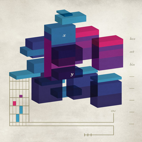
  • US artist Chad Hagen has a lovely set of prints titled “Nonsensical Infographics“, with the form of data visualisation but no content3626_largeview_cbca1479-548b-467f-9997-e25d0ff76662_large


November 20, 2015

Headline inflation

The breakthrough of the decade doesn’t happen most years, and the breakthrough of the year doesn’t happen most weeks, but you still need to put out a health news section.  If you do it by hyping whatever turns up, your headlines end up not having a lot of information value.

So, today, “Blood test for ovarian cancer ‘100% accurate‘” in the Herald is grade inflation.  The researchers at Georgia Tech have some impressive findings, but their test still hasn’t been evaluated on anyone other than the 95 women whose cancer status was known in advance and whose blood was used to develop the test. As the research paper says

…because the disease is in low prevalence in the general population (~0.1% in USA), a screening test must attain a positive predictive value (PPV) of >10%, with a specificity ≥99.6% and a sensitivity ≥75% to be of clinical relevance in the general population

That is, they want the test to give no more than 4 false positives per 1000 healthy women. So far, they’ve only looked at 49 healthy women.

The story is better than the headline on how significant this is, with an independent expert.

Dr Simon Newman, of Target Ovarian Cancer, said: “It is exciting preliminary research. It’s crucial to diagnose ovarian cancer promptly, as up to 90 per cent of women would live for five or more years if diagnosed at the earliest stage.

“However, this highly promising discovery needs significant further development and validation in large clinical trials before we know if it is suitable for screening the general population and works as well as predicted.

Even that’s exaggerated. We just don’t know what the survival would be with early diagnosis. At the moment, you have to be very fortunate to have your ovarian cancer detected at the earliest stage, and these tumours might be very non-representative.  We’ve seen real but smaller-than-expected benefits from screening in other cancers.

There are worse problems with the story than a bit of exaggeration, though. It gets the scientific idea completely wrong, saying:

But when Georgia Institute of Technology researchers looked at the blood of 46 women in the early stages of the disease and that of 49 healthy women, the cancerous samples contained different levels of 16 proteins compared with the healthy ones.

The innovative step in this research was to not use proteins. As the press release says

“People have been looking at proteins for diagnosis of ovarian cancer for a couple of decades, and the results have not been very impressive,”

Instead, the researchers looked at ‘metabolites’, smaller molecules produced by cell processes. Their hypothesis was that tumours might have varying genetic changes and varying proteins, but if they ended up as cancer they would have some cellular processes in common.


November 19, 2015

False positives

I searched for “Joe Hill” on Google a few months ago, and the “aren’t we clever” box popped up with:

CCvDKyaUMAEGqVg

The statistics and  computation behind these searches is impressive: in addition to all the usual Google stuff, the system realises that the – fairly common – words “joe” and “hill” occur together sufficiently often that they are probably a thing. Then it takes advantage of Wikipedia to realise that “joe hill” is the name of a person, not a geographical feature or a coffee shop (or, I suppose, profanity), and finds pictures and information. And it almost works — even with people who aren’t especially well known.

The gentleman on the left really is Joe Hill (author), aka Joseph Hillstrom King. One of his books has been made into a movie starring Daniel Radcliffe, so he’s definitely successful but not in any sense a mainstream celebrity. The gentleman on the right is someone else. People with an interest in labour history or folk music will recognise Joe Hill (activist), aka Joseph Hillstrom ,aka Joel Emmanuel Hägglund: I dreamed I saw Joe Hill last night, alive as you and me”. It’s an understandable mistake for the Google: the modern Joe Hill was named after the historical one, and there will be a lot of cross-referencing of the two. And it doesn’t really matter.

Joe Hill (activist) was involved in a rather more important false positive. The song says “they framed you on a murder charge”, and it’s only exaggerating a bit. There was strong circumstantial evidence and Hill refused to give any explanations, but it also appears the eyewitness testimony was manufactured. He was executed 100 years ago today.

November 18, 2015

Old-time graphics advice

  1. We must keep symbols to a minimum, so as not to overload the reader’s memory. Some ancient authors, by covering their cartograms with hieroglyphics, made them indecipherable.”
  2. “One of us recommends adopting scales for ordinate and abscissa so the average slope of the phenomenon corresponds to the tangent of the curve at an angle of 45◦”.
  3. “Areas are often used in graphic representations. However, they have the disadvantage of often misleading the reader even though they were designed according to indisputable geometric principles. Indeed, the eye has a hard time appreciating areas.”
  4. “We should not, as it is sometimes done, cut the bottom of the diagram under the pretext that it is useless. This arbitrary suppression distorts the chart by making us think that the variations of the function are more important than they really are.”
  5.  “In order to increase the means of expression without straining the reader’s memory, we often build cartograms with two colors. And, indeed, the reader can easily remember this simple formula: ‘The more the shade is red, the more the phenomenon studied surpasses average; the more the shade is blue, the more phenomenon studied is below average.’ ”

These are from a failed attempt to get the International Institute of Statistics to set up some standards for statistical graphics. In 1901.

(from Hadley Wickham)

November 16, 2015

Measuring gender

So, since we’re having a Transgender Week of Awareness at the moment, it seems like a good time to look at how statisticians ask people about gender, and why it’s harder than it looks.

By ‘harder than it looks’ I don’t just mean that it isn’t a binary question; we’re past that stage, I hope.  Also, this isn’t about biological sex — in genetics I do sometimes care how many X chromosomes someone has, but most questionnaires don’t need to know. It’s harder than it looks because there isn’t just one question.

The basic Male/Female binary question can be extended in (at least) two directions.  The first is to add categories to represent other ways people identify their gender beyond just male/female, which can be fluid over time, or can have more than two categories. Here a write-in option is useful since you almost certainly don’t know all the distinctions people care about across different cultures. In a specialised questionnaire you might even want to separate out questions about fluid/constant identity from non-binary/diversity, but for routine use that might be more than you need.

A second direction is to ask about transgender status, which is relevant for discrimination and (or thus) for some physical and mental health risks.  (Here you might want also want to find out about people who, say, identify as female but present as male.) We have very little idea how many people are transgender — it makes data on sexual orientation look really precise — and that’s a problem for service provision and in many other areas.

Life would get simpler for survey collectors if you combined these into a single question, or if you had a Male/Female/It’s Complicated question with follow-up questions for the third group. On the other hand, it’s pretty clear why trans people don’t like that approach. These really are different questions. For people whose answer to the first question is something like “it depends” or a culturally specific third option, the combination may not be too bad. The problem comes when answer to the second type of question might be “Trans (and yes I sometimes get comments behind my back at work but most people are fine)”, but the answer to the first “Female (and just as female as people with ovaries and a birth certificate, ok)”.

Earlier this year Stats New Zealand ran a discussion and  had a go at a better gender question, and it is definitely better than the old one, especially when it allows for multiple answers and for a write-in answer. They also have a ‘synonym list’ to help people work with free-text answers, although that’s going to be limited if all it does is map back to binary or three-way groups. What they didn’t do was to ask for different types of information separately. [edit: ie, they won’t let you unambiguously say ‘female’ in an identity question then ‘trans’ in a different question]

It’s true that for a lot of purposes you don’t need all this information. But then, for a lot of purposes you don’t actually need to know anything about gender.

(via Writehanded and Jennifer Katherine Shields)

Stat of the Week Competition: November 14 – 20 2015

Each week, we would like to invite readers of Stats Chat to submit nominations for our Stat of the Week competition and be in with the chance to win an iTunes voucher.

Here’s how it works:

  • Anyone may add a comment on this post to nominate their Stat of the Week candidate before midday Friday November 20 2015.
  • Statistics can be bad, exemplary or fascinating.
  • The statistic must be in the NZ media during the period of November 14 – 20 2015 inclusive.
  • Quote the statistic, when and where it was published and tell us why it should be our Stat of the Week.

Next Monday at midday we’ll announce the winner of this week’s Stat of the Week competition, and start a new one.

(more…)

Stat of the Week Competition Discussion: November 14 – 20 2015

If you’d like to comment on or debate any of this week’s Stat of the Week nominations, please do so below!

November 15, 2015

Out of how many?

Stuff has a story under the headline ACC statistics show New Zealand’s riskiest industries. They don’t. They show the industries with the largest numbers of claims.

To see why that’s a problem, consider instead the number of claims by broad ethnicity grouping: 135000 for European, 23100 for Māori, 10800 for Pacific peoples(via StatsNZ). There’s no way that European ethnicity gives you a hugely greater risk of occupational injury than Māori or Pacific workers have. The difference between these groups is basically just population size. The true risks go in the opposite direction: 89 claims per 1000 full-time equivalent workers of European ethnicities, 97 for Māori, and 106 for Pacific.

With just the total claims we can’t tell whether working in supermarkets and grocery stores is really much more dangerous than logging, as the story suggests. I’m dubious, but.

November 13, 2015

Blood pressure experiments

The two major US medical journals each published  a report this week about an experiment on healthy humans involving blood pressure.

One of these was a serious multi-year, multi-million-dollar clinical trial in over 9000 people, trying to refine the treatment of high blood pressure. The other looks like a borderline-ethical publicity stunt.  Guess which one ended up in Stuff.

In the experiment, 25 people were given an energy drink

We hypothesized that drinking a commercially available energy drink compared with a placebo drink increases blood pressure and heart rate in healthy adults at rest and in response to mental and physical stress (primary outcomes). Furthermore, we hypothesized that these hemodynamic changes are associated with sympathetic activation, which could predispose to increased cardiovascular risk (secondary outcomes).

The result was that consuming caffeine made blood pressure and heart rate go up for a short period,  and that levels of the hormone norepinephrine  in the blood also went up. Oh, and that consuming caffeine led to more caffeine in the bloodstream than consuming no caffeine.

The findings about blood pressure, heart rate, and norepinephrine are about as surprising as the finding about caffeine in the blood. If you do a Google search on “caffeine blood pressure”, the recommendation box at the top of the results is advice from the Mayo Clinic. It begins

Caffeine can cause a short, but dramatic increase in your blood pressure, even if you don’t have high blood pressure.

The Mayo Clinic, incidentally, is where the new experiment was done.

I looked at the PubMed research database for research on caffeine and blood pressure.  The oldest paper in English for which I could get full text was from 1981. It begins

Acute caffeine in subjects who do not normally ingest methylxanthines leads to increases in blood pressure, heart rate, plasma epinephrine, plasma norepinephrine, plasma renin activity, and urinary catecholamines.

This wasn’t news already in 1981.

Now, I don’t actually like energy drinks; I prefer my caffeine hot and bitter.  Since many energy drinks have as much caffeine as good coffee and some have almost as much sugar as apple juice, there’s probably some unsafe level of consumption, especially for kids.

What I don’t like is dressing this up as new science. The acute effects of caffeine on the cardiovascular system have been known for a long time. It seems strange to do a new human experiment just to demonstrate them again. In particular, it seems ethically dubious if you think these effects are dangerous enough to put out a press release about.


Flag text analysis

The group in charge of the flag candidate selection put out a summary of public responses in the form of a word cloud. Today in Insights at the Herald there’s a more accurate word cloud using phrases as well as single words and not throwing out all the negative responses

wordcloud

There’s also some more sophisticated text analysis of the responses, showing what phrases and groups of ideas were common, and an accompanying story by Matt Nippert

Suzanne Stephenson, head of communications for the flag panel, rejected any suggestion of spin and said the wordcloud was never claimed as “statistically significant”.

“I think people misunderstood it as a polling exercise.”

“Statistically significant” is irrelevant misuse of technical jargon. The only use for a word cloud is to show which words are more common. If that wasn’t what the panel wanted to do, they shouldn’t have done it.