Posts from February 2017 (23)

February 13, 2017

Stat of the Week Competition: February 11 – 17 2017

Each week, we would like to invite readers of Stats Chat to submit nominations for our Stat of the Week competition and be in with the chance to win an iTunes voucher.

Here’s how it works:

  • Anyone may add a comment on this post to nominate their Stat of the Week candidate before midday Friday February 17 2017.
  • Statistics can be bad, exemplary or fascinating.
  • The statistic must be in the NZ media during the period of February 11 – 17 2017 inclusive.
  • Quote the statistic, when and where it was published and tell us why it should be our Stat of the Week.

Next Monday at midday we’ll announce the winner of this week’s Stat of the Week competition, and start a new one.

(more…)

Stat of the Week Competition Discussion: February 11 – 17 2017

If you’d like to comment on or debate any of this week’s Stat of the Week nominations, please do so below!

February 8, 2017

Things to check about your bar chart

There was some discussion yesterday on Twitter about age-representativeness of Parliament.

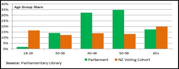
I tweeted this graph, from a 2014 General Election summary report, after checking that the source was reputable and that the bars started at zero.

mps-library

I didn’t check whether the age group shares added up to 100%. They don’t for the orange bars: it’s about 80%. That’s obviously wrong — there isn’t anywhere else for the missing 20% of people to be.

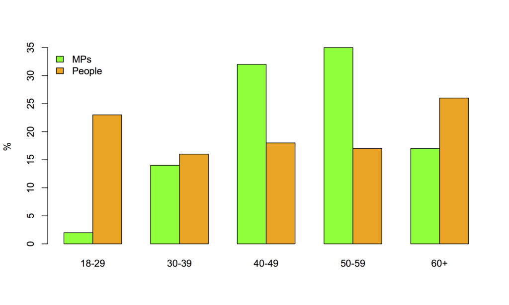
So, I found NZ population age structure data and tweeted this revision.

mps

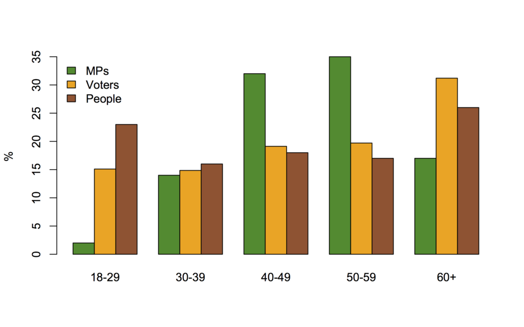
However, that’s the whole population and part of the point of the original graph might have been lower turnout at some ages. Here’s the graph with share of voters as well as of the population
mp-all

It’s not necessarily a good thing for the age distribution of voters to match that of voters or of adults in general, but if that’s what you wanted we have about the right number of thirtysomething MPs, but we have an excess in the 40-60 range and we’re missing under-30s and older people.

Compared to the population as a whole, Parliament’s also a bit low on women, immigrants, and people who think medical marijuana use should be legal.

Hans Rosling, 1948-2017

Hans Rosling, the public health physician and inspiring statistics communicator, has died.

Coverage:

His TED talk.

Gapminder, the foundation he co-founded, with the aim of giving people accurate information about health and development around the world.

February 7, 2017

Official statistics and official truth

From a story in the Guardian about the US government and official statistics

In August, the then presidential candidate described the Bureau of Labor Statistics (BLS) unemployment numbers as “phoney”, claiming: “The 5% figure is one of the biggest hoaxes in American modern politics.” In the same speech, Trump suggested alternative data, adding: “The number’s probably 28, 29, as high as 35. In fact, I even heard recently 42%.”

As the story goes on to say, Trump is unlikely to tamper with the estimation of basic economic statistics — they’re too important to government and big business, and it would be a very messy fight.  It’s more likely that lower-level statistics on questions he doesn’t want answered will be lost.   On the other hand, there are a lot of unemployment statistics it’s possible that the government could start advertising a different one.

The number that’s “probably 28, 29, as high as 35. In fact, I even heard recently 42%” exists. It’s reported by the Bureau of Labor Statistics in the same report that gives the 5% number, and estimated from the same basic data.  It’s just that there are a lot of ways to summarise changes and differences in unemployment and the whole world has decided the 5% number is a good one to standardise on.

It’s relatively easy to count the number of people with jobs: either by a survey or by the fact that they (mostly) pay taxes.  What’s harder is to decide who to compare them to.   The simplest choice, dividing by the total population, gives the ’employment:population ratio’.  You still need to decide which total population to use; the standard choice is everyone 16-64 who isn’t in the military, in prison, or in some other sort of institution such as a nursing home.  The employment:population ratio in the US is currently a little under 60% in the US, still down a lot in the Great Recession.  In New Zealand, it’s about 67%.  Subtracting from 100% gives about 40% in the US and about 33% in NZ.

The problem with using the employment:population ratio to measure unemployment is the fact that it counts a lot of people who aren’t even potentially employed. In particular, a lot of the variation between countries and over time in the employment:population ratio comes from women entering the workforce, which isn’t a change in unemployment in the sense that we usually mean.

‘Unemployment’ in the sense we usually care about means that people are trying to get jobs, and can’t. The difficulty here is measuring who is trying to get a job, which has to be done by surveys and has to be approximated with a questionnaire.  The ‘headline’ measure of unemployment is people looking for jobs as a fraction of those who have jobs or are looking — the denominator is called the ‘labour force’.

However, when jobs get hard to find, some people will temporarily stop looking and do something more productive instead.  These aren’t the same as people who currently don’t want a job. So, in addition to the employment:population ratio and the unemployment rate, statistics agencies publish a range of other summaries.  Stats NZ reports ‘underutilised’ people, defined as ‘underemployed’ (wants more work), “unemployed”, “potential available jobseeker” (wants work but not actively looking), and ‘unavailable jobseeker’ (looking, but for a future start, not right now). The US Bureau of Labor Statistics reports ‘marginally attached’ (don’t have a job; were looking recently),  ‘part time for economic reasons’ (basically Stats NZ’s underemployed), and ‘discouraged’ (not looking because they say they don’t think there are jobs).

You can combine these numbers lots of ways, and there are good uses for many of them. But the headline unemployment rate isn’t a hoax, and anyone who wants to understand what it means and how it’s calculated can readily find out.
February 6, 2017

Stat of the Week Competition: February 4 – 10 2017

Each week, we would like to invite readers of Stats Chat to submit nominations for our Stat of the Week competition and be in with the chance to win an iTunes voucher.

Here’s how it works:

  • Anyone may add a comment on this post to nominate their Stat of the Week candidate before midday Friday February 10 2017.
  • Statistics can be bad, exemplary or fascinating.
  • The statistic must be in the NZ media during the period of February 4 – 10 2017 inclusive.
  • Quote the statistic, when and where it was published and tell us why it should be our Stat of the Week.

Next Monday at midday we’ll announce the winner of this week’s Stat of the Week competition, and start a new one.

(more…)

Stat of the Week Competition Discussion: February 4 – 10 2017

If you’d like to comment on or debate any of this week’s Stat of the Week nominations, please do so below!

February 4, 2017

Tracing a science story

The Herald has a headline Two or more children? You’re at risk of heart disease. The story does have a link, but it’s to the Daily Mail, which (unsurprisingly) has no further information about sources.

Searching for key words (“china heart disease risk number of children“) leads to a story at Science DailyIt also doesn’t link or specify enough information to find the research. However, it does indicate that the origin is some sort of commentary from someone at the European Society of Cardiology, involved with their guidelines on “Management of CVD During Pregnancy.”

Searching for ‘“management of CVD During Pregnancy” esc‘ finds both the ESC press release and the EurekAlert version.  The EurekAlert one has had the reference trimmed off, but it’s in the original.  So now I can search on the title of the research paper or, more reliably in theory, on the DOI permanent identifier.  These lead to an error page at Oxford University Press saying

Sorry, the International Journal of Epidemiology content that you are trying to access has moved. Please search for the content using the DOI, Author or Title.

That advice does not get me any further. Neither does going in via the PubMed database. Looking further at the journal website, the paper is not in the ‘coming soon’ list, nor in any recent issue of the journal.

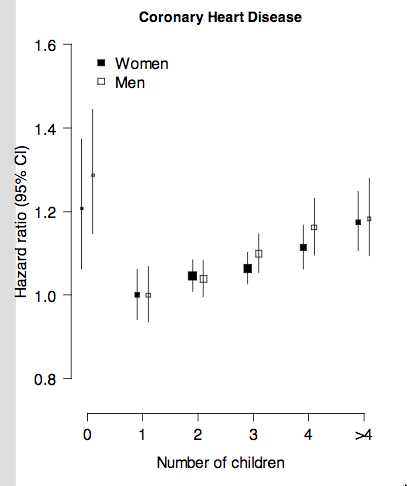
I have no idea what’s happened to the paper, but the Google does reveal a presentation about the research (PDF). I’m going to show you a graph from page 8.

kids-heart

They’re estimating a lower risk for people with children than those without. Among those with kids, the risk was higher with more, but by less than 5% per extra child.

As the researchers say, this probably isn’t biochemical, it’s probably socioeconomic. In which case, a cohort from China during both their economic boom and the One Child policy might not generalise all that well to New Zealand.  And while I wouldn’t expect a busy journalist to go to the lengths I did to find a source, they should at least notice they don’t have one.

February 2, 2017

Defining on-time arrival

Bernard Orsman, in the Herald, has written about Auckland bus punctuality, this time with data from Auckland Transport broken down by bus route.  The numbers look good overall, with, apparently, 96.36% of buses on time in January. If you caught a bus in January, you might find this surprising. The problem is that defining and then measuring the percentage of on-time buses is harder than it sounds.

The Auckland Transport number is the percentage of buses that depart their first stop within 5 minutes of schedule. That’s probably a good number for measuring whether the bus companies are delivering the service they’re being paid for. It’s not a good description of the lived experience of passengers.

At the other extreme, you could argue for a measurement averaged over all bus stops. That punctuality number would inevitably be lower, because of variation in traffic and traffic lights from trip to trip.  This isn’t the ideal measure in many ways, because the way to optimise it would be to have lots of slack in the bus timetable and force the bus to wait at every stop. But people do care about it. I bet Aaron Schiff that 80% of buses were within 5 minutes of schedule averaged over all stops and all trips using the bus GPS data. I’ve conceded: I think the true figure is probably more like 70%.

Another approach would be to  look at on-time performance at the timepoints on the official timetable for the route. For example, the 324, singled out in the Herald story, has Mangere Town Centre, Ōtāhuhu station, Ōtāhuhu Town Centre, and Seaside Park.  If you wanted an official benchmark statistic, that would be a reasonable choice. You’d expect to get a higher number than the all-trips/all-stops figure, but lower than the first-stop-only figure.

There are other possibilities, though. For a frequent service what matters isn’t the timetable but the waiting time between buses. You’d prefer to have all the buses 10 minutes late rather than alternate ones 10 minutes late and on time. “Maintenance of Headway” is the the technical term (and the title of a humorous novel about bus timetables. No, I’m not making this up).

Also, there can be more important things than adherence to a schedule.  On a rainy Friday evening the punctuality is going to be pretty bad, but your ability to get from point A to point B by bus is going to be better than on a typical Sunday morning.

The right choice of summary depends on what you’re trying to do: contractual audit, benchmarking for trends or against similar cities, describing what it typically feels like to passengers, or detecting that the system is having a bad time right now.  Personally, I’m most interested in the last of these: describing how performance varies over time with weather, school holidays, and other challenges, and how it varies over Auckland.

Whatever your aim, it’s important to have realistic expectations based on what summary you’re using: 90% punctuality would likely be unattainable taken over all stops, but it’s a bit average for just the first stop.

Eat more kale?

From the Mail, via the Herald

Eating nuts, kale and avocado could help protect women from suffering a miscarriage, new research suggests.

Being deficient in vitamin E starves an embryo of vital energy and nutrients it needs to grow, scientists have found.

There’s a sense in which this is true. But only a weak one.  Here’s the first sentence of the research paper (via Mark Hanna)

Vitamin E (α-tocopherol, VitE) was discovered in 1922 because it prevented embryonic mortality in rats, but the involved mechanisms remain unknown 

That is, it’s been known since vitamin E was discovered 95 years ago that severe deficiency causes miscarriage in rats. In fact, the chemical name ‘tocopherol’ comes from Greek words meaning, basically, “to carry a pregnancy.” This isn’t new.  The new research was a study of severe deficiency in little tropical fish, so it wouldn’t be an improvement over rats from the point of view of a public health message.  And the research paper doesn’t try to say anything about avocados and kale for preventing miscarriage; it’s about clarifying what goes wrong with the embryos at a biochemical level.

The dietary-advice question would be whether it’s common for women to have low enough levels of vitamin E to increase miscarriage risk, and if so whether nuts, kale, and avocado would help or whether supplements make sense as they do with folate and perhaps iodine.  Somewhat surprisingly, the first published research on this question seems to be from 2014 (story, paper).  In a study in rural Bangladesh, where nearly 75% of women had vitamin E deficiency, those with low vitamin E were twice as likely to miscarry.  I don’t have data for New Zealand, but in the US less than 1% of people have vitamin E deficiency of that severity.  It doesn’t look to be a big problem. And, from the authors of the 2014 study:

Schulze says that the study may not be generalizable to higher-income nations where women of childbearing age tend to have better nutritional status.

It’s possible that slight deficiency increases miscarriage risk slightly, but there isn’t any direct evidence. And the new research doesn’t even try to address this issue.

Finally, if someone wanted to get more vitamin E, would the recommendations help? Well, according to this site, it would take 14 cups of kale a day to get up to the recommended daily intake. And we know there are problems with avocado in younger adults. So perhaps try the nuts instead.