Density trends
This came from Twitter (arrows added). I don’t have a problem with the basic message, that when people are packed into a smaller area it takes less energy for them to get around, but there are things about the graph that look a bit idiosyncratic, and others that just look wrong
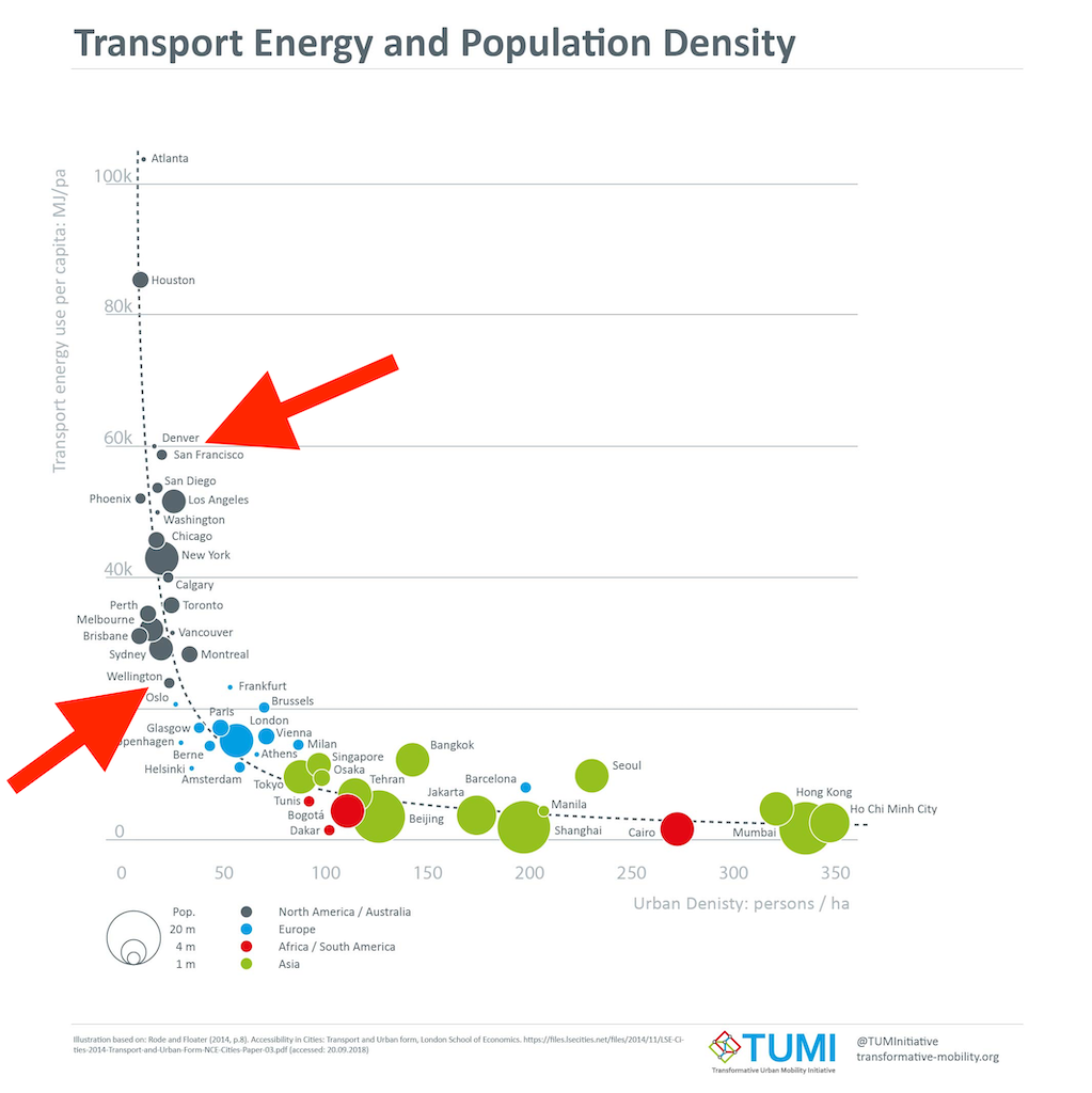
The location of the points comes from an LSE publication that’s cited in the footnote, which got it from a 2015 book, using 1995 data (data not published). The label on the vertical axis has been changed — in both the sources it was “private passenger transport energy use per capita”, so excluding public transport — and the city-size markers have been added.
One thing to note is that you could almost equally well say that transport energy use depends on what continent you’re in: the points in the same colour don’t show much of a trend.
Two points that first really stood out for me were San Francisco (lower population density than LA) and Wellington (higher population than Frankfurt, Washington, Athens, Oslo; same general class as Manila and Amsterdam). In this sort of comparison it makes a big difference how you define your cities: is Los Angeles the local government area or the metropolis or something in between? In this case it’s particularly important because the population data were added in by someone else to an existing graph.
In some cases we can tell. Melbourne must be the whole metropolitan area (the thing a normal person would call ‘Melbourne’), not the small municipality in the centre. The book gives the density for Los Angeles on a nearby page as the “Los Angeles–Long Beach Urbanized Area”, which is (roughly speaking) all the densely populated bits of Los Angeles County. Conversely, San Francisco looks to be the whole San Francisco-Oakland Urbanized Area, which has rather lower density than what you’d think of as San Francisco. The circle looks wrong, though: the city of San Francisco is small, but the San Francisco area has a higher population than Brisbane or Perth.
The same happens in other countries. Manila, by its population, should just be the city of Manila, but that had a population density of 661/ha in 1995 so the density value is for something larger than Manila but smaller than the whole National Capital region (which had a density of 149/ha and a population of 9.5 million). If it’s in the right place on the graph, its bubble should be bigger. The time since 1995 also matters: Beijing is over 20 million people now, but was under 10 million at the time the graph represents. We’ve seen that the San Francisco point is likely correct, but the size is probably wrong. The same seems to be true for Wellington: the broadest definition of Wellington will give you a smaller population than the narrowest definition of Washington or Frankfurt.
As I said at the beginning, I don’t think the basic trend is at all implausible. But when you have data points that are as sensitive to user choice as these, and when the size data and density data were constructed independently and don’t have clearly documented sources, it would be good to be confident someone has checked on whether Manila really has the same population as Wellington and San Francisco is really less dense than LA.
Thomas Lumley (@tslumley) is Professor of Biostatistics at the University of Auckland. His research interests include semiparametric models, survey sampling, statistical computing, foundations of statistics, and whatever methodological problems his medical collaborators come up with. He also blogs at Biased and Inefficient See all posts by Thomas Lumley »