March 8, 2026
Briefly
- From BBC Somerset: “Rare coincidence as three cousins born on same day“. Two sisters-in-law gave birth on the same day, one to identical twins. One of the hospitals notes that identical twins are about 1 in 250 pregnancies. It’s going to be uncommon for two closely-linked women to give birth to three kids on the same day. The chance increases as you consider non-identical twins and more relationships — primary-school BFF, college flatmate, next-door neighbour, sky-diving partner, whatever. Given that the UK has over half-a-millon births per year, this has got to be a thing that regularly happens. It’s still rare enough to properly be a big deal to the families involved, and BBC Somerset aren’t overselling it too much.
- From a BBC news item about electricity theft (and the risks involved)
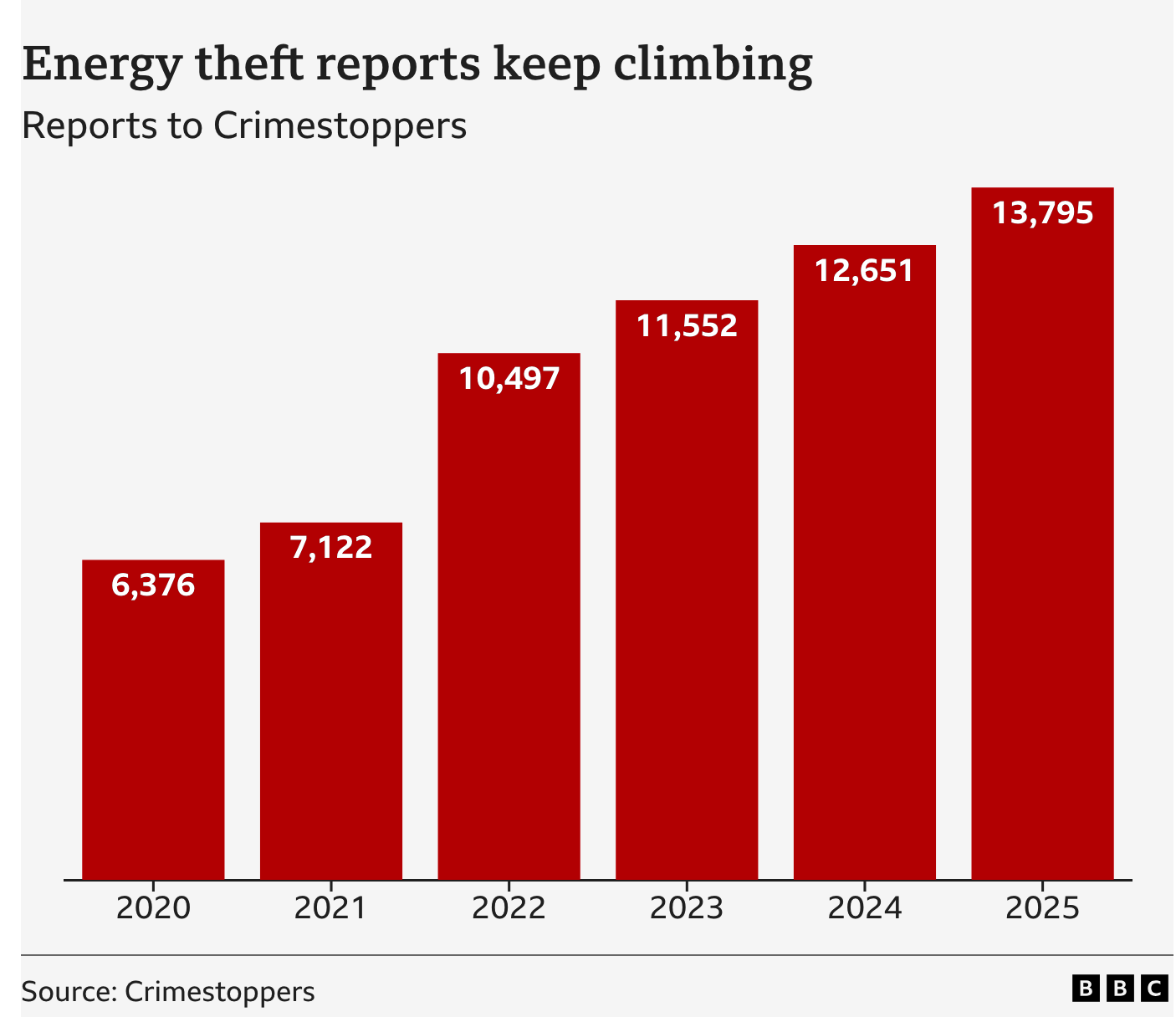
The clear increase shown in the graph is a bit undermined by “Crimestoppers estimates that a further 250,000 cases go unreported every year”. If 95% of cases are unreported, there’s no hope for estimating trends from the 5% of reported cases — we can’t possibly distinguish trends in reporting from trends in the true rate. Long-time StatsChat readers will remember me saying this about everything from skin cancer to domestic violence. - Weight-loss jab could be made for $3 a month, study finds (Guardian). This is plausibly true and I’m not going to argue that pharmaceutical prices are where they should be. However, as with The Guardian itself, the price of one additional copy of the the finished product is not the main determiner of the price, nor should it be.
- CNN: Here’s how much the war with Iran is expected to cost every day. The answer they give is nearly US$1 billion per day. That’s a lot, but the US is a big country: it’s about three times the US daily spend on coffee and a bit less than the cost of car insurance. More importantly, it’s not the cost of the war. It’s not even the cost of the war to the USA as ABC News and Al Jazeera frame the same number. It’s only the cost of the munitions used by the USA. The cost of the war, under any attempt at reasonable accounting, is far higher.