Posts written by Thomas Lumley (2644)

avatar

Thomas Lumley (@tslumley) is Professor of Biostatistics at the University of Auckland. His research interests include semiparametric models, survey sampling, statistical computing, foundations of statistics, and whatever methodological problems his medical collaborators come up with. He also blogs at Biased and Inefficient

March 31, 2026

Dangers of opt-in surveys

There have been two stories just recently in the Guardian about the dangers of opt-in surveys.  A survey from the respectable polling organisation YouGov reported a big increase in (Christian) church attendance among young people.  This was a bit of a  surprise, and didn’t seem to match up with other polling data (or with attendance counts by denominations that count attendance), but it was YouGov and it was what some people wanted to hear.

Apparently the problem was opt-in respondents.  This isn’t the completely useless opt-in clicky polls that our news sites put up from time to time; YouGov is a serious polling organisation.  However, I think it’s fair to say YouGov has tried to get accurate poll results by focusing more on statistical modelling of who responds and less on trying to get a good sample.  Again, that’s a perfectly reasonable strategy and has historically been competitive. You can’t get real random samples of people any more — not like in the 1950s — and so you get samples that are representative in some qualitative sense and reweight them to match the groups you’re trying to study.

You might think it’s strange that people would try to get into survey samples. It is strange, and that’s exactly the problem. Only a small fraction of people will try to get into surveys for the money, so those people are very unrepresentative, and while they are only a small fraction of the population that’s still a lot of people.   In the future, there’s the potential for LLM-based fake people to take surveys for the money (or just to be inconvenient), and they will be still worse.

When you start with a reasonably well-controlled sample and some people opt out, you have a subset of a reasonably well-controlled sample. It looks as though allowing too much self-selection can be qualitatively worse (though this is a one-off so far, and only provides limited evidence).

I also want to note that CNN reports a response from the Bible Society to the withdrawal of the survey report

The Bible Society said in a statement it was “deeply disappointed” by what had happened, but insisted the “wider picture” from other surveys pointed to “an increased engagement in faith among young adults compared to older generations.”

This isn’t a good reaction: the reason we found out the report was inaccurate was precisely that other evidence didn’t point the same way.

March 26, 2026

As and when it looks supportive

Via Russell Brown on Bluesky, the Herald has a report on the increases in people being charged with cannabis possession. Charges fell by about 1/3 from 2017 to 2021, in parallel with increasing evidence that arrests for possession didn’t really have social license, but then started rising and now are back at nearly 2017 levels.

So what do the police say? Well, the Herald reports

Director of the National Organised Crime Group Detective Superintendent Greg Williams says wastewater testing in the Auckland and Northland region shows cannabis consumption spiking in July 2024.

“If you look at that charging data, it actually perfectly almost reflects what looks like a significant increase in cannabis consumption.”

We can look at the charging data, and the Herald does. We can’t look at the wastewater cannabis data, though.  On the same day in the Herald there was a story on the newest results from wastewater drug analyses. The story reported estimates of meth, MDMA, and cocaine use. As expected, there’s a lot more meth than anything else, but there’s a potentially worrying increase in cocaine (it’s not so much that cocaine is worse than meth, but it’s a new supply chain).  There was no comment in the story on cannabis use.  There were related stories at One News and RNZ and Newstalk ZB.

If you go to the NZ Police webpage on wastewater drug testing you see

The drugs tested for include methamphetamine, MDMA, cocaine, fentanyl, and heroin. These reports focus on methamphetamine, MDMA and cocaine as these drugs are routinely detected by the programme.

At PHF Science (former ESR) you can find plenty of pages talking about their efforts in testing for meth, MDMA and cocaine, such as this one on the 2024 spike in meth, or this research paper with the mind-numbing details of how they do the testing, or this drug harm page where they say

To date, wastewater testing has been used to measure consumption of illicit drugs including methamphetamine, MDMA, cocaine, heroin and fentanyl. 

Neither the police nor PHF Science publish cannabis-use estimates from wastewater.  The reason they don’t publish the estimates is they aren’t very good.  According to a research report from PHF Science,

However, certain characteristics of cannabis – such as it being lipophilic, not dissolving well in water and its tendency to stick to surfaces such as wastewater pipes – have made analysis in wastewater more difficult. Additionally, due to the considerable chemical differences between cannabis and the other illicit substances being monitored it cannot be added to the same analysis workflow. At this stage there is still too much uncertainty for cannabis measurements to be reliably quantifiable. However, the monitoring data can still be used in trend analyses

They do measure cannabis at five sites around the country, and as the research report says, the data could still be used in trend analyses. But popping up with a claim about two regions from undisclosed data about one time period isn’t a credible trend analysis.

What other data are there?

I don’t find the NZ Drug Trends Survey all that convincing on a detailed level, but its questions asking people who admit to using illegal drugs about which drugs they use should also be ok for trend analyses, and their cocaine reports show a similar trend to the wastewater data. They see a decrease and then increase in daily or weekly cannabis use over the time period we’re talking about, but to a much smaller extent: 68% of respondents at the peak, then down to 57%, then up to 70% for the most recent data. That’s about a 15% decrease and corresponding in regular cannabis use among regular drug users.  Also, a big spike in population cannabis use would increase the number of regular drug users, and show up as a decrease in the proportion regularly using other drugs, which we don’t see.

The NZ Health Survey asks about drug use. The Drug Foundation has collected their data (along with other data sources) and it doesn’t show a pattern anything like the police charging data (click to embiggen, as always)

So, I’m not convinced by the bare assertion that wastewater data show the police are just picking up the same fraction of a varying drug-user population. If the police want to use trends in the cannabis wastewater data to influence public policy they should publish the complete data series, with all the attached caveats from the scientists behind the testing (who I do trust).

How cats vote

Joao Barbosa posted these two maps of Paris on Bluesky: votes in the mayoral election, and cat ownership. If you’re one of the dozens of people on the internet who aren’t American, the political colour scheme is the way you expect.

You can probably come up with explanations for the left-wing lean of the cats if you’re a cat person. And even more so if you’re a dog person.

Another useful map is this one from a report on the risk of gentrification in Paris caused by the 2024 Olympics. It’s a map of income: light colours are high income, dark colours are low income.

There seems to be a general rule that all choropleth maps of a given place reduce to one of a very small number of basic patterns.  There’s an XKCD comic about this for the USA, and Kieran Healy has also written about the two basic US maps

March 20, 2026

Cars vs public transport

Yesterday I noted RNZ had just quoted an Auckland Transport claim about the cost of driving that was implausible on the face of it, and didn’t seem to have done any checking or provided any explanation.  Today, the same story is in the Herald, with the same  lack of explanation.

Here’s the RNZ quote; the Herald one is almost identical

Auckland Transport said before the Iran conflict began late last month, the cost of public transport was roughly the same as the cost of driving a vehicle with single occupancy in Auckland.

It’s now costing people nearly double to drive their own cars.

“The cost of petrol has risen at least 50 cents per litre since then, with a 15-kilometre single person commute now costing roughly 80 cents per kilometre, which is equal to about $12 for the total trip.”

So where does this come from? In comments to yesterday’s post, David Welch pointed me to the IRD page on the cost of driving.  The “Tier 1” cost in 2024-5 was $1.17/km for petrol cars. That’s higher than 80c/km, and it’s also not the right comparison — it’s an average cost per km. That is, it includes a per-km share of the fixed costs of having a car. Auckland Transport are (or should be) talking about just the extra per-km cost of using the car to commute. Taking a bus won’t make your car loan go away.

The IRD view on the cost of running a car is their “Tier 2” number, which is only 37c/km.   That, interestingly, is close to half the 80c/km that Auckland Transport is claiming. Since they say that this is double what last year’s cost was, their estimate of last year’s cost is interestingly close to the IRD Tier 2 value and might come from the same methods?

I found an estimate of national average petrol prices as $2.66/L  from December last year.  That would be an increase of 44c/L compared to the one Auckland station I checked yesterday.  If, instead, we take Auckland Transport’s “at least 50c/L”, the increase in running costs would be 5c/km for a vehicle that gets 10 km/L, and less than that for a more typical single-commuter vehicle, so again we can’t get the AT figure.

Even without trying to work out and replicate their calculations, however, we can say one simple thing.  Petrol prices have not yet nearly doubled, so they can’t have caused driving costs, however defined, to have nearly doubled.

On the other hand, the conclusion that people should consider switching to public transport is true: we want to save the potentially scarce supply of oil for people and industries who don’t have any alternatives.


Update: Greater Auckland have also reprinted the claim from AT, again without comment.

March 19, 2026

Briefly

  • RNZ passes on a claim by Auckland Transport  that Cost of driving 15km in Auckland nearly double that of public transport. Specifically, they say we have “a 15-kilometre single person commute now costing roughly 80 cents per kilometre, which is equal to about $12 for the total trip.” That seems a lot?  I won’t claim to be an expert on driving costs, but the nearest petrol station for which I can see data (Mobil on K Rd)  is charging $3.099/litre.  To get 80c/km you would need to use a bit over a 1/4 litre per km (more precisely, 0.258l/km). This is 25.8 L/100km (for our US readers, about 9 mpg).
  • The US celebrated Pi Day this week, and there was a niche popular video describing how to estimate π by coin tossing.  Toss a coin until there are more heads than tails. The expected value of the proportion at this point (which is obviously more than 1/2 and at most 1) is π/4, so by repeating this procedure lots and lots of times and averaging the results you can estimate π/4, and thus π.  This is not a good way to compute π, but it’s surprising that it works at all (sadly, the explanation for why it works is not very illuminating)
  • From newsroom, “Mazda NZ’s Driving Good promotion promises the company will donate five trees to environmental charity Trees That Count and that “over each vehicle’s five-year warranty term, these five trees will not only mitigate any environmental impact from CO2 emissions, but they will significantly contribute to the ecosystems in which they are planted”.” Whether this is true turns out to be sensitive to your interpretation of “mitigate”.  There is a sense in which planting any trees provides some mitigation of the environmental impact from CO2 emissions, but you might think Mazda was saying something more like “will absorb as much CO2 as the car emits”. If that’s what you think, you agree with Lawyers for Climate Action, who say it would take 41,000 trees to absorb a comparable amount of CO2.
  • StatsNZ said “food prices were up 2.5 percent in January 2026 compared with December 2025. The correct increase was 2.1 percent.”  They’ve fixed it, and it didn’t impact the CPI.
March 16, 2026

Twenty years on benefit?

The National Party is saying in ads “Stats show people under the age of 25 on Jobseeker Support will spend an average of 20 years on a benefit over their lifetimes.” That’s a surprising claim.  Most surprising numerical claims in political advertising are true (though often misleading) and so we should expect this one to be true. It’s not so much that it might be misleading — I don’t think anyone will actually believe the natural interpretation of it — but it’s the sort of statement that (without context) is corrosive to the public confidence in statistics.

The natural interpretation is that people who go on Jobseeker Support while looking for a job under age 25 will spend an average of 20 years on unemployment benefits and similar. I don’t see how that could really be true. Lots of young people apply for Jobseeker Support while looking for jobs.

Let’s consider possibilities.  One explanation would be that “on a benefit” is being interpreted to include, say, child support or pensions. In that case the claim might be true but uninteresting, and you might worry about attempts to change the statistics.  Another possibility is that “Jobseeker Support” is a term with hidden complexities. A third is that there’s something happening with the calculation itself that is different from our expectations.

We need to find out what the actual “stats show”. This is trickier than it should be.  Advertisers are required to have some support for certain sorts of claims, but they don’t have to make it easy to check. There’s nothing on the ads that I saw. There’s a story on Stuff that has expanded versions of the claims being made.  In fact, there’s a substantially stronger claim

MSD analysis shows beneficiaries aged under 25 are projected to spend at least 20 of their working years on welfare 

It doesn’t explain the implausible numbers, but it does at least provide links.

One of the links is to a page at MSD that gives some of the numbers

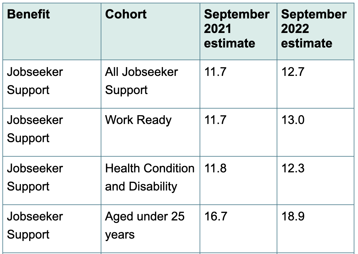
This table is useful. It makes two things clear. First, there are hidden complexities in the “Jobseeker Support” label — it also includes people unable to work for health or disability reasons. Second, and more surprising, this doesn’t help with the explanation.  The “work ready” and “health condition and disability” subgroups have pretty much the same estimated years on benefit.  The time is longer for young people, but that’s for the obvious reason that they have more time before age 65 available.  The page also gives a list of what they count as “on a benefit”, confirming that they aren’t cheating by including things like retirement or child support.

Another link is to the underlying report (PDF).  From this report, Table 3.1 is informative (click to embiggen)

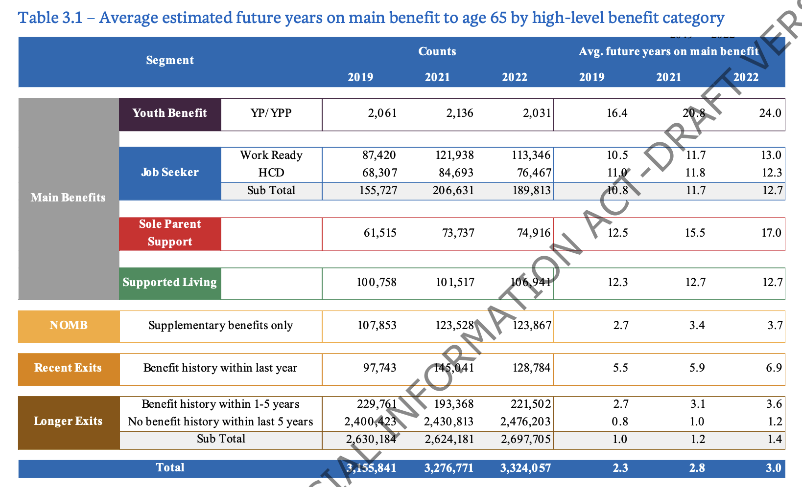
One important piece of information is the middle one of the brown-tagged rows: “Benefit history within last year”.  This, together with the use of a modelling date of 30 September, and a table adding up to plausibly the NZ adult population, makes me think the denominator for the average time on a benefit is determined just by who is on a benefit on 30 September each year.  If Chris finishes study in December, takes a month off, and starts looking for work in January, finding a job in June, they won’t be counted as “on a benefit under 25”.  Using “on benefit at a particular date” as means your denominator will miss out on most people who have a short period of unemployment.  In statistics, this is called “length-biased sampling”. We don’t mean “biased” in a negative way, necessarily, but sampling at a single date means you get more people with long eligibility periods and fewer people with short eligibility periods.

This, I think, is the context that makes the number more plausible. It’s not measuring people who start on a benefit when under 25, it’s measuring people who, at a particular point in time, are currently on a benefit. On top of that, the particular point in time is chosen to miss the short-term unemployment decrease each year as people leave full-time education.   We can see that the length-biased sampling matters, because the group “Benefit history within last year” have about half the expected future time on benefits, and “Benefit history within 1-5 years” about another half lower.

With this in mind, the expected time on benefits in the future still probably does count as worryingly high.  There’s no particular partisan side to concern about benefit traps — they are well recognised as a potential problem by progressives as well as conservatives.  The policy questions are more about whether you should spend more money helping people get into jobs vs making it harder and more unpleasant to stay on benefit, and about what the appropriate income level of benefits should be.

I don’t feel the either the Ministry or the National Party have published these numbers in a way that makes the context easy to understand. I don’t think journalists have done a great job in explaining the numbers, either. In some ways the ads are the least worrying manifestation of these numbers, since no-one really expects a political ad to be fair and informative, but it would be nice if we could.

March 15, 2026

Survey framing

From an admittedly bogus poll of my followers on Mastodon

The correct answer is “none of the above”. The most appropriate common name is probably “avocado”

It looks like most respondents didn’t know what Persea americana is, but assumed the question was about some actual controversy such as the appropriate name for Actinidia deliciosa cultivars  — ‘kiwifruit’, but often called ‘kiwi’ in the US. This is frivolous, but it’s similar in many ways to putatively serious survey questions such as “bombing Agrabah” or asking about Harambe as a presidential candidate in 2016.

March 8, 2026

Briefly

  • From BBC Somerset: “Rare coincidence as three cousins born on same day“. Two sisters-in-law gave birth on the same day, one to identical twins. One of the hospitals notes that identical twins are about 1 in 250 pregnancies. It’s going to be uncommon for two closely-linked women to give birth to three kids on the same day. The chance increases as you consider non-identical twins and more relationships — primary-school BFF, college flatmate, next-door neighbour, sky-diving partner, whatever.  Given that the UK has over half-a-millon births per year, this has got to be a thing that regularly happens.  It’s still rare enough to properly be a big deal to the families involved, and BBC Somerset aren’t overselling it too much.
  • From a BBC news item about electricity theft (and the risks involved)

    The clear increase shown in the graph is a bit undermined by “Crimestoppers estimates that a further 250,000 cases go unreported every year”. If 95% of cases are unreported, there’s no hope for estimating trends from the 5% of reported cases — we can’t possibly distinguish trends in reporting from trends in the true rate.  Long-time StatsChat readers will remember me saying this about everything from skin cancer to domestic violence.
  • Weight-loss jab could be made for $3 a month, study finds (Guardian).  This is plausibly true and I’m not going to argue that pharmaceutical prices are where they should be. However, as with The Guardian itself, the price of one additional copy of the the finished product is not the main determiner of the price, nor should it be.
  • CNN: Here’s how much the war with Iran is expected to cost every day. The answer they give is nearly US$1 billion per day. That’s a lot, but the US is a big country: it’s about three times the US daily spend on coffee and a bit less than the cost of car insurance.  More importantly, it’s not the cost of the war. It’s  not even the cost of the war to the USA as ABC News and Al Jazeera frame the same number. It’s only the cost of the munitions used by the USA.  The cost of the war, under any attempt at reasonable accounting, is far higher.
March 6, 2026

Over-averaging

The Guardian reports “Gen Z males twice as likely as baby boomers to believe wives should obey husbands”, with similar phrasing in headlines from the Daily Mail, and the NY Post, and in the lede from the BBC. This has, unsurprisingly, caused a bit of concern.

Looking at the original information from King’s College London (research for International Women’s Day†) the trend seems to go over all ages

This seems strange. I would not have thought women’s equality had been getting steadily worse for the past eighty years. Do we just have a bad question, or a bad sample, or what? The page at King’s College shows broadly similar patterns for other gender attitude questions, though often less extreme. It’s not just the question but it might be partly the question.  In particular, there might be a carryover from ‘obey’ in wedding vows, which is not quite the same. However, “A husband should have the final word on important decisions made in his home” gets very similar answers to the “obey” question.

Here’s the worldwide comparison for the ‘obey’ question:

There’s a huge amount of variation between countries, so the results will be sensitive to how countries are combined.  Honest and competent researchers will give you this sort of information, and there is a full PDF report actually linked from the King’s College page, near the top!  It has a Technical Note on the last page that says in part

The data is weighted so that the composition of each country’s sample best reflects the demographic profile of the adult population according to the most recent census data. “The Global Country Average” reflects the average result for all the countries and markets in which the survey was conducted. It has not been adjusted to the population size of each country or market and is not intended to suggest a total result. [emphasis added]

It would be interesting to see separate trends for countries and regions, rather than suggesting a total result, when the responses from different countries are so different.


† Yes, there is. November 19.

March 5, 2026

March madness

Newsroom has a long piece on traffic congestion in Auckland in March. Near the beginning, Douglas Wilson, from the Transport Research Centre at the Uni of Auckland says

“So suddenly people say, ‘Wow, it’s taking me double the travel time to get to work. Why is that the case?’ It’s not that you’ve doubled the traffic volume. Actually, the volume has only gone up a little, proportionally, but the traffic flow has reached capacity.”

This is one of the Two Simple Facts from queueing theory, the branch of applied probability that deals with congestion in networks. These networks can be physical road networks or electronic data networks or something like a system of medical waiting lists, or something as simple as a literal queue, and what they all have in common is waiting for other users.

Queueing theory can lead to very complicated simulations and theoretical approximations, but parts of it are simple. My Two Simple Facts are

  1. When you have multiple servers you should still try to have a single queue
  2. A queueing system has a “capacity” and when it gets near that capacity small changes make things much worse

Most of the time, Auckland’s traffic system works reasonably well. There’s enough wiggle room for traffic to catch up around the inevitable slowdows.  When you get a big crash on the motorway or heavy rain or extra drivers, though, the whole system suddenly gets much slower. In the other direction, removing drivers after Christmas opens up the city out of all proportion to the number who leave.

Sudden slowdowns near full capacity are a pretty general property of queueing systems. We can look at them in a nice simple example — this sort of mathematical model is very useful both for understanding the general vibes and for developing theoretical tools.

(more…)