Posts written by Thomas Lumley (2645)

avatar

Thomas Lumley (@tslumley) is Professor of Biostatistics at the University of Auckland. His research interests include semiparametric models, survey sampling, statistical computing, foundations of statistics, and whatever methodological problems his medical collaborators come up with. He also blogs at Biased and Inefficient

February 16, 2015

Pot and psychosis

The Herald has a headline “Quarter of psychosis cases linked to ‘skunk’ cannabis”, saying

People who smoke super-strength cannabis are three times more likely to develop psychosis than people who have never tried the drug – and five times more likely if they smoke it every day.

The relative risks are surprisingly large, but could be true; the “quarter” attributable fraction needs to be qualified substantially. As the abstract of the research paper (PDF) says, in the convenient ‘Interpretation’ section

Interpretation The ready availability of high potency cannabis in south London might have resulted in a greater proportion of first onset psychosis cases being attributed to cannabis use than in previous studies

Let’s unpack that a little.  The basic theory is that some modern cannabis is very high in THC and low in cannabidiol, and that this is more dangerous than more traditional pot. That is, the ‘skunk’ cannabis has a less extreme version of the same problem as the synthetic imitations now banned in NZ. 

The study compared people admitted as inpatients in a particular area of London (analogous to our DHBs) to people recruited by internet and train advertisements, and leaflets (which, of course, didn’t mention that the study was about cannabis). The control people weren’t all that well matched to the psychosis cases, but it wasn’t too bad.  The psychosis cases were somewhat more likely to smoke cannabis, and much more likely to smoke the high-THC type. In fact, smoking of other cannabis wasn’t much different between cases and controls.

That’s where the relative risks of 3 and 5 come from.  It’s still possible that these are due at least in part to some other factor; you can’t tell from just this sort of data. The atttributable fraction (a quarter of cases) comes from combining the relative risk with the proportion of the population who are exposed.

Suppose ‘skunk-type’ cannabis triples your risk, and 20% of people in the population use it, as was seen for controls in the sample. General UK data (eg) suggest the rate in non-users might be 5 cases per 10,000 people per year. So, in 100,000 people, 80,000 would be non-users and you’d expect 40 cases per year. The other 20,000 would be users, and you’d expect a background rate of 10 cases plus 20 extra cases caused by the cannabis. So, in the 100,000 people, you’d get 70 cases per year, 50 of which would have happened anyway and 20 due to cannabis. That’s not exactly the calculation the researchers did — they used a trick where they don’t need the background rate as long as it’s low, and I rounded more — but it’s basically the same. I get 28%; they got 24%.

The figures illustrate two things. First, the absolute risk increase is roughly 20 cases per 100,000 20,000 people per year. Second, the ‘quarter’ estimate is very sensitive to the proportion exposed. If 5% of people used ‘skunk-type’ cannabis, you can run the numbers again and you get 5 cases due to cannabis out of 55 in 100,000 people: only 9% of cases due to exposure.

Now we’re at the ‘interpretation’ quote from the research paper.  In this South London area, 20% of people have used mostly the high-potency cannabis and 44% mostly have used other types, with 37% non-users. That’s a lot of pot.  Even if the relative risks are correct, the population attributable proportion will be much lower for the UK as a whole (or for NZ as a whole).

Still, the research does tend to support the idea of regulated legalisation, the sort of thing that Mark Kleiman advocates, where limits on THC and/or higher taxes for higher concentrations can be used to push cannabis supply to lower-risk varieties.
 

February 15, 2015

Caricatures and credits


A lot of surprisingly popular accounts on Twitter just tweet pictures, without giving any sources,and often with captions that misleading or just wrong.  One from yesterday had a picture of a picnic on a highway in the Netherlands in 1973 and described it as being from the US.

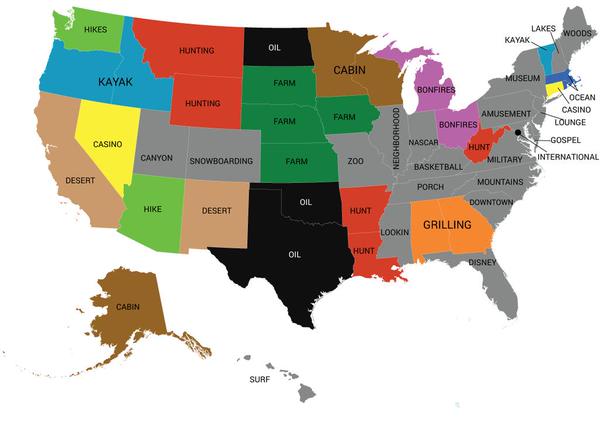
Here’s one that came from @AmazingMaps, today, captioned “Most popular word used in online dating profiles by state”

B916Zi9IIAAXAJb


Could it really be true that ‘NASCAR’ is the most popular word in Indiana dating profiles? Or that ‘oil’ is the most popular word in Texas? Have the standard personal-ad clichés become completely outdated? Aren’t Americans easy-going any more? Doesn’t anyone care about romance or honesty or humour?

We’ve seen this sort of analysis before on StatsChat. It’s designed to produce a caricature, though not necessarily in a bad way. This one comes from Mashable, based on analysis by Match.com. The original post says

Essentially, they broke down which words are used with relative frequency in certain states, as compared to relative infrequency in the rest of the country.

That is, the map has ‘oil’ for Texas and ‘NASCAR’ for Indiana not because these words were used very often in those states, but because they were used much less often in other states. Most Indiana dating profiles probably don’t mention NASCAR, but a much higher proportion do than in, say, New York or Oregon. Most Texas dating profiles don’t talk about oil, but it’s more common in Texas than in Maine or Tennessee. It’s not that everyone in Oregon or Idaho kayaks, but a lot more do than in Iowa or Kansas.


When this map first came out, in November, there were lots of stories about it, typically getting things wrong (eg an NBC motor sports site had the headline “NASCAR” is most frequently used word among Indiana online dating profiles”). That’s still bad, but most of these sites had links or at least mentioned the source of the map, so that people who care could find out what the facts are. @AmazingMaps seems confident none of its followers care.

February 14, 2015

Run and find out, but guess first

Vox.com has a post on calendar patterns.  Yuri Victor noticed that, this year, February is a nice rectangular shape on a calendar (as happens whenever it starts on Sunday in  a non-leap year), and wondered how often this happened.  This is the sort of question where you can easily find out the answer, so he did:

I decided to see if this occurs often so I wrote some code and found out it happens more than I thought.In the past 100 years, there have been 11 Februaries that make a rectangle.

He also noticed that February 13th would be Friday when this happened and wondered how often we got a Friday 13th:

Friday the 13ths also happen more than I thought. In the past 100 years there have been 171 Friday the 13ths, which means there is one to two a year.

This is a Good Thing. We want journalists wondering about patterns and looking up data to check them. We don’t want them being required to call an expert in calendars to give a quote. It’s also a Good Thing that he tells us his expectations were wrong

It would be even better, though, if he’d tried to work out a quantitative guess and tell us. The simplest guess would be that, in the long run, February 1 is a Sunday as often as any other day, and that the 13th of a month is a Friday as often as any other day.  These are natural guesses because there’s no special reason the year or a particular month should start on a particular day of the week. 

In  100 years there are 1200 months, and 1200/7 is 171.4, so it looks as though Friday 13th happens in almost exactly 1/7 of months.  In the past 100 years there are 75 Februaries with 28 days, and 75/7 is 10.7, so 28-day Februaries begin on Sunday almost exactly 1/7 of the time.

You wouldn’t always expect the simplest possible explanation to hold. For example, the date of Passover is set based on the solar and lunar calendars, in a 19-year cycle. Since 7 doesn’t divide 19, you’d expect either that the days of the week didn’t divide up equally or that they took a long time (requiring lots of leap years) to do so.


February 13, 2015

Misunderstanding genetic heritability

From the Herald, under the headline “Is this why we’re all getting fat?”

According to the UN’s World Health Organisation, obesity nearly doubled worldwide from 1980 to 2008.

More than 2.8 million adults die each year as a result of being overweight or obese, it says. A full 42 million children under the age of five are considered to be obese.

Diet and a sedentary lifestyle have long been fingered as causes of obesity, but in recent years, advances in gene sequencing have turned attention to inheritance.

Previous studies have variously estimated genes as being to blame for between 40 and 70 per cent of the problem.

Every sentence here is true, but the impression is completely wrong.

The 40-70% genetic contribution to weight is comparing different individuals in basically the same environment.  The ‘obesity epidemic’ is comparing whole populations over time.  One thing we know can’t possibly explain the recent increases in obesity is genetics: there hasn’t been time for the genes of these populations to change.

Looking under the lamppost

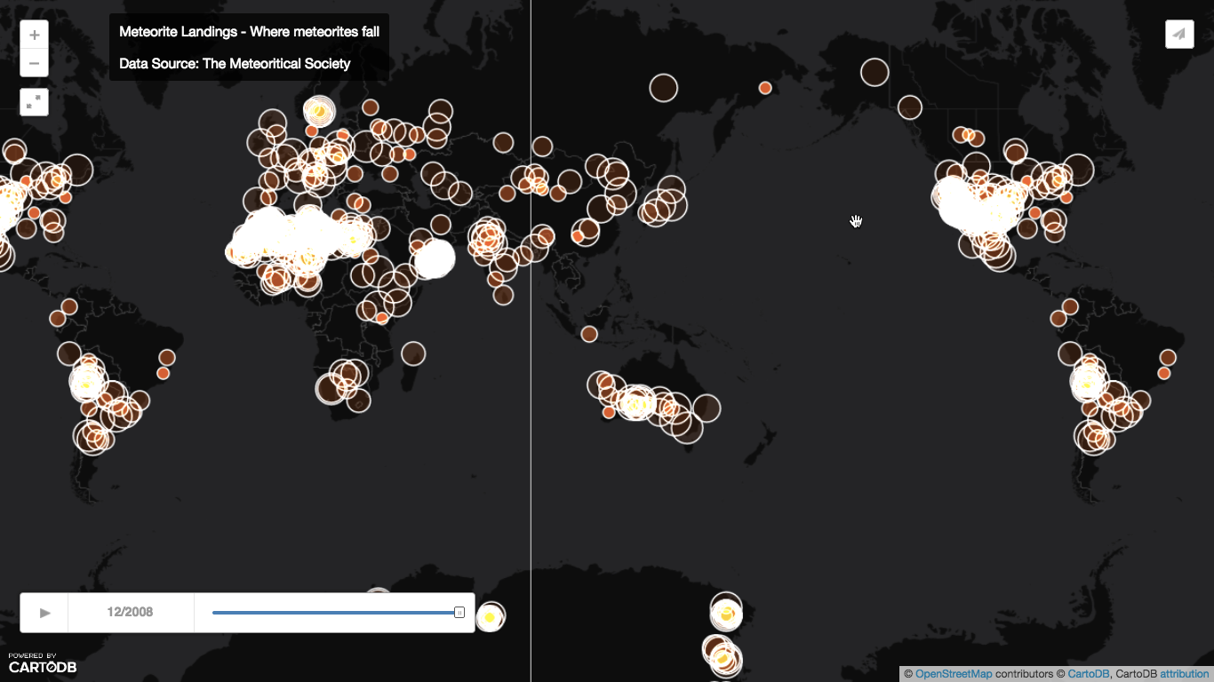
Harkanwal Singh, at the Herald, has a very nice animation of known meteorite locations around the world and over time, as part of the report on Wednesday night’s fireball.  Here’s a still of the last frame: click to expand.

meteor-map,

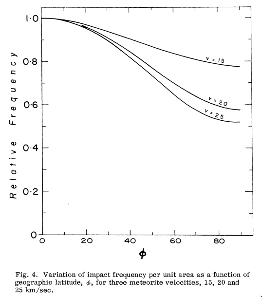
This is basically a map of sampling bias. That is, meteorites hit the Earth uniformly by longitude and over time, though with a preference for the tropics over the poles. The bias towards the tropics is fairly slight by real area, but the Mercator projection will amplify it. From a 1964 paper by Ian Halliday:

meteorites

That’s not what the map looks like.

The first part of the sampling bias is that a meteorite basically has to hit land to be counted: if it hits ocean it will sink without a trace.

It’s easier to find meteorites in places where they don’t bury themselves in soil or get eroded, so we see lots of them in desert or in ice. You don’t get many found in the Amazon, but there are lots just to the west in the Atacama desert of Chile.

In non-ideal circumstances it helps if there’s a fairly dense population of observers and scientists: meteorites in the modern US have a reasonable chance of being found even in non-ideal countryside.  And finally, some places are easier to search than others. There’s a sharp drop off in meteorite finds between Oman and Yemen. This isn’t due to a dramatic geological or weather boundary; it has the same causes as the 13-year difference in life expectancy.

February 12, 2015

Eat food

From the Herald, based on this paper

Dietary advice issued to tens of millions had warned that fat consumption should be strictly limited to cut the risk of heart disease and death.

But experts say the recommendations, which have been followed for the past 30 years, were not backed up by scientific evidence and should not have been issued.

Firstly, the “not  backed up by scientific evidence” actually means “not backed up by randomised trials”. When there’s a shortage of randomised trials on a topic it doesn’t mean there is no evidence. Randomised trials are ideal, but they are very hard to do usefully for effects of diet.  The same issue of the scientific journal has a useful commentary piece talking about the evidence and policy questions.

Second,  it’s true that there were real gaps in knowledge on the difference between types of fat back then. All fat isn’t the same, and neither is all saturated fat, or all polyunsaturated fat. Since I wasn’t in epidemiology back then, I don’t know how much this was a known unknown that should have led to more caution versus an unknown unknown.

Third, in the US at least, people didn’t really reduce their fat consumption as a result of the guidelines. For example, in a paper in the American Journal of Clinical Nutrition

In a comparison of NHANES 2005–2006 with NHANES I, men had a decreased absolute daily fat intake (by 20 ± 23 kcal, from 909 to 889 kcal), whereas women had an increased absolute daily fat intake (by 27 ± 14 kcal, from 577 to 605 kcal).

Fat intake as a proportion of calories decreased quite a lot, because calories went up, but absolute fat intake stayed fairly stable. Saying the recommendations ‘have been followed for the past 30 years’ is misleading.

Fourth, as this shows we don’t know a lot about how to make recommendations that translate to the right sort of behaviour changes. This is another area where there’s shortage of randomised trials. And of scientific evidence generally.

And finally, there was a good story by Martin Johnston in the Herald in December that gives more background on the issue. There’s genuine disagreement, but the establishment view isn’t what the caricatures suggest:

Professor Jackson reckons the Japanese and traditional Mediterranean diets offer insights. He says the balance of carbs and fats is probably unimportant as long as most fat is not saturated and most carb is the complex variety, not sugar and white flour-based refined carbs.


Two types of brain image study

If a brain imaging study finds greater activation in the asymmetric diplodocus region or increased thinning in the posterior homiletic, what does that mean?

There are two main possibilities. Some studies look at groups who are different and try to understand why. Other studies try to use brain imaging as an alternative to measuring actual behaviour. The story in the Herald (from the Washington Post), “Benefit of kids’ music lessons revealed – study” is the second type.

The researchers looked at 334 MRI brain images from 232 young people (so mostly one each, some with two or three), and compared the age differences in young people who did or didn’t play a musical instrument.  A set of changes that happens as you grow up happened faster for those who played a musical instrument.

“What we found was the more a child trained on an instrument,” said James Hudziak, a professor of psychiatry at the University of Vermont and director of the Vermont Center for Children, Youth and Families, “it accelerated cortical organisation in attention skill, anxiety management and emotional control.

An obvious possibility is that kids who play a musical instrument have different environments in other ways, too.  The researchers point this out in the research paper, if not in the story.  There’s a more subtle issue, though. If you want to measure attention skill, anxiety management, or emotional control, why wouldn’t you measure them directly instead of measuring brain changes that are thought to correlate with them?

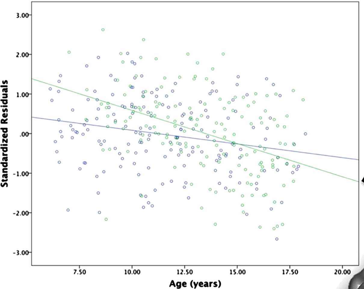
Finally, the effect (if it is an effect) on emotional and behavioural maturation (if it is on emotional and behavioural maturation) is very small. Here’s a graph from the paper
PowerPoint Presentation


The green dots are the people who played a musical instrument; the blue dots are those who didn’t.  There isn’t any dramatic separation or anything — and to the extent that the summary lines show a difference it looks more as if the musicians started off behind and caught up.

Briefly

  • Ways of visualising uncertainty in statistics, from Visualising Data
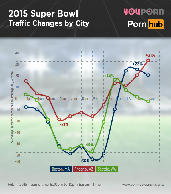
  • Football competes with internet porn for audience: analysis from Pornhub
    pornhub-insights-2015-super-bowl-traffic-city
    The zero line is ‘average day and time’: a better comparison would have been a typical winter Sunday.
  • The New Yorker, on the problems with so-called precision medicine: The pace of genetics research, the variability of test methods and results, and the aura of infallibility with which the tests are marketed, she told me, make this advance a more complicated one than the EKG.  But, as the demand for DNA testing increases, she says, “it will probably be a bit worse before it gets better.”
  • A panel of the Institute of Medicine has come out with a definition, diagnostic criteria, and a new name for ‘chronic fatigue syndrome’.  The question wasn’t whether people were sick — that’s pretty obvious. The question was which set of people have the same thing wrong with them, and how to tell.  It’s a statistical issue because a definition leads to counting people who satisfy it.
  • It sees you when you’re sleeping; it knows when you’re awake: smart power meters on the front page of the Dominion Post.  (It also sends you lots of email whenever you alter your habits, eg, by travelling).
  • “There’s no plague on the New York subway. No platypuses either”.  Ed Yong on false positives in DNA testing. His team swabbed tomato plants in a field in Virginia, analysed the DNA in those samples, and found matches to the duck-billed platypus—an Australian animal, not known to live in Virginia. They then analysed over 19,000 publicly available microbiome samples from around the world; around a third threw up matches for platypus DNA. Either the platypus secretly rules the world or, more likely, this was a hilarious case of false positives gone mad.
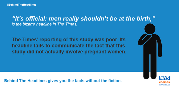
  • NHS Choices makes StatsChat look tactful and friendly: they are going after the newspapers on Twitter
    B7-Gn42IQAAJYWX
  • “But these headlines are without serious foundation, and through no fault of the journalists.”  David Spiegelhalter on UK coverage of a study of health associations with low-level alcohol consumption.
  • How to release data in a spreadsheet: clean-sheet.org.  Send this to everyone who know who releases data, or just put it on your blog in a passive-aggressive way. The key point is that data release is different from data presentation.
February 11, 2015

Red wine good for your liver?

From the UK press, rather than NZ, but by Twitter request

  • Independent Drinking red wine could help overweight people burn fat better, scientists claim
  • DailyMail How a glass of red wine can be slimming
  • Telegraph: Drinking wine or red grape juice ‘can help burn fat’

From the Oregon State University press release:

“We didn’t find, and we didn’t expect to, that these compounds would improve body weight,”

So, the headlines are misleading at best.

Previous research, about a year ago, showed that feeding grape extracts to mice reduced fat accumalation in the liver. The new research looked at human cells grown in a lab: cells from fat and liver cells, and showed that these extracts made them synthesise less fat, providing some support for the idea that this might work in people as well. The doses are not insane — about a cup and a half of grapes per day.

There are some important reservations (aren’t there always?)

First, the research looked at extracts from muscadine grapes, not ordinary wine or table grapes. The chemical being studied, ellagic acid, isn’t found at any significant level in the type of grapes grown in NZ (or, probably , the UK). There is some ellagic acid in ordinary wine, but only from oak aging and cork corks, so not that much in NZ wines.  There’s nothing in the research about whether you could get relevant amounts of ellagic acid from wine.

Second, while ellagic acid may reduce fat accumulation in the liver, alcohol tends to increase it. The mice and cell cultures got lots of ellagic acid and no alcohol; lots of alcohol and moderate amounts of ellagic acid might not be any good.

Finally, and more technically, the press release speculates about the biochemical mechanism

Shay hypothesizes that the ellagic acid and other chemicals bind to these PPAR-alpha and PPAR-gamma nuclear hormone receptors, causing them to switch on the genes that trigger the metabolism of dietary fat and glucose. Commonly prescribed drugs for lowering blood sugar and triglycerides act in this way, Shay said.

“Commonly prescribed” is pushing it. The best-known PPAR-gamma ligand drug was rosiglitazone (Avandia), famous for having been recalled from market.  There are still drugs that target PPAR-alpha and PPAR-gamma, but they aren’t that widely used. If this is how ellagic acid works, I’d want to see careful human trials before trusting it — it could have nasty side effects.

February 8, 2015

Briefly

Thousand words edition:

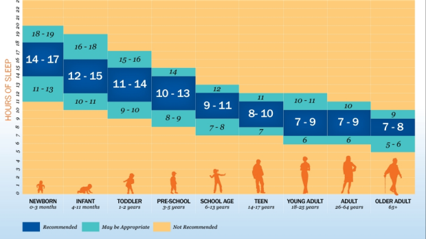
  • From the Sydney Morning Herald (I’m in the West Island at the moment), new recommendations for amounts of sleep now have extra ‘may be appropriate’ uncertainty fringes around the central band, representing our lack of real knowledge about sleep.  If you are an adult and get 5 or less hours sleep a night, you aren’t getting enough. On the other hand, you probably have a small child and know you aren’t getting enough, or are Margaret Thatcher.
    1423162435981


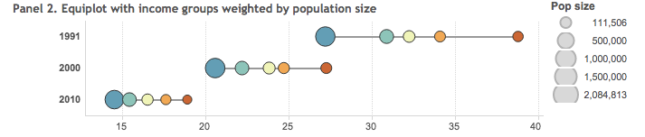
  • A graph for showing inequality. This has potential, but it would be more convincing if the examples involved real data. School decile data would be one possibility
    equiplot
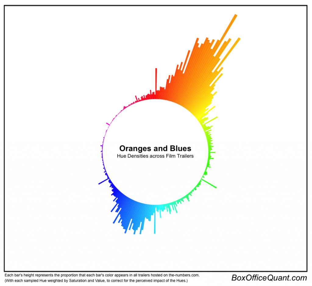
  • Orange and blue: A circular histogram of the colour profiles in film trailers (from, via)
    Hue-Density-1024x938