Posts written by Thomas Lumley (2645)

avatar

Thomas Lumley (@tslumley) is Professor of Biostatistics at the University of Auckland. His research interests include semiparametric models, survey sampling, statistical computing, foundations of statistics, and whatever methodological problems his medical collaborators come up with. He also blogs at Biased and Inefficient

February 27, 2015

What are you trying to do?


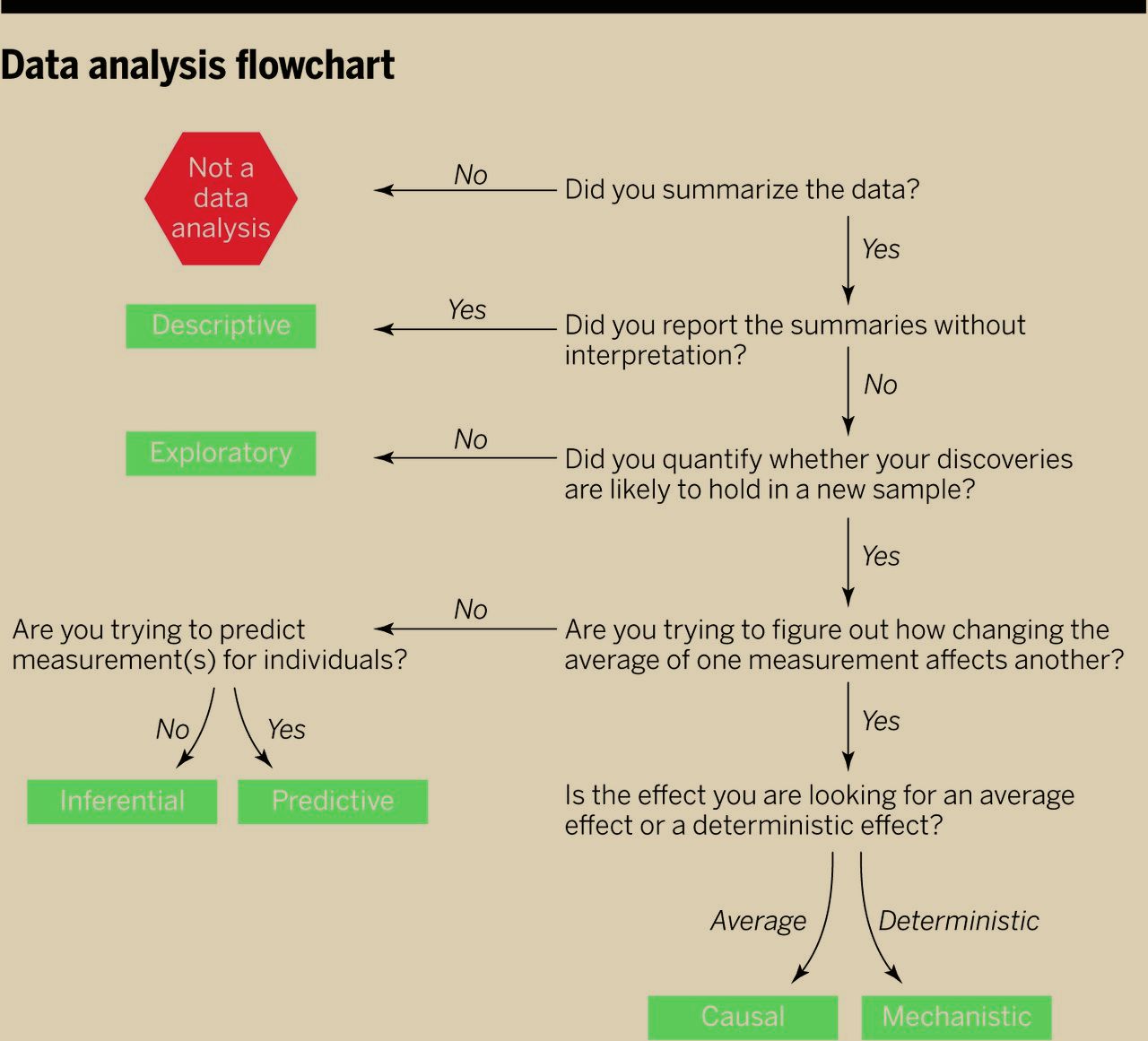
There’s a new ‘perspectives’ piece (paywall) in the journal Science, by Jeff Leek and Roger Peng (of Simply Statistics), arguing that the most common mistake in data analysis is misunderstanding the type of question. Here’s their flowchart

F1.large

The reason this is relevant to StatsChat is that you can use the flowchart on stories in the media. If there’s enough information in the story to follow the flowchart you can see how the claims match up to the type of analysis. If there isn’t enough information in the story, well, you know that.


February 25, 2015

Measuring what you care about

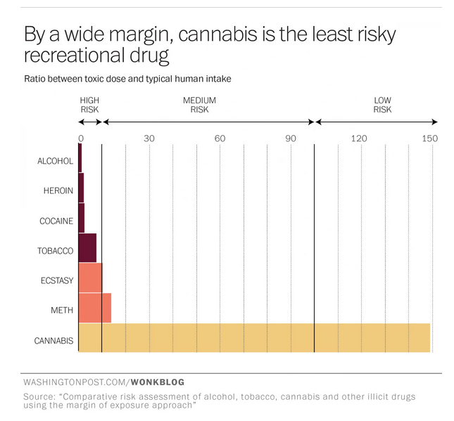
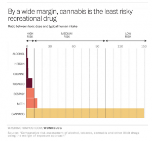
If cannabis is safer than thought (as the Washington Post says), that might explain why the reporting is careful to stay away from thought.
thought


The problem with this new research is that it’s looking at the acute toxicity of drugs — how does the dose people usually take compare to the dose needed to kill you right away.  It’s hard to overstate how unimportant this is in debates over regulation of alcohol, tobacco, and cannabis.  There’s some concern about alcohol poisoning (in kids, mostly), but as far as I can remember I have literally never seen anti-tobacco campaigns mentioning acute nicotine poisoning as a risk, and even the looniest drug warriors don’t push fatal THC overdoses as the rationale for banning marijuana.

Alcohol is dangerous not primarily because of acute poisoning, but because of car crashes, violence, cancer, liver failure, and heart damage. Tobacco is dangerous not primarily because of acute poisoning, but because of lung cancer, COPD, heart disease, stroke, and other chronic diseases.

It’s hard to tell how dangerous marijuana is. It certainly causes dependence in some users, and there are reasons to think it might have psychological and neurological effects. If smoked, it probably damages the lungs. In all these cases, though, the data on frequency and severity of long-term effects are limited.  We really don’t know, and the researchers didn’t even try to estimate.

The conclusions of the researchers — that cannabis is over-regulated and over-panicked-about relative to other drugs — are reasonable, but the data provide very little support for them.  If the researchers had used the same methodology on caffeine, it would have looked much more dangerous than cannabis, and probably more dangerous than methamphetamine. That would have been a bit harder to sell, even with a pretty graph.


[story now in Herald, too]

Briefly

  • NZ papers have sensible coverage of the new peanuts/kids research (Herald, Stuff). NHS Behind The Headlines has a summary and takes some UK papers to task.
  • “Rich Data, Poor Data”: Nate Silver writes about why sports statistics works. Unfair summary: it’s an artificial problem in a controlled environment that people care about more than they should.
  • “the vast majority of health sites, from the for-profit WebMD.com to the government-run CDC.gov, are loaded with tracking elements that are sending records of your health inquiries to the likes of web giants like Google, Facebook, and Pinterest, and data brokers like Experian and Acxiom.” Story at vice.com, video summary from the researcher:
  • “A memo to the American people from US Chief Data Scientist Dr DJ Patil”.  More informative than you might expect given the source.
  • “the biggest problem facing the world of public opinion research isn’t that online opt-in polls, but rather the temptation to troll twitter to “see what people are thinkingand other thoughts from Cathy O’Neil, based on the new report on Big Data from the American Association for Public Opinion Research.
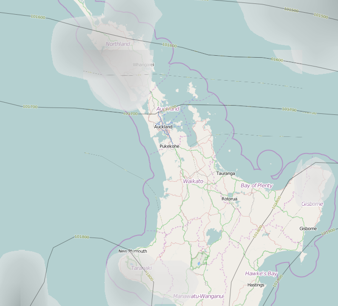
  • Openweathermap.org: another part of the increasing supply of open data
    weathermap
February 21, 2015

Another interesting thing about petrol prices

or What I Did At Open Data Day.

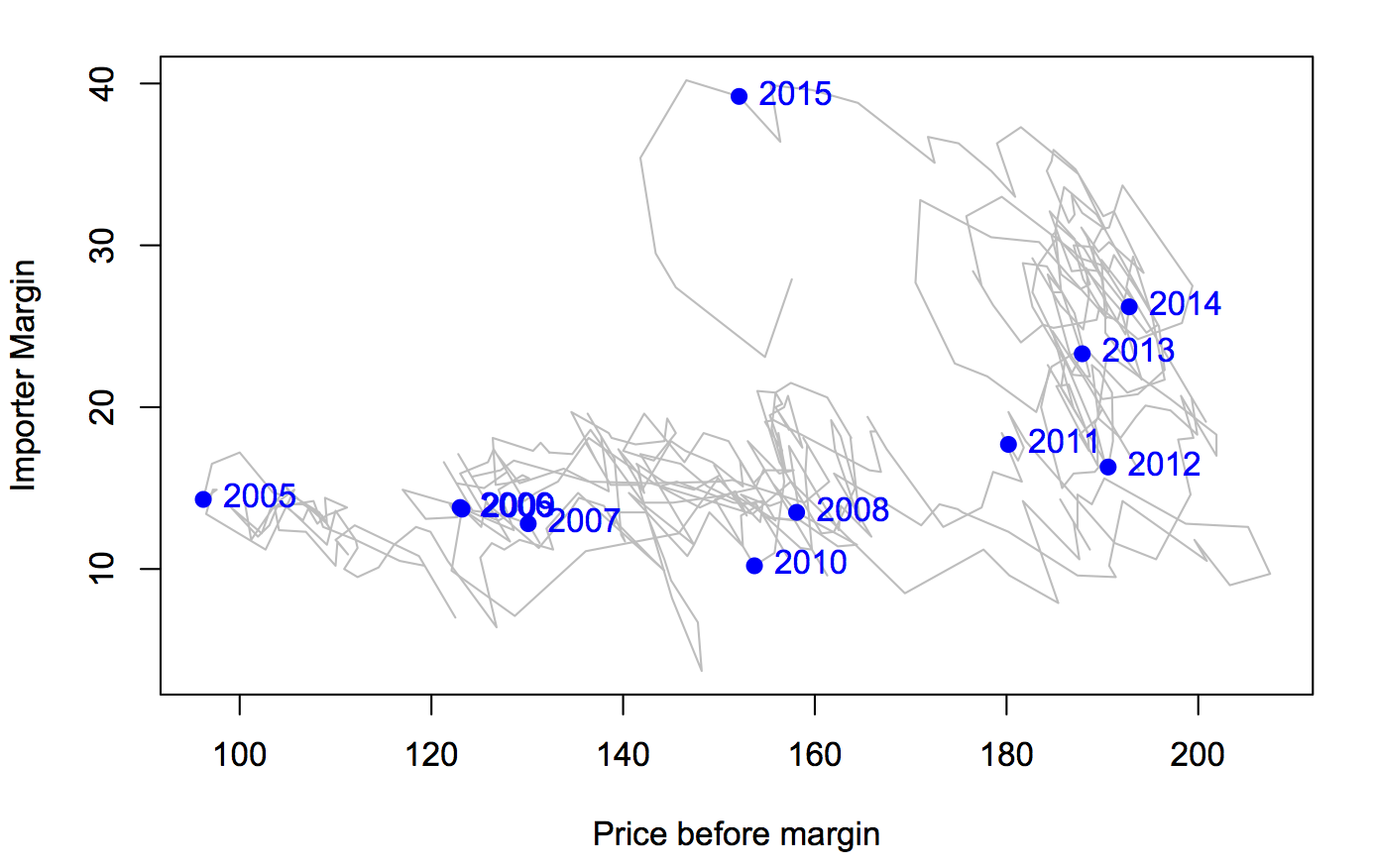
The government monitoring data on petrol prices go back to 2004, and while they show their data as time series, there are other ways to look at it.

petroltrend

The horizontal axis is the estimated cost of imported petrol plus all the taxes and levies. The vertical axis is the rest of the petrol price: it covers the cost hauling the stuff around the country, the cost of running petrol stations, and profit for both petrol stations and companies.

There’s an obvious change in 2012. From 2005 to 2012, the importer margin varied around 15c/litre, more or less independent of the costs. From 2012, the importer margin started rising, without any big changes in costs.

Very recently, things changed again: the price of crude oil fell, with the importer margin staying roughly constant and the savings being passed on to consumers. Then the New Zealand dollar fell, and the importer margin has fallen — either the increased costs from the lower dollar are being absorbed by the vendors, or they have been hedged somehow.


If it seems too good to be true

The Herald (from the Daily Telegraph) has a story about a new high-antioxidant chocolate

Its makers claim it can change the underlying skin of a 50 to 60-year-old into that of someone in their 20s or 30s.

Actually, in an uncontrolled short-term trial in 400 people they say

“We used people in their 50s and 60s and in terms of skin biomarkers we found it had brought skin back to the levels of a 20 or 30-year-old

The target market is

“elegant, educated and affluent” city-dwelling women in their 30s and businessmen “to support their appearance in a stressful environment and on their business travels”.

or, in other words, people who would be willing to bore on about how young and beautiful their skin biomarkers are, in case you can’t tell by looking.

To be fair, there is independent expert comment (which is not entirely convinced). If you read right to the last sentence you get the real highlight:

Nutrition experts at UCL also warned that previous trials showed that astaxanthin worked better when applied directly to the face rather than ingested.


Updated to add: the story was also on Prime News, where they made explicit the point that this really has nothing to do with the chocolate. They could have put the astaxanthin in a pill, but they thought it would be more attractive if they put it in chocolate. A spoonful of sugar makes the medicine go down, etc,

February 20, 2015

Why we have controlled trials


joc80747f2

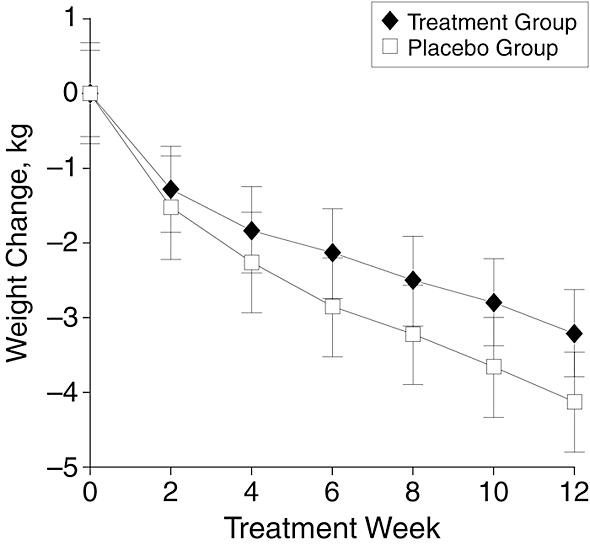
The graph is from a study — a randomised, placebo-controlled trial published in a top medical journal — of a plant-based weight loss treatment, an extract from Garcinia cambogia, as seen on Dr Oz. People taking the real Garcinia cambogia lost weight, an average of 3kg over 12 weeks. That would be at least a little impressive, except that people getting pretend Garcinia cambogia lost an average of more than 4kg over the same time period.  It’s a larger-than-usual placebo response, but it does happen. If just being in a study where there’s 50:50 chance of getting a herbal treatment can lead to 4kg weight loss, being in a study where you know you’re getting it could produce even greater ‘placebo’ benefits.

If you had some other, new, potentially-wonderful natural plant extract that was going to help with weight loss, you might start off with a small safety study. Then you’d go to a short-term, perhaps uncontrolled, study in maybe 100 people over a few weeks to see if there was any sign of weight loss and to see what the common side effects were. Finally, you’d want to do a randomised controlled trial over at least six months to see if people really lost weight and kept it off.

If, after an uncontrolled eight-week study, you report results for only 52 of 100 people enrolled and announce you’ve found “an exciting answer to one of the world’s greatest and fastest growing problems” you perhaps shouldn’t undermine it by also saying “The world is clearly looking for weight-loss products which are proven to work.”


[Update: see comments]

February 19, 2015

London card clash sensitivity analysis

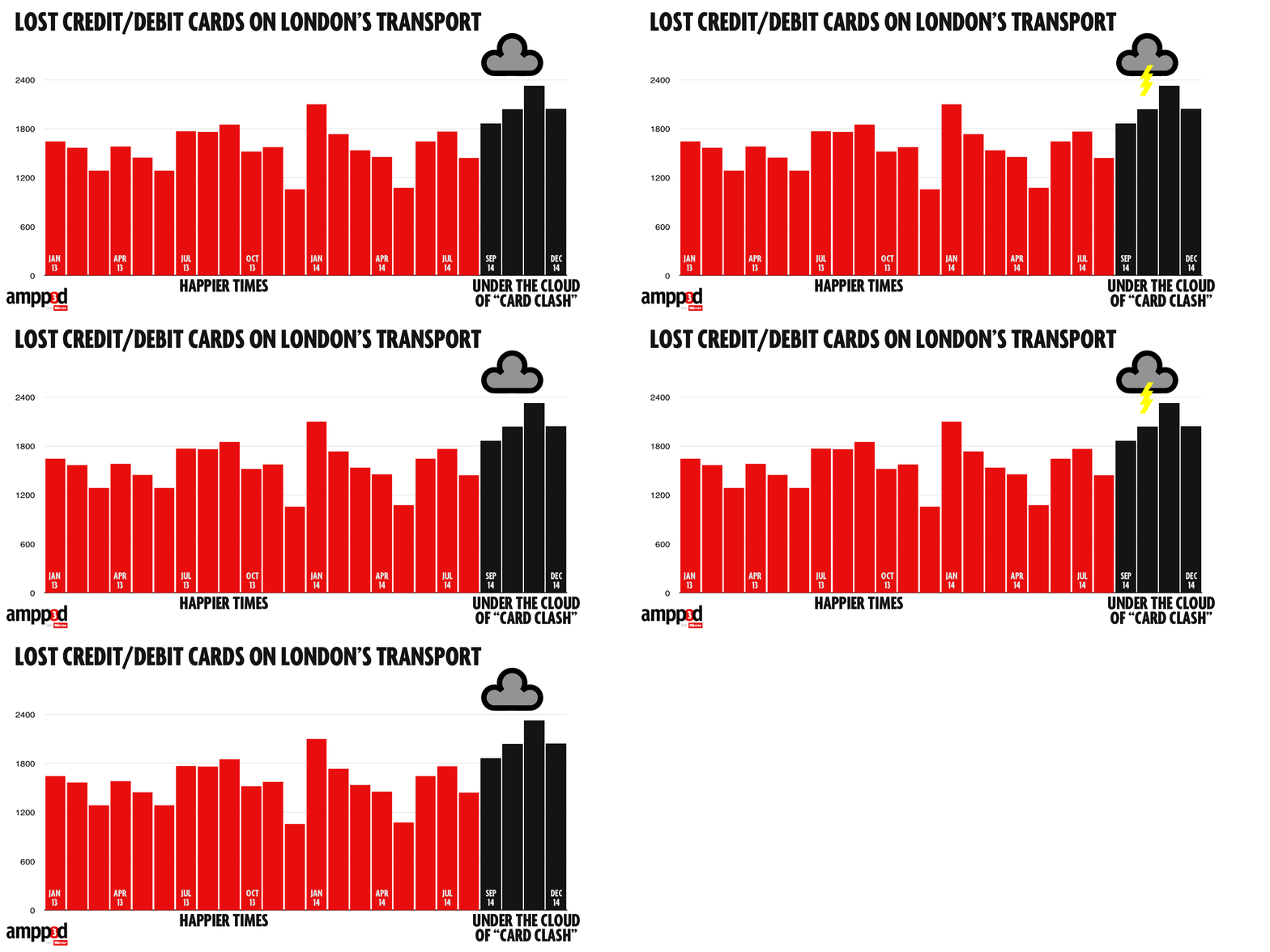
The data blog of the Daily Mirror reports a problem with ‘card clash’ on the London Underground.  You can now pay directly with a debit card instead of buying a ticket — so if you have both a transport card and a debit card in your wallet, you have the opportunity to enter with one and leave with the other and get overcharged. Alternatively, you can take the card out of your wallet and drop it.  Auckland Transport has a milder version of the same problem: no-touch credit cards can confuse the AT HOP reader and make it not recognise your card, but you won’t get overcharged unless you don’t notice the red light.

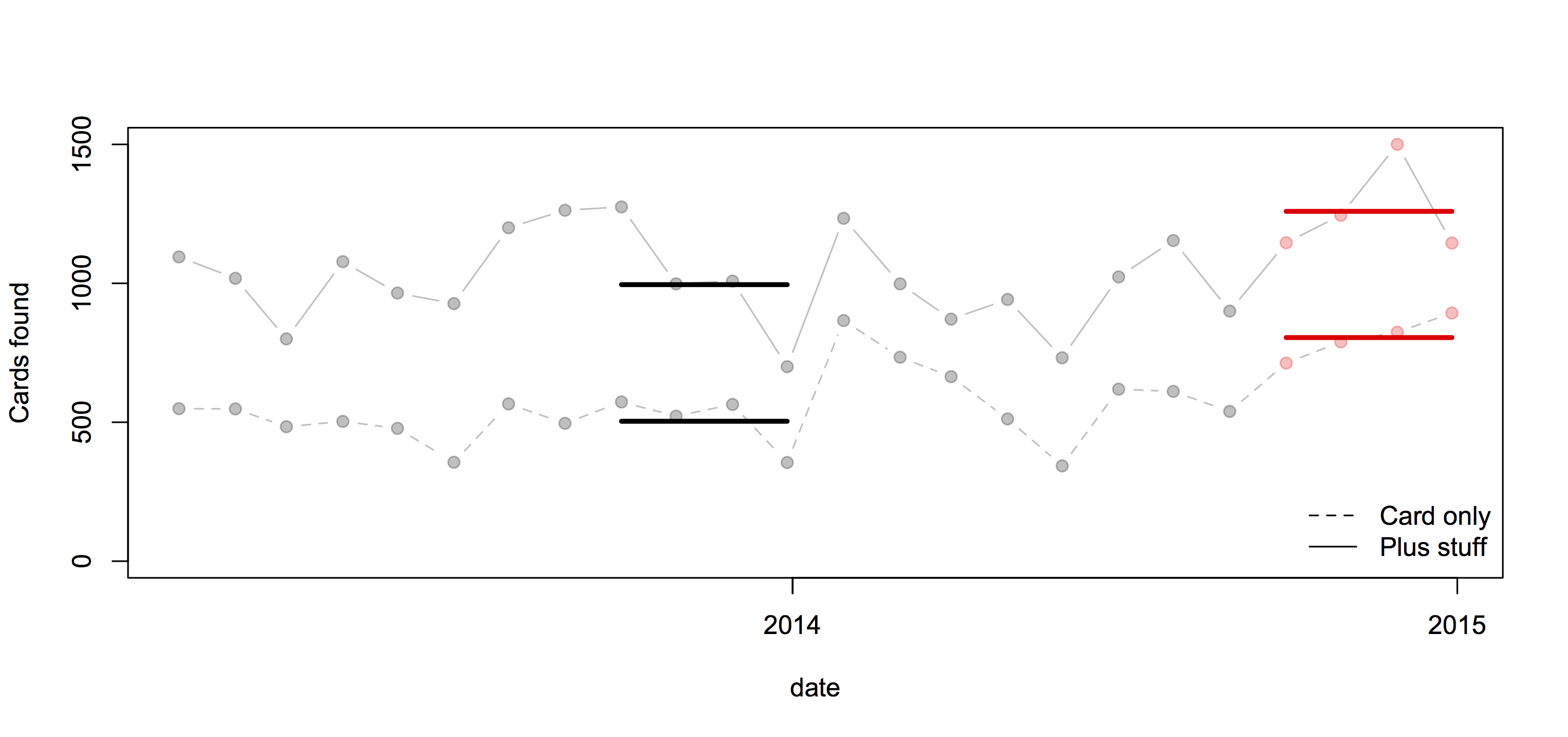
They looked at numbers of cards handed in at lost-and-found across the London Underground over the past two years (based on FOI request)

card-clash

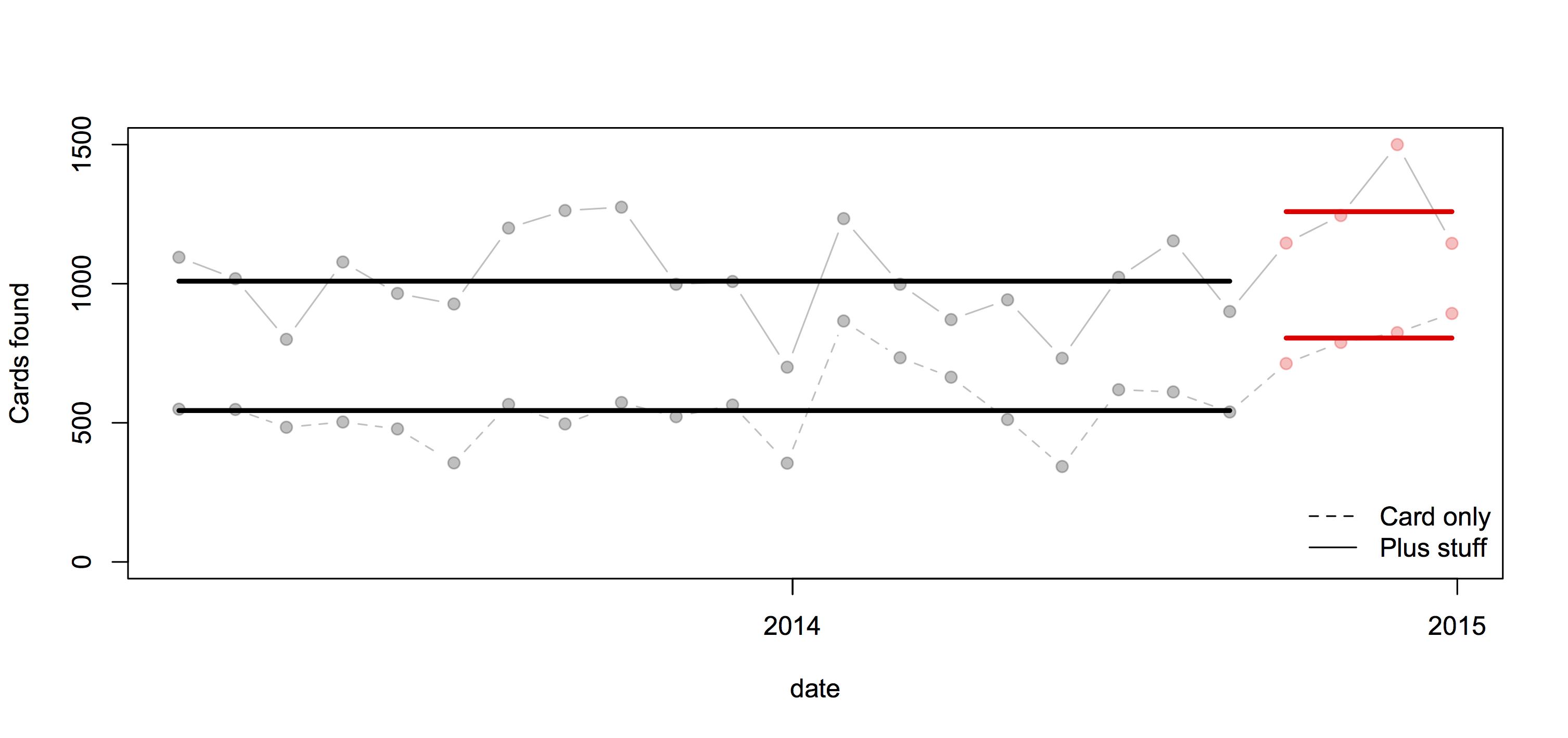
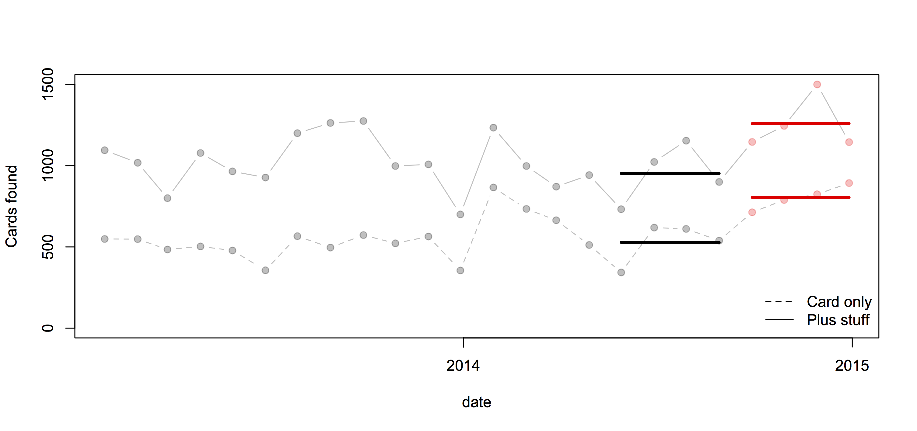
If we’re going to spend time on this, we might also consider what the right comparison is. The data include cards on their own and cards with other stuff, such as a wallet. We shouldn’t combine them: the ‘card clash’ hypothesis would suggest a bigger increase in cards on their own.

Here’s a comparison using all the data: the pale points are the observations, the heavy lines are means.

allcards

Or, we might worry about trends over time and use just the most recent four months of comparison data:

recentcards

Or, use the same four months of the previous year:

matchedcards


In this case all the comparisons give basically the same conclusion: more cards are being handed in, but the increase is pretty similar for cards alone and for cards with other stuff, which weakens the support for the ‘card clash’ explanation.

Also, in the usual StatsChat spirit of considering absolute risks: there are 3.5 million trips per day, and about 55 cards handed in per day: one card for about 64000 trips. With two trips per day, 320 days per year, that would average once per person per century.

West Island census under threat?

From the Sydney Morning Herald

Asked directly whether the 2016 census would go ahead as planned on August 9, a spokeswoman for the parliamentary secretary to the treasurer Kelly O’Dwyer read from a prepared statement.

It said: “The government and the Bureau of Statistics are consulting with a wide range of stakeholders about the best methods to deliver high quality, accurate and timely information on the social and economic condition of Australian households.”

Asked whether that was an answer to the question: “Will the census go ahead next year?” the spokeswoman replied that it was.

Unlike Canada, it’s suggested they would at least save money in the short term. It’s the longer-term consequences of reduced information quality that are a concern — not just directly for Census questions, but for all surveys that use Census data to compensate for sampling bias. How bad this would be depends on what is used to replace the Census: if it’s a reasonably large mandatory-response survey (as in the USA), it could work well. If it’s primarily administrative data, probably not so much.

In New Zealand, the current view is that we do still need a census.

Key findings are that existing administrative data sources cannot at present act as a replacement for the current census, but that early results have been sufficiently promising that it is worth continuing investigations.


February 18, 2015

Petrol prices

From time to time I like to remind people about the national petrol price monitoring program. For example, when there’s a call for a review of fuel prices.

The Ministry of Business, Innovation & Employment (Economic Development Information) carries out weekly monitoring of “importer margins” for regular petrol and automotive diesel.  The weekly oil prices monitoring report is reissued each week with the previous week’s data.

The importer margin is the amount available to retailers to cover domestic transportation, distribution and retailing costs, and profit margins.

The purpose of this monitoring is to promote transparency in retail petrol and diesel pricing and is a key recommendation from the New Zealand Petrol Review

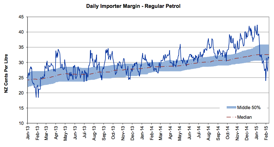
The importer margin for petrol over the past three years looks like this:

petrol-margin

The wiggly blue line is the week-by-week estimated margin; the shaded area is centered around the red trend line and covers 50% of the data. The margin had been going up; the calls for a review came just after it plummeted.

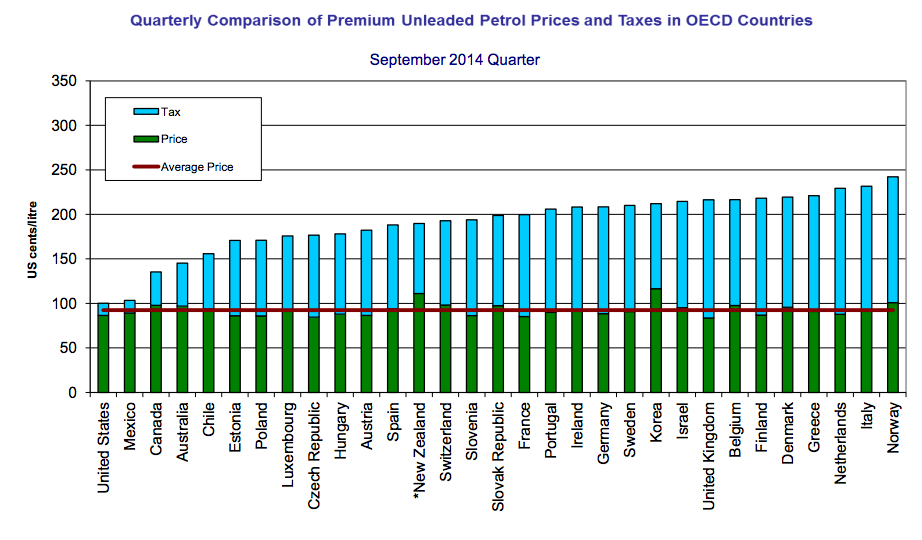
At the same site, but updated only quarterly, is an international comparison of the cost of fuel broken down into tax and everything else.

petrol-international

February 16, 2015

Briefly