Posts written by Thomas Lumley (2645)

avatar

Thomas Lumley (@tslumley) is Professor of Biostatistics at the University of Auckland. His research interests include semiparametric models, survey sampling, statistical computing, foundations of statistics, and whatever methodological problems his medical collaborators come up with. He also blogs at Biased and Inefficient

January 27, 2015

Benadryl and Alzheimers

I expected the Herald story “Hay fever pills linked to Alzheimer’s risk – study” to be the usual thing, where a fishing expedition found a marginal correlation in low-quality data.  It isn’t.

The first thing I noticed  when I found the original article is that I know several of the researchers. On the one hand that’s a potential for bias, on the other hand, I know they are both sensible and statistically knowledgeable. The study has good quality data: the participants are all in one of the Washington HMOs, and there is complete information on what gets prescribed for them and whether they fill the prescriptions.

One of the problems with drug:disease associations is confounding by indication. As Samuel Goldwyn observed, “Any man who goes to a psychiatrist needs to have his head examined”, and more generally the fact that medicine is given to sick people tends to make it look bad.  In this case, however, the common factor between the medications being studied is an undesirable side-effect for most of them, unrelated to the reason they are prescribed.  In addition to reducing depression or preventing allergic reactions, these drugs also block part of the effect of the neurotransmitter acetylcholine. The association remained just as strong when recent drug use was excluded, or when antidepressant drugs were excluded, so it probably isn’t that early symptoms of Alzheimer’s lead to treatment.

The association replicates results found previously, and is quite strong, about four times the standard error (“4σ”) or twice the ‘margin of error’. It’s not ridiculously large, but is enough to be potentially important: a relative rate of about 1.5.

It’s still entirely possible that the association is due to some other factor, but the possibility of a real effect isn’t completely negligible. Fortunately, many of the medications involved are largely obsolete: modern hayfever drugs (such as fexofenadine, ‘Telfast’) don’t have anticholinergic activities, and nor do the SSRI antidepressants. The exceptions are tricyclic antidepressants used for chronic pain (where it’s probably worth the risk) and the antihistamines used as non-prescription sleep aids.

School fee/real-estate arithmetic

There’s an interesting piece in the Herald arguing that the effective school fees you pay by living in one of the top school zones in Auckland aren’t great value, and that you’d be better off just paying private-school fees explicitly. It’s a good point, but I think the calculations in the article are missing something:

Where a school zone boundary sliced through the middle of a suburban street, in-zone houses were up to $272,000 more expensive than comparable properties on the other side of the road.

“Over the life of a 20-year mortgage, at a fixed mortgage rate of 6.5 per cent, the extra $272,000 it costs to buy a home ‘in-zone’, with interest, equates to an outlay of $486,710. That’s almost half a million dollars.

That’s compared to private-school fees that could easily total “more than $100,000 per student over five years”.

There are two points that don’t get addressed explicitly in the article. Firstly, many people have more than one child. Secondly, the money spent on school-zone real estate isn’t gone, it’s a speculative investment.

Using their figures (because I’m lazy), if you subtract two kids at $100,000 school fees from the $486,710 real-estate plus interest you get $286,710. If the real-estate premium for the school zones keeps up with inflation, you basically break even, with the possibility of a big loss (if boundaries are redrawn) or a big gain (if prices keep going up).

If you’re the sort of person the article is aimed at, there’s a good chance you’ve already got more of your money in Auckland real estate than is ideal, so speculating on the Grammar Zone premium might not be a good investment, but it’s not self-evidently bad.

There are a couple of surprising points about the article. First, you would hope this is the sort of calculation anyone would already be doing before planning to spend the thick end of million bucks. Second, the fact that real-estate prices can go up as well as down is not something the Herald usually misses.

January 24, 2015

Measuring what you care about

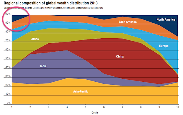
Via Felix Salmon, here’s a chart from Credit Suisse that’s been making the headlines recently, in the Oxfam report on global wealth.  The chart shows where in the world people live for each of the ‘wealth’ deciles, and I’ve circled the most interesting piece.

wealth

About 10% of the least wealthy people in the world live in North America. This isn’t (just) Mexico, Guatemala, Nicaragua, etc, it’s also the US, because some people in the US have really big debts.

If you are genuinely poor, you can’t have hundreds of thousands of dollars of negative wealth because no-one would give you that sort of money. Compared to a US law-school graduate with student loans, you’re wealthy.  This is obviously a dumb way to define wealth. Also, as I’ve argued on the ‘net tax’ issue, cumulative percentages just don’t work usefully as summaries when some of the numbers are negative.

This doesn’t mean wealth inequality doesn’t exist (boy, does it) or doesn’t matter, but it does mean summaries like the Credit Suisse one don’t capture it. If you wanted to capture the sort of wealth inequality worth worrying about, you’d need to think about what it really meant and why it was a problem separately from income inequality (which is much easier to define).

There seem to be two concerns with wealth inequality that people on a reasonably broad political spectrum might care about, if we stipulate that redistributive international taxation is not on the agenda:

  • transfer of wealth from parents to children leads to social stratification
  • high concentrations of wealth give some people too much power (and more so in societies more corrupt than NZ).

Both of these are non-linear ($200 isn’t twice as much as $100 in any meaningful sense) and they both depend on where you are ($20,000 will get you much further in Nigeria than in Rhode Island). There probably isn’t going to be a good way to look at global wealth inequality. Within countries, it’s probably feasible but it will still take some care and I expect it will be necessary to discount debts quite a lot.  If you owe the bank $10, you’re not wealthy, but if you owe the bank $10 million, you probably are.

January 23, 2015

Where did I come from?

One of the popular uses of recreational genotyping is ancestry determination.  Everyone inherits mitochondria only from our mothers, who got it from their mothers, and so on. Your mitochondrial DNA is a good match for your greatnth-grandmother, and people will sell you stories about where she came from.  In men, the Y chromosome does the same job for male-line ancestry.

When you go back even 50 generations (eg, very roughly to the settlement of New Zealand, or the Norman Conquest), you have approximately a million billion ancestors, obviously with rather a lot of overlap. You might wonder if the single pure female line ancestor was representative, and how informative she was about your overall ancestry.

In a new paper in the American Journal of Human Genetics, researchers looked at what you’d conclude about ancestry from the mitochondrial DNA compared to what you’d conclude from the whole genome.  They weren’t trying to get this very precise, just down to what continent most of your ancestors came from. This is what they found:

Continental-ancestry proportions often varied widely among individuals sharing the same mtDNA haplogroup. For only half of mtDNA haplogroups did the highest average continental-ancestry proportion match the highest continental-ancestry proportion of a majority of individuals with that haplogroup. Prediction of an individual’s mtDNA haplogroup from his or her continental-ancestry proportions was often incorrect. Collectively, these results indicate that for most individuals in the worldwide populations sampled, mtDNA-haplogroup membership provides limited information about either continental ancestry or continental region of origin.

The agreement was better than chance — there is some information about ancestry from just your greatnth-grandmother — but not very good. It wasn’t even a particularly severe test, since the samples were a set that had been previously selected to expand the diversity of genome sequencing and were deliberately spread out around the world.  In a random group of young adults from London or New York or Rio you’d expect to do worse.

January 22, 2015

Do they know it’s Christmas time?

It’s (fortunately) out of season now, but there’s an interesting post on 538 about how Christmas music is detected, selected and played.

For example, the impact on algorithms that discover new hits or new performers:

The discovery algorithm searches for situations when the popularity of a song rises substantially faster than the popularity of the song’s artist. This becomes a problem in November, because Spotify starts seeing “Home for the Holidays” crooner Perry Como — who has been dead for 13 years — suddenly start behaving like an indie band out of Portland, Oregon, that’s about to make it big.

January 21, 2015

How to feel good about New Zealand

StatsChat criticises the NZ media a lot, but if you really want a target-rich zone, the place is the UK. Today, the Daily Express had this front page:

B703j6kIcAEiyUl

The biggest vote on this country’s ties to ­Brussels for 40 years saw 80 per cent say they no longer want to be in Europe, the ­Daily Express can reveal.

It marks a huge leap forward in this news­paper’s crusade to get Britain out of the EU.


This comes from a survey in three Conservative electorates in the southern UK (out of 650 electorates), where 100,000 questionnaires were distributed. About 12% said Britain should leave the EUK, about 3% were opposed, and the other 85% didn’t respond.

Other, better-conducted polling doesn’t find such a dramatic lead. Even a late-December poll by “Get Britain Out” found only 51% support for leaving the EU and consoled themselves by describing this as showing their campaign was gaining momentum.

(via @federicacocco)

Tired foreign drivers

This one makes sense as a possibility

However, road safety campaigner Clive Matthew-Wilson today slammed the new website a “dangerous waste of time”.

He has repeatedly called for tourist drivers to be banned from driving vehicles within 24 hours of arriving in the country.

“Driving tired is as dangerous as driving drunk,” said Mr Matthew-Wilson.

Obviously it matters how tired vs how drunk, but fatigue certainly is unhealthy in drivers.

There’s also the issue that almost 50% of foreign tourists have only come from Australia, not a terribly arduous trip, and that there are almost as many Kiwis returning from Foreign Parts as there are Foreigners visiting. Still, banning car rentals within 24 hours of a sufficiently long flight is something that wouldn’t need to be restricted to foreigners and so wouldn’t require withdrawing from the UN Conventions on Road Traffic.

It would be surprising if tired foreign drivers weren’t at somewhat higher risk of a crash. We’d still want data to see how many crashes we’re talking about. Is this rule going to prevent 10 fatal crashes per year, or 1 per decade?

We can get an initial idea from the National Crash Map built by Richard Law and Andrew Parnell and feature in the Herald Data Blog on Christmas Day.

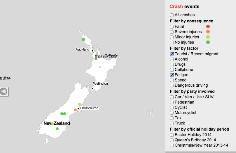
Here are all the crashes from December 2013 to July 2014 where both fatigue and being a foreign driver were judged to be contributing causes. It’s an overestimate, since it includes fatigue from all causes rather than just from recent arrival, and in a multi-car collision even includes fatigue in someone other than the foreign driver. Also, it’s based on police judgment and maybe they overestimate or underestimate fatigue as a cause.

It’s a start.

tired-foreign


Over this eight-month period there were no fatal crashes, one serious-injury crash, and two minor-injury crashes satisfying these criteria.

This is just two-thirds of one year, and a proper analysis would look at the data back to 2007 (or the more-limited data even further back). It’s still more data than the story provided.


January 20, 2015

Is it misleading to say a majority of US public school kids live in poverty?

Yes.

Well, no.

Ok, yes, maybe.

This was the Washington Post headline: “Majority of U.S. public school students are in poverty“. It hasn’t made the NZ media, but some of you probably read about the rest of the world occasionally and might have seen it.

The original source, a report from the Southern Education Foundation, is careful not to use the word “poverty”.  They say 51% of public school students are low-income, defined as receiving free or subsidised school meals.  There’s a standard US government definition of poverty, used in defining eligibility for social programs, and by that definition 51% of public school students come from households with income less than 1.85 times the threshold for poverty.  The report also says what proportion get free school meals, for which the threshold is 1.35 times the poverty line, and it’s 44%.

They don’t give the proportion under the official poverty line. If the exact figure mattered for this post I could probably work it out from the American Community Survey, but since only about 10% of US kids are in private schools after kindergarten and before college, it’s going to be in the same ballpark as the proportion for all children — 22%.   It’s hard to see it being more than 30%.

On the other hand, the US has an unusual official definition of poverty.  In most Western countries, the poverty line is a set fraction (often 60%) of the median household income (adjusted somehow for household size). The US uses the price of a fixed set of foodstuffs and an estimate of what fraction of income goes on food, defined in 1963-4 and then updated using the CPI (actually, that’s what the Census Bureau uses, the rest of the government uses a simplified version of the same thing).  If you defined poverty by 60% of median household income, you’d come pretty close to the subsidized-meals threshold.  That is, defining poverty the way most other Western countries do, the headline is close to being correct.

On the other other hand, the Washington Post is a  US newspaper.  If you’re writing for the Post and you think it’s unreasonable to define ‘poverty’ to exclude a US family of three with an income (including cash benefits) of $20,000, I have some sympathy for your position. I still think you need to say your definition is different from the official one and wasn’t used by your source.

Ask a silly question, get a silly answer

The monthly US FoodDemand survey added some questions about government policies this time around. Mostly these were reasonable (eg, do you support a tax on sugared sodas, which got 39% ‘Yes”, the same as here; do you support a ban on sale of marijuana, 46% yes)

However, one question was

“Do you support mandatory labeling for foods containing DNA?”

There’s no way this is a sensible question about government policies: it isn’t a reasonable policy or one that has been under public debate.  Most foods will contain DNA, the exceptions being distilled spirits, some candy, and (if you don’t measure too carefully) white rice and white flour. Nevertheless, 80% of people were in favour.

There was also a question “Do you support mandatory labeling for foods produced with genetic engineering”. This got 82% support.

It seems most likely that many respondents interpreted these questions as basically the same: they wanted labelling for food containing DNA that was added or modified by genetic engineering.  This isn’t what the researchers meant, since they write

A large majority (82%) support mandatory labels on GMOs, but curiously about the same amount (80%) also support mandatory labels on foods containing DNA.

If you ask a question that is nuts when interpreted precisely, but is basically similar to a sensible question, people are going to answer the question they think you meant to ask. People are helpful that way, even when it isn’t helpful.

January 16, 2015

Women are from Facebook?

A headline on Stuff: “Facebook and Twitter can actually decrease stress — if you’re a woman”

The story is based on analysis of a survey by Pew Research (summary, full report). The researchers said they were surprised by the finding, so you’d want the evidence in favour of it to be stronger than usual. Also, the claim is basically for a difference between men and women, so you’d want to see summaries of the evidence for a difference between men and women.

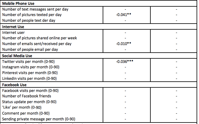
Here’s what we get, from the appendix to the full report. The left-hand column is for women, the right-hand column for men. The numbers compare mean stress score in people with different amounts of social media use.

pew

The first thing you notice is all the little dashes.  That means the estimated difference was less than twice the estimated standard error, so they decided to pretend it was zero.

All the social media measurements have little dashes for men: there wasn’t strong evidence the correlation was non-zero. That’s not we want, though. If we want to conclude that women are different from men we want to know whether the difference between the estimates for men and women is large compared its uncertainty.  As far as we can tell from these results, the correlations could easily be in the same direction in men and women, and could even be just as  strong in men as in women.

This isn’t just a philosophical issue: if you look for differences between two groups by looking separately for a correlation each group rather than actually looking for differences, you’re more likely to find differences when none really exist. Unfortunately, it’s a common error — Ben Goldacre writes about it here.

There’s something much less subtle wrong with the headline, though. Look at the section of the table for Facebook. Do you see the negative numbers there, indicating lower stress for women who use Facebook more? Me either.


[Update: in the comments there is a reply from the Pew Research authors, which I got in email.]