Posts written by Thomas Lumley (2645)

avatar

Thomas Lumley (@tslumley) is Professor of Biostatistics at the University of Auckland. His research interests include semiparametric models, survey sampling, statistical computing, foundations of statistics, and whatever methodological problems his medical collaborators come up with. He also blogs at Biased and Inefficient

December 9, 2014

Health benefits and natural products

The Natural Health and Supplementary Products Bill is back from the Health Committee. From the Principles section of the Bill:

(c) that natural health and supplementary products should be accompanied by information that—

   (i)is accurate; and

   (ii)tells consumers about any risks, side-effects, or benefits of using the product:

(d)that health benefit claims made for natural health and supplementary products should be supported by scientific or traditional evidence.

There’s an unfortunate tension between (c)(i) and (d), especially since (for the purposes of the Bill) the bar for ‘traditional evidence’ is set very low: evidence of traditional use is enough.

Now, traditional use obviously does convey some evidence as to safety and effectiveness. If you wanted a herbal toothache remedy, you’d be better off looking in Ngā Tipu Whakaoranga and noting traditional Māori use of kawakawa, rather than deciding to chew ongaonga.

For some traditional herbal medicines there is even good scientific evidence of a health benefit. Foxglove, opium poppy, pyrethrum, and willowbark are all traditional herbal products that really are effective. Extracts from two of them are on the WHO essential medicines list, as are synthetic adaptions of the other two. On the other hand, these are the rare exceptions — these are the  ones where a vendor wouldn’t have to rely only on traditional evidence.

It’s hard to say how much belief in a herbal medicine is warranted by traditional use, and different people would have different views. It would have been much better to allow the fact of traditional use to be advertised itself, rather than allowing it to substitute for evidence of benefit.  Some people will find “traditional Māori use” a good reason to buy a product, others might be more persuaded by “based on Ayurvedic principles”.  We can leave that evaluation up to the consumer, and reserve claims of ‘health benefit’ for when we really have evidence of health benefit.

This isn’t treating science as privileged, but it is treating science as distinguished. There are some questions you really can answer by empirical study and repeatable experiment (as the Bill puts it), and one of them is whether a specific treatment does or does not have (on average) a specific health benefit in a specific group of people.
 

Diversity and segregation

A very nice interactive game and simulation by Vi Hart and Nicky Case, showing how very high levels of segregation can result even from just a preference for not being overwhelming outnumbered.

On the positive side, a fairly small active preference for diversity can overcome this problem.

December 8, 2014

Political opinion: winning the right battles

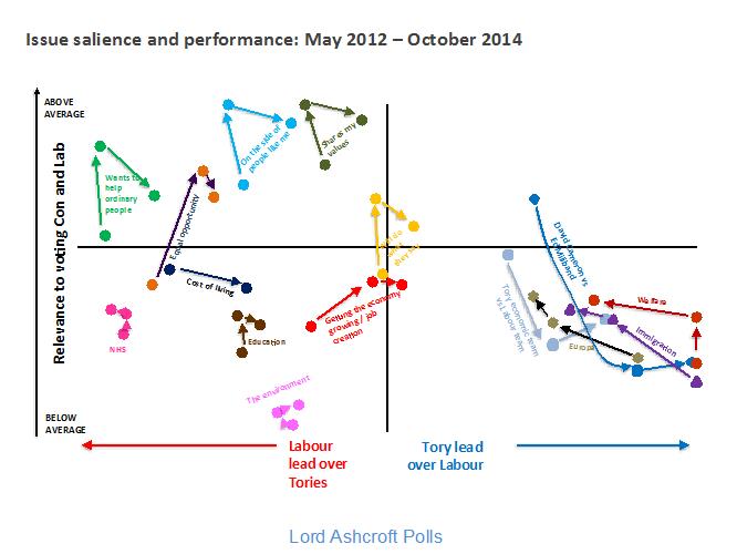
From Lord Ashcroft (UK, Conservative) via Alex Harroway (UK, decidedly not Conservative), an examination of trends in UK opinion on a bunch of issues, graphed by whether they favour Labour or the Conservatives, and how important they are to respondents. It’s an important combination of information, and a good way to display it (or it would be if it weren’t a low-quality JPEG)

Ashcroft-Chart


Ashcroft says

The higher up the issue, the more important it is; the further to the right, the bigger the Conservative lead on that issue. The Tories, then, need as many of these things as possible to be in the top right quadrant.

Two things are immediately apparent. One is that the golden quadrant is pretty sparsely populated. There is currently only one measure – being a party who will do what they say (in yellow, near the centre) – on which the Conservatives are ahead of Labour and which is of above average importance in people’s choice of party.

and Alex expands

When you campaign, you’re trying to do two things: convince, and mobilise. You need to win the argument, but you also need to make people think it was worth having the argument. The Tories are paying for the success of pouring abuse on Miliband with the people turned away by the undignified bully yelling. This goes, quite clearly, for the personalisation strategy in general.

December 7, 2014

Briefly

Bot or Not?

Turing had the Imitation Game, Phillip K. Dick had the Voight-Kampff Test, and spammers gave us the CAPTCHA.  The Truthy project at Indiana University has BotOrNot, which is supposed to distinguish real people on Twitter from automated accounts, ‘bots’, using analysis of their language, their social networks, and their retweeting behaviour. BotOrNot seems to sort of work, but not as well as you might expect.

@NZquake, a very obvious bot that tweets earthquake information from GeoNet, is rated at an 18% chance of being a bot.  Siouxsie Wiles, for whom there is pretty strong evidence of existence as a real person, has a 29% chance of being a bot.  I’ve got a 37% chance, the same as @fly_papers, which is a bot that tweets the titles of research papers about fruit flies, and slightly higher than @statschat, the bot that tweets StatsChat post links,  or @redscarebot, which replies to tweets that include ‘communist’ or ‘socialist’. Other people at a similar probability include Winston Peters, Metiria Turei, and Nicola Gaston (President of the NZ Association of Scientists).

PicPedant, the twitter account of the tireless Paulo Ordoveza, who debunks fake photos and provides origins for uncredited ones, rates at 44% bot probability, but obviously isn’t.  Ben Atkinson, a Canadian economist and StatsChat reader, has a 51% probability, and our only Prime Minister (or his twitterwallah), @johnkeypm, has a 60% probability.


December 5, 2014

Bogus polls don’t work even for the good guys

There’s a story in the Times Higher Education Supplement about a Nuffield Council report “The Culture of Scientific Research in the UK.”  The lead in the THES story is

More than a quarter of scientists have felt tempted or under pressure to compromise the integrity of their research, according to a report on the ethics culture at universities.

On the other hand, since the report also found that 56% of scientists were women, the UK must be doing something right.

Seriously, there is a lot to be concerned about — especially in the light of the recent case of Professor Stefan Grimm at Imperial College — but that makes it more important to be careful about facts, not less important.

The survey that formed the quantitative part of the report had just under 1000 responses over three months, which is a substantially lower fraction of the target population than the NZ Association of Scientists managed for similar surveys in much less time. Researchers in biosciences are over-represented (57% of respondents vs 34% of university scientists, according to the report), and I think postdocs probably are too (30% of respondents).

The report itself is careful to describe the percentages as “of survey respondents” — it’s THES that dropped this distinction. As usual, it’s the qualitative information in the report that is most useful, and it’s a pity it has been pushed aside by unreliable numbers.

December 4, 2014

The poker economy?

StatsChat spends a lot of time criticising the Herald and Stuff. That’s because they are readily available, not because they are particularly bad.

For a change, this graph is from the Waikato Business News (you can see the e-book version of the paper here)

hamilton-is-coming

So, there’s some measure of a city’s economy where Hamilton is 4/7 of Auckland, Christchurch is 6/7 of Auckland, and where ChCh and Auckland will be stable but Hamilton will increase and Wellington decrease by about the same amount over the next 10 years.

It’s a bit surprising that you can find a measure (other than construction expenditures, perhaps) where Christchurch’s economy is almost as big as Auckland’s. The graph doesn’t say what the measure is, or how big the poker chips are. Neither does the text of the story. The statistics and graphs are attributed to a report “Growing the Hamilton Economy” by Berl Economics, which I can’t find online — but the reader shouldn’t have to do this much work to decode a front-page headline graphic.

Fortune cookie science reporting

fortune_cookies

For science, the appropriate addition is “in mice.”

The Herald’s story (from the Daily Telegraph) “The latest 12 hour diet backed by science” has exactly this problem. It begins

Dieters hoping to shed the kilos should watch the clock as much as their calorie intake after scientists discovered that limiting the time span in which food is consumed can stop weight gain.

Confining meals to a 12-hour period, such as 8am to 8pm, and fasting for the remainder of the day, appears to make a huge difference to whether fat is stored, or burned up by the body.

It’s not until paragraph 6 that we find out this isn’t about dieters, it’s about mice.  The differences truly are huge — 5% of body weight within a few days, 25% by the end of the study — so you’d think it would be easy to demonstrate these benefits in humans if they were real.

Earlier this year, a different research group published a summary of studies on time-restricted feeding.  There are no controlled studies in humans. The uncontrolled studies aren’t especially high quality, and the ones with a 12-hour period mostly just take advantage of the no-daytime-eating rule observed by Muslims during the month of Ramadan. However, it’s still notable that the average weight reductions from a 4-week period of 12-hour food restrictions were 1-3%.


December 3, 2014

Briefly

  • The Economist has a piece on interactive graphics “It is becoming clear that the native form for data is alive, not dead. Online, interactive charts will become the norm, nudging aside paper-based, static ones.”
  • Ampp3d is the data blog of (UK left-wing tabloid) The Mirror. I’m not sure how to phrase this without sounding more pretentious than I actually am, but it’s good to find data journalism in idioms other than California/Manhattan nerdy and New York Times/BBC/Guardian upper-middle-class liberal.
  • Datavisualization.ch claims to be “the premier news and knowledge resource for data visualization and infographics.” Despite that, it is really worth reading.
December 2, 2014

Bogus UK poll reporting

The Daily Express today: Ukip is now MORE popular than LABOUR: Nigel Farage gets polls boost as Ukip surges ahead. For NZ readers who aren’t familiar with Ukip, you can think of them as NZ First without all the tolerance and multiculturalism. It would be surprising, to put it mildly, for them to be doing that well.

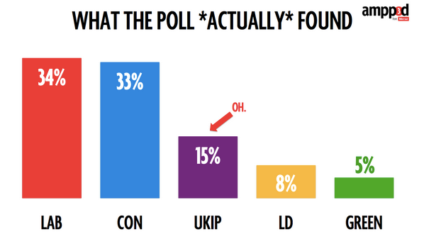
I heard about this on Twitter, from Federica Cocco, who (among other things) writes about politics, data, and statistics for the Mirror Here are her graphs:

raw-poll 

and

weighted-poll

That’s a lot more plausible.

As she says, the problem is sampling bias. I had a long post drafted on reweighting and YouGov and non-response bias, but then I read her post more carefully (on a real computer, not on my phone) and realised the mistake was nothing nearly as complicated or subtle.

YouGov report results broken down in a lot of subsets, because that’s how their methodology works. Rather than attempting to get a relatively random sample and fine-tuning it to be representative, they have given up on random samples and rely on statistical modelling to get representative results. Essentially, they give each respondent a different number of ‘votes’ depending on whether people like them are under-represented or over represented in the sample.

For example, they report the results for people 18-24 (who were under-represented by about 1/3 in the sample and so will be given extra votes in the result), for Scots (who were over-represented by about 1/2 and so will be given fractional votes in the result), and for Sun readers (who were represented about right in the sample).

Overall, accounting for the over- and under-representation, the UKIP got 15% support; among the 18-24 year olds, the UKIP got 10% support; among the Scots, they got 2%. And among Sun readers they got 28% support. That’s pretty much the sort of variation you’d expect, and shows YouGov have probably picked sensible categories for doing their statistical adjustments.

The question still remains as to how the Express managed to report the poll results only for Sun readers, a small, unrepresentative sample of people who support their competition. I don’t know, but my guess is that it’s because the ‘Sun readers’ column is on the right-hand edge of the table of results. If you aren’t paying attention, you might expect the overall totals to be there.


[for non-UK readers: a guide to British papers]