Posts written by Thomas Lumley (2645)

avatar

Thomas Lumley (@tslumley) is Professor of Biostatistics at the University of Auckland. His research interests include semiparametric models, survey sampling, statistical computing, foundations of statistics, and whatever methodological problems his medical collaborators come up with. He also blogs at Biased and Inefficient

October 25, 2012

Journalists have to get it from somewhere

A new paper in the (open-access) journal PLoS Medicine looks at ‘spin’ in reporting of scientific findings in the mass media, in press releases, and in the scientific papers underlying the press releases.

They found that the scope or importance of scientific findings were exaggerated in about half the media stories, almost always based on what was in the press release.  That’s not at all surprising.  The interesting part is that ‘spin’ in the press release often followed ‘spin’ in the scientific paper itself.  That is, it’s not just that the scientists cooperate with the university press office, they even exaggerate when writing for other scientists.

This doesn’t exonerate the journalists in cases of science puffery.  In sports, we expect the media to detect and ridicule any attempt to treat an ordinary All Blacks recruit as the second coming of Colin Meads.  They should also be able to tell the difference between a modestly interesting test-tube experiment and a ground-breaking clinical trial.

October 24, 2012

Colorado looks special again

But, unlike last time,  it’s supposed to be.

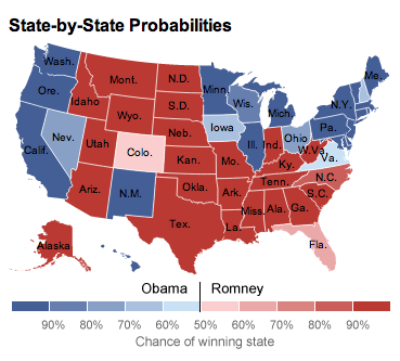
The graph, from Nate Silver’s fivethirtyeight.com, shows the probability of each State (and its Electoral College votes) going to Obama or Romney.  The colour scale makes states near 50% stand out, which is a feature, not a bug. States near 50% are the important ones.

Colorado is dramatically visible because it’s smallest estimated margin that the Republicans have.  It’s also dramatic because it’s surrounded by non-marginal states, which is appropriate.

The only way in which Colorado is inappropriately highly visible is that it’s sparsely populated and so occupies more of the map than its importance to the election result would justify.  That’s a really hard problem to solve with data-based maps: sparsely populated areas do get too much attention, and none of the ways of mitigating this really work.

October 23, 2012

Why is this week unlike every other week?

Researchers frequently want to find out how people behave in a typical day or week.  It turns out, though, that it’s often better to ask them what they did this week, even though this week may be far from typical.

It seems that a ‘typical’ day or week is actually a sort of Platonic ideal rather than a mean or median: in a ‘typical’ week, perhaps you exercise every day, but this particular week you missed a couple of days.  In a ‘typical’ week you eat vegetables every evening, but this particular week there was a social event at work and you didn’t.  In a typical week, you work five days, but this week there was a holiday on Monday.

The graph below shows the distribution of working hours reported for ‘usual’ weeks in two US government surveys and for “last week” in a third survey

People who work a lot tend to report more hours for a ‘usual’ week than last week. People who work less than half time tend to report fewer hours for a ‘usual’ week than last week.

The Washington Post article that provided the graph says that people who claim to work long hours are “lying”, but it’s more complicated than that.  Presumably these are people who ‘typically’ work long hours but reasonably often have to leave work ‘early’ to handle some part of the rest of their lives.  Conversely, the people at the low end of the distribution may have a regular part-time job that provides their ‘usual’ hours of work, but fairly often have over-time or additional jobs so that the average week has more work than a ‘usual’ week.   They aren’t lying, they just aren’t answering the question you thought you wanted to ask.

New earthquake risks

Earthquake forecasting (for everyone except Ken Ring) is difficult, and the accuracy of forecasts (for everyone, including Ken Ring) is low.  Even for relatively predictable faults such as NZ’s Alpine Fault, the margin of error is in decades.

The Italian government has just taken steps to make earthquake forecasting even less accurate.  Six scientists and a government official who failed to forecast that a set of small tremors near Aquila were forerunners of a big, deadly, quake have been sentenced to six years in prison for manslaughter. (Herald, Stuff).  They are still planning an appeal (and the Stuff headline is  wrong) but the courts do not appear to be friendly to the concept of uncertainty.


October 22, 2012

Ginger benefits not completely misrepresented

A story in Stuff about the benefits of ginger is to be commended for providing actual links to their supporting evidence for some of the claims (assuming you want more evidence than the approval of Confucius).

Unfortunately, if you provide links, there’s always the risk that people will follow them:

rich in antioxidants.  The linked paper describes chemical measurements of the antioxidant effects of ginger.  The abstract doesn’t support “rich” — the chemical analysis was of the antioxidant strength, not the concentrations of antioxidants and, at least in the abstract, didn’t compare to anything else (the journal, unusually, isn’t one that UoA library has access to).

combats nausea: This one appears to actually be true — it’s a combination of six randomised trials, and found ginger was better than placebo.  The researchers did note that publication bias was a concern and said the data are insufficient to draw firm conclusions.

natural pain relief.  The link here says that the result comes from the US National Library of Medicine.  That’s only true to the extent that it’s stored on their virtual shelves, like everything else published in biology and medicine. The study (by some Iranian scientists publishing in the Journal of Alternative and Complementary Medicine) compared ginger to two medications for period pain and didn’t find a statistically significant difference.  The researchers concluded that ginger was as effective, but their data don’t actually support this conclusion: you can’t conclude equivalence just from a lack of statistical signifiance.  If you look at the data in their Table 2 (which you can’t, since it’s not open-access), you can compute a 95% confidence interval for the difference in proportion of women who reported that the treatment helped: ibuprofen could have been 23 percentage points better than ginger, which is hardly a convincing demonstration of equivalence.

There’s also a link to some (then) unpublished research from the University of Sydney showing that chemicals in ginger inhibit the inflammation-related enzymes COX-1 and COX-2.  This link is from 2001 — I noticed how old it was because the researcher was talking enthusiastically about selectively inhibiting COX-2. As Vioxx did.  He said that he planned to do a study in actual patients. Nothing seems to have come of this study in the past decade: either it wasn’t done or it has succumbed to publication bias.

Natural arthritis relief.From the conclusion section of the linked abstract “Due to a paucity of well-conducted trials, evidence of the efficacy of Z. officinale to treat pain remains insufficient. However, the available data provide tentative support for the anti-inflammatory role of Z. officinale constituents,”

Stress reducer: The first link is to the Daily Mail. Enough said.  The second link  is introduced as “Ginger extract showed “significant antidepressant activity” in a study that was published in the International Research Journal of Pharmacy.”  A study in rats, if you follow the link.

 Anti-inflammatory: In test-tubes, ginger extracts inhibit some things related to inflammation. The abstract of the linked study concludes “Identification of the molecular targets of individual ginger constituents provides an opportunity to optimize and standardize ginger products with respect to their effects on specific biomarkers of inflammation. Such preparations will be useful for studies in experimental animals and humans.” In other words, we don’t know whether this translates to benefits in mice, let alone in people.

Antibiotic: This was the one that provoked me to write this post.  The story says “Ginger was more effective than antibiotic drugs in fighting two bacterial staph infections”.  The research says that high concentrations of ginger extract inhibited bacteria growing in a dish in lab more than low doses of antibiotics. No “infections” were involved in the research.

Common colds: The story says “Ginger contains almost a dozen anti-viral compounds and scientists have identified several that can fight the most common cold virus, the rhinoviruses.” The linked research doesn’t mention rhinoviruses, or any other kind of virus. It’s a lab study of four types of  bacteria.

Aids digestion: specifically, stimulates production of stomach acid and speeds emptying of the stomach.  The stomach-emptying is apparently true. No link is given for the stomach acid increase, but a Google search finds lots of web sites telling you how ginger can reduce stomach acid and help with gastric reflux.

Fights diabetes:  The story says “Ginger can help to manage blood sugar levels in long-term diabetic patients”.  The research says “one fraction of the extract was the most effective in reproducing the increase in glucose uptake by the whole extract in muscle cells grown in culture.” and “It is hoped that these promising results for managing blood glucose levels can be examined further in human clinical trials,”  So, again, this is lab bench research, not involving actual diabetic patients.

Boosts circulation: Ginger extracts inhibit blood clotting and platelet aggregation in blood samples in test-tubes.

So, we have one passing grade on nausea, and a partial pass on aiding digestion.  Two of the links provided absolutely no support for the claims, and the rest were mostly test-tube or rat research that might in the future lead to human research that might support the claims.

Drivers fined $3 per month

The AA is shocked (shocked!) to find that traffic and parking fines in Auckland add up to a lot of money.  The Herald did a good job on basic arithmetic, in converting traffic-fine totals of $36 million over 12 months and $20 million over eight months into the much less dramatic $3 million/month and $2.54 million per month.

One further piece of arithmetic would be to divide the $3 million per month by the 1 million registered vehicles in Auckland (table 36).  Is $3/month a surprising average?

For comparison, the Dominion Post reported total fines of “more than $12 million” in Wellington for the 2008-2009 financial year, on 283000 registered vehicles, giving a per-vehicle average of $3.5/month (before the GST increase).

Perhaps, as the AA’s Simon Lambourne believes, this indicates not enough effort put into education of drivers. Perhaps the idea of fining  people who don’t pay for parking  is “not being realistic about the importance of the car to mobility in Auckland.”  But the country’s primary motoring organisation can’t really get away with pretending surprise.

October 19, 2012

Surveys and political identification (yet again)

I’ve written before about the problem of getting actual opinions rather than social or political identifications in surveys.  US late-night TV host Jimmy Kimmel had a great demonstration.  He went out on the streets of LA on the afternoon before the 2nd presidential-candidate debate, and asked people who they thought won “last night’s debate”.  There wasn’t any shortage of people with confident opinions (presumably these are a selected subset of the most entertaining victims, but the point still holds)   (via)

Road toll still down.

The police are urging people to drive carefully this weekend, which is a good idea as always.  They are also reducing their speeding threshold to 4km/h over the limit, saying that this “had made a big difference during previous holiday periods”, and that they want to “avoid a repeat of last year’s carnage, in which seven people were killed on the roads”. The lower speed tolerance was bought in for the Queens Birthday weekend 2010, which was before last year, so at least for Labour day it doesn’t seem to have made much difference.

It’s always hard to interpret figures for a single weekend (or even a single month) because of random variation.  Here’s the data for the past six years (from, and)

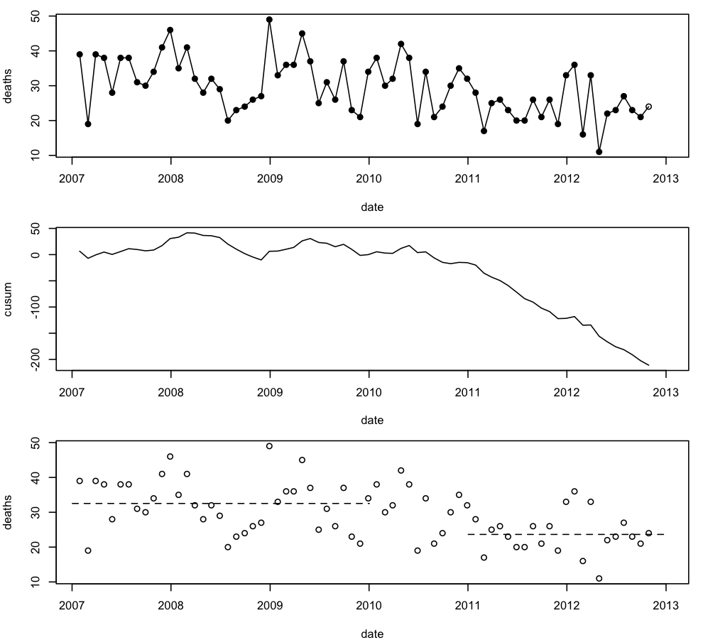
The top panel shows monthly deaths, with October 2012 as an open circle because the number there is an extrapolation by doubling the deaths for Oct 1-15.  There’s a lot of month-to-month variability, and the trend isn’t that obvious.

The second panel shows cumulative sums of deaths minus the average number for 2007-2009, a chart used in industrial process monitoring. The curve is basically flat until mid-2010, and then starts a steady decline, suggesting that a new, lower, average started in mid-2010 and has been pretty stable since.  The current value of the curve, at -200, means that 200 people are still alive who would have died on the roads if the rates were still at the 2007-2009 levels.

The third panel shows the monthly deaths again, with horizontal lines at the average for 2007-2009 and 2011-12, confirming that there was a decrease to a new, relatively stable level. The decrease doesn’t just happen in months with holiday weekends, so it’s unlikely to just be the tightened speeding tolerance causing it. It would be good to know what is responsible, and there are plenty of theories, but not much evidence.

October 18, 2012

Never mind the numbers, look at the neuroscience.

Q:  Have you seen the headline: “Skipping breakfast makes you gain weight: study”?

A:  If that’s the one with the chocolate cupcake photo, yes.

Q:  Was this just another mouse study, or did they look at weight gain in people?

A: People, yes, but they didn’t measure weight gain.

Q: But doesn’t the headline say “makes you gain weight”?

A: Indeed.

Q: So what did they do?

A: They measured brain waves, and how much pasta lunch people ate. The people who skipped breakfast ate more.

Q: So it was a lab experiment.

A: You can’t really tell from the Herald story, which makes it sound as though the participants just chose whether or not to have breakfast, but yes.  If you look at the BBC version, it says that the same people were measured twice, once when they had breakfast and once when they didn’t.

Q: And how much more lunch did they eat when they didn’t eat breakfast?

A: An average of 250 calories more.

Q: How does that compare to how much they would have eaten at breakfast?

A:  There were brain waves, as well.

Q: How many calories would the participants have eaten at breakfast?

A: The part of the brain thought to be involved in “food appeal”, the orbitofrontal cortex, became more active on an empty stomach.

Q: Are you avoiding the question about breakfast?

A: Why would you think that?  The breakfast was 730 calories.  But the MRI imaging showed that fasting made people hungrier

Q: Isn’t 730 more than 250?

A: Comments like that are why people hate statisticians.

October 17, 2012

Consenting intellectual S&M activity

That’s how Ben Goldacre described the process of criticism and debate that’s fundamental to science, at a TED talk last year.  At this time of year we expose a lot of innocent young students to this process: yesterday it was the turn of statistical consulting course, next month it’s BSc(Hons) and MSc research projects, and then the PhD students.

Here’s Ben Goldacre’s whole talk