Posts written by Thomas Lumley (2645)

avatar

Thomas Lumley (@tslumley) is Professor of Biostatistics at the University of Auckland. His research interests include semiparametric models, survey sampling, statistical computing, foundations of statistics, and whatever methodological problems his medical collaborators come up with. He also blogs at Biased and Inefficient

October 17, 2012

Do we trust the police?

Cameron Slater (and the Police, and the Police Association) are Outraged about a Horizon poll on public perceptions of the police.  They do have some fair points, although a few deep breaths wouldn’t hurt.

Horizon Research conducted a poll shortly after an article in the Dominion Post.  This, in itself, is one of the claims against the company, but I don’t think this one really holds water — if you’re a public opinion firm wanting coverage, trying to capitalise on well-publicised issues seems fair enough, and it’s not as if we in the blogosphere are on the moral high ground here.

The results of the poll are clearly not relevant to the question of police conduct in the particular incident described in the Dominion Post article, since if the poll has even the slightest pretension to being representative, none of the respondents will know anything about that incident beyond what they might have read in the papers.  Also, since this is a one-off poll, the Dominion Post’s headline “Trust in police hits new low survey shows” cannot possibly be justified.  There is no comparison with a series of similar surveys in the past; respondents were just asked whether their trust in the police had changed over time.

Many of the reported findings of the poll seem reasonable, and in line with other evidence, for example: 73% have the same or more trust in the police than five years ago, and the police are thought to do well on their primary areas of responsibility

  • protecting life: 87.1% well, 10.2% poorly
  • protecting the peace: 84% well, 11.6% poorly
  • road safety: 86% well, 12.3% poorly
  • protecting property: 67.1% think they perform well, 28.7% poorly.

The police, in their press release, apparently as further argument against the poll results,  point out that crime rates are falling.  That’s not really relevant.  Even if the crime rates were falling specifically because of police actions (which is unproved, since there are falls in other countries too), it would only prove that people should think the police are effective in stopping crime, not that they do think the police are fair in investigating complaints.

The controversial claims are about victims of police misconduct:  firstly, that sizable majorities think the investigation procedure needs to be more independent, and secondly, that people who identify themselves as victims are not happy with how their cases were handled.  Again, this doesn’t seem all that strange: I basically trust the police, but I’m still in favour of having investigations done independently just from the ‘lead us not into temptation’ principle.  It’s not news that NZ, by international standards, gives people fairly low levels of compensation for all sorts of things. And it’s hardly surprising that people who think they were mistreated by police aren’t happy with how they were treated by police.

The problem is with how the poll was conducted, and there are at least two pieces of evidence that it wasn’t done well. The first is in the poll results themselves.  The number of New Zealanders who file complaints against the police is very small.  We looked at this back when the issue of complaints against teachers came up.  In a one-year period there were 2052 complaints, half of them minor ‘Category 5’ complaints.  That’s one Category 1-4 complaint per 4500 Kiwis per year (and if some people make multiple complaints, the effective number is even smaller).   In a representative sample of 756 people there shouldn’t have been enough people with experience of police complaints to get useful estimates of anything, let alone to the quoted three decimal places.   Even if we ignored bias and just worried about sampling variation, it would be a serious fault that no margin of error or sample size is quoted for these subgroups.

The second problem is that a Facebook page associated with the incident gave a bounty (chance of winning money and iPad) to people who clicked through to the online poll.   There are now comments on that page saying that not very many people did click through and that they might not have been counted anyway because they wouldn’t have been registered far enough in advance.  That reminds me of this XKCD cartoon. If you have a poll where it’s even conceivable that it could be biased this way, it’s not much consolation to know that the only known attempt to do it was a failure.

October 16, 2012

Dragon baby boom in NZ?

Back in January, Rachel Cunliffe looked at birth statistics for China as a whole and for Hong Kong, and saw a small ‘dragon baby’ boom for the Year of the Dragon in Hong Kong, but nothing for the whole PRC.

Today, the Herald is seeing a Year of the Dragon boom in Auckland

A support organisation for migrant parents in Auckland is experiencing a baby boom because of a surge in the number of dragon babies born to Chinese parents.

They go on to say

Membership at the Chinese Parents Support Service Trust for new Chinese migrant mothers has reached 200 – and one in four mothers had a dragon baby born this year.

It’s hardly surprising that new Chinese migrant mothers are likely to have a baby born this year — that’s what makes them new mothers.  So what we really have is growth in the number of mothers using the service, and the fact that one in four of these mothers has a child under 9 months, a ‘dragon baby’.

Magical transformations of pumpkin

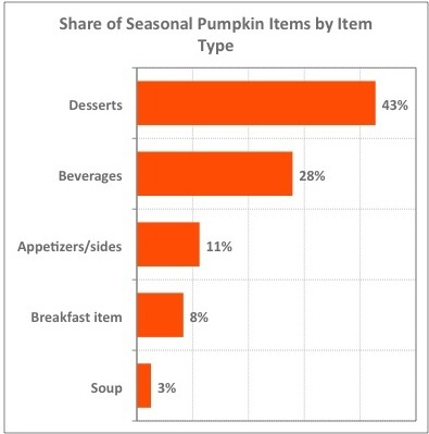
Today’s graph is almost entirely frivolous.  It’s pumpkin season in the US (Halloween and Thankgiving), and Felix Salmon (a past winner of the American Statistical Association’s award for excellence in statistical reporting) is writing about how pumpkin has diversified.

‘Pumpkin,’ in this context, usually means the combination of sugar, cinnamon, cloves, and nutmeg that makes pumpkin pie palatable.  The vegetable itself doesn’t really make an appearance.

On the continuing issue of how survey responses are sensitive to exact wording, it’s also worth pointing out that the Americans have a much narrower view of which vegetables qualify as pumpkins — they have to be round and orange on the outside.   These, which I photographed last year in Melbourne, would not count as pumpkins in the US.

October 15, 2012

Reporting risk safely

An interesting post on how media reporting of risk could actually make us less safe. (via)

Think of a number, then add 50%

The Herald tells us:

More than 700 drivers have been nabbed for drug-driving since a new law came into effect.

Figures released under the Official Information Act show 575 motorists were charged with drug-driving from when new legislation was introduced on November 1, 2009 to July this year.

During the same period, another 134 motorists were charged under older legislation.

That’s a 20-month period, which, as usual, makes no particular sense.  We heard about  429 of the 575 motorists charged under the new law back in February.  If that was for the first year (which makes sense given the lag in the current figures), the rate is going down.  In fact, even if the 429 were through the end of January, which would be very fast data collection, the rate is still down, though not statistically significantly.

October 14, 2012

One of the most important meals of the day

Stuff is reporting “Food and learning connection shot down”,based on a local study

Researchers at Auckland University’s School of Population Health studied 423 children at decile one to four schools in Auckland, Waikato and Wellington for the 2010 school year.

They were given a free daily breakfast – Weet-Bix, bread with honey, jam or Marmite, and Milo – by either the Red Cross or a private sector provider.

My first reaction on reading this was: why didn’t they take this opportunity to do a randomised trial, so we could actually get reliable data.  So I went to the Cochrane Library to see what randomised trials had been done in the past. These have mostly been in developing countries and have found improvements in growth, but smaller differences in school performance.

Then I tried asking the Google, and its second link was a paper by Dr Ni Mhurchu, the researcher mentioned in the story, detailing the plans for a randomised trial of school breakfasts in Auckland.  At that point it was easy to find the results, and see that in fact Stuff is talking about a randomized trial. They just didn’t think it was important enough to mention that detail.

To the extent that one can trust the Stuff story at this point, there seem to be three reactions:

  • I don’t believe it because my opinions are more reliable than this research
  • Lunch would work even if breakfast didn’t
  •  We should be making sure kids have breakfast even if it doesn’t improve school performance.

The latter two responses are perfectly reasonable positions to take (though they’re more convincing where they were taken before the results came out).  School lunches might be more effective than breakfasts, and the US (hardly a hotbed of socialism) has had a huge school nutrition program for 60 years.

Still, if we’re going to supply subsidised meals to school kids, we do need to know why we’re doing it and what we expect to gain.    This study is one of the first to go beyond just saying that the benefits are obvious.


October 12, 2012

Even better than chocolate

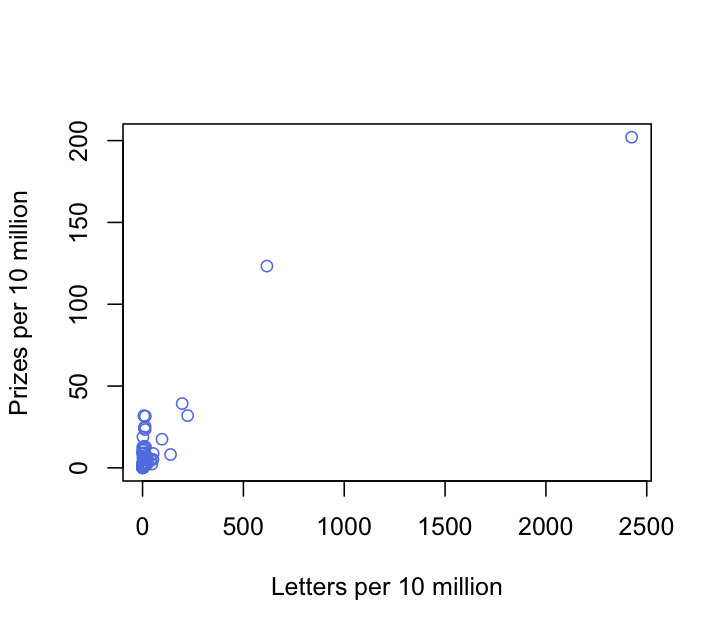
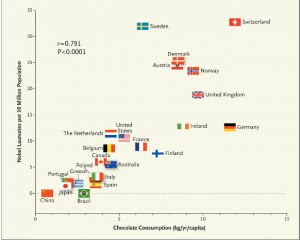
You can do even better than chocolate consumption in finding correlations with Nobel Prizes per capita.  With a few minutes on the Wikipedia entry used by Franz Messerli, I came up with a correlation of 0.921, much better than his 0.721. Here’s the graph (without lots of little flags, sorry)


The number of letters in the country’s name divided by total population is a much better predictor than the total chocolate consumption divided by total population.  Admittedly, changing the name of a country is usually more expensive than just eating more chocolate.

Turning a number into a rate or proportion helps for doing simple comparisons (this has a tag of its own on StatsChat) but simple ratio-based standardisation of two variables can create strong spurious correlations between them, something that medical researchers should be aware of.


There’s nothing like a good joke.

Q:  Have you started eating more chocolate yet?

A: I assume this is about the New England Journal paper.

Q: Of course.  You could increase your chance of a Nobel Prize

A: There are several excellent reasons why I am not going to get a Nobel Prize, but in any case I don’t have to eat the chocolate: anyone in Australia or New Zealand would do just as well. You can have my share.

Q:  What do you mean?

A: The article didn’t look at chocolate consumption by Nobel Prize winners, it looked at chocolate consumption in countries named in the official biographical information about Nobel Prize winners.  This typically includes where they were born and where they worked when they did the prize-winning research, and in some cases yet another country where they currently work.

Q: Does the article admit this?

A: In part.  The author admits that this is just per-capita data, not individual data.  Because he just got the Nobel Prize data from Wikipedia, rather than from the primary source, he doesn’t seem to have noticed that multiple countries per recipient are counted.

Q: Would the New England Journal of Medicine usually accept Wikipedia as a data source when the primary data are easily available?

A: No.

Q: What about the chocolate data?

A: The author doesn’t say whether the chocolate consumption measures weight as consumed (ie, including milk and sugar) or weight of actual chocolate content. That’s especially sloppy since he goes on and on about flavanols. Also, the Nobel Prize data is for 1901-2011 and the chocolate data is mostly just from 2010 or 2011: chocolate consumption in many countries has changed over the past century.

Q: Do you want to say something about correlation and causation now?

A: No, that’s what you say when you don’t know what causes spurious correlations.

Q: So what did cause this correlation?

A: There are at least two likely contributions.  The first is just that wealthy countries tend to have more chocolate consumption and more Nobel Prizes.  Chocolate and research are expensive.  The second is more interesting: it’s the same reason that storks per capita and birth rates are correlated.

Q: Storks bring chocolate as well as babies?

A: Not quite.  Birth rates and storks per capita tend to be correlated because they are both multiples of the reciprocal of population size.   Jerzy Neyman pointed this out in the prehistory of statistics, and Richard Kronmal brought it up again in 1993.  More recently, someone has done the computation with real data (p=0.008). Imperfect standardisation will induce correlation, and since Nobel Prizes almost certainly don’t depend linearly on population, the correction is bound to be imperfect.

Q: Why did the New England Journal publish this article?

A: It wasn’t published as a research article; it was in their ‘Occasional Notes’ series, which the journal describes as “accounts of personal experiences or descriptions of material from outside the usual areas of medical research and analysis.”

Q: Isn’t it good that stuffy medical journals do this sort of thing occasionally? There’s nothing like a good joke

A: Well, you might hope they would do it better, like the BMJ does.  This is nothing like a good joke.


October 11, 2012

Make your own data maps

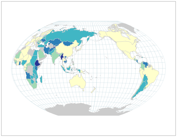
Indiemapper is a web-based tool for creating maps for data visualisation, based on your data or their built-in files. Here’s an example, showing cumulative inflation 2001-2008

It knows about projections, sensible colour schemes, and ways of representing information on maps.  It’s a bit slow, since it has to run in your browser, but it’s well worth trying

October 10, 2012

Classification problems

I was interested in how the new psychoactive substances laws were going to handle the problem of, on one hand, the unsafe legal highs that they don’t want to ban, and on the other hand, the potentially psychoactive substances that they don’t want to have to regulate.  Safety testing for new medications is a complicated scientific and statistical problem and hard to get right even when you aren’t trying to gerrymander it.

The regulatory impact statement says they are just going to do all this by fiat. Alcohol, tobacco, caffeine (and presumably kava) will be exempted so they can be handled by existing law; currently-banned drugs will still be banned;  and things like nutmeg and a range of ornamental plants will be classified by fiat as not psychoactive if anyone raises the issue.  In the case of any ambiguity, the regulator will get to just decide. I suppose that’s the only practical way to do it, given the goals.

The headlines so far have been about the cost of approval, which is about twice what MEDSAFE charges for new medications. That’s  not unreasonable considering that legal highs are likely to be less chemically and biologically familiar than most medications.  However, the costs are basically irrelevant unless the safety criteria are written loosely enough that some psychoactive compound could conceivably pass them.  Since the criteria don’t have to be consistent with any of the rest of drug and food laws, and it’s unlikely that anyone will come up with the testing budget, there’s no upside to making them realistic.

It will still be interesting to see how the criteria end up being written, and whether caffeine, nutmeg, (or, in the other direction, some cannabis preparation) would be able to pass them. Obviously alcohol and tobacco wouldn’t.