Posts written by Thomas Lumley (2645)

avatar

Thomas Lumley (@tslumley) is Professor of Biostatistics at the University of Auckland. His research interests include semiparametric models, survey sampling, statistical computing, foundations of statistics, and whatever methodological problems his medical collaborators come up with. He also blogs at Biased and Inefficient

March 16, 2012

Blink, and you’ll miss it

It’s not often that you see a special interest group make a claim about the economic impact of their chosen problem and think “I never imagined it could be so small”.

Today is, apparently, World Sleep Day, and we have a problem

A quarter of New Zealanders have a chronic sleep problem, according to the World Association of Sleep Medicine.

 That’s 15% with insomnia and `up to’ 9% with sleep apnea.  The  sleep docs go on to say

Studies by the World Association of Sleep Medicine show sleep disorders cost New Zealand at least 40 million dollars a year in lost productivity

A quarter of (working-age) New Zealanders is a bit under a million people, so that’s an average of about a buck a week, or about five minutes per sufferer per week at minimum wage.   Can lack of sleep really be that unimportant economically, or has someone dropped a decimal place somewhere?

March 15, 2012

Two for the price of one

Roy Morgan have released their “State of the Nation” report, and the Herald has two stories. In the first

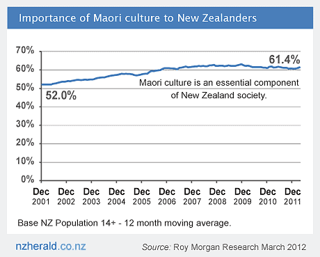
According to the Roy Morgan State of the Nation March 2012 report, there has been an upsurge in the number of New Zealanders who consider Maori culture to be an “essential component” of New Zealand society.

 If a change from 52% to 61% is an upsurge, then yes, but the upsurge happened from 2001-2005.  Since 2006, the proportion has been flat at over 60%, as is clear from the Herald’s own graph:

The other story says that most of NZ wealth is now  held by over-55s.

the 55-plus group has increased its share of net wealth from 43 per cent in 2002 to 52 per cent last year.

that is, by about a quarter

Their share of the population also rose in the same period, but only from 19.5 per cent to 24.7 per cent.

or, about a quarter.   Based on these numbers, in 2002, the average net wealth for people over 55 was about 2.2 times higher than the average for everyone over 14, and it’s now about 2.1 times higher.  Since the story goes on to say

The value of their own homes accounted for 56 per cent of their wealth a decade ago, and 70 per cent last year.

presumably the ratio for non-home wealth is even less favorable to the over-55s.


Significant imperfections in cancer screening

The Herald did a good job itself in providing statistics to put today’s front-page story in context

BREAST CANCER

2700 number of new cases in 2008

624 number of deaths in 2008

8: number of women who had something unspecified wrong with their diagnosis, for reasons we don’t give, having unknown impact on their future health, in circumstances that are still being investigated but might not be exciting enough for the front page if we wait for the facts.


Prediction is hard, especially about buses?

The bus prediction system is potentially a very good idea — research in other cities has shown that it reduces actual waiting time, and reduces perceived waiting time even more.

Unfortunately, the illusory sense of control over one’s fate that the prediction system gives is easy to shatter.  This morning it was a stealth bus: arriving when it was allegedly still ten minutes away.   On other occasions the waiting time counts down steadily to DUE and then disappears, indicating that a ghost bus has gone by.

Bus prediction involves some hard engineering problems: the buses need to know where they are, they need to be able to tell the central office, and the central office needs to be able to get the information to transit users.  Fortunately, the first problem is solved by GPS (and odometers), the second by packet radio, and the third by the internet (and text-message gateways).

What remains is mostly a statistical problem, and partly a problem in applied psychology.    The data are fairly straightforward: the system knows approximately where the bus was every couple of minutes into the past, and this needs to be projected forward.   The Seattle MyBus project did a good job of implementing a simple version about ten years ago:  the prediction is a weighted average between where the bus would arrive at its current speed and when it should arrive by schedule, and the weights come from a large collection of actual bus trips.   There’s actually a lot more information available — for example, it’s hard to predict from a bus’s performance along Manukau Rd how long it will take to get through Newmarket, but since there’s a bus along Broadway every few minutes the system potentially has up-to-date information on congestion and crowding.

My guess, based on the relatively high frequency of buses that apparently go backwards, is that the Auckland system is a bit over-optimistic about how fast a late bus can return to schedule, and isn’t using the congestion information.  It also doesn’t seem to know which incoming bus will be running each route out of the city, so the city-center predictions can be a bit useless.  The real problem, though, is how to incorporate this uncertainty when presenting the results.   Even when you’re using all the available information there’s always prediction error, and sometimes a bus will stop transmitting information either for a few minutes or for its whole route.   In that case, the system has to fall back on the timetable, but the Auckland system doesn’t tell you it’s done that.

OneBusAway, in Seattle, distinguishes clearly between real predictions and timetable predictions. It also does helpful things like indicating which buses have just left, and it doesn’t seem to have ghost buses or stealth buses.  It’s also based on an open data stream that anyone can use — both the real-time bus location data and the predictions are accessible to anyone who wants to set up an improved system or just write a better app.


March 14, 2012

Big data in the papers

The New York Times has another article about the importance of `big data’ in the modern world:

GOOD with numbers? Fascinated by data? The sound you hear is opportunity knocking.

and in the UK, the Graudian’s DataBlog is asking “What is a data scientist?”, motivated by a conference in Califoria on “Making Data Work“.


March 12, 2012

Run along and play

The Herald (and others) are reporting the Milo State of Play survey, which says kids don’t play enough. In fact, the Herald says

The report outlines how a lack of play can deprive children of an activity crucial to healthy brain development.

Actually, it doesn’t. The report states that play is important to social development, and uses the phrase ‘prefrontal cortex’, but that’s all. Perfectly reasonable, since that’s not what the survey was about.  The survey (once you find the actual report than backs up the YouTube animation) used interviews of three samples: children, parents, grandparents to ask about activities and attitudes.  These were sampled in a nicely representative way, though from an online survey panel, so they may be more technologically aware and active than Kiwis as a whole.

According to the YouTube video, 96% of the participants agreed that active play was essential for development, and about half  (52%) of the parents, but less than half the children (40%)  or grandparents (31%), said children should have more playtime outside than they currently do.  That’s not really the impression that the story gives.

Some of the detailed findings are interesting:

More than half (56%) of parents think children enjoy playing games from their parents’ childhood. Where in fact, 96% of children state they do enjoy playing games from their parents’ youth.

and most children said they would like to spend more time playing with their parents.

The basic message of spending more time playing and having more unstructured time is one that has been promoted before, and seems sensible, but the report doesn’t really provide any more evidence for it than we had previously.

As a final note, the Herald story leads with

New Zealand children risk weight and brain development issues as a new study shows nearly half of Kiwi kids are not playing every day.

Is it just me that finds it ironic to get warnings like this from a survey sponsored by a multinational founded on selling chocolate and baby formula ?

March 9, 2012

Newsflash: Auckland is larger than Wellington

The denominator problem shows up yet again, this time in a press release from AA insurance, leading to stories in the Dominion Post, the Herald, the Aucklander, and probably others, and a Stat of the Week nomination for the Groping Towards Bethlehem blog (via Eric Crampton).

There are statistical problems in the press release, but the newspapers came up with additional bonus examples.

The press release says

Between 2009 and 2011 AA Insurance received the highest number of burglary and theft from vehicle claims from Auckland, Hamilton, Wellington, and Christchurch.

and the Dominion Post amplifies this to

But Wellingtonians were far less likely to be burgled than their Auckland counterparts, with 31 per cent of all burglaries taking place in the Auckland region, compared with just under 9 per cent in Wellington.

Auckland has three times as many burglaries as Wellington, which sounds bad until you consider that Auckland is larger than Wellington, by a factor of about, um, three.  Using population at the last census, the rate of burglaries per capita is still higher in Auckland, but by only 20%.   If we compare Auckland to the whole population of New Zealand, the burglary rate per capita is slightly lower in Auckland; and since the Wellington rate is lower, if we combine Auckland and Wellington the rate is also lower than for the rest of the country. This tends to cast doubt on the comment

AA Insurance head of operations Martin Fox said daytime robberies were more common in big cities, where most people did not head home for lunch.

This could be true  if night-time burglaries[I assume he means burglaries, not robberies] were much more common outside big cities, but we aren’t given any data to support this, and the data we do have argues against it.

So far this is mostly fluff, but the interesting bit of news is

Security alarms had proven effective for preventing burglaries, with 60 per cent of claims between 2009-11 coming from homes without alarm systems.

AA Insurance presumably know how many of their customers have security alarms, so they might have evidence for this claim. Perhaps only  30% of insured homes lack alarm systems, so the 60% of claims from such homes is notable.   We can’t tell, because they don’t explicitly give any comparisons of rates, they don’t give information that we could use to compute rates, and they sure haven’t given us any reason to trust them on the handling of denominators.

If we did have rates, there would still be a problem of causation vs correlation.  A Ministry of Justice survey in 2004 did find lower rates of burglary in houses with alarms, but they also found

The security measure most strongly associated with lowered rates of burglary was ‘telling neighbours when everyone will be away’. As only a small proportion of burglaries occurred while the occupants were away (Section 6.5.1), presumably this measure was an indicator for a more general relationship, such as a lowered risk of burglary when neighbours are known and when neighbours look out for one another.

March 8, 2012

Not all heart disease is the same

The Heart Foundation is calling for approval of a new drug, ivabradine (for subsidy — it’s already approved for prescription).  The report in Stuff, unfortunately, puts in a bunch of numbers of varying relevance.

We are told the pill costs “as little as $3 a day” and that “Up to 160,000 people” in New Zealand have heart disease.  If ivabradine was actually useful in all those 160,000 people, the total cost would be $175 million per year, or about a quarter of Pharmac’s budget.   And you would know about it already.

The randomized trials of ivabradine, which do look very promising, are in people with one specific type of heart failure.  Heart failure is a particularly nasty form of chronic heart disease where the heart can’t pump enough blood to supply oxygen to the body.  Slowing down the heart rate helps — for centuries, foxglove extract (digitalis) was used, and the introduction of standardised versions of digitalis in 1785 is regarded as the start of modern therapeutics.  Fortunately, heart failure is a relatively small part of heart disease in the population.   There’s about 10,000 hospitalisations per year for heart failure, but that’s not 10,000 different people.  A 2005 paper found 8000 deaths over 9 years, or about 900 per year.   Not all of these will be the specific type of heart failure where ivabradine works.

If ivabradine works as well in practice as in the trials, and there don’t turn out to be any nasty side-effects, the Heart Foundation could be right — it could potentially prevent (actually, postpone for a bit) hundreds of deaths per year in NZ.   But the 160,000 people with heart disease or the one death every 90 minutes from all types of heart disease are not relevant to this much more specialised medical question.

March 7, 2012

Smoking wrecks the economy

Our Stat-of-the-Summer was a miscalculation of the individual costs of smoking.  A correspondent has pointed me to an international correlation on the same topic.  Economists at ConvergEx have found a strongish correlation across countries between debt:GFP ratio and smoking.  The economists went as far as saying

“The relationship is strong enough that counting the cigarette butts in the ashtrays of street-side cafes around the world could be safely called `sovereign credit research’,” said Nicholas Colas, chief market strategist at ConvergEx.

That’s clearly nuts, but is the correlation telling us something useful or even interesting?  Could it really be true, as the correlation would suggest, that sovereign debt is the biggest factor affecting smoking rates (or, almost equally plausibly, vice versa)?

One empirical indication that ashtrays are not the best place to find national debt data comes from looking at changes over time.  Public debt is a cumulative process, so even more than usual we can quote the biologist D’Arcy Thompson “Everything is the way it is because it got that way”.

Over time, in the US, Britain, Australia, New Zealand, and many other countries, smoking reached a maximum among people born at the start of the twentieth century and has now been decreasing in popularity (because it, you know, kills you and stuff).  The pattern of public debt in those countries has been quite variable.  In Australia, debt ballooned and has now shrunk again.  In NZ, debt is increasing.  In the USA then debt:GDP ratio went down to a post-war minimum in the Clinton years and has been increasing again.  Also, the reasons for the changes are different in different countries — US debt is up largely because of tax cuts, but Australian debt is down in part because of better commodity prices.

So, over time, there is no consistent correlation between smoking and sovereign debt:GDP.  That being the case, it’s hard to see how the correlation across countries right now could be anything other than a coincidence.

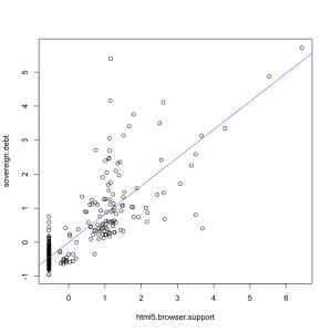
If you ask Google Correlate what is correlated with “sovereign debt” as a web search term, you find out that “html 5 browser support”, rather than “smoking” has the strongest correlation (0.82) among terms that aren’t specifically debt-related, as in the graph on the left.  That makes about as much sense.


Hardcore music has a use

News outlets around the world and locally are reporting on a study that found loud music made alcohol taste sweeter.  The research participants drank various concentrations of cranberry & vodka while listening to nothing,  loud annoying music, a news track that they had to repeat back, or both the music and the news.

People who listened to the music rated the drinks as sweeter.  The researchers suggest this explains why people drink more in clubs.  I think they’re missing an important point.  The sweetness of alcoholic drinks is under the control of the manufacturer and the drinker, and there’s no reason to think that people in quiet settings deliberately choose drinks that are less sweet than they would prefer.  If the noise effect is strong enough to be meaningful in practice, it should just mean that people choose less sweet drinks when it’s loud and sweeter ones when it’s quiet — the same way that people allegedly drink more tomato juice on aeroplanes because taste sensations are different at altitude.

The researchers also found that the combination of the music and the news task “was accompanied by increased negative mood”, so if you need to take dictation, choose a bar that plays country and western, not hardcore.