Posts written by Thomas Lumley (2645)

avatar

Thomas Lumley (@tslumley) is Professor of Biostatistics at the University of Auckland. His research interests include semiparametric models, survey sampling, statistical computing, foundations of statistics, and whatever methodological problems his medical collaborators come up with. He also blogs at Biased and Inefficient

June 20, 2020

Watered down science

Q: Did you see that COVID actually came from Italy?

A: No.

Q: Radio NZ “samples taken in Milan and Turin on 18 December showed the presence of the SARS-Cov-2 virus…..may have been circulating before China reported the new disease to the WHO on 31 December.”

A: Well, yes, but the date China told the WHO isn’t very biologically meaningful.  The first hospital admission in Wuhan was 16 December.

Q: That’s still pretty early to see it in Italy, though.  What does the paper say about how it got there and how it took more than another month to emerge?

A: The press release says “did not automatically imply that the main transmission chains that led to the development of the epidemic in our country originated from these very first cases”. There isn’t a paper.

Q: The preprint, then?

A: There is only the press release.

Q: That’s pretty fucking unsatisfactory, isn’t it?

A: Yes

Q: At least the dexamethasone crew had some excuse for thinking their results were needed urgently

A: Yes.

Q: Are these just some cranks, then?

A: No, that’s what’s annoying.  They have been doing wastewater testing for some time; they say they confirmed the positive tests with a different assay in a different lab; they talk about having sensible controls; it’s all what you’d like to see, only you’d like to actually see it.

Q: These tests are pretty reliable, aren’t they

A: Well, they haven’t told us what tests they used, but the ones you would expect them to have used should give very few false positives.

Q: So it would be surprising if the results were wrong?

A: Yes, but it would also be surprising if the results were right, so unquantified surprise doesn’t get us very far.

Q: Two separate cities, though? How many people would you need in each city for a positive test?

A: That’s one of the other things they don’t say.  An Australian study with two positive results estimated hundreds of cases, but maybe the new Italian results used more sensitive tests. And it’s possible for a person to contribute to the wastewater flow in both Milan and Turin on the same day. I have done so.

Q: Can they do the genome thing on these samples to see how they relate to the early outbreak in Wuhan and the much later Italian outbreak?

A: They don’t…

Q: …say.  Right.

A: The Australian study did do some sequencing, though not of the whole genome, only of one gene.

Q: How could the virus have stayed undetected until the outbreak in February? Was it in the sewage all that time?

A: They say they found it in Bologna in a sample from January 29, and I think the press release is saying there were positive samples in Milan and Turin in January.

Q: So not just a tourist group.  You’d expect more people to have been sick during January, wouldn’t you?

A: Yes. That’s why it’s reasonable that the tests might have be wrong, which would not ordinarily be a good explanation.

June 19, 2020

Dexamethasone and COVID

You’ve probably heard (Stuff*, NZ$ Herald) that there is a new treatment for serious cases of COVID-19, a drug called dexamethasone.  There’s not a lot of controversy about the drug itself, but there’s some about the way the the announcement was handled and about the reporting.

Dexamethasone is a corticosteroid.  Its main use is to shut down large chunks of your immune system.   (The basic mechanism is the same  as inhaled steroids for asthma and hay fever, but those are lower doses and are carefully engineered not to get into your blood stream,  so they don’t have much effect outside your nose and lungs.)   In serious cases of COVID, a patient’s immune system is extremely overactive, and clinical trials are looking at corticosteroids and at more selective ways to reduce immune activity.

Since fighting off viruses is part of the point of having an immune system, the drug is less likely to be helpful in less serious cases (and it didn’t show any benefit in people who weren’t on oxygen). It is extremely unlikely that dexamethasone would be helpful in preventing the disease — you’d expect it to increase risks.   The tendency of the modern medical system to talk in terms of clinical evidence is bit of a problem here.  People will say “there’s no evidence that it’s beneficial in prevention”, and a lay person can’t necessary tell where this is on the spectrum from  “we don’t have clinical trial results yet so we’re being conservative” to “don’t inject bleach, it will kill you”.

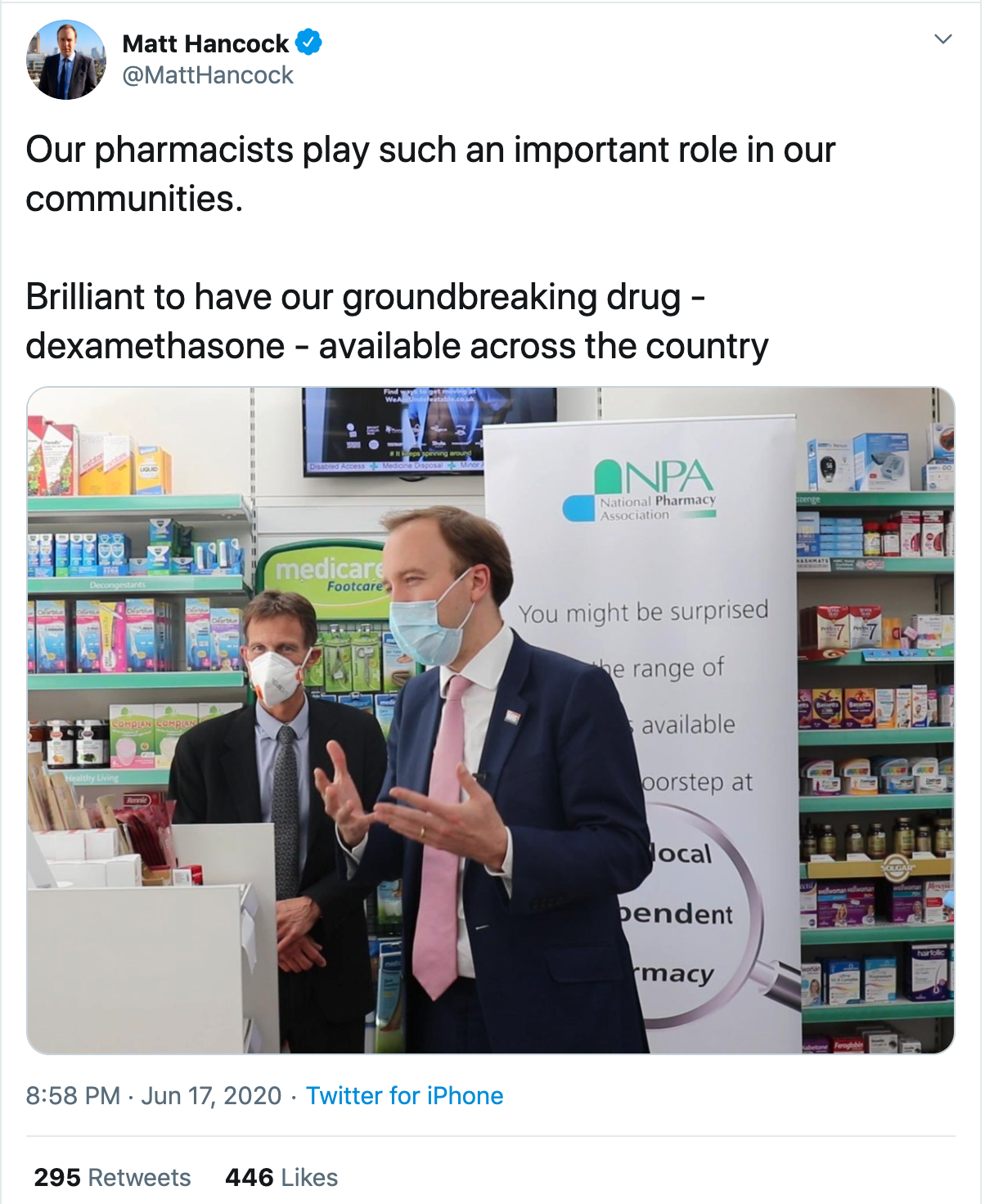
So when the UK Secretary of State for Health poses in an ordinary chemist’s shop talking about community pharmacists and widespread availability of dexamethasone it’s not the best look.

What he would doubtless explain he means is that the UK government has made sure they have enough dexamethasone for the people who need it — but since there were 450,000 prescriptions for it in the year to March, it’s not exactly rare.

There’s a bit of disagreement in coverage about whether this is ‘low dose’  or ‘high dose’.  That’s because dexamethasone is a very powerful corticosteroid, and it’s only used in settings where you really want the immune system to know what hit it.  The 6mg/day dose is low or moderate for dexamethasone (compared to the doses used in some cancers) but it’s a high dose of steroid.

The actual controversy is about the results announcement. The researchers put out a press release saying that the trial had been stopped early because they were sure everyone should get dexamethasone, but there was very little data released.  In this particular case no-one is suggesting that the data are completely made up or even that the specific numbers released are untrustworthy, but there is always an expectation that the researchers are putting their best foot forward in the press release. The final publication is often a bit less convincing, when all the measurements are taken into account.

Atul Gawande (well-known surgeon, writer, and public health researcher) said on Twitter

It will be great news if dexamethasone, a cheap steroid, really does cut deaths by 1/3 in ventilated patients with COVID19, but after all the retractions and walk backs, it is unacceptable to tout study results by press release without releasing the paper.

He’s got a point, but it’s not clear what the alternative was.

The Data Monitoring Committee (who get to see all the data) had recommended that the study stop randomly choosing people to not get dexamethasone. The trial management agreed. But the trial had been running all this time. There is more trial data on dexamethasone now than there was in the report to the Data Monitoring Committee, and the researchers need to redo the analysis with this extra data before they can publish a journal article (or even put out a preprint).  The final results are not yet available.

On the other hand, the 173 hospitals participating in the trial need to know that they’re not randomising people to dexamethasone, and that it’s because it works, not because it doesn’t work.   Even if none of them leak this information, new patients (and their families) will be given a different description of the possible treatments than previous patients received, and someone is going to notice.  A press release is a lot better than the news just leaking out.

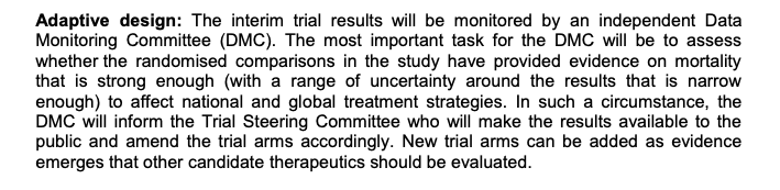
In some trials there is a partially mechanical set of plans for stopping and you could just put out a statement “blah blah met pre-specified stopping boundary blah blah further results soon”. But RECOVERY doesn’t have pre-specified stopping boundaries, because COVID treatment is such a fluid topic. Here, via Hilda Bastian, is the description

The Data Monitoring Committee are just supposed to use their best judgement as to whether the results will be convincing.

What I’d like to see in a situation like this is public release of the report to the Data Monitoring Committee, after any necessary redactions for privacy (eg, details of adverse events), and with big red flashing letters explaining that the final results will change slightly.  But no-one should pretend this wouldn’t be revolutionary.


* I removed the Stuff link because the site autoplayed a video ad with the sound on.

June 17, 2020

Alert but not alarmed?

As you know, two people were allowed out of isolation in Auckland, travelled to Wellington, and subsequently turned out to be positive for SARS-Cov-2.

On the one hand, this was definitely not the administration’s finest hour.  Mistakes were made, and while I don’t think firing people at this point is very productive, I hope someone is finding out who all made them and ensuring they don’t get made again.

On the other hand, even if everything happens the way it should, people will, from time to time, come out of border isolation carrying SARS-Cov-2.

We expect that one or two cases will be arriving in New Zealand each week, and while the testing and quarantine process will catch the majority of these, the tests are nowhere near perfect.  It’s quite possible for someone to arrive with a mild case of the disease, and pass it on to someone else in quarantine, who is still healthy and still tests negative when they leave.  It’s going to happen.

The imperfectly closed border is why the COVID tracer app is still useful: we want to have some way of keeping track of where we’ve been and when, to speed up contact tracing.  It’s why staying home is important if we’re at all unwell. It’s why testing is important if we have any plausibly COVID symptoms. It’s why… one of the reasons why… handwashing is important. And it’s why kindness is important; if people are scared to get tested because of public reactions, we’re going to be in trouble.

If most of us mostly do things right, the contact tracing system can cover up the unavoidable gaps, and we can have rugby and pubs and universities and dating and KFC. But there’s still a pandemic out there.

June 16, 2020

Testing for COVID after the protests

I was referred on Twitter to this story from Twin Cities Pioneer Press, about COVID testing of people participating in the Minneapolis protests over the killing of George Floyd.

The headline is Early test results show few protesters caught COVID-19.  I think that’s a bit premature, though the story itself is fine and it makes sense to share whatever information there is about.

More than 3,300 people who participated in protests and community events after Floyd’s death were tested for the coronavirus …

Results from about 40 percent of the coronavirus tests done in St. Paul and Minneapolis this week show 1.4 percent of participants who were tested had contracted COVID-19. Health officials are awaiting the rest of the test results and are encouraging anyone who participated in mass gatherings to get tested — regardless of symptoms.

As a first reaction, it’s really good news that the health officials are trying to get everyone tested,  to mitigate any effects of the protest.  Because this is the internet, I probably also need to say that, yes, the protesters are imposing a infection risk on people who didn’t volunteer for it, but being killed by police is also a risk substantially imposed on people who don’t do anything to volunteer for it. And I should probably also say that this viewpoint may not be the policy of the University of Auckland (but it should be).

Getting back to the actual numbers, 1.4% seems quite a lot.  The story compares it to the 3.7% positive rate in current testing, but correctly points out that the usual testing is of people who are much more likely than average to have the virus.  Another possible comparison is that about 30,000 of Minnesota’s 5.6 million population have tested positive so far, or about 0.5%.   It’s easy to imagine that Minnesota has missed 2/3 of its cases (I could believe that NZ has missed 2/3 of its cases), so 1.4% isn’t looking so bad. On the other hand, that proportion in Minnesota as a whole is over the entire duration of the epidemic, not at one point in time.  And the 1.4% will, to some extent, be an underestimate of infections in those tested, since the accuracy of the test before you develop symptoms is not wonderful.  So, yes, 1.4% looks like some infections due to the protests.

Minnesota currently has about 4000 active COVID cases.  If (extrapolating wildly from the tests) there are 100 or so from the protests, and most of these people get diagnosed and are willing and able to isolate while infectious, the impact doesn’t really qualify as a ‘spike’.  If there hadn’t been proactive testing, most of these people would have had no reason to suspect they were carriers and a serious increase in cases would be more likely.

June 6, 2020

Looking clueless

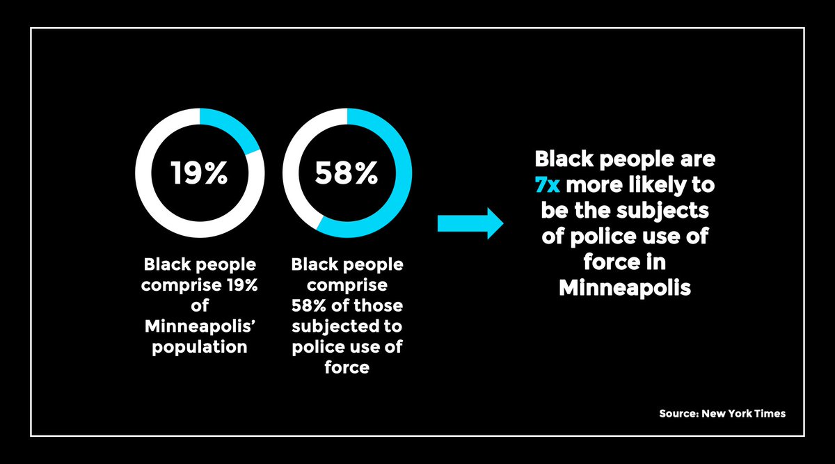
I saw this ‘infographic’ on the Twitter feed of a civil rights lawyer in the US

The implication is so obviously wrong that you’d wonder how someone would fail to notice: 58% is about three times 19%, not seven times.  I wondered if this was a confusion of rate ratios and odds ratios, but that didn’t explain it either. So I went to the New York Times story, and saw this at the top of the page

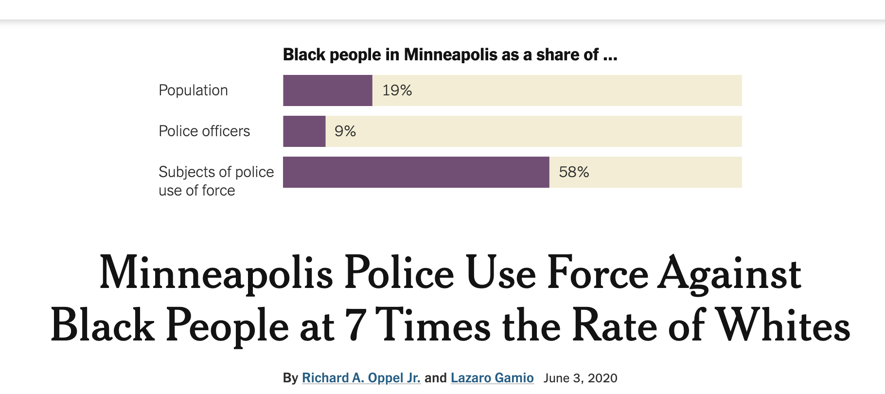
Same numbers in the graph: a three-fold difference. Almost the same claim in the text —  a seven-fold difference — but now with a reference group.

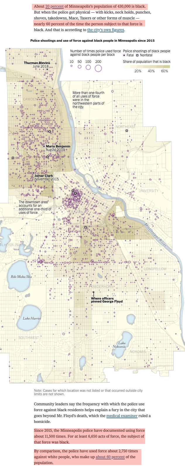
If you read carefully, they are both right.  The graph (and all the graphs in the story) compare Blacks (20% of the populaton) to non-Blacks (80%).  The headline compares Black and white (60%), and the relative rate there is a bit above seven.  To find the numbers for this comparison, you just need to read the sections highlighted in red here

That’s three separate paragraphs, with a map in the middle.

Both the graph and the headline are very suited to social media (‘clickbait’ is a bit strong, since it’s actually good data). They will be circulated by lots of progressive US people who, like the lawyer whose tweet I first noticed, will look numerically clueless.   That can’t be good for the Times.

June 5, 2020

And again

The Surgisphere papers on COVID (the chloroquine one I mentioned yesterday, and one on the safety of blood pressure drugs that affect the angiotensin system) have been retracted, at the request of three of the four authors. They had organised an independent review of the data, but:

Our independent peer reviewers informed us that Surgisphere would not transfer the full dataset, client contracts, and the full ISO audit report to their servers for analysis as such transfer would violate client agreements and confidentiality requirements. As such, our reviewers were not able to conduct an independent and private peer review and therefore notified us of their withdrawal from the peer-review process

With the combination of widespread concern about the data veracity and the unequivocal evidence from the Guardian that the Australian data were misrepresented or falsified, they didn’t have much choice.   The charitable (and quite plausible) assumption is that those three authors were dupes: someone offered them the ability to do (or at least publish) valuable analyses of COVID treatment options, and they didn’t check up on the provenance.

Ben Goldacre says this incident shows the importance of publishing code. I’m not convinced.  If I were faking a 90,000 person data set and sophisticated data analyses, I’d actually do the work of faking the data, not just the results.  Then I could publish the code perfectly safely, claim the data were confidential, but still be tripped up by someone willing to call up all the major hospitals in Australia and check whether they were involved.

June 4, 2020

Chloroquine, yet again

Two and a half important things today.

First, a reasonably-sized, well-conducted trial of chloroquine after exposure to prevent disease found no real evidence of benefit (NYTimes) The  original research paper is supposed to be here, but isn’t up yet.

Second, Melissa Davey, Stephanie Kirchgaessner, and Sarah Boseley, in the Guardian have followed up on the concerns about that large multinational observational study.   If you missed it so far, the paper claimed to have data on over 90,000 hospitalised patients in six continents, and found patients getting chloroquine had substantially mortality. The data were supposed to have been collected from the hospitals electronically, more or less in real time, and sent to a server in the USA, but data use agreements supposedly meant that the hospitals (or even the countries they were in) couldn’t be identified — only the continents.  The Guardian journalists had the same idea as I had, that the Australian data (5 hospitals, 63 patients) was the weak point for checking: Australia is a small continent, with a small COVID outbreak, and a highly concentrated population, so you’d only have to call a fairly small number of hospitals and get them to deny sending their data to Surgisphere.  Unlike me, they actually did it:

The Guardian has since contacted five hospitals in Melbourne and two in Sydney, whose cooperation would have been essential for the Australian patient numbers in the database to be reached. All denied any role in such a database, and said they had never heard of Surgisphere. Desai did not respond to requests to comment on their statements.

So, the Australian data, after being obviously impossible and being corrected, are impossible again.  Australian patients make up only a tiny fraction of the claimed database — less than one in one thousand — but as Mies van der Rohe said, “God is in the details”

The additional half topic is that Surgisphere says they are having the data audited 

We believe that an independent academic audit that validates those three functions as it relates to our papers in the New England Journal of Medicine and The Lancet will bring further transparency to our work, further highlight the quality of our work, and also continue to deserve the confidence of our work by our colleagues.

This process will follow strict boundaries as it relates to our data use agreements, among other considerations. We are pursuing such an independent audit with all due haste while ensuring compliance with various legal and regulatory concerns.

That’s good, but they don’t say by whom. Also “This process will follow strict boundaries as it relates to our data use agreements, among other considerations” is potentially a problem. Surgisphere have claimed that the data use agreements do not allow the hospitals to be identified. An audit that does not verify the participation of at least an auditor-determined sample of the hospitals is not worth much — and ideally there would be some checks of data against records in those hospitals. A proper audit would be a lot of work, but Surgisphere claim to have carried out some such checks themselves: they say in the research paper

Collection of a 100% sample from each health-care entity is validated against financial records and external databases to minimise selection bias.

Auditing, and data access in general, are expensive and annoying if you have to do them, but so is getting the wrong answer on treatment effectiveness in COVID-19.

June 1, 2020

It’s raining rain (hallelujah)

Not for the first time in history, but it hasn’t been happening nearly enough this year.

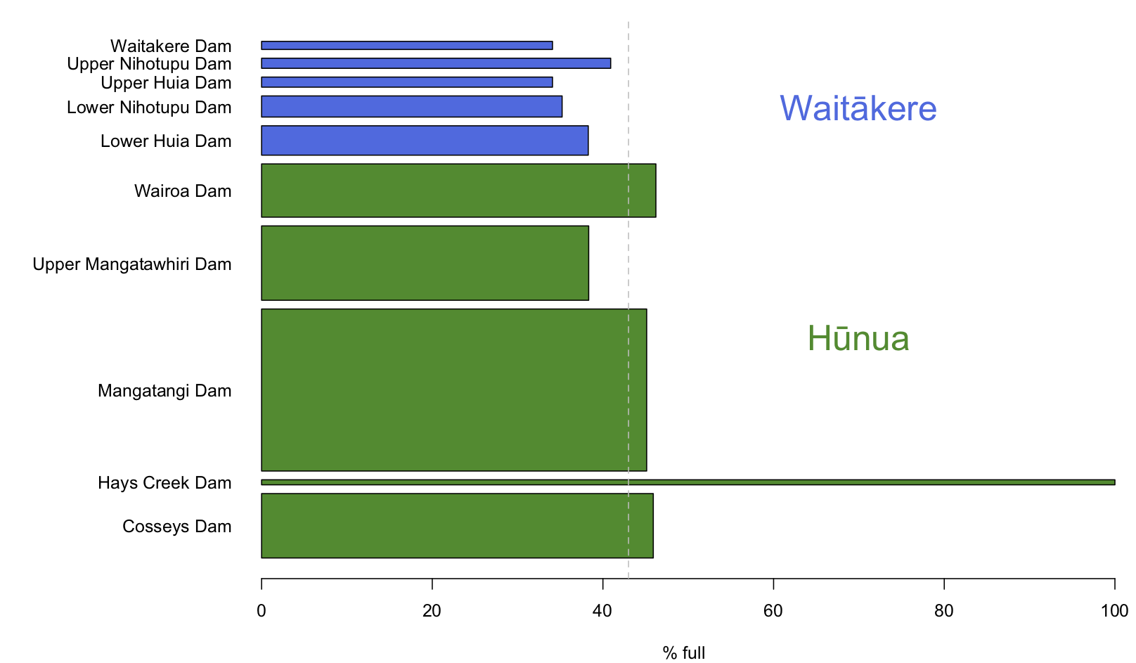
Here’s the state of Auckland’s water storage: the width of the bars is proportional to the capacity of the dam

I got the data from aucklandwatersupply.co.nz, which uses data from Watercare to produce graphics over time.  Auckland’s total stored water today is basically the same as it was on Friday.

[Auckland also has real-time water from the Waikato and from the Onehunga spring, but having to rely on those would be bad.]

May 30, 2020

Austral….asia?

The Lancet published a paper recently claiming that chloroquine and hydroxychloroquine, with or without azithromycin and similar antibotics didn’t help COVID-19 but did cause heart problems, in 96000 people hospitalised for the disease across six continents.Since that’s what most people who would pay attention to a Lancet paper already believed,  it was basically a confirmation. I argued that it made future randomised trials a bit unnecessary.

There is increasing concern about whether the paper accurately represented the source and quality of the data that went into the analysis. More precisely, sober and responsible people are even suggesting it might have been made up.

The Guardian has a headline:  Covid-19 study on hydroxychloroquine use questioned by 120 researchers and medical professionals. Which, by now, is a big underestimate.

Probably the biggest concern is that idea that a software system released last year, could already be getting real-time clinical data from 671 hospitals in six continents, apparently with the rest of the healthcare informatics industry not noticing.

Also, there’s no data about the hospitals except which continent they are in, which is unusual for research of this type.

On top of that, some of the data are clearly wrong.   I hadn’t read the paper carefully.  I looked at it this morning in a bit more detail. One thing that jumped out was the claim that 609 of the hospitalised COVID cases were at five hospitals in Australia.  This is using data up to April 14. On April 10, the Herald talked with Tony Blakely, who said there were 263 hospitalised cases in all of Australia. There’s no way these numbers match up.

It turns out that someone had noticed this already: the Australian data don’t match other data sources in other ways. In a new correction, the researchers said they had listed one hospital in the wrong continent. There were actually only 63 patients from Australia whose data  was in the study, and one of the hospitals was in Asia:

“We have reviewed our Surgisphere database and discovered that a new hospital that joined the registry on April 1, and self-designated as belonging to the Australasia continental designation,”

They’d been mixed up because the hospital said it was in “Australasia”.  Now, I’d think if you were setting up data access and non-disclosure contracts with hospitals, you’d want to know what country’s laws the hospitals operate under, but maybe machine learning can get around these issues.

A further interesting question is where this hospital could possibly be. Remember, it is supposed to have had 609-63=546 hospitalised, PCR-positive, COVID cases by April 14, and to be in Asia,  and to have self-described as being in Australasia.  We can rule out the Pacific islands that would be regarded as in Australasia — they don’t have anywhere near that many cases. Papua New Guinea has eight confirmed cases, counting up to right now.   Timor-Leste has 24.

Could it be a hospital in Indonesia? Indonesia started testing very late, so 546 PCR-confirmed, hospitalised patients by April 14 is a fair chunk of the whole country. The special COVID hospital that’s now at the Asian Games’ athletes’ village near Jakarta has been in the news, and it’s got the right sort of patient numbers, and so there might be a couple of other Indonesian candidates. But it’s hard to see them self-describing as being in “Australasia”, or as having signed up to  this new database system in the middle of a pandemic.

May 23, 2020

COViD links

  • Matt Nippert has two wonderful stories about the government response to the pandemic, in the NZ$ Herald.  He’s used the huge trove of documents released by the government about a week ago to show the government scrambling frantically, but still (by luck and skill and co-operation) managing to keep up.   We were so close to having the wheels come off the public-health response system.
  • “You always expect some resistance but if I had known people’s mental anchor in that negotiation was 10 cases, I might not have been so courageous in my recommendations.      So I’m pleased I didn’t know that.” Ayesha Verrall, who audited the contact-tracing system, talking to Derek Cheng in the NZ$ Herald.

  •  “the stark turning point, when the number of daily COVID-19 cases in the U.S. finally crested and began descending sharply, never happened. Instead, America spent much of April on a disquieting plateau”  Ed Yong’s brilliant ‘patchwork pandemic’ story in The Atlantic
  • There’s still controversy over whether the infection fatality rate of COVID-19 is around 1 in 100 or around 1 in 1000. Hilda Bastian comments on the latest meta-analysis by John Ioannidis.
  • Meanwhile, in New York City, excess deaths this year reached 20,569, which works out to one person in 400.
  • Good news (via XKCD and HuffPost and Pew) is that most people in the US agree with the social-distancing programs.
  • Less good news: only 52% even of Democrats will call ‘false’ the statement “Bill Gates wants to use a mass-vaccination campaign against COVID-19 to implant microchips that would be used to track people with a digital ID” (via @publicaddress).