Are old apes really happier?
Prompted by a comment from Cosma Shalizi (who, irritatingly, is right as usual), I tried some simulated data on the great ape midlife crisis, and I’m now even less impressed with the paper.
There’s very strong evidence in the paper that the youngest apes are rated as happier by their handlers, and that the relationship with age is not linear. What’s less clear is that there is a U-shape.
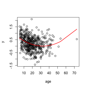
I simulated data where the score decreased sharply at young ages and then flattened out, but didn’t go up again in old age, and analysed as the researchers did in the paper. This is what the data and true relationship look like:
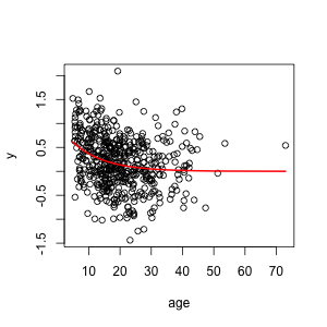
Fitting the model used in the research paper gives a U-shape, because the model they fitted can only give U-shapes. As in the paper, the minimum is in middle life. The statistical significance for the non-linear term is better than in the paper.
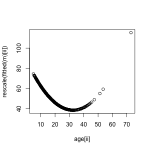
In the paper, the fitted U-shape was rescaled to have mean 50 and standard deviation 10, and the raw data weren’t displayed, making the relationship look much stronger:
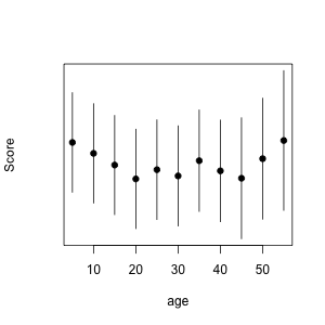
And, as in the paper, the banded model in the Appendix is at least consistent with a U-shape.
So, you can get the results in the paper with no midlife crisis at all. Now, you don’t necessarily get results like these: if you run the code with different sets of random numbers you get results this good maybe half the time. And of course, you could also get those results with a true U-shape.
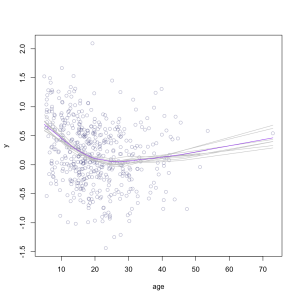
The point is that the results in the paper are not strong evidence for a U-shape, and the graphs and tables in the paper give the impression of much stronger evidence than they actually contain. A much better graph would use a scatterplot smoother, to draw a curve through the data objectively, and something like bootstrap replicates of the curve to give a real impression of uncertainty. This doesn’t give a formal test, but at least it shows what the data are saying.
It would take some thought to come up with a good formal test, but a graph like this one should be a minimum threshold. If there really is evidence of a midlife crisis in apes this graph would show it, and if there isn’t, it wouldn’t.
## simulating the data, reproducibly
set.seed(201211)
age<-rgamma(500,4,scale=5)
ii<-order(age)
y<-exp(-age/10)+rnorm(500,s=0.5)
## quadratic term shows up in model, as in paper
summary(m<-lm(y~age+I(age^2)))
rescale<-function(z) { z<- (z*10/sd(z)); z<-z+50-mean(z)}
## data and true relationship with age
plot(y~age)
lines(age[ii], exp(-age[ii]/10),lwd=2,col="red")
## data and fitted U-shape
plot(y~age)
lines(age[ii],fitted(m)[ii],lwd=2,col="red")
## rescale to match plots in paper
plot(age[ii],rescale(fitted(m)[ii]))
## what they should have done
plot(y~age,col="#00005050")
for(i in 1:10){
 bootsample<-sample(500,500,replace=TRUE)
 lines(lowess(age[bootsample], y[bootsample] ),col="grey")
 }
lines(lowess(age,y ),col="purple",lwd=TRUE)
## fitting banded model
summary(m2<-lm(y~factor(age %/% 5)))
coef(m2)[-1]->beta
SE(m2)[-1]->se
lo<-beta-1.4*se
up<-beta+1.4*se
xx<-(1:11)*5
## displaying banded model
plot(c(xx,xx),c(lo,up),type="n",xlab="age",yaxt="n",ylab="Score")
points(xx,beta,pch=19)
segments(xx,lo,xx,up)
Thomas Lumley (@tslumley) is Professor of Biostatistics at the University of Auckland. His research interests include semiparametric models, survey sampling, statistical computing, foundations of statistics, and whatever methodological problems his medical collaborators come up with. He also blogs at Biased and Inefficient See all posts by Thomas Lumley »
