When not to map
Maps are good because they take advantage of all the previous maps we’ve seen to provide background familiarity. On the other hand, they use up both the available spatial dimensions before you’ve actually got any data, so you need to encode the information some other way. Colour is the obvious choice, but colour is much more limited than people appreciate.
Kieran Healy tweeted “It’s not like there’s a simple, tradeoff-free solution, but this is not a good map.”
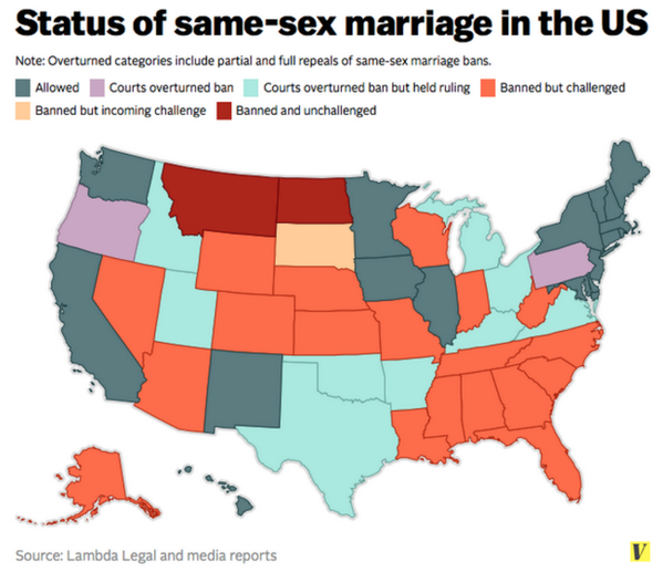
And he’s right; it isn’t. There are too many categories, and some of them are ordered but not all of them, so colour isn’t enough. Even if you’re going to try, these aren’t the right colours: for example, orange should be between yellow and red. About the most you could do clearly with a single map is the three-way split: Yes, same-sex couples can just roll up to the registry; No, not this week; or It’s Complicated.
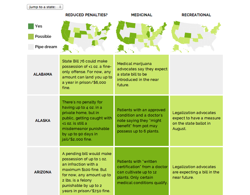
Jacob Harris pointed to an article at Source, describing the design of graphics for a story about marijuana legalisation. It does much better
They link to the classic piece “When maps shouldn’t be maps” by Matthew Ericson, which I’ve linked before. They also have a whole collection of articles on better maps, though it’s fairly programming-oriented.
Thomas Lumley (@tslumley) is Professor of Biostatistics at the University of Auckland. His research interests include semiparametric models, survey sampling, statistical computing, foundations of statistics, and whatever methodological problems his medical collaborators come up with. He also blogs at Biased and Inefficient See all posts by Thomas Lumley »