Briefly
Infographic edition
1. Thomson Reuters illustrated the importance of fine detail in graphic in one of their ads. It looks like a Venn diagram. Oops.

Removing the transparent overlap and changing the colours makes it less Venn-ish

2. Kevin Schaul in the Washington Post came up with this neat graphical summary of state data
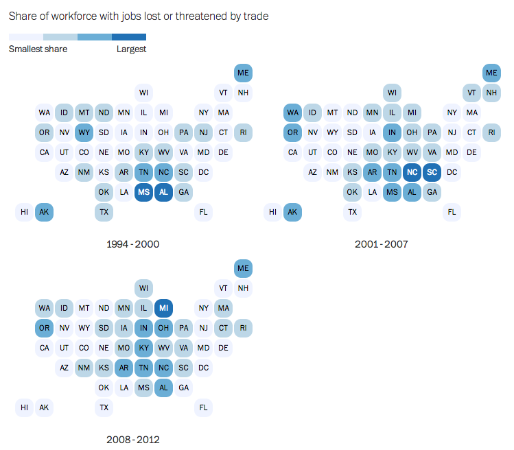
Because the basic outline of the US is so familiar (especially to people who live there), the huge spatial distortions aren’t actually all that disturbing. Mark Monmonier, a geographer, seems to have been the first person to move in this direction (eg). I suggested to Kevin, on Twitter, that this technique would also allow Alaska to be moved from the tropical Pacific to its proper home in the north, and he agreed.
3. That’ll wake you up
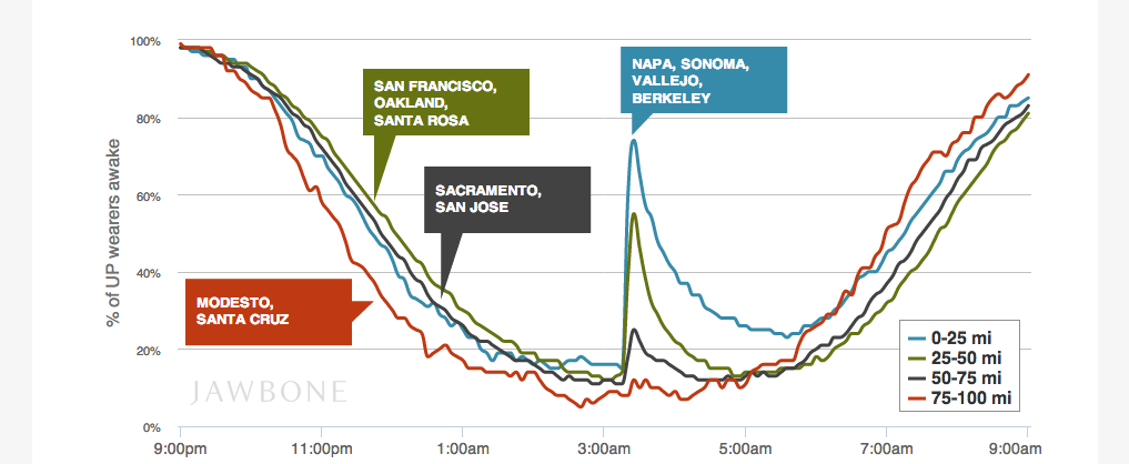
Jawbone, who make products that tell you if you are awake and walking around, looked at the impact of this week’s Napa earthquake. The data resolution isn’t quite fine enough to see the time taken for the ground waves to propagate — compare XKCD on the Twitter event horizon

Thomas Lumley (@tslumley) is Professor of Biostatistics at the University of Auckland. His research interests include semiparametric models, survey sampling, statistical computing, foundations of statistics, and whatever methodological problems his medical collaborators come up with. He also blogs at Biased and Inefficient See all posts by Thomas Lumley »