Highchart of the week
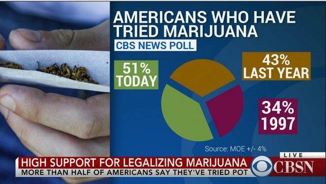
It’s not a piechart, because the wedges don’t add up to anything, which is the only possible justification for a pie chart. On the other hand, unlike the pizzachart it is trying to display numerical data.
Also, “51% of Americans have tried marijuana today” is presumably not the intended reading, but the graphic doesn’t make that as clear as it might.
And the source for the data isn’t a guy named Moe. That’s an abbreviation for Margin of Error. Google suggests the source is a CBS News Poll (PDF report), but that’s from last year.
(via @seanjtaylor)
Thomas Lumley (@tslumley) is Professor of Biostatistics at the University of Auckland. His research interests include semiparametric models, survey sampling, statistical computing, foundations of statistics, and whatever methodological problems his medical collaborators come up with. He also blogs at Biased and Inefficient See all posts by Thomas Lumley »
Original CBSN reporting of the survey seems to be from Apr 2016 too, with a version of the image appearing on reddit in Oct 2016.
http://www.cbsnews.com/news/marijuana-use-and-support-for-legal-marijuana-continue-to-climb/
https://www.reddit.com/r/dataisugly/comments/5a0wp5/this_one_has_it_all_pie_chart_instead_of_a_bar/
7 years ago