January 18, 2012
Oooh. Pretty.
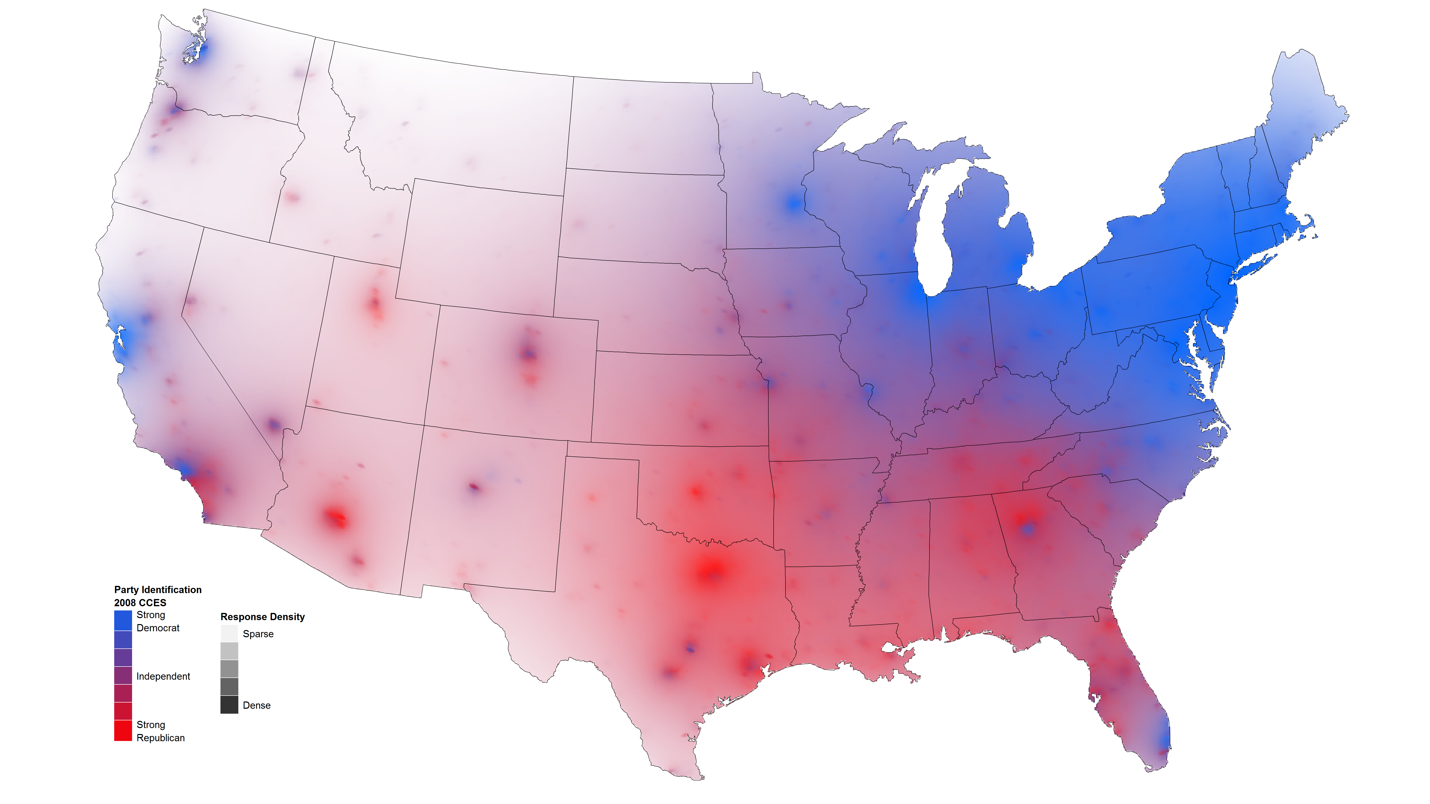
David Sparks has some nice maps of public opinion, using transparency to indicate the level of uncertainty.
Compare to my cruder county-level versions, based on plotting a sample of several thousand from the population
Thomas Lumley (@tslumley) is Professor of Biostatistics at the University of Auckland. His research interests include semiparametric models, survey sampling, statistical computing, foundations of statistics, and whatever methodological problems his medical collaborators come up with. He also blogs at Biased and Inefficient See all posts by Thomas Lumley »


