Hurricane Sandy Signals
Despite all the media coverage of Hurricane Sandy, I found it hard to get a sense of the scale of the storm and the destruction it caused – there’s plenty of noise, but hard to find the signals.
A few sources of information I’ve found useful are:
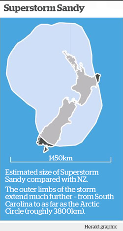
A map in yesterday’s NZ Herald giving useful size context to the storm:

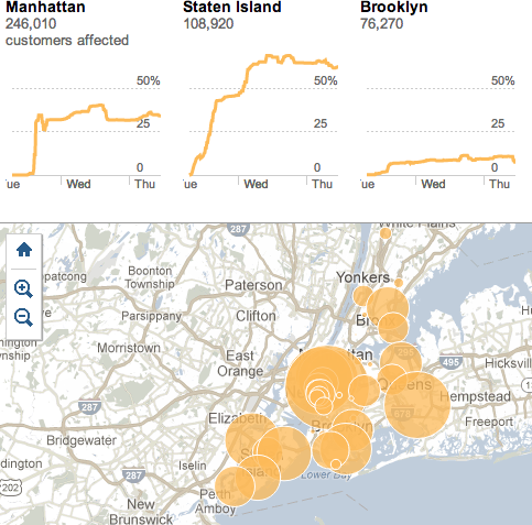
The New York Times is real-time graphing and mapping the number of customers affected by power outages in New York city after Hurricane Sandy:
For another good overview divided by different types of damage in New York city, see: Assessing the Damage From Hurricane Sandy.
Google has an interactive crisis map.
There were not-so-useful statistics being used such as “Facebook Sees Mentions of ‘Hurricane Sandy’ Spike 1 Million Percent”.
The Atlantic does a nice job of verifying social media photos of Sandy.
Have you found any good resources online for getting a sense of the scale and destruction of Hurricane Sandy? Let me know!
Rachel Cunliffe is the co-director of CensusAtSchool and currently consults for the Department of Statistics. Her interests include statistical literacy, social media and blogging. See all posts by Rachel Cunliffe »

Thanks for the post Rachel, I too was suffering from the effects you described. Unsurprisingly, but still frustratingly, TV is the worst offender. The links you provided were excellent.
11 years ago