Redesigning a graph
There are lots of posts criticizing graphs out there on the internet, and a few that provide an improvement, but not many that show their working.
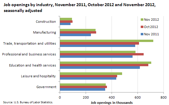
An post at The Why Axis redesigns the jobs chart put out each month by the US Bureau of Labor Statistics, which starts off like this:
and goes through a number of intermediate versions including this
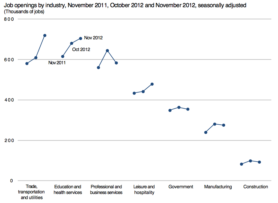
before the final design.
(thanks to Luis Apiolaza for pointing out The Why Axis on Twitter)
Thomas Lumley (@tslumley) is Professor of Biostatistics at the University of Auckland. His research interests include semiparametric models, survey sampling, statistical computing, foundations of statistics, and whatever methodological problems his medical collaborators come up with. He also blogs at Biased and Inefficient See all posts by Thomas Lumley »