Psychic bargraphs
Promoted from comments: Steve Black
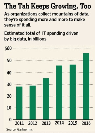
In the Wall St Journal article there is a graphic which does an excellent example of showing why you have to be careful.
So what we’re looking at is that 2011 and 2012 are real. All the rest are made up. And it looks like they made up the trend for 2014-2016 from the pattern of 2011-2013 (two about the same, next two higher) even though 2013 itself is not yet a quarter over. Less than a concrete example?
Yup. I should have noticed that one.
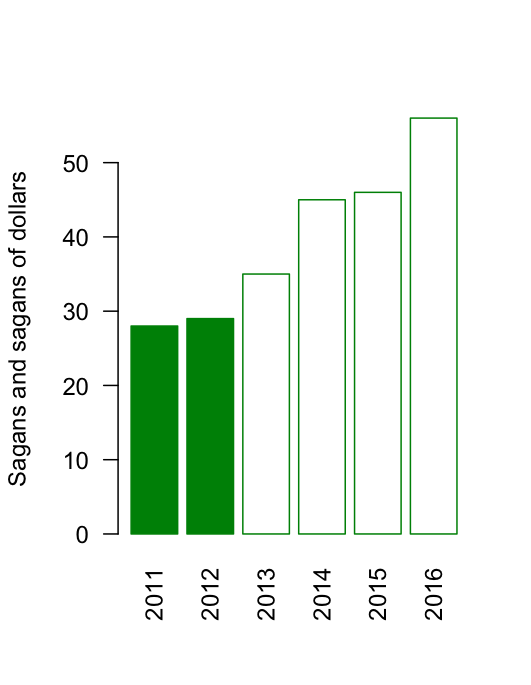
Standard practice is to use a different colour or shading for imaginary numbers:
Thomas Lumley (@tslumley) is Professor of Biostatistics at the University of Auckland. His research interests include semiparametric models, survey sampling, statistical computing, foundations of statistics, and whatever methodological problems his medical collaborators come up with. He also blogs at Biased and Inefficient See all posts by Thomas Lumley »