Inequality in NZ
Nick Iversen nominated the Herald’s story on increasing inequality as Stat of the Week, on the grounds that it didn’t have any data showing increasing inequality. That’s slightly unfair — the increase in high incomes is not explainable by inflation — but it’s certainly true that the conclusion was pretty weakly supported by the numbers.
Firstly, any comparison of money in 2006 to money in 2013 that’s not inflation-adjusted in some way is pretty pointless. The CPI went up 19% over that period.
Secondly, minimum wages are pretty obviously relevant. At the last Census, the minimum wage was $9.50; at this Census it was $13.50, a nominal increase of 42% and a real increase of 19%.
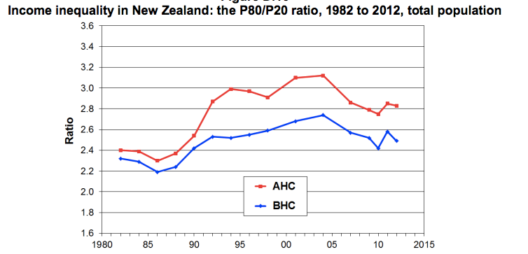
Thirdly, there are established ways to measure income inequality, and while they aren’t perfect, they are better than trying to reinvent the wheel. From an Inequality Forum earlier this year, we can find some summaries based on survey data (PDF) of the ratio of the 80th to 20th percentile of income, and the Gini index. Here’s the 80:20 ratio, with the blue line for income before subtracting housing costs and the red line for income after subtracting housing costs. Both have gone down since 2006, though up since the 1980s, and housing costs are clearly a fair chunk of the inequality problem.
The Gini index is a more complicated summary of inequality that uses all the data, not just two percentiles. It’s popular for comparing between times and between countries. The Gini index for raw income (before taxes and benefits) has stayed fairly stable in NZ recently.
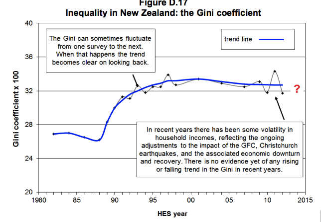
The Gini index for income after taxes and benefits will have increased, but probably not by a lot.
So, inequality in NZ is substantially higher than it used to be, and there are a lot of reasons to think this is bad, but the increase was in the 1980s and 1990s, not since 2006. And this information is not hard to find.
Thomas Lumley (@tslumley) is Professor of Biostatistics at the University of Auckland. His research interests include semiparametric models, survey sampling, statistical computing, foundations of statistics, and whatever methodological problems his medical collaborators come up with. He also blogs at Biased and Inefficient See all posts by Thomas Lumley »
I have seen a number of competing claims regarding trends in inequality recentlt. All a bit confusing, so this summary was really helpful. Thanks. Would be interested to know if you have any stats on the optimal inequality? Commentators seem to write as if any inequality was bad, but that is surely incorrect for all sorts of reasons
13 years ago
There’s unlikely to be agreement on what it even means for something to be the optimal level of inequality, since different people will define ‘optimal’ very differently. Also, the harm from a given level of inequality is higher when social mobility is low.
And, even given agreement on values, there is uncertainty about the size of the various tradeoffs involved.
But there is a pretty good case that zero inequality would be optimal if it could be achieved without reducing output — you only need to believe that an extra dollar is always less valuable to someone with more money. The problem is that you can’t achieve zero inequality without very substantial cost, and even with more moderate goals there is a lot of both uncertainty and disagreement on values as to what interventions do more good than harm.
Still, there’s pretty broad consensus that US inequality is high enough to be worth doing something about, and I think NZ inequality is, too.
13 years ago
A lot of literature on inequality is confusing because people confuse inequality with poverty. You see, for example, phrases such as “the poor are being left behind” and blame inequality for that when in actual fact the phrase should be “the poor are poor” and the blame belongs to poverty.
I read Max Rashrooke’s book “Inequality: A New Zealand Crisis” and it seems to me to be a book mainly about poverty, not inequality. However, there is some good inequality related stuff in there. An example is how inequality leads to a more punitive society.
Another source of confusion is that people write as though it has been proven that inequality is bad for society (such people usually refer to “The Spirit Level”) whereas it’s only a hypothesis.
The problems of poverty (as measured by absolute income) are real and immediate (kids with diseases from bad housing). The problems of inequality (as measured by Gini coefficient) are more subtle (good teachers drifting towards schools in richer suburbs). When you don’t confuse poverty with inequality your writing becomes clearer.
13 years ago
A good test to see if a problem is that of poverty or inequality is to ask what happens to the problem if we add a couple of zeros to everyone’s incomes. Then the poverty goes away (people on a benefit of $10,000 per year will get $1million per year) but the inequality (Gini coefficient) remains the same.
If the problem goes away then it was a problem of poverty. If it remains then it was a problem of inequality (or something else completely).
13 years ago
From a policy point of view the distinction is actually less important — if you have an intervention that reduces poverty, it either works by reducing inequality (in which case the confusion isn’t present) or it works despite not reducing inequality (in which case it’s a free lunch, and should obviously be taken).
13 years ago
I think there are issues with the Gini in that it’s not based on an age standardised populations. That’s going to become more of an issue as the baby boomers head into retirement. They’ll have low incomes but be asset rich.
13 years ago
Yes, definitely, although that’s not specifically a problem with the Gini index, but with the whole concept of income inequality.
13 years ago
Hi,
I’m curious about few things –
The data from latest census release does show that there has been a significant increase in people earning in $70K bracket and that is what the story is based on. Thus the focus on the increasing gap in personal received income, based on the census data. Would that be a wrong inference to make this from the data?
Also, the median income figure was adjusted for inflation. So taking that into account, for the number of people earning less than $40K there hasn’t been a significant change.
I contributed to the story, so I’ll be keen to know where exactly it’s wrong as I’m currently working on a more detailed income-data story.
13 years ago
I agree (and said) that the increase in people over $70k is real and is more than could be explained by inflation. It still should have been adjusted for inflation (like any $ comparison) and perhaps changes in median income or minimum wage (to make it relevant specifically to inequality).
On the other hand, the fact that the Gini index is pretty stable and the 80:20 ratio has decreased suggests that there’s a lot of variation in who is better off and worse off at different parts of the distribution, not any simple increase in inequality — and that’s not surprising given the global financial crisis intervening.
The problem isn’t that the numbers in the story are wrong, it’s that there are reasonably standard summaries of inequality, and that these do not agree with the headline summary — it’s not a case of “this is wrong” as much as “it’s more complicated than this suggests”.
I was actually surprised at how stable the Gini index has been in recent years in NZ: it suggests that a lot of the poverty increase is due either to falls in total output or to increases in housing costs, which isn’t at all what I had expected. I was expecting to write a post saying “the details are more complicated than that but the Herald headline has the right message and Nick Iversen is just nitpicking”
In this case the details matter because they have policy implications. It matters whether inequality is based on raw income, or income after taxes and benefits, or income after taxes, benefits, and housing costs, because those affect what you can do about it.
The 80:20 ratio trends, together with the Child Poverty report and its comments on housing, suggest that relaxing zoning in Auckland and Christchurch to allow more density and discourage speculative land banking might be quite an effective intervention.
13 years ago
Thanks Thomas. I definitely understand that it’s much more complicated than what the story covers. At this stage, it’s about reporting the latest census data and hopefully tomorrow’s story will cover some details around the data and what it does show.
13 years ago
Inequality is measured by the ratio of top incomes to bottom incomes.
You are comparing top counts in age brackets to lower counts. This is wrong. You must compare the actual incomes, not the number of people on those incomes.
Also you are cheat by cherry picking the data with the most dramatic change. You should use ALL the data and use an inequality measure such as the Gini or 80:20.
Journalists cheat a lot cos they cherry pick for the headline numbers not the representative numbers.
13 years ago
Thanks for your comment Nick. The story is based on the census data and because it was written the next day, it was impossible to have all the data. I’m working on an interactive for tomorrow which will show income breakdown for all the regions. So at least in terms of the census, all the data will be there. The focus for these stories is to report around the census data and we’ll try best to do that.
13 years ago