Posts from March 2014 (59)

March 31, 2014

Election poll averaging

The DimPost posted a new poll average and trend, which gives an opportunity to talk about some of the issues in interpretation (you should also listen to Sunday’s Mediawatch episode)

The basic chart looks like this

nzpolls20140330bc1

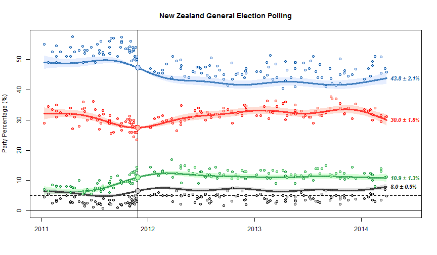
The scatter of points around the trend line shows the sampling uncertainty.  The fact that the blue dots are above the line and the black dots are below the line is important, and is one of the limitations of NZ polls.  At the last election, NZ First did better, and National did worse, than in the polling just before the election. The trend estimates basically assume that this discrepancy will keep going in the future.  The alternative, since we’ve basically got just one election to work with, is to assume it was just a one-off fluke and tells us nothing.

We can’t distinguish these options empirically just from the poll results, but we can think about various possible explanations, some of which could be disproved by additional evidence.  One possibility is that there was a spike in NZ First popularity at the expense of National right at the election, because of Winston Peters’s reaction to the teapot affair.  Another possibility is that landline telephone polls systematically undersample NZ First voters. Another is that people are less likely to tell the truth about being NZ First voters (perhaps because of media bias against Winston or something).  In the US there are so many elections and so many polls that it’s possible to estimate differences between elections and polls, separately for different polling companies, and see how fast they change over time. It’s harder here. (update: Danyl Mclauchlan points me to this useful post by Gavin White)

You can see some things about different polling companies. For example, in the graph below, the large red circles are the Herald-Digipoll results. These seem a bit more variable than the others (they do have a slightly smaller sample size) but they don’t seem biased relative to the other polls.  If you click on the image you’ll get the interactive version. This is the trend without bias correction, so the points scatter symmetrically around the trend lines but the trend misses the election result for National and NZ First.

poll-digipoll

Stat of the Week Competition: March 29 – April 4 2014

Each week, we would like to invite readers of Stats Chat to submit nominations for our Stat of the Week competition and be in with the chance to win an iTunes voucher.

Here’s how it works:

  • Anyone may add a comment on this post to nominate their Stat of the Week candidate before midday Friday April 4 2014.
  • Statistics can be bad, exemplary or fascinating.
  • The statistic must be in the NZ media during the period of March 29 – April 4 2014 inclusive.
  • Quote the statistic, when and where it was published and tell us why it should be our Stat of the Week.

Next Monday at midday we’ll announce the winner of this week’s Stat of the Week competition, and start a new one.

(more…)

Stat of the Week Competition Discussion: March 29 – April 4 2014

If you’d like to comment on or debate any of this week’s Stat of the Week nominations, please do so below!

March 30, 2014

Inflation adjustment before breakfast

I saw this story in the Herald and didn’t read it in detail, just thought it was an interesting calculation to do

The Financial Times reported last week that the average global price of eight breakfast staples had risen almost 25 per cent this year.

The increases mainly affected coffee, orange juice, wheat, sugar, milk, butter, cocoa and pork.

We decided to create a Kiwi version of the Financial Times story and Statistics NZ food price figures reveal New Zealand families are not exempt from the trend.

David Farrar did read the story, and so was rather less impressed, as he also mentioned on Twitter.  The problem is that the calculation was done wrong.

If you served tomatoes, mushrooms, bacon, toast, eggs, tinned spaghetti and cereal, with coffee, tea and orange juice this weekend, it would have cost you 6.9 per cent more than the same meal in 2008, and almost 3 per cent more than in 2012. Breakfast food prices have risen more quickly than other prices.

Over the past five years, the compound average annual rate of inflation was 2.1 per cent.

If the average annual rate was 2.1%, which sounds about right, the total increase over five years would be 2.1% five times, which turns out to be 11%. Since 6.9% is less than 11%, breakfast food prices have risen less quickly than other prices. Quite a bit less. The story has it completely backward.

If you’re reading especially carefully, you might also notice that it’s more than five years from “this weekend” back to 2008 — for example, a comparison of end of March 2008 to this weekend would be a six year period.

This is the sort of thing that a subeditor should spot. It’s also the sort of thing the RBNZ inflation calculator is useful for — you put in a number and two years and it does the calculations.  If you use the calculator, you find that “this weekend” is apparently December 2013, and the 2008 comparison is December 2008, rather than March 2008 to March 2013. You’d also see that the sub-index for food had increased less than the total CPI, which would presumably make you more suspicious about the story.

There’s also some discussion of individual item prices. This doesn’t have the awful 5:1 error ratio of the main argument, but it still demonstrates where a bit of thinking could have helped

Mild Arabica coffee was trading on the commodity markets for US$1.76 ($2.03) a pound (453g) in February, up from US$1.35 in January. Mild Arabica coffee was trading on the commodity markets for US$1.76 ($2.03) a pound (453g) in February, up from US$1.35 in January.

If you go to the Countdown website you find that their Signature range coffee beans cost NZ$6 for 200g, or roughly US$12 per pound. Obviously most of the cost is not the wholesale commodity price. That’s presumably even more true for instant coffee (the authentic version of the beverage in a ‘traditional cooked breakfast’)

The components of the CPI that have increased fastest aren’t all that surprising if you read the Herald regularly. For example, the cost of home ownership was up 27% over that five-year period, insurance was up 26%, education, and cigarettes and tobacco were up 67%.

If some things go up faster than average, others must go up slower or even decrease. Household appliances and furniture are down a bit. Telecommunications equipment, computing equipment,  and telecommunications services have gotten much cheaper. You can hardly give away a 2008 phone or computer (though if you’re trying to, Te Whare Marama refuge will put it, and more recent kit, to good use)

March 29, 2014

WiFi context

Age-adjusted brain cancer diagnoses and deaths in the US over time (SEER)

brain


The IEEE 802.11a standard was published in 1999 and was first called WiFi in 2000.  WiFi exposure has increased dramatically since then. You can see what the trend in brain cancer has been.

The International Agency for Cancer Research (IARC) lists WiFi as a ‘possible’ human carcinogen. That doesn’t mean they think it’s actually causing cancer. That means there’s enough uncertainty that they can’t rule out the possibility that it would cause cancer at some dose.

A cancer ‘hazard’ is an agent that is capable of causing cancer under some circumstances, while a cancer ‘risk’ is an estimate of the carcinogenic effects expected from exposure to a cancer hazard. The Monographs are an exercise in evaluating cancer hazards, despite the historical presence of the word ‘risks’ in the title. The distinction between hazard and risk is important, and the Monographs identify cancer hazards even when risks are very low at current exposure levels, because new uses or unforeseen exposures could engender risks that are significantly higher.

It’s quite hard to rule this sort of thing out, which is why out of the 970 agents IARC has classified, only one has been labelled “probably not carcinogenic to humans”. That one wasn’t radiofrequency electromagnetic fields, but if you read the summary of the monograph (PDF) you find it’s cellphones held to the ear that are the possible risk they were concerned about.

This information may be helpful context if you read the Dominion Post.


Where do people come from?

An analysis of global migration flows,  published in Science, via Quartzvid_global_migration_datasheet_web-gimp3


The first thing that Kiwis will note is the graph says no-one migrates to New Zealand. That’s even though the proportion of foreign-born residents in New Zealand is almost twice that in the USA and more than twice that in the UK.

As usual, the issue is denominators: the graphic shows the largest migration flows, and in New Zealand the flow of migrants to Australia is about equal to all the inflows put together. None of the other flows of migrants are large enough to show up.

March 28, 2014

Briefly

Reader request edition

  • Margin of error. The Herald has a reasonable story on public opinion about Labour’s baby-bonus plan. It would have been good to say what the margin of error was for the difference between men and women, since that was the headline. If the gender split was about 50:50 the margin of error for that difference is going to be just over 7%, and the observed difference was 8%. The headline is ok, but that’s the sort of calculation someone should have done, and having done, should have reported. We already have doubts about this particular poll, though. (via @danylmc)


  • The New Republic thinks sunglasses make you less moral and advises against them, based on the fact that masks are used for anonymity and that undergraduates in a psych experiment gave away an average of 90c less when they were wearing sunglasses.  The data on benefits of sunglasses are somewhat better founded. (via @juha_saarinen)
March 27, 2014

NRL Predictions for Round 4

Team Ratings for Round 4

The basic method is described on my Department home page. I have made some changes to the methodology this year, including shrinking the ratings between seasons.

Here are the team ratings prior to this week’s games, along with the ratings at the start of the season.

Current Rating Rating at Season Start Difference
Roosters 11.68 12.35 -0.70
Storm 6.54 7.64 -1.10
Rabbitohs 6.24 5.82 0.40
Sea Eagles 5.81 9.10 -3.30
Bulldogs 3.68 2.46 1.20
Cowboys 2.39 6.01 -3.60
Knights 1.81 5.23 -3.40
Panthers 0.89 -2.48 3.40
Titans -0.35 1.45 -1.80
Broncos -1.76 -4.69 2.90
Sharks -2.48 2.32 -4.80
Dragons -3.31 -7.57 4.30
Warriors -4.17 -0.72 -3.50
Wests Tigers -6.50 -11.26 4.80
Raiders -7.00 -8.99 2.00
Eels -15.28 -18.45 3.20


Performance So Far

So far there have been 24 matches played, 10 of which were correctly predicted, a success rate of 41.7%.

Here are the predictions for last week’s games.

Game Date Score Prediction Correct
1 Wests Tigers vs. Rabbitohs Mar 21 25 – 16 -12.00 FALSE
2 Broncos vs. Roosters Mar 21 26 – 30 -10.20 TRUE
3 Panthers vs. Bulldogs Mar 22 18 – 16 1.60 TRUE
4 Sharks vs. Dragons Mar 22 12 – 14 7.10 FALSE
5 Cowboys vs. Warriors Mar 22 16 – 20 14.40 FALSE
6 Sea Eagles vs. Eels Mar 23 22 – 18 30.10 TRUE
7 Raiders vs. Titans Mar 23 12 – 24 0.10 FALSE
8 Storm vs. Knights Mar 24 28 – 24 10.50 TRUE


Predictions for Round 4

Here are the predictions for Round 4. The prediction is my estimated expected points difference with a positive margin being a win to the home team, and a negative margin a win to the away team.

Game Date Winner Prediction
1 Roosters vs. Sea Eagles Mar 28 Roosters 10.40
2 Dragons vs. Broncos Mar 28 Dragons 3.00
3 Warriors vs. Wests Tigers Mar 29 Warriors 6.80
4 Eels vs. Panthers Mar 29 Panthers -11.70
5 Bulldogs vs. Storm Mar 29 Bulldogs 1.60
6 Rabbitohs vs. Raiders Mar 30 Rabbitohs 17.70
7 Knights vs. Sharks Mar 30 Knights 8.80
8 Titans vs. Cowboys Mar 31 Titans 1.80


Super 15 Predictions for Round 7

Team Ratings for Round 7

The basic method is described on my Department home page. I have made some changes to the methodology this year, including shrinking the ratings between seasons.

Here are the team ratings prior to this week’s games, along with the ratings at the start of the season.

Current Rating Rating at Season Start Difference
Sharks 6.23 4.57 1.70
Crusaders 6.07 8.80 -2.70
Chiefs 4.72 4.38 0.30
Brumbies 4.45 4.12 0.30
Waratahs 4.38 1.67 2.70
Bulls 4.20 4.87 -0.70
Stormers 1.68 4.38 -2.70
Reds -0.48 0.58 -1.10
Hurricanes -0.57 -1.44 0.90
Blues -1.59 -1.92 0.30
Highlanders -3.50 -4.48 1.00
Cheetahs -3.66 0.12 -3.80
Lions -3.94 -6.93 3.00
Force -4.07 -5.37 1.30
Rebels -6.93 -6.36 -0.60


Performance So Far

So far there have been 36 matches played, 24 of which were correctly predicted, a success rate of 66.7%.

Here are the predictions for last week’s games.

Game Date Score Prediction Correct
1 Highlanders vs. Hurricanes Mar 21 35 – 31 -1.10 FALSE
2 Waratahs vs. Rebels Mar 21 32 – 8 12.40 TRUE
3 Blues vs. Cheetahs Mar 22 40 – 30 5.40 TRUE
4 Brumbies vs. Stormers Mar 22 25 – 15 6.20 TRUE
5 Force vs. Chiefs Mar 22 18 – 15 -5.90 FALSE
6 Lions vs. Reds Mar 22 23 – 20 0.10 TRUE
7 Bulls vs. Sharks Mar 22 23 – 19 -0.10 FALSE


Predictions for Round 7

Here are the predictions for Round 7. The prediction is my estimated expected points difference with a positive margin being a win to the home team, and a negative margin a win to the away team.

Game Date Winner Prediction
1 Crusaders vs. Hurricanes Mar 28 Crusaders 9.10
2 Rebels vs. Brumbies Mar 28 Brumbies -8.90
3 Blues vs. Highlanders Mar 29 Blues 4.40
4 Reds vs. Stormers Mar 29 Reds 1.80
5 Bulls vs. Chiefs Mar 29 Bulls 3.50
6 Sharks vs. Waratahs Mar 29 Sharks 5.90


Individual risk and population risk

The Herald and Stuff both have a story about the most dangerous intersections in the country, based on the Ministry of Transport press release. The Herald continues its encouraging new policy of providing the actual data, so we can look in more detail.

The first thing to note is that no intersection in the country appears to have had more than two fatal crashes in ten years, which is better than I would have expected. That’s why crashes involving even minor injuries need to be included in the ranking.

The second issue is the word ‘dangerous’. These 100 intersections are the ones that most need something done to them; they are where the most crashes happen. That’s not the same as the usual use of ‘most dangerous’ — these aren’t the intersections that pose the greatest risk to someone driving through them. The list is from a population or public health viewpoint: these intersections are more dangerous in the same way that dogs are more dangerous than sharks, or flu is more dangerous than meningitis.