Election poll averaging
The DimPost posted a new poll average and trend, which gives an opportunity to talk about some of the issues in interpretation (you should also listen to Sunday’s Mediawatch episode)
The basic chart looks like this
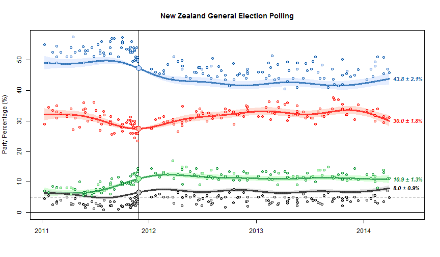
The scatter of points around the trend line shows the sampling uncertainty. The fact that the blue dots are above the line and the black dots are below the line is important, and is one of the limitations of NZ polls. At the last election, NZ First did better, and National did worse, than in the polling just before the election. The trend estimates basically assume that this discrepancy will keep going in the future. The alternative, since we’ve basically got just one election to work with, is to assume it was just a one-off fluke and tells us nothing.
We can’t distinguish these options empirically just from the poll results, but we can think about various possible explanations, some of which could be disproved by additional evidence. One possibility is that there was a spike in NZ First popularity at the expense of National right at the election, because of Winston Peters’s reaction to the teapot affair. Another possibility is that landline telephone polls systematically undersample NZ First voters. Another is that people are less likely to tell the truth about being NZ First voters (perhaps because of media bias against Winston or something). In the US there are so many elections and so many polls that it’s possible to estimate differences between elections and polls, separately for different polling companies, and see how fast they change over time. It’s harder here. (update: Danyl Mclauchlan points me to this useful post by Gavin White)
You can see some things about different polling companies. For example, in the graph below, the large red circles are the Herald-Digipoll results. These seem a bit more variable than the others (they do have a slightly smaller sample size) but they don’t seem biased relative to the other polls. If you click on the image you’ll get the interactive version. This is the trend without bias correction, so the points scatter symmetrically around the trend lines but the trend misses the election result for National and NZ First.

Thomas Lumley (@tslumley) is Professor of Biostatistics at the University of Auckland. His research interests include semiparametric models, survey sampling, statistical computing, foundations of statistics, and whatever methodological problems his medical collaborators come up with. He also blogs at Biased and Inefficient See all posts by Thomas Lumley »
My favourite explanation is that the undecideds finally come into play at election time as they finally have to make up their minds about who to vote for. (Isn’t there something like 20% of undecideds in these polls at the moment – that’s a big deal.)
IMO the undecideds are undecided because they are contemplating a difficult decision such as changing position from their previous vote, voting the same way again doesn’t take much brain power and can be decided on early.
Given random voting change (unlikely but interesting) it tends to go against the incumbant over the pretender just because more people voted for the incumbant last time.
And, in my lesser educated opionion, that the vote went to NZ First was just luck that Winston made the right move in the last week to catch the undecideds.
12 years ago