Posts from October 2014 (47)

October 22, 2014

Currie Cup Predictions for the Currie Cup Final

Team Ratings for the Currie Cup Final

The basic method is described on my Department home page. I have made some changes to the methodology this year, including shrinking the ratings between seasons.

Here are the team ratings prior to this week’s games, along with the ratings at the start of the season.

Current Rating Rating at Season Start Difference
Lions 7.39 0.07 7.30
Western Province 5.87 3.43 2.40
Sharks 3.00 5.09 -2.10
Blue Bulls 1.17 -0.74 1.90
Cheetahs -3.53 0.33 -3.90
Pumas -8.20 -10.00 1.80
Griquas -10.10 -7.49 -2.60
Kings -14.91 -10.00 -4.90


Performance So Far

So far there have been 42 matches played, 31 of which were correctly predicted, a success rate of 73.8%.

Here are the predictions for last week’s games.

Game Date Score Prediction Correct
1 Lions vs. Sharks Oct 18 50 – 20 6.70 TRUE
2 Western Province vs. Blue Bulls Oct 18 31 – 23 10.00 TRUE


Predictions for the Currie Cup Final

Here are the predictions for the Currie Cup Final. The prediction is my estimated expected points difference with a positive margin being a win to the home team, and a negative margin a win to the away team.

Game Date Winner Prediction
1 Western Province vs. Lions Oct 25 Western Province 3.50


ITM Cup Predictions for the ITM Cup Finals

Team Ratings for the ITM Cup Finals

Here are the team ratings prior to the ITM Cup Finals, along with the ratings at the start of the season. I have created a brief description of the method I use for predicting rugby games. Go to my Department home page to see this.

Here are the team ratings prior to this week’s games, along with the ratings at the start of the season.

Current Rating Rating at Season Start Difference
Tasman 12.36 5.78 6.60
Canterbury 12.25 18.09 -5.80
Counties Manukau 6.58 2.40 4.20
Taranaki 6.27 -3.89 10.20
Auckland 4.84 4.92 -0.10
Hawke’s Bay 0.47 2.75 -2.30
Wellington -2.74 10.16 -12.90
Manawatu -2.90 -10.32 7.40
Otago -3.98 -1.45 -2.50
Northland -4.05 -8.22 4.20
Waikato -5.74 -1.20 -4.50
Southland -6.07 -5.85 -0.20
Bay of Plenty -9.23 -5.47 -3.80
North Harbour -10.13 -9.77 -0.40


Performance So Far

So far there have been 74 matches played, 48 of which were correctly predicted, a success rate of 64.9%.

Here are the predictions for last week’s games.

Game Date Score Prediction Correct
1 Hawke’s Bay vs. Northland Oct 17 26 – 21 9.30 TRUE
2 Manawatu vs. Southland Oct 18 23 – 18 7.70 TRUE
3 Taranaki vs. Auckland Oct 18 49 – 30 3.00 TRUE
4 Tasman vs. Canterbury Oct 18 26 – 6 1.30 TRUE


Predictions for the ITM Cup Finals

Here are the predictions for the ITM Cup Finals. The prediction is my estimated expected points difference with a positive margin being a win to the home team, and a negative margin a win to the away team.

Game Date Winner Prediction
1 Manawatu vs. Hawke’s Bay Oct 24 Manawatu 0.60
2 Taranaki vs. Tasman Oct 25 Tasman -2.10


October 20, 2014

Advertising about your weekend

Today’s Daily Mail story in the Herald is unusual, not because it’s a survey done to advertise a company, but because the company of that name in New Zealand is getting a freebie. The story is describes people lying about their boring weekends, and it’s a survey commissioned by Travelodge, the UK budget hotel chain. The hotel company with with the Travelodge brand in this part of the world is, as far as I can tell, not related.

What is notable about the story, which confused me at first when looking across multiple versions in the British media, is that it’s a re-run. Travelodge did the same survey in 2011, on a larger sample. Here’s the Mail story from last time; the Herald escaped it then.

The press release for this year’s survey isn’t up, but if it’s like the 2011 one it won’t give any information about how the survey was conducted, and only reports a few highlights of the results, so if it were about anything important you wouldn’t want to pay attention.

Stat of the Week Competition: October 18 – 24 2014

Each week, we would like to invite readers of Stats Chat to submit nominations for our Stat of the Week competition and be in with the chance to win an iTunes voucher.

Here’s how it works:

  • Anyone may add a comment on this post to nominate their Stat of the Week candidate before midday Friday October 24 2014.
  • Statistics can be bad, exemplary or fascinating.
  • The statistic must be in the NZ media during the period of October 18 – 24 2014 inclusive.
  • Quote the statistic, when and where it was published and tell us why it should be our Stat of the Week.

Next Monday at midday we’ll announce the winner of this week’s Stat of the Week competition, and start a new one.

(more…)

Stat of the Week Competition Discussion: October 18 – 24 2014

If you’d like to comment on or debate any of this week’s Stat of the Week nominations, please do so below!

October 19, 2014

Broadening your data display palate — multivariate beer?

Nathan Yau at Flowing Data has a project page on multivariate beer. That is, he wants to use beer recipes to encode information about US counties taken from the American Community Survey:

The great thing about beer is that it has plenty of dimensions to work with: body, bitterness, head retention, hop profile, color, aroma, alcohol by volume, and plenty more. The amount of various ingredients affects how beer looks, tastes, and smells.

Still a work in progress, here’s how a beer recipe is formed.

  • Greater head retention should increase with higher education, so a grain called Carapils is added.More hop aroma represents higher employment. This comes from more hops at the end of a boil and dry hopping.
  • Rye adds spice and complexity to the beer as health care coverage increases.
  • A darker-colored and more full-bodied beer comes from higher median household income and Crystal Malt 40.
  • More hop bitterness and flavor means more people per square mile, and the type of hops — Cascade, Centennial, Citra, Warrior, and Magnum — represents the races of the population.

That sounds fun, but I’m not convinced by its possibilities for data communication.

People often want to use other senses than vision for data communication, because they would provide more dimensions.  There are a couple of problems with this. First, the bandwidth and resolution of the other senses aren’t as good — for example, even a professional tea-taster can’t manage much over a thousand data points per day. Second, there’s encoding: the idea is to take advantage of the richness of experience from using all the senses, but it’s hard enough to work out how to encode numbers visually, and it will be much harder to come up with encodings for the other senses that convey accurate quantitative information.

October 18, 2014

Briefly

1. There’s a conference coming up in Canada on “Fairness, Accountability, and Transparency in Machine Learning”, a topic I wrote a little about for the Listener

Questions to the machine learning community include:

  • How can we achieve high classification accuracy while eliminating discriminatory biases? What are meaningful formal fairness properties?
  • How can we design expressive yet easily interpretable classifiers?
  • Can we ensure that a classifier remains accurate even if the statistical signal it relies on is exposed to public scrutiny?
  • Are there practical methods to test existing classifiers for compliance with a policy?

(via mathbabe.org)

2. From Nate Silver at fivethirtyeight.com

Democrats may not be wrong. The polls could very well be biased against their candidates. The problem is that the polls are just about as likely to be biased against Republicans, in which case the GOP could win more seats than expected.

This sort of slowly varying bias is probably one of the reasons the NZ election polls weren’t very good: not only did they have more variability than you’d expect given the sample sizes, but averaging didn’t cancel out much of the error.

3. Yesterday was Spreadsheet Day. Flee in terror! (via @kara_woo)

4. An informative  visualisation of what the world eats, over time. (via Harkanwal Singh)


When barcharts shouldn’t start at zero

Barcharts should almost always start at zero. Almost always.

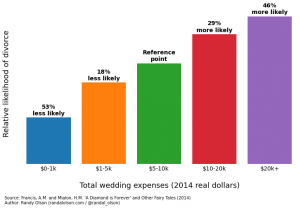
Randal Olson has a very popular post on predictors of divorce, based on research by two economists at Emory University. The post has a lot of barcharts like this one

marriage-stability-wedding-expenses

The estimates in the research report are hazard ratios for dissolution of marriage. A hazard ratio of zero means a factor appears completely protective — it’s not a natural reference point. The natural reference point for hazard ratios is 1: no difference between two groups, so that would be a more natural place to put the axis than at zero.

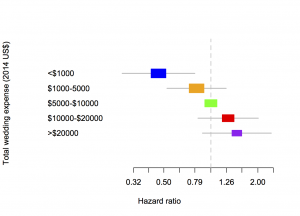
A bar chart is also not good for showing uncertainty. The green bar has no uncertainty, because the others are defined as comparisons to it, but the other bars do. The more usual way to show estimates like these from regression models is with a forest plot:

marriage

The area of each coloured box is proportional to the number of people in that group in the sample, and the line is a 95% confidence interval.  The horizontal scale is logarithmic, so that 0.5 and 2 are the same distance from 1 — otherwise the shape of the graph would depend on which box was taken as the comparison group.

Two more minor notes: first, the hazard ratio measures the relative rate of divorces over time, not the relative probability of divorce, so a hazard ratio of 1.46 doesn’t actually mean 1.46 times more likely to get divorced. Second, the category of people with total wedding expenses over $20,000 was only 11% of the sample — the sample is differently non-representative than the samples that lead to bogus estimates of $30,000 as the average cost of a wedding.

October 16, 2014

Do you feel lucky?

I’m glad to say it’s been quite a while since we’ve had this sort of rubbish from the NZ papers, but it’s still  going across the Tasman (the  Sydney Morning Herald)

If you’re considering buying a lottery ticket, you’d better make sure it’s from either Gladesville or Cabramatta, which are now officially Sydney’s luckiest suburbs when it comes to winning big. 

NSW Lotteries has released statistics that show the luckiest suburbs across all lotto games in NSW and the ACT, as well as other tips for amateurs hoping to ring their bosses tomorrow morning to say they wouldn’t be coming in to work. 

Of course, the ‘luckiest’ suburbs are nothing of the sort: just the ones where the most money is lost on the lotteries. Cabramatta has improved a lot in recent years, but it’s still not the sort of place you’d expect to see called ‘lucky’.

October 15, 2014

Currie Cup Predictions for the Semi-Finals

Team Ratings for the SemiFinals

The basic method is described on my Department home page. I have made some changes to the methodology this year, including shrinking the ratings between seasons.

Here are the team ratings prior to this week’s games, along with the ratings at the start of the season.

Current Rating Rating at Season Start Difference
Lions 6.03 0.07 6.00
Western Province 6.02 3.43 2.60
Sharks 4.36 5.09 -0.70
Blue Bulls 1.02 -0.74 1.80
Cheetahs -3.53 0.33 -3.90
Pumas -8.20 -10.00 1.80
Griquas -10.10 -7.49 -2.60
Kings -14.91 -10.00 -4.90


Performance So Far

So far there have been 40 matches played, 29 of which were correctly predicted, a success rate of 72.5%.

Here are the predictions for last week’s games.

Game Date Score Prediction Correct
1 Kings vs. Pumas Oct 10 26 – 25 -2.20 FALSE
2 Lions vs. Cheetahs Oct 11 47 – 7 11.30 TRUE
3 Western Province vs. Sharks Oct 11 20 – 28 8.70 FALSE
4 Blue Bulls vs. Griquas Oct 11 46 – 12 13.70 TRUE


Predictions for the SemiFinals

Here are the predictions for the SemiFinals. The prediction is my estimated expected points difference with a positive margin being a win to the home team, and a negative margin a win to the away team


Game Date Winner Prediction
1 Lions vs. Sharks Oct 18 Lions 6.70
2 Western Province vs. Blue Bulls Oct 18 Western Province 10.00