November 17, 2014
Stat of the Week Competition Discussion: November 15 – 21 2014
If you’d like to comment on or debate any of this week’s Stat of the Week nominations, please do so below!
If you’d like to comment on or debate any of this week’s Stat of the Week nominations, please do so below!
When statisticians get quoted on the lottery it’s pretty boring, even if we can stop ourselves mentioning the Optional Stopping Theorem.
This week, though, John Oliver took on the US state lotteries: “..,more than Americans spent on movie tickets, music, porn, the NFL, Major League Baseball, and video games combined. “
(you might also look at David Fisher’s Herald stories on the lottery)
Via Michael Toth I found this animated GIF from isomorphismes, showing the ‘yield curve‘ for Federal Reserve bonds
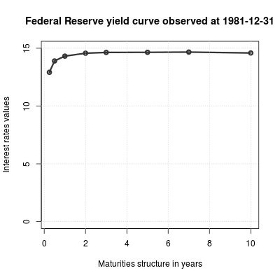
Michael modified the curve to make it prettier — alternatively, more similar to the style of The Economist. In both cases, though, I felt the time context was missing. Using animation rather than multiple plots lets you get a lot more on a page, but you can’t see what’s happening as clearly.
One possibility is to make a separate graphic that shows where you are in time; another is to keep some history by letting the graph leave shadows. In the graph below (based on both the linked examples), there are 12 months worth of shadow lines trailing the solid line, and a grey indicator bar showing where we are in history, with GDP growth and unemployment as context.
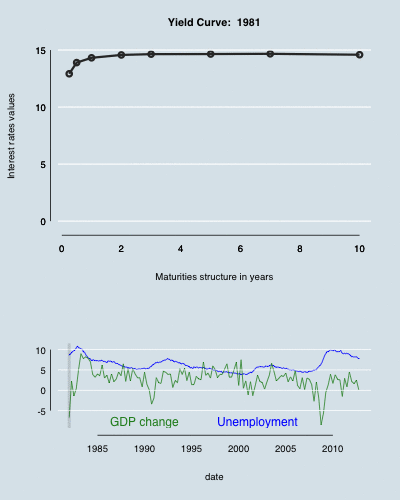
Even better (though not embeddable in WordPress) would be to make the time axis able to both autoplay and be controllable by the user, as in this example from the R animint package.
(update: the code)
New Zealand has a national school funding system that allocates money to schools based on socio-economic data about students. This isn’t self-reported individual-level data, but is at the level of Census meshblocks (details here.) Schools are divided into ten deciles, and more funding given to lower-decile schools. Despite the higher funding, lower-decile schools, on average, have poorer results on standardised assessments. You can see good visualisations of this from Luis Apiolaza,
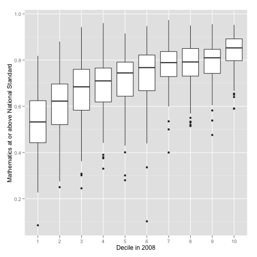
There are less-good ones at Stuff: dot plots aren’t ideal for this, and it really is better to look at cumulative categories (‘at standard or better’) rather than individual categories (‘at standard but not better’). Unfortunately, these graphs tell you almost nothing about the policy question of whether there are better ways to target the funding. There might be; there might not be.
One advantage of the current system is its automatic stabilisation. The Herald, earlier this week, had a good story about changing ethnic profiles of schools, with the sort of combination of data and individual stories it would be nice to see more often. It turns out the low-decile schools are seeing fewer students of European ethnicity, and more Māori and Pasifika students. The phrase ‘white flight’ was used, but because of the funding system this isn’t the same sort of problem as the original ‘white flight’ from US inner cities.
In the US, a lot of public school funding comes from local government. When more-affluent families leave an area, the government funding for education goes down. In New Zealand, when more-affluent families leave an area, the government funding for education goes up. There’s still a concern about diversity, but not the same sort of vicious circle that was seen in the US.
From the Telegraph (via many people on Twitter)
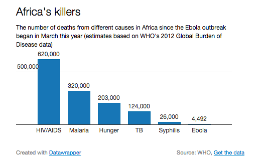
Seeing this at the same time as hearing about Bob Geldof’s Band-Aid reboot really emphasises the point that Africa isn’t a single place. The first Band-Aid recording was intended to help people in Ethiopia; the new one is for the Ebola-stricken regions of West Africa. The distance from Freetown to Addis Ababa is about the same as Auckland to Dili in East Timor, or Los Angeles to Bogota (or Addis Ababa to Prague).
On the other hand, the graph does make an important point. Syphilis, starvation, and TB are all very inexpensively treatable. Malaria and HIV are largely preventable, also at low cost. An effective treatment for Ebola will help, especially for medical personnel who are otherwise at very high risk, but in the long run it isn’t going to be enough. If we can’t deliver penicillin effectively, we won’t be able to deliver Ebola drugs. To make a real difference, we need a vaccine that’s good enough to prevent outbreaks.
Each week, we would like to invite readers of Stats Chat to submit nominations for our Stat of the Week competition and be in with the chance to win an iTunes voucher.
Here’s how it works:
Next Monday at midday we’ll announce the winner of this week’s Stat of the Week competition, and start a new one.
If you’d like to comment on or debate any of this week’s Stat of the Week nominations, please do so below!
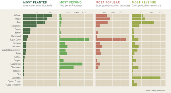
This chart is from a beautiful infographic about cash crops. I don’t believe the cannabis revenue number. That’s partly because I read Keith Humphreys and Mark Kleiman on the subject.
Keith Humphreys takes apart a claim of $120 billion for the total value of the US marijuana market, showing that it can’t be anything near that much.
Current pot smokers report that they use marijuana an average of 60 days a year. Using our current example, 40 ounces/60 days of use means that the average user would have to go through 2/3 of an ounce of marijuana on each day that they used marijuana. That’s .67 X 50 or 33.5 joints per day of use. And there’s a terrific bridge for sale in Brooklyn too.
Even then, the purported $120 billion was the price to the consumer. That’s not what was used for the legal crops, and it makes a big difference.
Suppose we agree use consumer price rather than farmer revenue because the data are slightly more reliable. I don’t really believe a number above about $12 billion for the US. The US has about 1/5 of the world GDP. If the US spent $12 billion/year on cannabis, the rest of the world would need to spend almost $300 billion, or more than six times as much as a fraction of their income. A lot of the world would need to spend more on pot than on basic carbohydrates.
It’s not inconceivable that the number is right — maybe cannabis is really big in, say, Brazil or India and I just don’t know about it — but it’s surprising enough that I’d want a lot more detail to justify it.
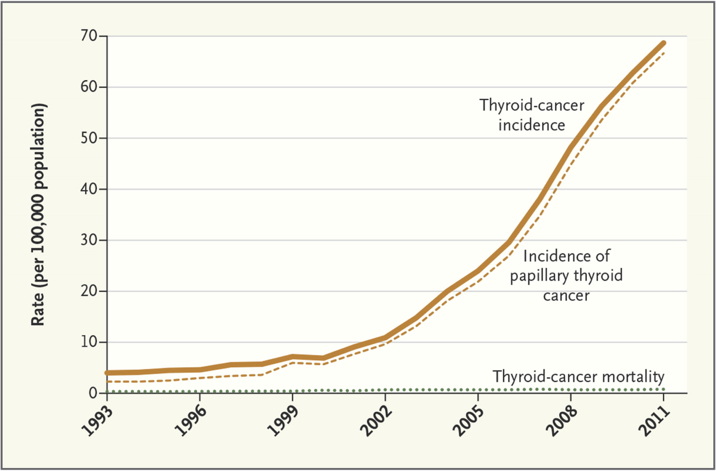
An article in the New England Journal of Medicine talks about screening for thyroid cancer in South Korea. There has been a massive increase in diagnosis, mostly of very small tumours that are probably harmless — there was been no change in the thyroid cancer deaths.
As the authors say:
Thyroid-cancer surgery has substantial consequences for patients. Most must receive lifelong thyroid-replacement therapy, and a few have complications from the procedure. An analysis of insurance claims for more than 15,000 Koreans who underwent surgery showed that 11% had hypoparathyroidism and 2% had vocal-cord paralysis.
From James Cheshire, a lecturer in geography in London
The majority of graphics we produced for London: The Information Capital required R code in some shape or form. This was used to do anything from simplifying millions of GPS tracks, to creating bubble charts or simply drawing a load of straight lines. We had to produce a graphic every three days to hit the publication deadline so without the efficiencies of copying and pasting old R code, or the flexibility to do almost any kind of plot, the book would not have been possible. So for those of you out there interested in the process of creating great graphics with R, here are 5 graphics shown from the moment they came out of R to the moment they were printed.
That is, good graphics rely on both soulless automation and creative design flair. Graphic designers shouldn’t need to put the data in by hand; they should be starting with the output of well-designed software and working from there.