Posts from November 2014 (27)

November 7, 2014

Measuring what you care about

From the Herald

According to co-founder Jackson Wood, many workplaces today use drug testing as a proxy for impairment testing. However, these are generally arbitrary or ineffective and not always reflective of potential employee impairment at the workplace.

Wood’s startup, Ora, is aiming to build a system that tests reliably for impairment. If it can be done, this would be valuable in NZ industries, and might well also attract interest from the US.  With the increasing number of states legalising cannabis, it is increasingly a problem that there is no simple and reliable proxy for driving impairment.


November 6, 2014

State lines

Two very geographical graphics:

From the New York Times (via Alberto Cairo), a map of percentage increases in number of people with health insurance in the US.

insured-map

This is a good example of something that needs to be a map, to demonstrate two facts about the impact of Obamacare. First, state policies matter. That’s most dramatic in this region from the right-hand side, about halfway up:

insured-highlight

Kentucky and West Virginia implemented an expansion in Medicaid, the low-income insurance program, and had a big increase in number of people insured. Neighbouring counties in Tennessee and Virginia, which did not implement the Medicaid expansion, had much smaller increases.  The beige rectangle at the top left is Massachusetts, which already had a universal health care law and so didn’t change much. (Ahem. Geography and orientation apparently not my strong points. Massachusetts didn’t change, but that’s Pennsylvania, which only just started Medicaid expansion)

Second, there was a lot of room for improvement in some places — most dramatically, south Texas. The proportion of people with health insurance increased by 10-15 percentage points, but it’s still below 40%.


As a contrast, the Washington Post gives us this,

venn

which is, hands-down, the least readable marriage equality map I’ve ever seen.


November 5, 2014

Briefly

Humans-sheesh

US election graphics

Facebook has a live map of who has mentioned on Facebook that they had voted (via Jason Sundram)

facebook-voted

USA Today showed a video including a Twitter live map

twitter-elections

These both have the usual problem with maps of how many people do something: there are more people in some places than others. As usual, XKCD puts it well:

xkcd-elections

Useful statistics is about comparisons, and this comparison basically shows that more people live in New York than in New Underwood.

As usual, the New York Times has informative graphics, including a live set of projections for the interesting seats.


November 3, 2014

It’s warmer out there

Following a discussion on Twitter this morning, I thought I’d write again about increasing global temperatures, and also about the types of probability statements.

The Berkeley Earth Surface Temperature project is the most straightforward source for conclusions about warming in the recent past. The project was founded by Richard Muller, a physicist who was concerned about the treatment of the raw temperature measurements in some climate projections. At one point, there was a valid concern that the increasing average temperatures could be some sort of statistical artefact based on city growth (‘urban heat island’) or on the different spatial distribution and accuracy of recent and older monitors. This turned out not to be the case. Temperatures are increasing, systematically.  The Berkeley Earth estimate agrees very well with the NASA, NOAA, and Hadley/CRU estimates for recent decades

best

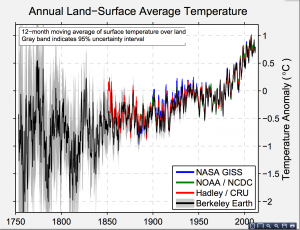
The grey band around the curve is also important. This is the random error. There basically isn’t any.  To be precise, for recent years, the difference between current and average temperatures is 20 to 40 times the uncertainty — compare this to the 5σ used in particle physics.

What there is uncertainty about is the future (where prediction is hard), and the causal processes involved. That’s not to say it’s a complete free-for-all. The broad global trends fit very well to a simple model based on CO2 concentration plus the cooling effects of major volcanic eruptions, but the detail is hard to predict.

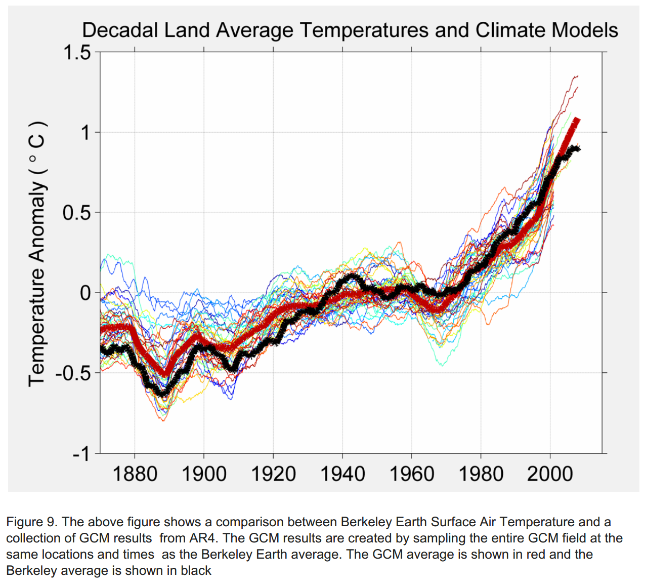
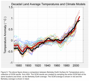
Berkeley Earth has a page comparing reconstructions of  temperatures with actual data for many climate models.  The models in the last major IPCC assessment report show a fairly wide band of prediction uncertainty — implying that future temperatures are more uncertain than current temperatures. The lines still all go up, but by varying amounts.

best-gcm


The same page has a detailed comparison of the regional accuracy of the models used in the new IPCC report. The overall trend is clear, but none of the models is uniformly accurate. That’s where the uncertainty comes from in the IPCC statements.

The earth has warmed, and as the oceans catch up there will be sea levels rises. That’s current data, without any forecasting.  There’s basically no uncertainty there.

It’s extremely likely that the warming will continue, and very likely that it is predominantly due to human-driven emissions of greenhouses gases.

We don’t know accurately how much warming there will be, or exactly how it will be distributed.  That’s not an argument against acting. The short-term and medium-term harm of climate changes increases faster than linearly with the temperature (4 degrees is much worse than 2 degrees, not twice as bad), which means the expected benefit of doing something to fix it is greater than if we had the same average prediction with zero uncertainty.

Stat of the Week Competition: November 1 – 7 2014

Each week, we would like to invite readers of Stats Chat to submit nominations for our Stat of the Week competition and be in with the chance to win an iTunes voucher.

Here’s how it works:

  • Anyone may add a comment on this post to nominate their Stat of the Week candidate before midday Friday November 7 2014.
  • Statistics can be bad, exemplary or fascinating.
  • The statistic must be in the NZ media during the period of November 1 – 7 2014 inclusive.
  • Quote the statistic, when and where it was published and tell us why it should be our Stat of the Week.

Next Monday at midday we’ll announce the winner of this week’s Stat of the Week competition, and start a new one.

(more…)

Stat of the Week Competition Discussion: November 1 – 7 2014

If you’d like to comment on or debate any of this week’s Stat of the Week nominations, please do so below!