US election graphics
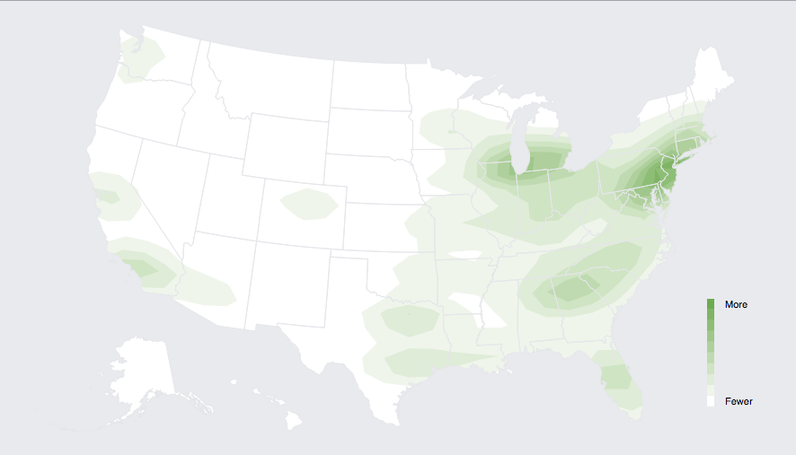
Facebook has a live map of who has mentioned on Facebook that they had voted (via Jason Sundram)
USA Today showed a video including a Twitter live map
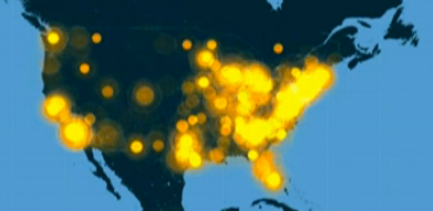
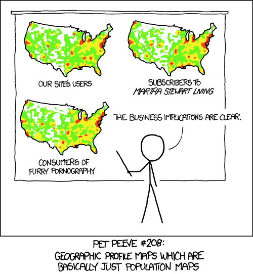
These both have the usual problem with maps of how many people do something: there are more people in some places than others. As usual, XKCD puts it well:
Useful statistics is about comparisons, and this comparison basically shows that more people live in New York than in New Underwood.
As usual, the New York Times has informative graphics, including a live set of projections for the interesting seats.
Thomas Lumley (@tslumley) is Professor of Biostatistics at the University of Auckland. His research interests include semiparametric models, survey sampling, statistical computing, foundations of statistics, and whatever methodological problems his medical collaborators come up with. He also blogs at Biased and Inefficient See all posts by Thomas Lumley »