Aspect ratios and not starting at zero
The vertical axis on a bar chart must start at zero. The very rare exceptions are ones that prove the rule: where ‘zero’ isn’t zero. Otherwise, the axis starts at zero or it isn’t a bar chart. The whole point of bar charts is that the length of the bar is proportional to the data value.
Line charts and scatterplots are different. They don’t need to be tied down to zero, and the axis scales can be chosen to make the information as clear as possible. With great power comes great responsibility, as we can see from the following pair of line graphs of oil drilling in the US.
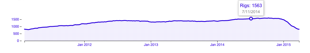
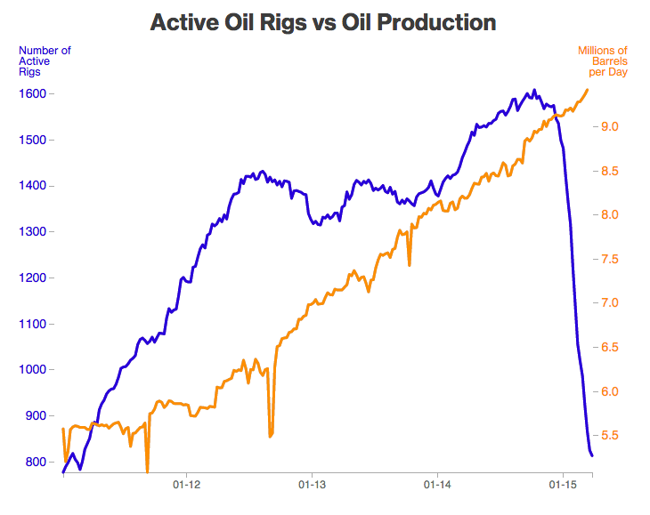
It’s pretty obvious that these come from people with different communications agendas. Or, it would be, except they are from the same story at Bloomberg.
Neither graph has an ideal aspect ratio. The flat one is too flat: you can’t see the wobbles over time in number of rigs. The tall one is too tall: the number of rigs has halved, but it looks as though it has crashed much more than that.
Bill Cleveland has a useful default rule for scaling line graphs: the median slope of the line segments should be about 45 degrees. The orange line on the tall graph isn’t far off that, but the blue line is steeper. The 45-degree rule would give a graph like this:
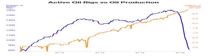
In fact, there is plenty of room to start the blue axis at zero, but that’s not always the right choice.
Here, in a sadly-appropriate pairing, is the Keeling Curve, the graph of atmospheric CO2 concentrations at Mauna Loa observatory, in a visualisation paper from Berkeley.
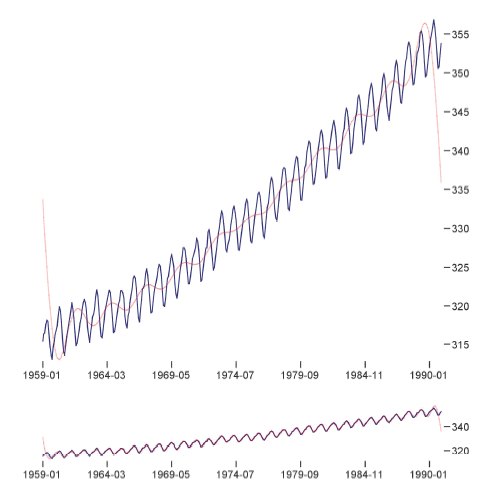
There’s no sense at all in having the vertical axis start at zero. Zero is just not a relevant value of atmospheric CO2. What’s more interesting, though, is how the two scalings show different information. The upper graph is scaled so the year-to-year changes have slope centred at 45 degrees. This makes it easier to see that the CO2 increase is accelerating. The lower graph is scaled so the month to month changes have slope centred at 45 degrees, making it easier to see the shape of the seasonal pattern.
Different vertical scaling can be used just to mislead the reader, but it can also be used to make data more readable and to communicate more effectively.
Thomas Lumley (@tslumley) is Professor of Biostatistics at the University of Auckland. His research interests include semiparametric models, survey sampling, statistical computing, foundations of statistics, and whatever methodological problems his medical collaborators come up with. He also blogs at Biased and Inefficient See all posts by Thomas Lumley »