Bar chart of the week
From the IMF, using OECD data, (via Sam Warburton)
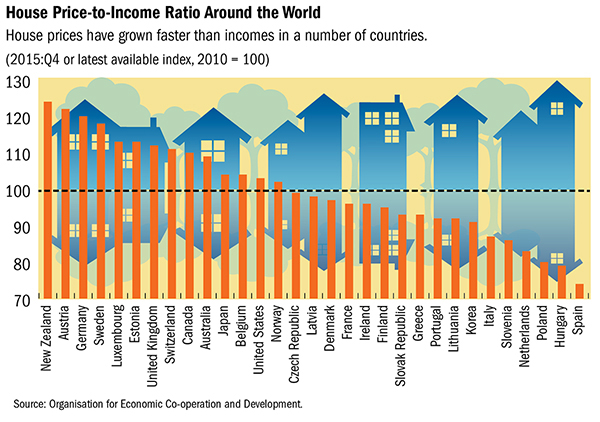
Bar charts should start at zero (and probably shouldn’t have distracting house/arrow/tree reflections in the background), but this graph would look even worse if the y-axis went down to zero. The problem is that ‘zero’ isn’t 0 for this sort of measurement. The index is the price:income ratio now, divided by the price:income ratio in 2010, multiplied by 100. The “no change” value is 100, which suggests using that for the floor of the bars. Making the bars wider relative to the spaces gives easier comparisons and makes the graph less busy. The colour scheme isn’t ideal for dichromats, but it only reinforces the information, it’s not needed to interpret anything.
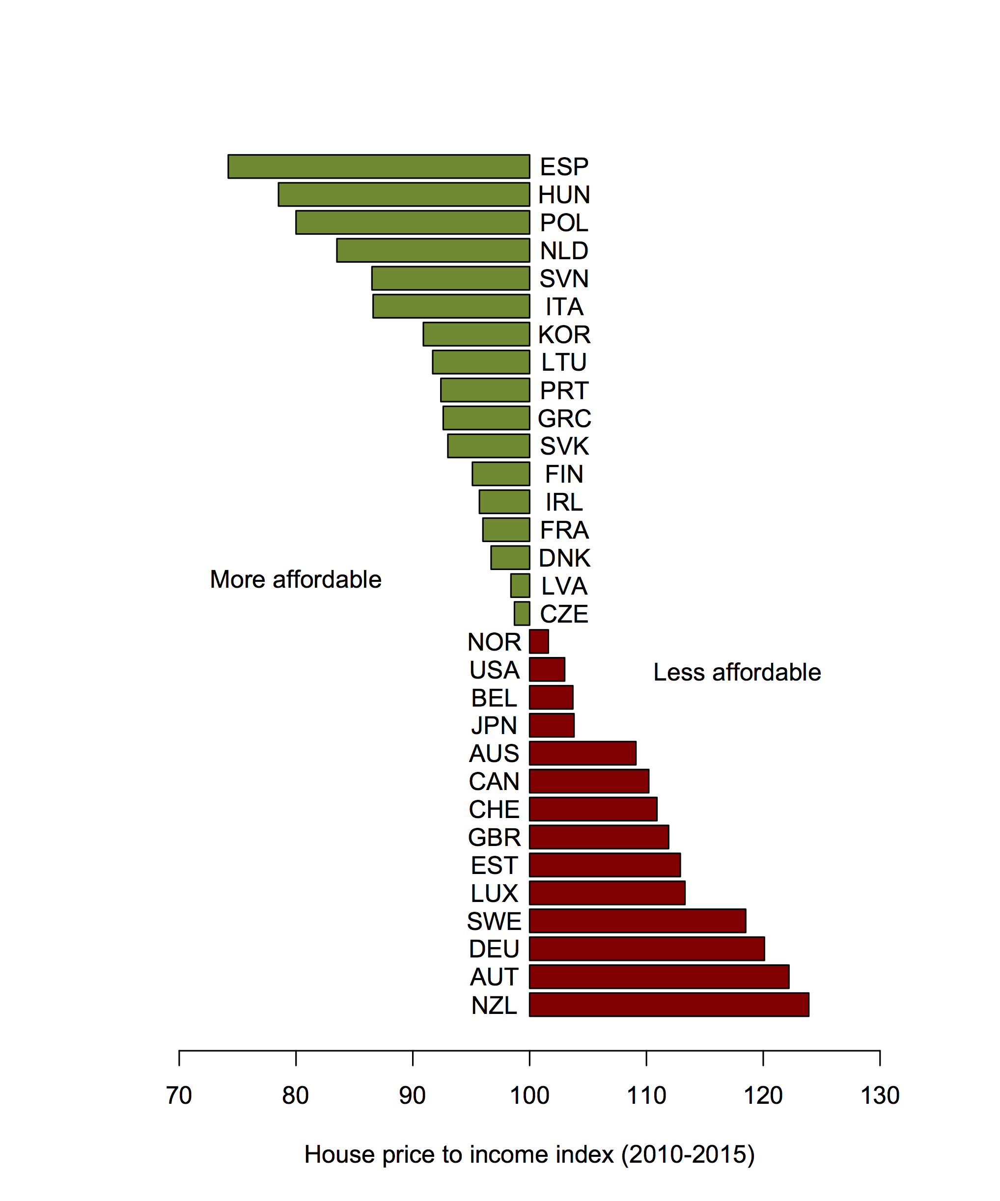
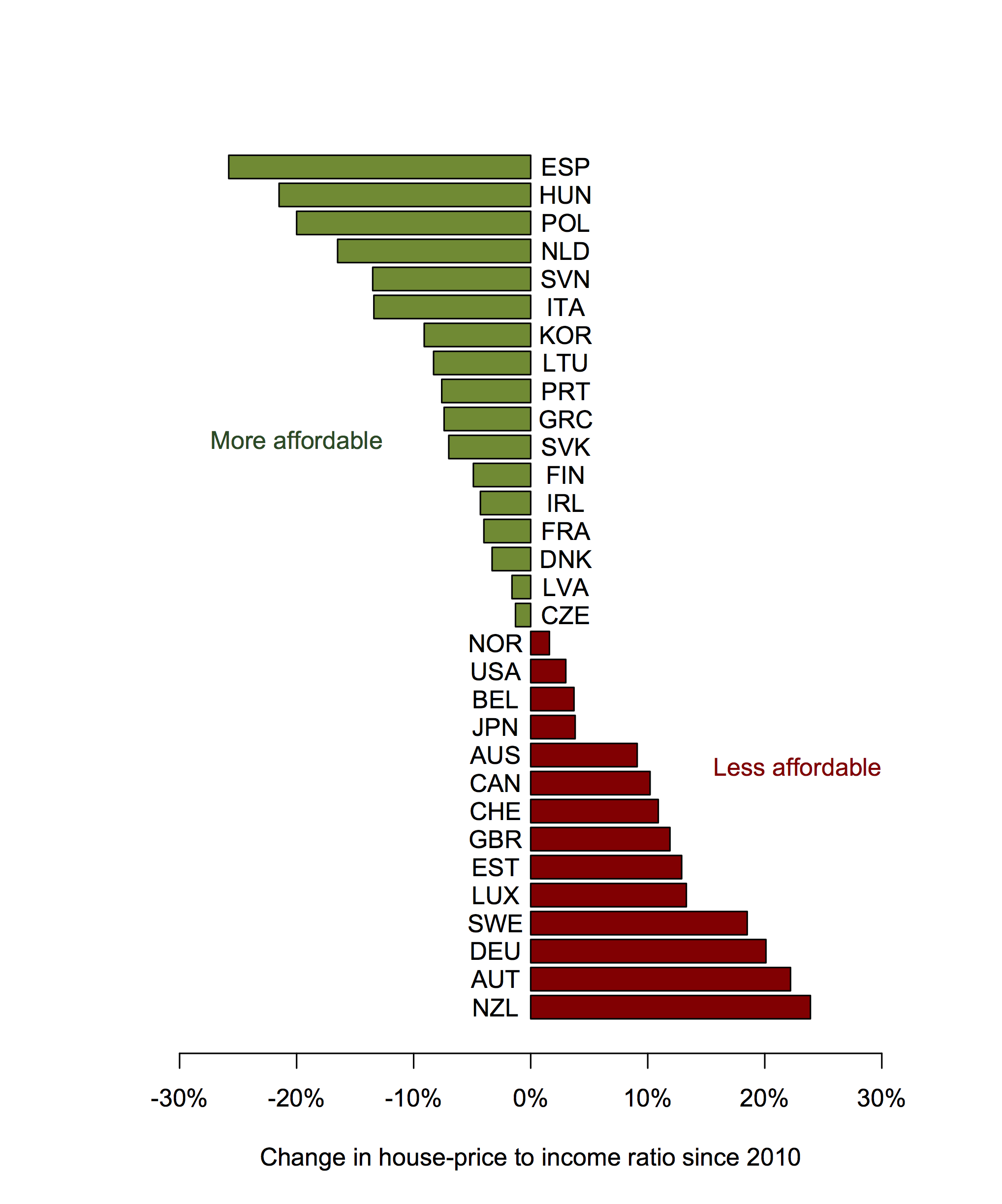
The next step, as Sam suggested on Twitter, would be to give up on the ‘index’, which is really economist jargon, and just describe the change in %. He also suggesting putting the two labels in colour (which required some fiddling: for the text colour to look like the bar colour it has to actually be darker).
One might also go back to the full names of the countries, but I quite like the abbreviations.
Thomas Lumley (@tslumley) is Professor of Biostatistics at the University of Auckland. His research interests include semiparametric models, survey sampling, statistical computing, foundations of statistics, and whatever methodological problems his medical collaborators come up with. He also blogs at Biased and Inefficient See all posts by Thomas Lumley »
Maybe also +s in front of the positive values on the scale! For symmetry!
10 years ago
And maybe change it to a per year figure. Six years doesn’t help comprehension much if you’re interested in more than just the countries relative to each other.
10 years ago
I don’t actually agree on that one. I’m not sure that six years is ideal, but I think a year is too short. Given a choice I’d probably go for five years.
10 years ago
One year’s data would be too short. The average of six years is still six years. Axis is still titled ‘average annual growth rate since 2010’.
I look at 6 years and wonder what the compounding-adjustment is! Is it 4% per annum or closer to 3%?
10 years ago
No, I don’t mean one year’s data. I meant that I think per annum is too small a unit. At least for first-time home buyers I’d want to know for something like five-year birth cohorts.
Obviously this is a matter of taste, though.
10 years ago