Posts from April 2017 (34)

April 28, 2017

Trends and pauses

There’s a story at the Guardian about whether there has been a ‘pause’ and an ‘acceleration’ in global warming.  The underlying research paper actually puts the question more clearly

While it is clear and undisputed that the global temperature data show short periods of greater and smaller warming trends or even short periods of cooling, the key question is: is this just due to the ever-present noise, i.e. short-term variability in temperature? Or does it signify a change in behavior, e.g. in the underlying warming trend?

Models for climate change predict that annual mean surface temperature should be going up fairly smoothly, so that the trend over a decade or so looks like a straight line. A deviation from this trend might indicate important factors have been left out of the model, or might indicate that the background processes are changing (eg as ice sheets retreat).  If you look at the recent past, compared to a straight-line trend, the observed data dipped below the straight line for a few years and have now caught up.  This raises the question of whether either of these indicated an important change in the underlying processes or a new inadequacy of the models.

To start with, let’s establish that we’re not talking about measurement error here.  The variability of annual mean temperatures around the straight-line trend isn’t like the variability of opinion poll results around a trend. The observed data are the truth.  The world really did warm less for a couple of years; it really has warmed more since then.  The straight line trend omits many factors that we know are relevant: events such as volcanic eruptions that affect the incoming sunlight, and events such as El Niño that affect the balance between air and ocean warming.

The question is whether the straight line trend is changing (fast enough to worry about).  You might reasonably object that the annual mean temperatures are far too crude to make that sort of decision; that you need much more details and more sophisticated modelling. As it turns out, you’d be right. However, the crude appearance of a slowdown and speedup in the annual means has been the fuel for a lot of discussion, so it’s worth evaluating.

What the research paper did was to model the deviations from the straight line trend as a simple random process, ignoring any year-to-year correlation.  The researchers could then evaluate mathematically how likely we would be to see an apparent pause or acceleration in warming with that amount of random variation, if in fact the trend was a perfect straight line. The deviations we have seen in the recent past are no larger than you’d expect just from the variation around a constant trend.

To be clear, this doesn’t mean there have been no changes in the trend.  In fact, we know that El Niño does cause systematic changes.  What it means is that the annual mean temperatures alone aren’t enough information to tell us about changes over a period as short as a few years. You shouldn’t change your beliefs (in any direction) over data like that. If the ‘hiatus’ had gone on for a decade, it would have meant something. If the acceleration goes on for a decade, it will mean something. But two or three years isn’t long enough to say anything.  It’s like looking at a month of data on road deaths: you can’t — or at least shouldn’t  — say much.
April 27, 2017

On debates about data

On Wednesday, the NZ Herald website featured a story and graphics by Harkanwal Singh and Lincoln Tan on immigration. This story was based on permanent and long-term migration data from Statistics New Zealand. The graphics allowed readers to explore the data for themselves. The data source was accurately described and was well targeted to the current political discussion about changing immigration policies.

The specific data set and visualisation used are not the only possible ones, and reasoned criticism of the data and analyses is entirely legitimate. StatsChat encourages that sort of thing. We have done it ourselves, and we have published links when other people do it.

Winston Peters, however, claimed that the Herald story was “fake news” and attributed the conclusions to the reporters being Asian immigrants themselves. The first claim is factually incorrect; the second (in the absence of convincing evidence) is outrageous.

James Curran (Professor of Statistics)
Thomas Lumley (Professor of Statistics)
Chris Triggs (Professor of Statistics)

April 26, 2017

NRL Predictions for Round 9

Team Ratings for Round 9

The basic method is described on my Department home page.

Here are the team ratings prior to this week’s games, along with the ratings at the start of the season.

Current Rating Rating at Season Start Difference
Raiders 8.12 9.94 -1.80
Storm 7.46 8.49 -1.00
Sharks 6.60 5.84 0.80
Broncos 4.89 4.36 0.50
Cowboys 1.83 6.90 -5.10
Dragons 1.15 -7.74 8.90
Panthers 1.05 6.08 -5.00
Roosters 0.32 -1.17 1.50
Sea Eagles -0.54 -2.98 2.40
Eels -1.64 -0.81 -0.80
Bulldogs -2.26 -1.34 -0.90
Titans -2.32 -0.98 -1.30
Rabbitohs -2.96 -1.82 -1.10
Warriors -4.65 -6.02 1.40
Wests Tigers -5.13 -3.89 -1.20
Knights -13.96 -16.94 3.00


Performance So Far

So far there have been 64 matches played, 36 of which were correctly predicted, a success rate of 56.2%.
Here are the predictions for last week’s games.

Game Date Score Prediction Correct
1 Raiders vs. Sea Eagles Apr 21 18 – 20 14.80 FALSE
2 Rabbitohs vs. Broncos Apr 21 24 – 25 -5.10 TRUE
3 Eels vs. Panthers Apr 22 18 – 12 -0.20 FALSE
4 Cowboys vs. Knights Apr 22 24 – 12 20.70 TRUE
5 Sharks vs. Titans Apr 22 12 – 16 15.40 FALSE
6 Wests Tigers vs. Bulldogs Apr 23 18 – 12 -0.40 FALSE
7 Roosters vs. Dragons Apr 25 13 – 12 3.00 TRUE
8 Storm vs. Warriors Apr 25 20 – 14 18.00 TRUE


Predictions for Round 9

Here are the predictions for Round 9. The prediction is my estimated expected points difference with a positive margin being a win to the home team, and a negative margin a win to the away team.

Game Date Winner Prediction
1 Broncos vs. Panthers Apr 27 Broncos 7.30
2 Rabbitohs vs. Sea Eagles Apr 28 Rabbitohs 1.10
3 Cowboys vs. Eels Apr 28 Cowboys 7.00
4 Titans vs. Knights Apr 29 Titans 15.10
5 Bulldogs vs. Raiders Apr 29 Raiders -6.90
6 Wests Tigers vs. Sharks Apr 29 Sharks -8.20
7 Warriors vs. Roosters Apr 30 Roosters -1.00
8 Dragons vs. Storm Apr 30 Storm -2.80


Simplifying to make a picture

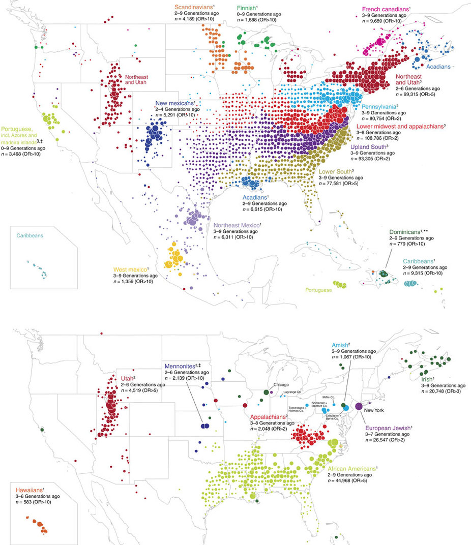
1. Ancestry.com has maps of the ancestry structure of North America, based on people who sent DNA samples in for their genotype service (click to embiggen)ncomms14238-f3

To make these maps, they looked for pairs of people whose DNA showed they were distant relatives, then simplified the resulting network into relatively stable clusters. They then drew the clusters on a map and coloured them according to what part of the world those people’s distant ancestors probably came from.  In theory, this should give something like a map of immigration into the US (and to a lesser extent, of remaining Native populations).  The map is a massive oversimplification, but that’s more or less the point: it simplifies the data to highlight particular patterns (and, necessarily, to hide others).  There’s a research paper, too.


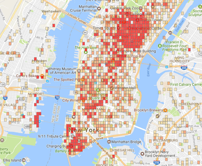
2. In a satire on predictive policing, The New Inquiry has an app showing high-risk neighbourhoods for financial crime. There’s also a story at Buzzfeed.

sub-buzz-24605-1493145131-7

The app uses data from the US Financial Regulatory Authority (FINRA), and models the risk of financial crime using the usual sort of neighbourhood characteristics (eg number of liquor licenses, number of investment advisers).


3. The Sydney Morning Herald had a social/political quiz “What Kind of Aussie Are You?”.

1486745652102

They also have a discussion of how they designed the 7 groups.  Again, the groups aren’t entirely real, but are a set of stories told about complicated, multi-dimensional data.


The challenge in any display of this type is to remove enough information that the stories are visible, but not so much that they aren’t true– and not everyone will agree on whether you’ve succeeded.

April 25, 2017

Electioneering and statistics

In New Zealand, the Government Statistician reports to the Minister of Statistics, currently Mark Mitchell.  For about a decade, the UK has had a different system, where the National Statistician reports to the UK Statistics Authority, which is responsible directly to Parliament. The system is intended to make official statistics more clearly independent of the government of the day.

An additional role of the UK Statistics Authority is as a sort of statistics ombudsman when official statistics are misused.  There’s a new letter from the Chair to the UK political parties

The UK Statistics Authority has the statutory objective to promote and safeguard the production and publication of official statistics that serve the public good.

My predecessors Sir Michael Scholar and Sir Andrew Dilnot have in the past been obliged to write publicly about the misuse of official statistics in other pre-election periods and during the EU referendum campaign. Misuse at any time damages the integrity of statistics, causes confusion and undermines trust.

I write now to ask for your support and leadership to ensure that official statistics are used throughout this General Election period and beyond, in the public interest and in accordance with the principles of the Code of Practice for Official Statistics. In particular, the statistical sources should be clear and accessible to all; any caveats or limitations in the statistics should be respected; and campaigns should not pick out single numbers that differ from the picture painted by the statistics as a whole.

I am sending identical letters to the leaders of the main political parties, with a copy to Sir Jeremy Heywood, Cabinet Secretary.

We don’t have anyone whose job it is to write that sort of letter here, but it would be nice if the political parties (and their partisans) still followed this advice.

Super 18 Predictions for Round 10

Team Ratings for Round 10

The basic method is described on my Department home page.

Here are the team ratings prior to this week’s games, along with the ratings at the start of the season.

Current Rating Rating at Season Start Difference
Hurricanes 17.51 13.22 4.30
Crusaders 11.67 8.75 2.90
Chiefs 9.68 9.75 -0.10
Highlanders 7.88 9.17 -1.30
Lions 7.29 7.64 -0.30
Brumbies 2.63 3.83 -1.20
Stormers 2.53 1.51 1.00
Blues 2.40 -1.07 3.50
Sharks 0.04 0.42 -0.40
Waratahs -0.23 5.81 -6.00
Jaguares -1.46 -4.36 2.90
Bulls -2.87 0.29 -3.20
Force -8.40 -9.45 1.10
Cheetahs -9.61 -7.36 -2.20
Reds -10.42 -10.28 -0.10
Rebels -10.75 -8.17 -2.60
Kings -15.90 -19.02 3.10
Sunwolves -19.10 -17.76 -1.30


Performance So Far

So far there have been 71 matches played, 55 of which were correctly predicted, a success rate of 77.5%.
Here are the predictions for last week’s games.

Game Date Score Prediction Correct
1 Hurricanes vs. Brumbies Apr 21 56 – 21 16.70 TRUE
2 Lions vs. Jaguares Apr 21 24 – 21 14.10 TRUE
3 Highlanders vs. Sunwolves Apr 22 40 – 15 31.80 TRUE
4 Crusaders vs. Stormers Apr 22 57 – 24 10.40 TRUE
5 Waratahs vs. Kings Apr 22 24 – 26 22.60 FALSE
6 Force vs. Chiefs Apr 22 7 – 16 -14.80 TRUE
7 Bulls vs. Cheetahs Apr 22 20 – 14 10.80 TRUE
8 Sharks vs. Rebels Apr 22 9 – 9 16.80 FALSE


Predictions for Round 10

Here are the predictions for Round 10. The prediction is my estimated expected points difference with a positive margin being a win to the home team, and a negative margin a win to the away team.

Game Date Winner Prediction
1 Highlanders vs. Stormers Apr 28 Highlanders 9.40
2 Chiefs vs. Sunwolves Apr 29 Chiefs 32.80
3 Reds vs. Waratahs Apr 29 Waratahs -6.70
4 Force vs. Lions Apr 29 Lions -11.70
5 Cheetahs vs. Crusaders Apr 29 Crusaders -17.30
6 Kings vs. Rebels Apr 29 Rebels -1.10
7 Jaguares vs. Sharks Apr 29 Jaguares 2.50
8 Brumbies vs. Blues Apr 30 Brumbies 4.20


April 24, 2017

Briefly

  • The Herald (from the Daily Mail) recommends drinking beetroot juice, based on a study of brain waves: “This finding could help people who are at-risk of brain deterioration to remain functionally independent, such as those with a family history of dementia“.  The NHS Choices blog commented on a similar study by the same research group in 2010; their comments still apply.
  • Testimonials and motivational speakers tell you “I did this and look how it turned out”.  As XKCD illustrates, results may not be typical 
  • “Data made available for reanalysis, a journal that promptly responded to the outcomes of that reanalysis, and a finding that could save lives.” (from Stat). Another moral to the story: don’t edit data by copy-and-paste.
  • The company says it has studies that back up its claims, but refused to release them on the grounds that they are commercial-in-confidence.” It appears that Johnson & Johnson would rather pull their ad than let people look at the evidence. (from The Age)
  • it’s not acceptable if you’ve got the information readily available to leave it to the last minute for release, that’s not what the Act says you can do”  The Chief Ombudsman interviewed by Newsroom  about the Official Information Act.

And finally

If you give a mouse a strawberry…


So, the Herald (from the Daily Mailhas a headline Why women should eat a punnet of strawberries a day. That seems a little extreme, especially as punnets of strawberries are fairly seasonal.

The story leads off with

Eating just 15 strawberries a day protected mice from aggressive breast cancer in a new medical study.

So, first of all, mice, not women.  Also, when you go to the open-access research paper, it didn’t exactly ‘protect’ the mice.  The mice had cells from a breast cancer cell culture implanted under their skins, and the study looked at the change in size of those implanted tumours, not at spread within the mouse or health of the mouse or anything like that.  It’s a useful approach to learning about cancer cell biology, but not all that close to preventing or treating human cancers.

More surprisingly, though, “15 strawberries a day” seems quite a lot for a mouse — several times its body weight. The story changes a bit later:

In total, the strawberries made up 15 percent of the mice’s diet. That is just shy of the recommended daily amount of fruit we should eat each day, and would be equivalent to a punnet of strawberries, reported the Daily Mail.

A figure of 15% seems more plausible than 15 strawberries, though it’s still not quite true, since actually the mice were given concentrated strawberry extract in their food rather than strawberries.  Using the standard (lowish) estimate of 2000 kcal/day, 15% of calories would  be 300 kcal/day  which would take nearly a kilogram of strawberries.

Previous studies have already shown that eating between 10 and 15 strawberries a day can make arteries healthier by reducing blood cholesterol levels.

There isn’t a reference, but the same researcher has studied strawberries and cholesterol (this time even in humans). The ‘between 10 and 15 strawberries a day’ was actually 500g per day.

[via Sam Warburton]

Stat of the Week Competition: April 22 – 28 2017

Each week, we would like to invite readers of Stats Chat to submit nominations for our Stat of the Week competition and be in with the chance to win an iTunes voucher.

Here’s how it works:

  • Anyone may add a comment on this post to nominate their Stat of the Week candidate before midday Friday April 28 2017.
  • Statistics can be bad, exemplary or fascinating.
  • The statistic must be in the NZ media during the period of April 22 – 28 2017 inclusive.
  • Quote the statistic, when and where it was published and tell us why it should be our Stat of the Week.

Next Monday at midday we’ll announce the winner of this week’s Stat of the Week competition, and start a new one.

(more…)

Stat of the Week Competition Discussion: April 22 – 28 2017

If you’d like to comment on or debate any of this week’s Stat of the Week nominations, please do so below!