Salary distributions
Chris Knox at the Herald has a very nice visualisation of salary distributions and gender differences by age, industry, region, and sector. 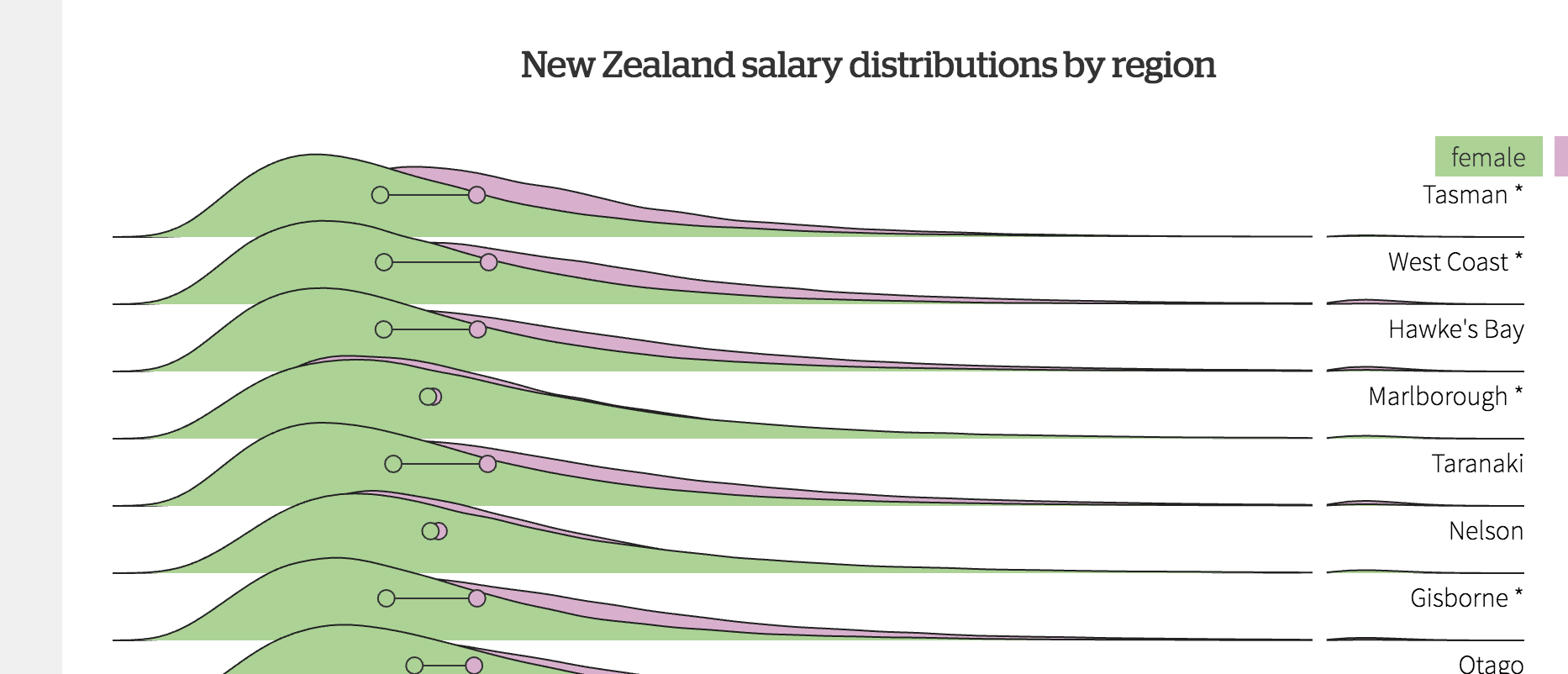
These are tidier than you’d expect from a relatively small survey, because they are predictions from a model, rather than raw survey data.
The good thing about using a model like this is that you can get somewhat realistic pictures from a much smaller survey than you’d otherwise need. The model is expanding the real data for each individual into a smooth distribution on the graph.
The bad thing is there’s a bit of distortion: for example, a graph of a large enough set of raw data would show spikes where multiple people have the same round-number income, and probably a sharper cutoff at the bottom end rather than a smooth tail down to zero.
The graph shows very little difference between private-sector and public-sector workers. That surprised me, because public sector employees on average have substantially higher wage/salary income — as Keith Ng separately writes in the Herald. The difference doesn’t, of course, represent higher pay for comparable jobs; it’s because the public sector is increasingly biased towards educated professionals. Also, government bodies (like other large organisations) will often contract out their lowest-paying jobs rather than using their own employees. Keith showed, using StatsNZ data, that public-sector employees tend to earn slightly less than private-sector employees within the same occupation type.
But if it takes comparisons within an occupation to correct the misleading public-private comparison in StatsNZ data, why doesn’t it take comparisons within an occupation in the visualisation? After some Twitter conversation we worked out that it’s because the visualisation is of salaries, and the other comparison is of salaries and wages. Restricting to salaried employees, while cruder than doing comparisons within occupation types, is enough to remove the bulk of the bias.
Thomas Lumley (@tslumley) is Professor of Biostatistics at the University of Auckland. His research interests include semiparametric models, survey sampling, statistical computing, foundations of statistics, and whatever methodological problems his medical collaborators come up with. He also blogs at Biased and Inefficient See all posts by Thomas Lumley »