July 6, 2018
Showing uncertainty with colour
From Claus Wilke on Twitter, using color to indicate uncertainty, based on data from before the 2016 US election.
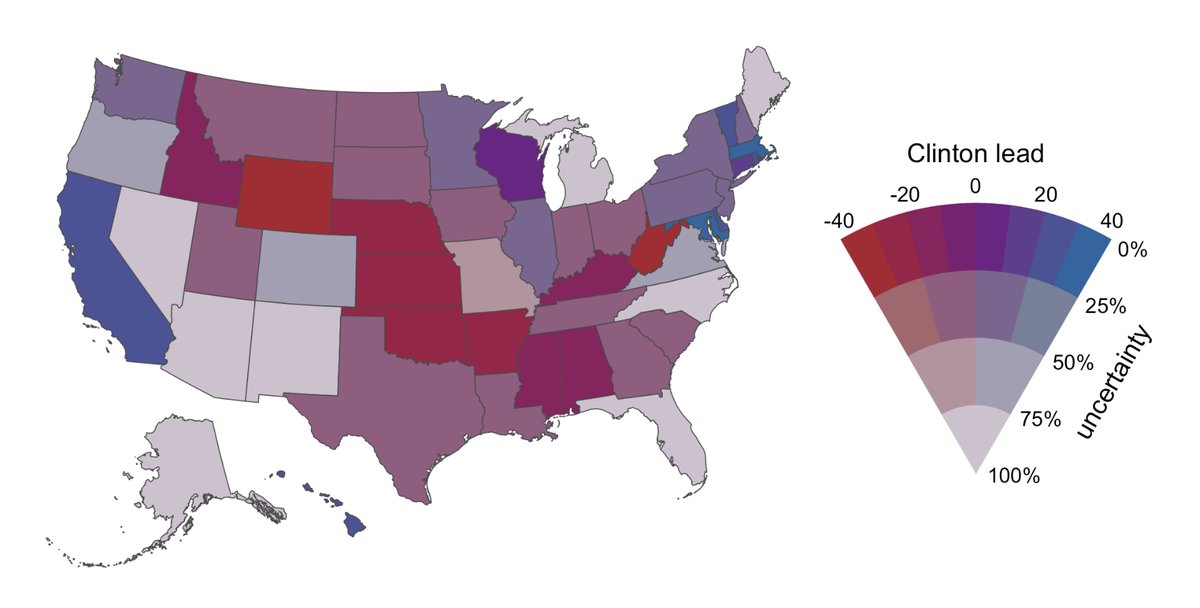
The red:blue scale indicates who is ahead, and the grey:coloured scale indicates confidence. There was lots of discussion about whether this is graying out the differences too much or not enough, and so on, but it’s an interesting idea.
Thomas Lumley (@tslumley) is Professor of Biostatistics at the University of Auckland. His research interests include semiparametric models, survey sampling, statistical computing, foundations of statistics, and whatever methodological problems his medical collaborators come up with. He also blogs at Biased and Inefficient See all posts by Thomas Lumley »
Trying to use two dimensions of colours is always hard to do. The only really feasible ways I’ve seen are to have the second dimension be something like opacity or saturation, but that can make it hard to read the other information encoded in there when the opacity or saturation are low.
Uncertainty’s kind of an interesting case though I think, given how the colour information becomes less and less important/reliable as the scale also makes it harder to discern.
8 years ago
Colour isnt the only other information given, the sizes of the states dont match the number of electoral votes. If area of each state was represented by only congressional districts (every state has 2 senators) then its clearer that US isnt a sea of reddish-purple with a few islands of blue.
8 years ago