Maps and votes
I’ve written several times about the ‘one-cow-one-vote’ problem in election maps, where low-population rural areas dominate the map. Brian Brettschneider has managed to come up with a map distorted the other way
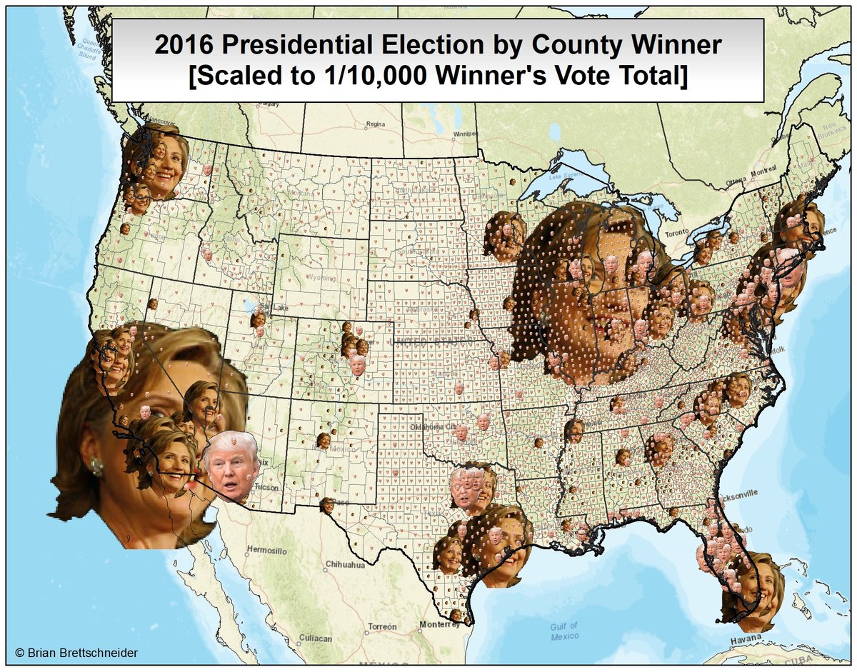
Because the counties with the greatest number of votes are urban, the photos of Hillary Clinton tend to be larger — even in Texas. You also see that in symbol-based maps, too — eg, coloured circles for each county. What makes this map biased is that the small faces are much harder to recognise than larger ones, so that most of Donald Trump’s votes are represented by illegible symbols. It’s a beautiful opposite of the usual map problems.
Thomas Lumley (@tslumley) is Professor of Biostatistics at the University of Auckland. His research interests include semiparametric models, survey sampling, statistical computing, foundations of statistics, and whatever methodological problems his medical collaborators come up with. He also blogs at Biased and Inefficient See all posts by Thomas Lumley »