Pie chart of the week
From Deloitte’s NZ budget infographic, via Siouxsie Wiles
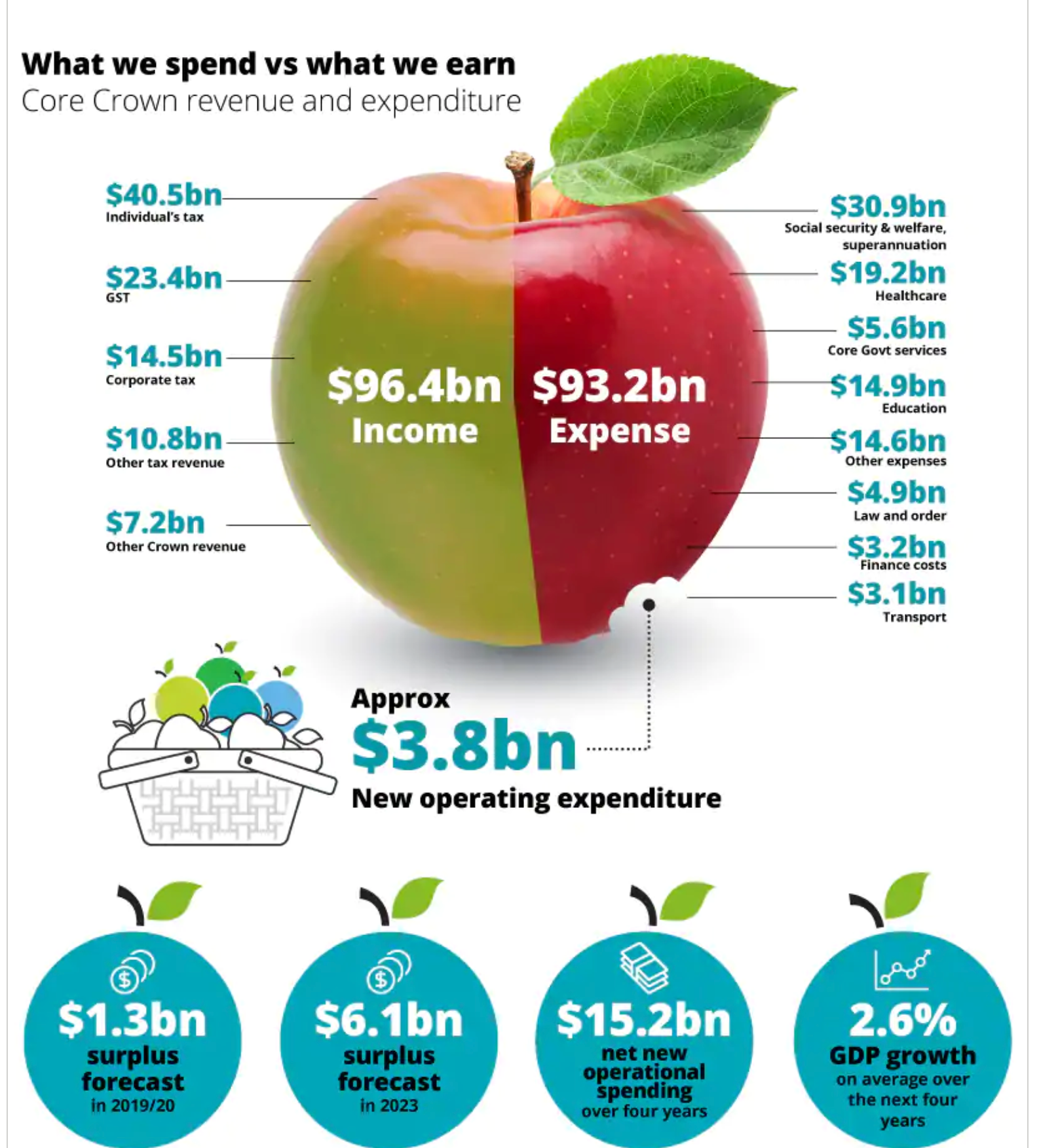
This is weird as a pie chart because the two sections aren’t components of a whole (which is how pies, or Camembert, work). It’s also strange that the new operating expenditure is shown as a bite out of expenses, when it actually makes expenses larger than they would be without it.
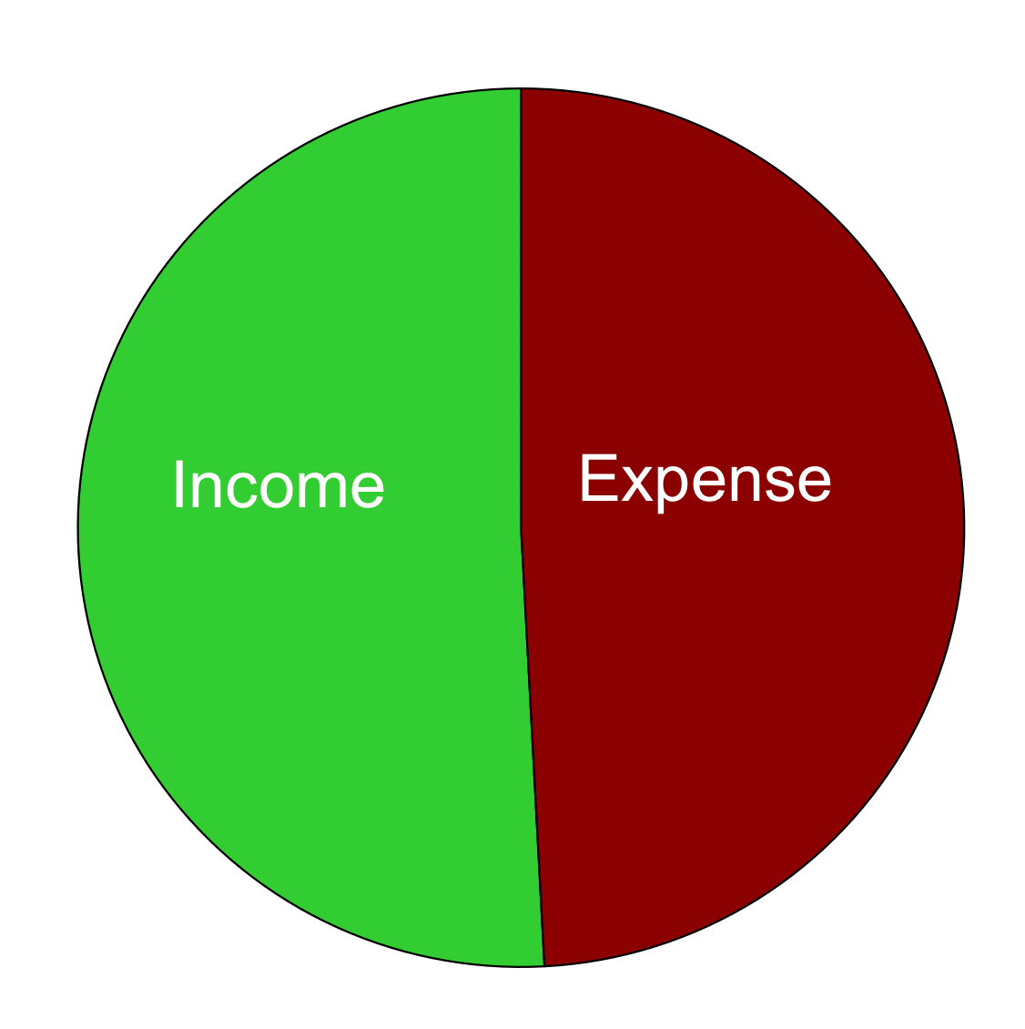
On top of all that, the divisions of the apple aren’t actually in proportion to the numbers. This is what a pie chart with those numbers would look like: the difference between the halves is nearly invisible.
Thomas Lumley (@tslumley) is Professor of Biostatistics at the University of Auckland. His research interests include semiparametric models, survey sampling, statistical computing, foundations of statistics, and whatever methodological problems his medical collaborators come up with. He also blogs at Biased and Inefficient See all posts by Thomas Lumley »