Unclear on the pie-chart concept
Everyone recognises pie. Everyone likes pie. So pie must be a good representation of numbers, right?
One important detail: you want bigger numbers to translate into more pie. This would be especially important if the numbers meant anything, but it’s not a good look even if they don’t.
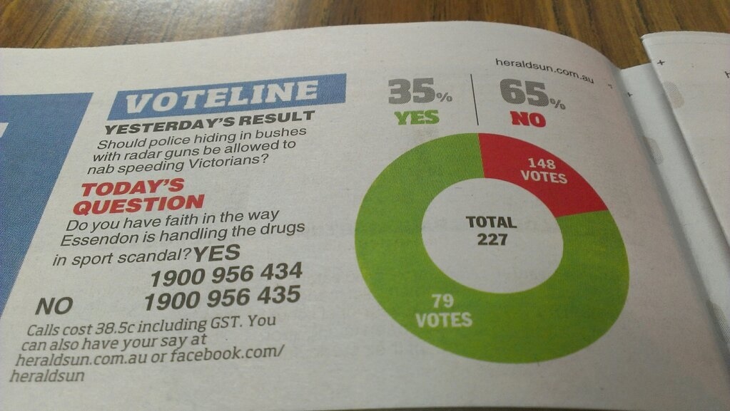
From the Herald-Sun, via Juha Saarinen on Twitter.
[Also: could a cynical reader perhaps think the question was a bit slanted?]
[Update: this looks like exactly the same pie chart they used for 56% vs 44% last month]
Thomas Lumley (@tslumley) is Professor of Biostatistics at the University of Auckland. His research interests include semiparametric models, survey sampling, statistical computing, foundations of statistics, and whatever methodological problems his medical collaborators come up with. He also blogs at Biased and Inefficient See all posts by Thomas Lumley »
That’s shameful!
13 years ago
LOL! So bad.
13 years ago
I’m surprised you haven’t mentioned this chart yet – http://www.nzherald.co.nz/politics/news/article.cfm?c_id=280&objectid=10865078
13 years ago
Because I hadn’t seen it — there’s nothing interesting at the start of that story and I didn’t read to the gory end.
13 years ago