More political graphics
This one is from Young Labour, and as with the previous examples it was retweeted into my Twitter feed. It’s a useful contrast to the previous, since it’s misleading only in the standard ways you expect from political graphs; it’s not an outright distortion.
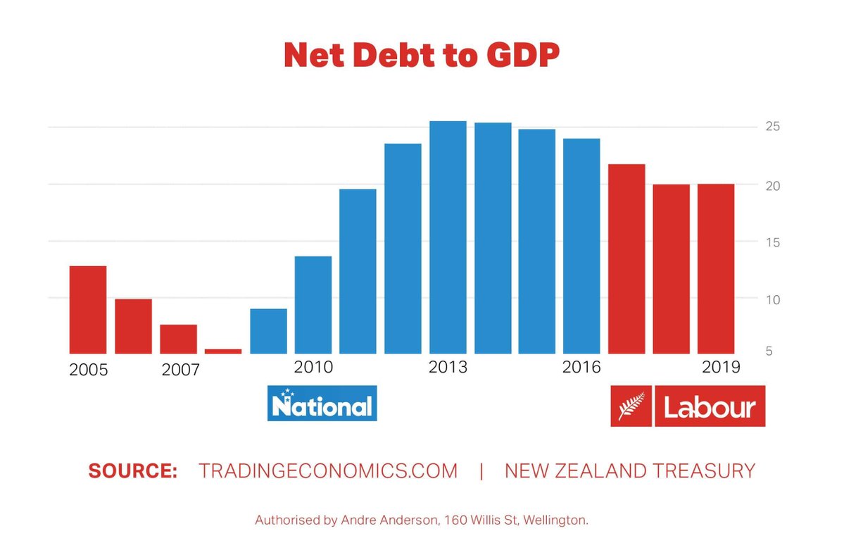
Good points: there is a reasonable data range, which is important for time-series comparisons. The vertical axis is labelled, and the labels match the quantities they are supposed to match.
From an economic point of view, there’s a problem. The increase in debt under John Key’s government was largely due to the Great Recession. Labour, one would hope, would also have run deficits during a major recession — that’s what you do — and there’s no way that the Great Recession can be blamed on the NZ National Party. So, as is often the case, there are important confounding factors in the time series. The numbers are right, but they don’t really support the obvious causal conclusion.
The graphical criticism: the vertical axis begins at 5% rather than at 0. While for line graphs there are a range of views about when zero needs to be included and how, there really aren’t for bar graphs. The area of the bar is supposed to convey information.
If you look up the data source, you find that it truncates the vertical axis in exactly the same way, which is presumably the reason (though hardly an excuse)
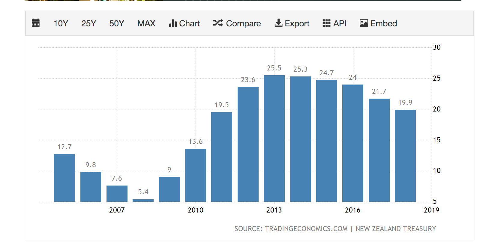
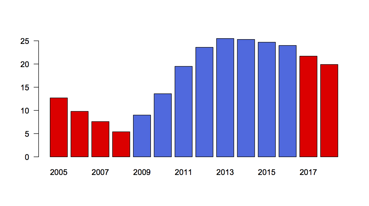
Redrawing, we can see what the graph should have looked like; I think the distorting effect is real but relatively small, especially for the last decade (which, again, not an excuse)
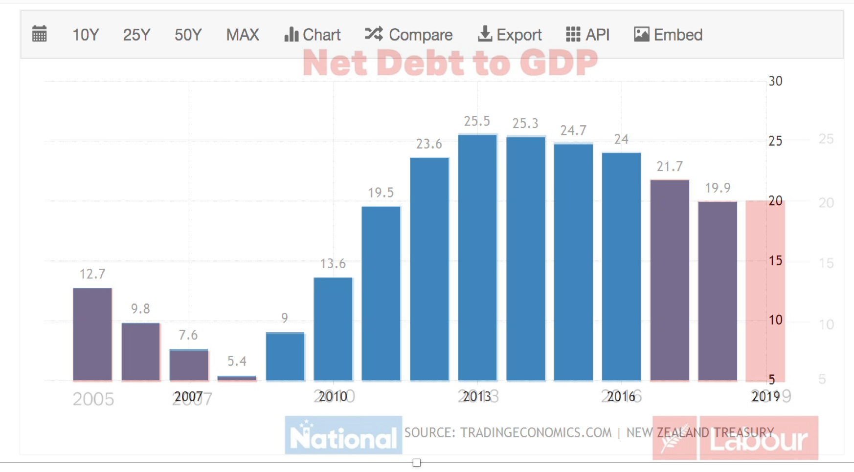
And, in fact, using the wonders of PowerPoint and image transparency, I found that the Young Labour graphic and the one from the TradingEconomics.com can be exactly superimposed — which I suppose argues against the vertical distortion being deliberate.
There’s just one more thing.
You will have noticed, perhaps, that my redrawn graphic has two red bars on the right-hand end, but Young Labour’s has three, with the last two at about the same height. If I hadn’t gone to the effort of superimposing the two versions I would have thought it was probably due to different divisions of the time axis or something. But it’s not. An extra bar has been added. That’s a bit suspicious.
Or, it would be if it weren’t about the same height as the previous bar. It turns out, if you go to the Treasury’s Interim Financial Statements for the four months ending 2019-10-31, you find a figure of 20.2%, which seems to be the height for the last bar. On the one hand, that’s not precisely comparable to the rest of the graph; on the other hand, it’s probably the best that could be done, and shows a reasonable degree of care.
Thomas Lumley (@tslumley) is Professor of Biostatistics at the University of Auckland. His research interests include semiparametric models, survey sampling, statistical computing, foundations of statistics, and whatever methodological problems his medical collaborators come up with. He also blogs at Biased and Inefficient See all posts by Thomas Lumley »
I’d be keen to know how inflation was considered. Has the dollar amount for all the years in the past been converted into today’s dollars?
7 years ago
These are just percentages. Both debt and GDP are in contemporary dollars for each time point, and the dollars cancel out of the ratio. It could equally well be that both were rescaled to 2019 dollars, but I’m fairly sure these data were recorded one year at a time as they happened.
The debt figure for each year does use the contemporary value of debt incurred in the past, of course.
7 years ago
A bigger issue is the graph only covers nett debt to GDP, total or gross debt has increased much more significantly.
The nett part excludes government funds like EQC ( now empty), plus share based funds like ACC (now at $45 bill) and Cullen or Super Fund ( now at $46 bill). Those funds are as well the largest taxpayers in NZ.
While its nice to know about ‘nett’ debt, gross debt is the amount to be repaid plus interest and we have borrowed against the fund to prepay future super costs. Talk about burning the candle at both ends
7 years ago