Misleading with maps
There are lots of maps going around of the Australian fires. Some of them are very good, others indicate ways you can accidentally or deliberately mislead people.
This one was created as a 3-D visualisation by Anthony Hearsey, based on infra-red hotspot data accumulated over the fire period. It has been circulated as a ‘NASA photo’, which it isn’t.
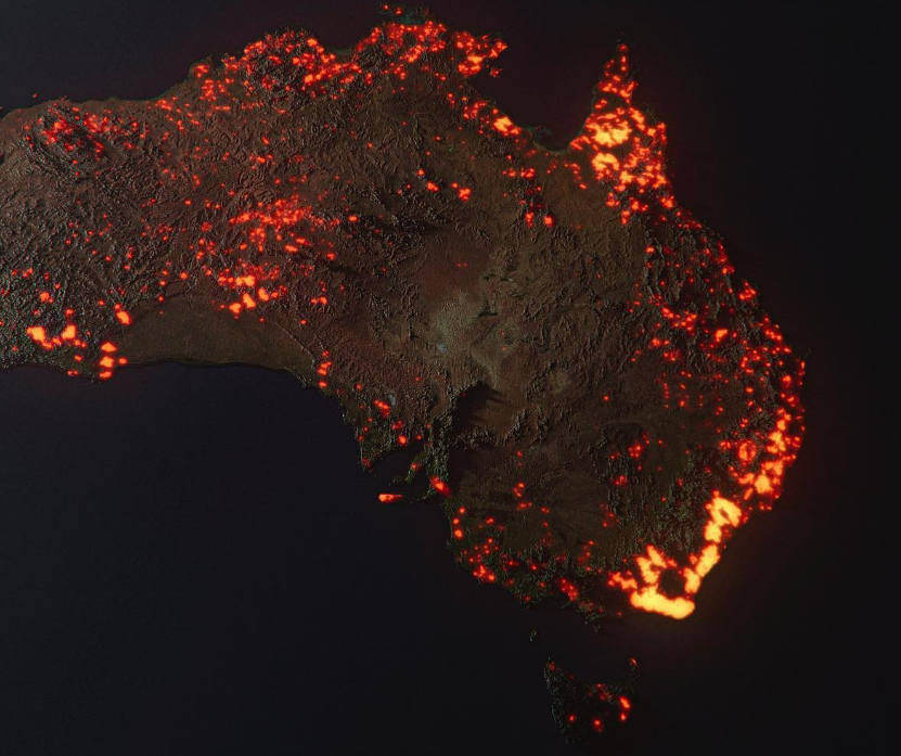
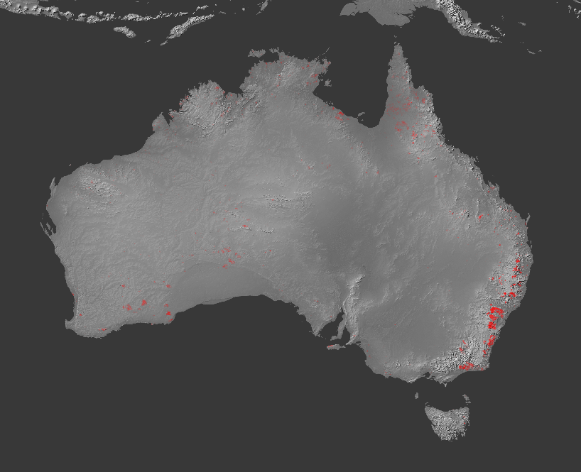
If you think of it as a map or photo, the image exaggerates the scale of the fires by accumulating burning areas over time, and by the ‘glow’ effect in the 3-d rendering. As Nick Evershed, a Guardian data journalist, points out, it is also exaggerated because it ’rounds up’ each spot of fire into a whole map grid square. Nick produced this version with the accumulated fires over time but without the rounding and glow.
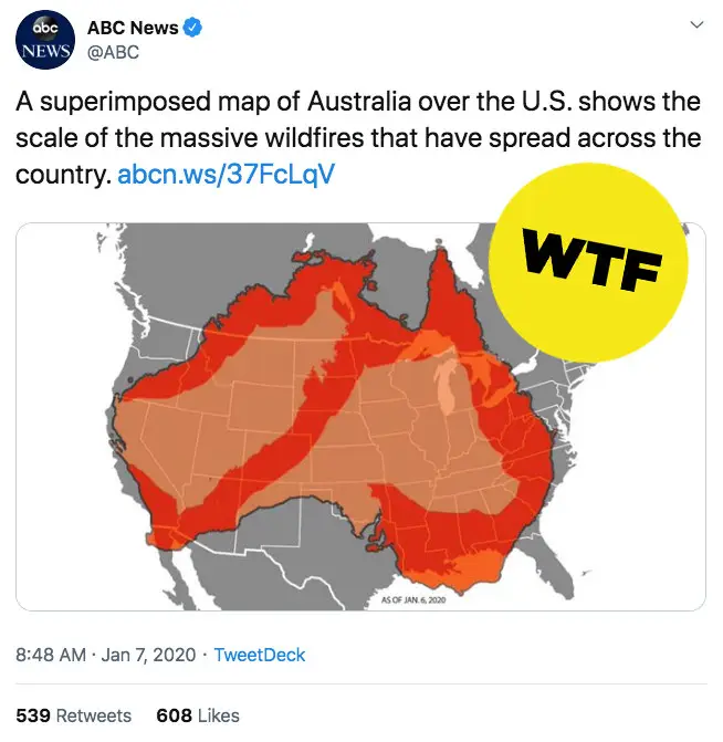
A much more effective way to mislead with maps, though, is just to make stuff up and not worry about the facts. Yesterday, ABC News (the US one, not the Australian one) gave this map (insightful annotation from Buzzfeed)
They now have this one. It still make the fire areas look larger than they are, but in standard and hard-to-avoid ways.
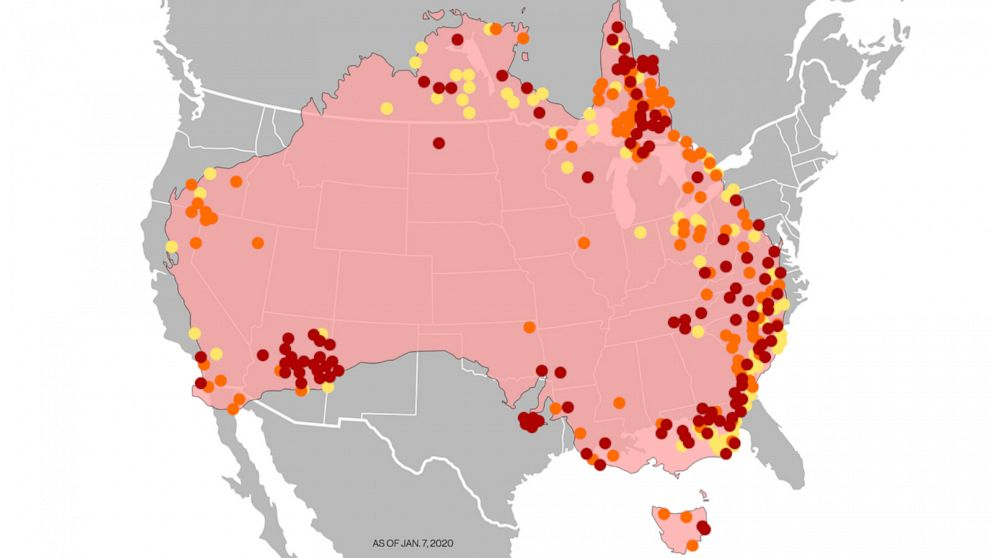
A note at the end of the story now says
Editor’s note: The previous graphic in this story has been updated to reflect the hot spots around Australia.
Maybe it’s a matter of taste, but I don’t think that goes nearly far enough towards admitting what they did.
Thomas Lumley (@tslumley) is Professor of Biostatistics at the University of Auckland. His research interests include semiparametric models, survey sampling, statistical computing, foundations of statistics, and whatever methodological problems his medical collaborators come up with. He also blogs at Biased and Inefficient See all posts by Thomas Lumley »