February 24, 2021
Briefly
- Good explanation by Jarrod Gilbert at newsroom of why gang member statistics tend to be inflated: it’s harder to count people leaving.
- Eric Crampton (correctly) argues that the Climate Commission should just publish its models so people can see what they’re sensitive to. Peter Ellis (who would know) thinks this should be perfectly feasible. I reviewed an air pollution epidemiology initiative that did this sort of thing with analysis code and pollution and health information from the 90 largest US cities, nearly two decades ago. Back then, it was kind of notable; now, not so much.
- The New York Times had a front-page visualisation of 500,000 Covid deaths, as dots over time. People in NZ aren’t the best audience for deciding how well something like this works, but there was an interesting Twitter thread criticising it.
- Truncating bar charts — failing to show them all the way down to zero — is bad in theory and I often complain about it here. New research suggests it’s actually bad in practice, too. It conveys inaccurate information even to trained people and even to people who are warned in advance.
- For a bit of nerd fun: Iceberger — draw an iceberg and see which way it will end up floating (motivated by the Campaign For Sideways Icebergs)
- Data collection is hard: “I’m interviewing 5 year olds and their best friend is a pretzel, so it’s hard to map their social networks.” — Jason Chow at an education conference in the US, quoted on Twitter
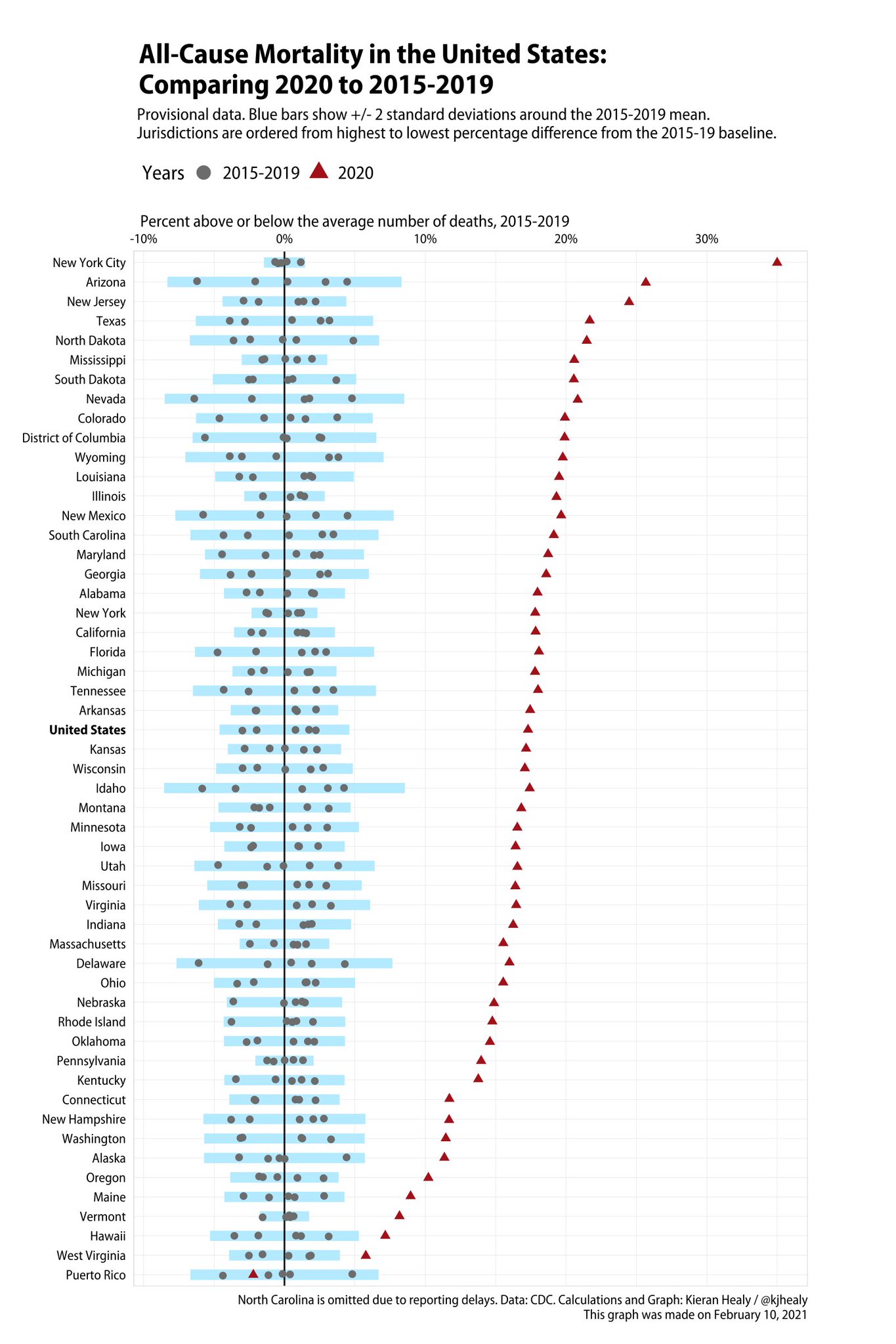
- Excess mortality in 2020 in the US (from Kieran Healy)
Thomas Lumley (@tslumley) is Professor of Biostatistics at the University of Auckland. His research interests include semiparametric models, survey sampling, statistical computing, foundations of statistics, and whatever methodological problems his medical collaborators come up with. He also blogs at Biased and Inefficient See all posts by Thomas Lumley »
I should maybe note that the iHAPSS project of reproducible code for air pollution analyses was important because the researchers were right and the polluting industries were wrong, and reproducible analysis made it a lot less effort for the researchers to defend their work.
5 years ago
I think being transparent is a good thing … but it is not without cost to those involved …
as there are certain forces who are happy to go after the players rather than play the game. And that comes down to the areas a person works in, their innate characteristics or their relative power. Ask Siouxsie Wiles and Doug Sellman.
I used to work in alcohol public health and I could see some of the games that were going on. The stuff that is finally getting close to a resolution now (https://thespinoff.co.nz/media/03-03-2021/crushing-defeat-for-dirty-politics-pr-man-with-apology-to-defamed-academics/ ) had it’s deep origins back to the aftermath of the 1999 alcohol law changes.
5 years ago
It’s a real problem, but it’s not a *transparency* problem (reality does not have a pro-big-business bias). If you’re giving policy advice to government, people will know, and failing to cite your sources and show your working won’t be any protection. That’s why I mentioned the iHAPSS project, which was transparency done *in self defence* by a group providing input on a very high-stakes policy question (the EPA threshold for the ‘criteria pollutants’). The previous thresholds had ended up in the US Supreme Court, and there was a real possibility these ones also would.
5 years ago
The more information you give people, the more they can nitpick – and as Ronald Reagan said “If you’re explaining, you’re losing.”.
An attack always gets more column inches then a carefully considered response. And people tend to believe there is no smoke without fire.
5 years ago