January 1, 2023
Briefly
- The “Great Kiwi Christmas Survey” led to stories at Herald, Newshub, Farmers Weekly, and Radio NZ on what people were eating for their Christmas meal. The respondents for the “Great Kiwi Christmas Survey” were variously described as “over 1000”, “over 1800”, and “over 3300” Kiwis, which seems a bit vague. According to newsroom, this was actually a bogus poll: “We promoted the survey through social media channels and sent the survey to those people who had signed up to receive information from us,” concedes Lisa Moloney, the promotions manager for Retail Meat NZ and Beef + Lamb NZ. Headlines based on bogus polls aren’t ever ok — even when you don’t think the facts really matter. Newsroom argued that the results under-represented vegetarians, which is plausible, but you can’t really tell from the data presented on the number of vegetarians. Not all Christmas meals at which vegetarians are present will be centred around plant-based food, as any vegetarian can tell you.
- Stuff, with the help of Auckland Transport, wrote about Auckland’s most prolific public transport user. Apparently, someone took 3400 trips over a year. It’s surprising that’s even possible: nearly ten trips per day, every day, and since the person is doing this on a gold card, starting no earlier than 9am on weekdays. Assuming the numbers are correct — actually, whether the numbers are correct or not — it’s also a bit disturbing that this analysis was done. The summaries of typical and top 100 users seem a lot more reasonable. The piece says “Stuff asked to interview the person, however Auckland Transport would not reveal their identity for privacy reasons.”, which is good, but you might want them not to be in a position to reveal it.
- “Support for low-income housing followed a similar pattern, with broad approval for building it someplace in the country (82 percent) but much less for building it locally (65 percent)” at 538. There should be a word for this.
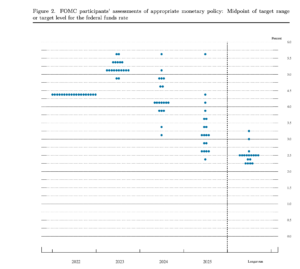
- Interesting discussion on the Slate Money podcast about a data display, the “Fed Dot Plot”, which shows the best guesses of members of the Federal Reserve Open Market Committee as to what interest rates they will want in the future; each dot is one person. The Fed is trying to de-emphasise this graph at the moment — partly because people tend to over-interpret it. Importantly, there’s no individual uncertainty shown, and there’s no way to tell how much of the difference between people is due to difference in what they think the economic situation will be and how much is due to differences in how they expect they will want to react to it.

Thomas Lumley (@tslumley) is Professor of Biostatistics at the University of Auckland. His research interests include semiparametric models, survey sampling, statistical computing, foundations of statistics, and whatever methodological problems his medical collaborators come up with. He also blogs at Biased and Inefficient See all posts by Thomas Lumley »
The AT hop card mega user seems more likely to be multiple cards ‘registered’ to a single users account ( for payment and tracking purposes) or this ..
‘Businesses managing AT HOP cards for their employees to use’
3 years ago
That would explain the large number, but it doesn’t seem to fit all that well with some of the language used in the report. AT must *know* if it’s one card or multiple cards, and it’s a bit unlikely that all the cards in a business account would be SupaGold cards (though not actually inconceivable).
3 years ago
If I had to guess I would say a religious evangelist (beats cycling) or a home cares worker.
3 years ago