Posts from April 2026 (24)

April 7, 2026

Super Rugby Predictions for Week 9

Team Ratings for Week 9

The basic method is described on my Department home page.
Here are the team ratings prior to this week’s games, along with the ratings at the start of the season.

Current Rating Rating at Season Start Difference
Chiefs 11.58 12.36 -0.80
Hurricanes 11.16 8.29 2.90
Blues 9.86 8.91 1.00
Crusaders 8.62 8.41 0.20
Brumbies 5.86 5.59 0.30
Reds -0.04 1.74 -1.80
Highlanders -3.03 -3.06 0.00
Western Force -4.50 -6.29 1.80
Waratahs -5.05 -5.84 0.80
Fijian Drua -8.84 -7.64 -1.20
Moana Pasifika -11.03 -7.88 -3.20


Performance So Far

So far there have been 38 matches played, 25 of which were correctly predicted, a success rate of 65.8%.
Here are the predictions for last week’s games.

Game Date Score Prediction Correct
1 Crusaders vs. Fijian Drua Apr 03 69 – 26 19.20 TRUE
2 Chiefs vs. Waratahs Apr 04 42 – 14 19.30 TRUE
3 Reds vs. Western Force Apr 04 19 – 42 11.90 FALSE


Predictions for Week 9

Here are the predictions for Week 9. The prediction is my estimated expected points difference with a positive margin being a win to the home team, and a negative margin a win to the away team.

Game Date Winner Prediction
1 Highlanders vs. Brumbies Apr 10 Brumbies -5.40
2 Moana Pasifika vs. Chiefs Apr 11 Chiefs -17.60
3 Fijian Drua vs. Western Force Apr 11 Fijian Drua 0.70
4 Hurricanes vs. Blues Apr 11 Hurricanes 6.30
5 Reds vs. Crusaders Apr 11 Crusaders -5.20


April 4, 2026

NZTA much better?

This is an expansion from the “Briefly” post about an NZTA summary of public comment on their SH1 Wellington proposals.

On Bluesky, @gwynebs had pointed out that some of the bars indicating levels of support didn’t appear to match the numbers attached to them — the “much better” category seemed inflated

A couple of days ago I noted there was a pattern to the distortion: it really was only the “much better” bar that was inflated and the other four were compressed in the same proportion. That is, some varying percentage was effectively being added to the “much better” level.  This is true for all five of the specific sections of the proposal,  but is not true for the two overall ratings in the middle of page 2, which appear correct. The bars are also correct in the much more detailed community engagement report; it’s just the summary that is wrong — which should indicate something about where things went wrong.

This is not rounding error. It’s much larger than that.

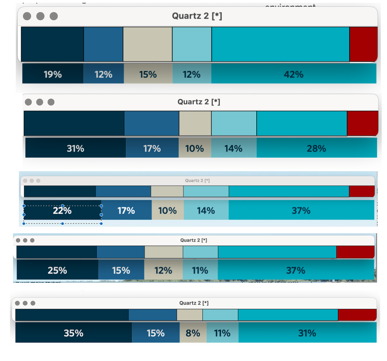
I went and measured the widths of all the bars in the five charts. These are in the same order as in the report: from top to bottom we have “2nd Terrace tunnel”, “Te Aro”, “Basin Reserve”, “2nd Mt Victoria tunnel”, and “Hataitai and Kilburnie”. The lower bar for each is cut from the NZTA summary. The upper bar has the correct percentages plus the necessary additional amount to make the bars line up — so the red is the amount that has been added to the “much better” category in the graph compared to the numbers. My bars and their bars don’t line up perfectly; that is probably rounding error. One possible explanation is that the red is some sort of “Don’t know” value that has inadvertently been put into the last bar — I could see that happening if the bars were drawn as pictures rather than as charts.

How much should we care about this? On the one hand, this sort of thing is probably corrosive to public trust in government data. On the other hand, this purports to be quantitative analysis of a self-selecting survey of the sort that attracts highly motivated and unrepresentative minorities*, so there’s a real limit to how seriously you should be taking the numbers.

Arguably, the point of this sort of survey is to see if there are surprising results — either something NZTA didn’t know about, or stronger opposition than they expected.  Even so, most people who aren’t the Advertising Standards Authority would think there’s something wrong with graphs that don’t match the data they purport to present.


*eg, people such as me

April 2, 2026

Briefly

  • For the day between March 31 and April 2nd, Andrew Gelman takes on an app that claims to find patterns in lotto numbers and make you money.
  • RNZ reports the plans for tolls on the Road of Northland Significance, a charge of $4.50 each way from Warkworth to Te Hana (you will see some quotes of $14.20, which includes current tolls on the already-existing road to Puhoi). They don’t report what fraction of the cost the tolls will cover. Greater Auckland looked at the NZTA consultation papers about the tolling and say 35 years of tolling will raise $391m. That would be nearly 10% of the (phase 1) cost if you didn’t include interest; it’s a much smaller fraction when you do. And this is phase 1 — there are two more phases in the planned road to Whangārei.  Whether the road is worth the cost isn’t my specialty, but it’s a lot of cost.
  • Len Cook (former Government Statistician) is in the Otago Daily Times disapproving of the planned removal of the census enumerations. We’ve covered this topic before.  The changes to the Data and Statistics Act are up for public comment, as are the necessary changes to the Electoral Act.   The electoral changes are not intrinsically controversial but are needed because electoral redistricting is currently triggered by the census. The electoral changes are important because they need a 75% supermajority in Parliament.
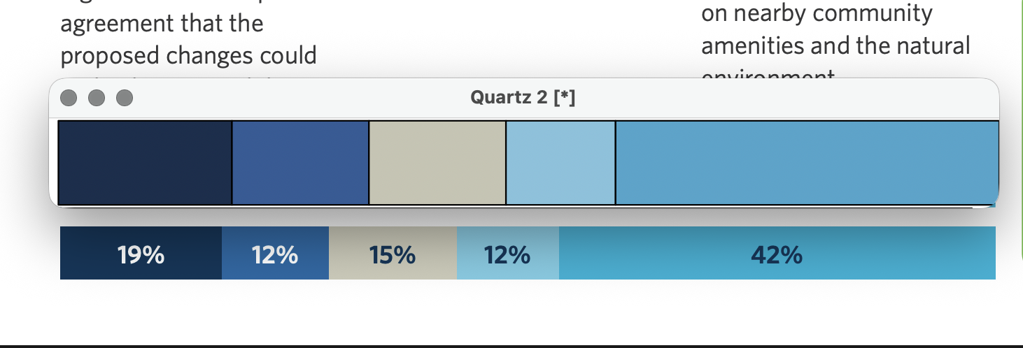
  • RNZ reports on an NZTA report on public consultation about road changes in Wellington. First, the usual whinge: please link to this sort of report, so we can read it if your summary gets us interested!  Second, and the StatsChat motivation, the NZTA report displays pretty graphics of the public feedback, which are systematically wrong! For example, on the question “will a second Terrace Tunnel make things worse or better for you?” the lower bar is from the report and the upper bar is correct based on the percentages.  The right end of the bar is “better”, and is exaggerated

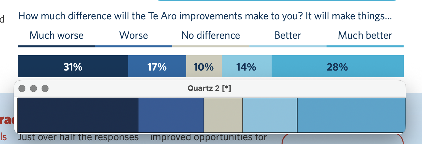
    Or the next question, about Te Aro improvements (original above, correct version below). Again, the “better” end is exaggerated

    I don’t think this is likely to be deliberate, but it’s a bad look

Oily rag

The Ministry of Transport have put up a fuel monitoring dashboard. It shows estimates of demand, supply, and price.

At the moment, the reduction in demand is less than 10%, a level of demand that’s probably not sustainable in the medium when global supply is down at least 25%. On the other hand, we are still at level 1 of the alert system, and even level 2 doesn’t ask for any real reductions in demand.

What this display doesn’t show is any sort of “time to running out”.  That’s probably sensible, because it’s not even well-defined, let alone predictable. If you define “running out” as some petrol stations being out of supplies then it’s already happened. If you define it as “no fuel in the country”, it probably won’t happen. And if you define it as level 3 or level 4 restrictions on supply then it’s a choice by the government based on unknown criteria, and so is hard to forecast statistically.