Search results for Poisson variation (10)

October 30, 2011

Poisson variation strikes again

What’s the best strategy if you want to have a perfect record betting on the rugby?  Just bet once: that gives you a 50:50 chance.

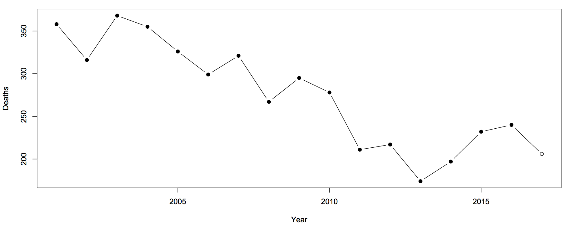
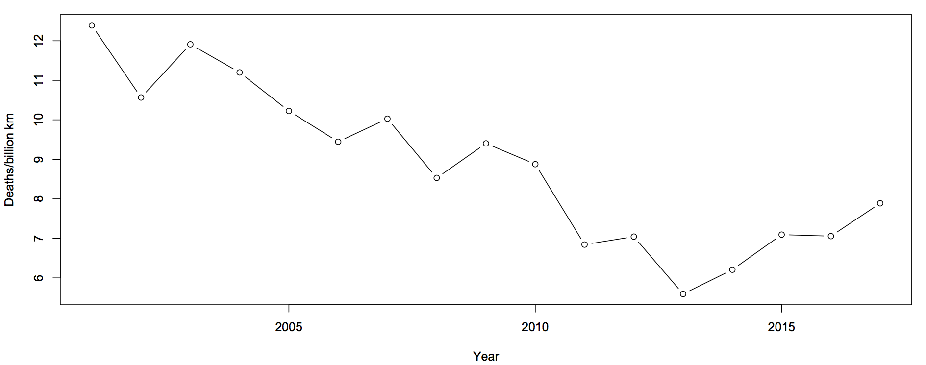
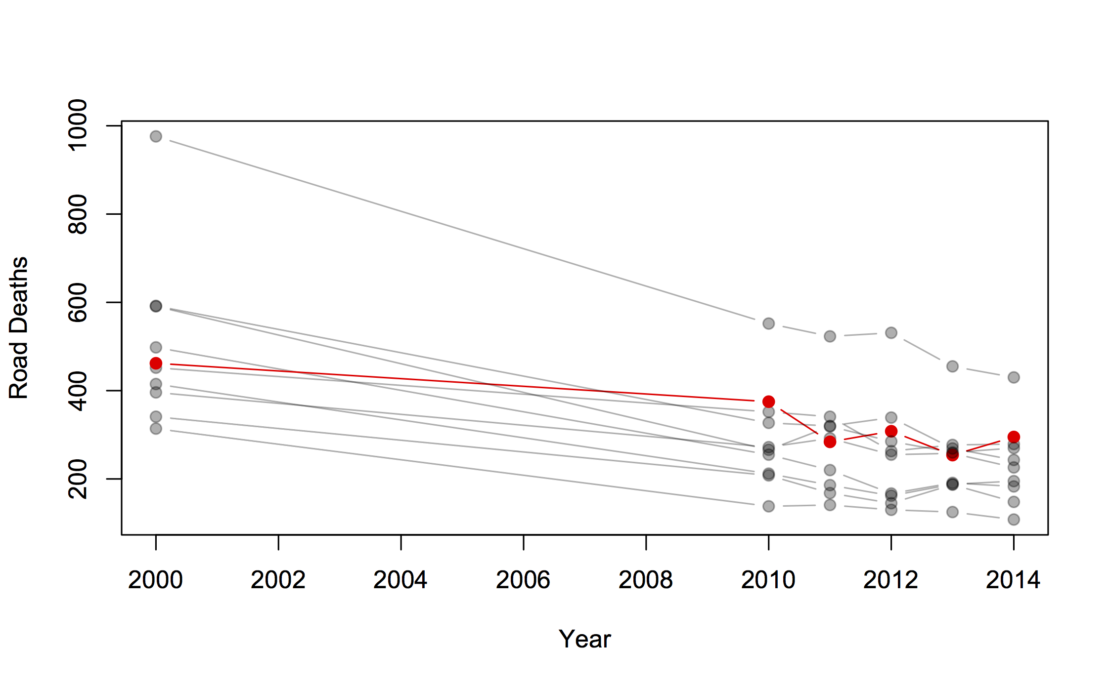
After national statistics on colorectal cancer were released in Britain, the charity Beating Bowel Cancer pointed out that there was a three-fold variation across local government areas in the death rate.  They claimed that over 5,000 lives per year could be saved, presumably by adopting whatever practices were responsible for the lowest rates. Unfortunately, as UK blogger ‘plumbum’ noticed, the only distinctive factor about the lowest rates is shared by most of the highest rates: a small population, leading to large random variation.

funnel plot of UK colorectal cancer His article was picked up by a number of other blogs interested in medicine and statistics, and Cambridge University professor David Speigelhalter suggested a funnel plot as a way of displaying the information.

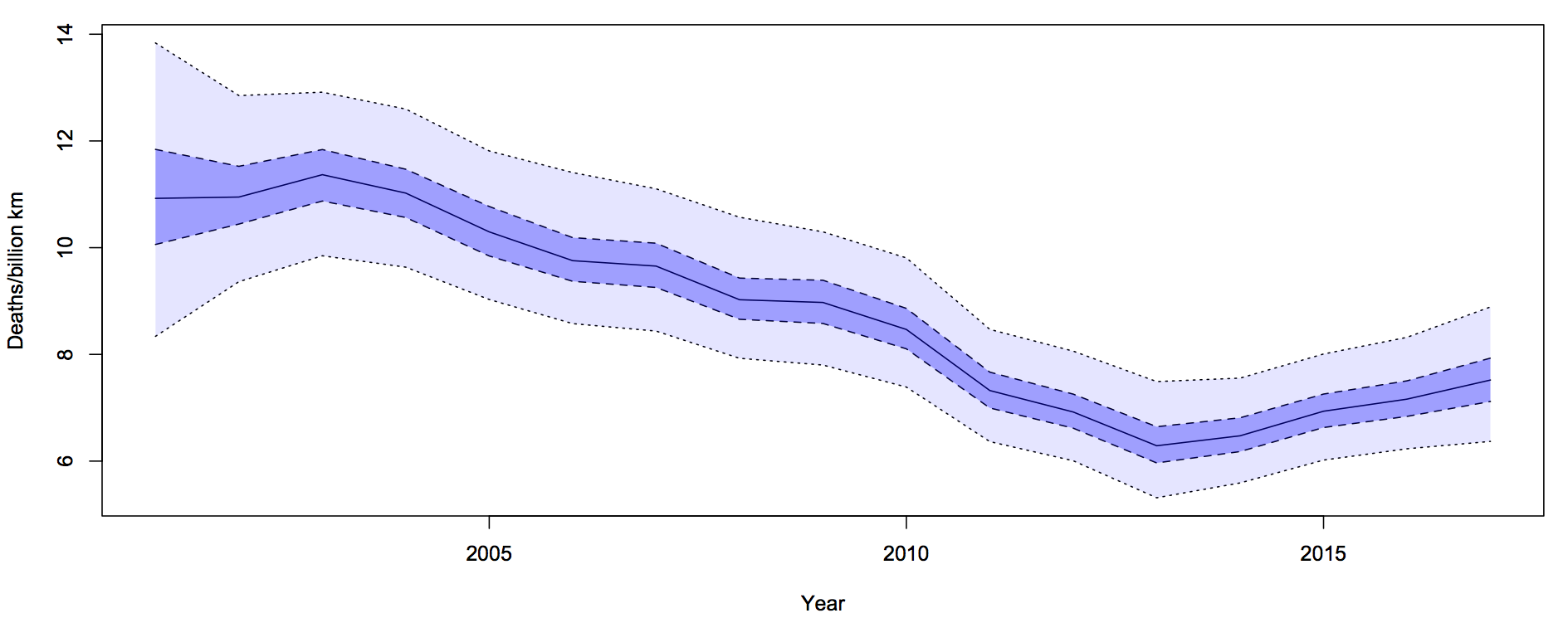
A funnel plot has rates on the vertical axis and population size (or some other measure of information) on the horizontal axis, with the ‘funnel’ lines showing what level of variation would be expected just by chance.

The funnel plot (click to embiggen) makes clear what the tables and press releases do not: almost all districts fall inside the funnel, and vary only as much as would be expected by chance. There is just one clear exception: Glasgow City has a substantially higher rate, not explainable by chance.

Distinguishing random variation from real differences is critical if you want to understand cancer and alleviate the suffering it causes to victims and their families.  Looking at the districts with the lowest death rates isn’t going to help, because there is nothing very special about them, but understanding what is different about Glasgow could be valuable both to the Glaswegians and to everyone else in Britain and even in the rest of the world.

October 13, 2017

Road deaths up

Sam Warburton (the economist, not the rugby player) has been writing about the recent increase in road deaths. Here are the counts (with partial 2017 data)

road-1

The first question you should ask is whether this is explained by population increases or by driving increases. That is, we want rates — deaths per unit of distance travelled

roads-2

There’s still an increase, but now the 2017 partial data are in line with the increase. The increase cannot be explained simply by more cars being on the roads.

The next question is about uncertainty.  Traditionally, news stories about the road toll were based on one month of data and random variation could explain it all. We still need a model for how much random variation to expect.  What I said before was

The simplest mathematical model for counts is the Poisson process.  If dying in a car crash is independent for any two people in NZ, and the chance is small for any person (but not necessarily the same for different people) then number of deaths over any specified time period will follow a Poisson distribution.    The model cannot be exactly right — multiple fatalities would be much rarer if it were — but it is a good approximation, and any more detailed model would lead to more random variation in the road toll than the Poisson process does.

In that case I was arguing that there wasn’t any real evidence of a change, so using an underestimate of the random variation made my case harder. In this case I’m arguing the change is larger than random variation, so I need to make sure I don’t underestimate random variation.

What I did was fit a Bayesian model with two extra random components.  The first was the trend over time. To avoid making assumptions about the shape of the trend I just assumed that the difference between adjacent years was relatively small and random. The second random component was a difference between the trend value for a year and the ‘true’ rate for that year. On top of all of that, there’s Poisson variation.  Since the size of the two additional random components is estimated from the data, they will capture all the variation.

roads-3

For each year, there is a 50% probability that the underlying rate is in the darker blue interval, and a 95% probability it’s in the light blue interval.  The trend is smoother than the data because the data has both the Poisson variation and the extra year-specific deviation. There’s more uncertainty in 2001 because we didn’t use pre-2001 data to tie it down at all, but that won’t affect the later half of the time period much.

It looks from the graph as though there was a minimum in 2013-14 and an increased rate since then.  One of the nice things about these Bayesian models is that you can easily and meaningfully ask for the probability that each year was the minimum. The probability is 54% for 2013 and 27% for 2014: there really was a minimum around then.

The probability that the rate is higher in 2017 than in 2013 is over 90%. This one isn’t just random variation, and it isn’t population increase.


Update: Peter Ellis, who has more experience with NZ official statistics and with Bayesian state-space time series models, gets qualitatively similar results

January 1, 2012

Deadliest jobs

Q: What proportion of fatal car crashes involve an alcohol-impaired driver

A: I can’t find the NZ figures, but according to the Centers for Disease Control and Prevention, in the US it’s about 1 in 3

Q: Since everyone involved is sober in 2/3 of crashes, does that mean it’s safer to drive drunk?

A: Why would you ask such a stupid question?

(more…)

August 26, 2011

Suicides really have been lower in ChCh

News stories about monthly counts of road deaths, suicides, or other relatively rare events tend to cause statisticians to grind their teeth and mutter “Poisson variation”.  If you have two deaths a week  apart, some of the time they will fall in the same month and some of the time in different months, pretty much at random.  This makes the monthly totals very variable: if Christchurch averages about 7 suicides per month and there was nothing making this vary over time, you would expect in most years to see a month with as many as 11 suicides and another with as few as three.  That sort of variation is unavoidable, and doesn’t indicate that there is anything to explain.  It’s called “Poisson variation” because the “nothing to see here, move along” distribution for counts was investigated in the 19th century by French mathematician Simeon Denis Poisson, in a study of court judgments.

With only Poisson variation, a month with just one suicide would be very unusual, though. Only one month in 12 years would we be that fortunate if nothing but chance were operating.  The NZ Herald is quite right that suicide rates have been down in Christchurch — there is something to explain, and the explanation is reasonable. The Dominion Post does even better, giving multiple possible explanations for the dip.

The papers do lose points for not linking to the actual numbers released by the Chief Coroner, which I still haven’t been able to find.


March 8, 2017

Briefly

  • “Exploding boxplots”: although a boxplot is a lot better than just showing a mean, it’s usually worse than showing the data
  • The US state of Michigan used an automated system to detect unemployment benefit fraud. Late last year, an audit of 22427 cases of fraud overturned 93% of them! Now, a class-action lawsuit has been filed (PDF), giving (a one-sided view of) more of the details.
  • StatsChat has been saying for quite some time that people shouldn’t be making generalisations about road crash rates without evaluating the statistical evidence for increases or decreases.  It’s good to see someone doing the analysis: the Ministry of Transport has a big long report (PDF, from here) including (p37)[updated link]

    110. However, since 2013 the fatality rate has injury rate has begun to increase. We conducted statistical tests (Poisson) to see whether this increase was more than natural variation, and found strong evidence that the fatality and injury rates are actually rising.

  • Fascinating blog by John Grimwade, an infographics (as opposed to data visualisation) expert (via Kieran Healy)
  • “Not only does Google, the world’s preeminent index of information, tell its users that caramelizing onions takes “about 5 minutes”—it pulls that information from an article whose entire point was to tell people exactly the opposite.”  Another problem with Google’s new answer box, less serious than the claims about a communist coup in the US, but likely to be believed by more people.
May 28, 2015

Road deaths up (maybe)

In Australia road deaths are going down but in New Zealand the number has shot up“, says the Herald, giving depressing-looking international comparisons from newly-announced OECD data. The percentage increase was highest in New Zealand The story does go on to point out that the increase reverses a decrease the previous year, suggesting that it might be that 2013 was especially good, and says

An ITF spokesman said New Zealand’s relatively small size made percentage movements more dramatic.”

Overall, it’s a good piece. Two things I want to add: first, it’s almost always useful to see more context in a time series if it’s available. I took the International Road Traffic Accident Database and picked out a group of countries with similar road toll to New Zealand in 2000: all those between 200 and 1000. The list is Austria, Denmark, Finland, Ireland, Israel, New Zealand, Norway, Slovenia, Sweden, Switzerland. Here are the data for 2000 and for 2010-2014; New Zealand is in red.

roaddeaths

There’s a general downward trend, but quite a bit of bouncing around due to random variation. As we keep pointing out, there are lots of mistakes made when driving, and it takes bad luck to make one of these fatal, so there is a lot of chance involved. It’s clear from the graph that the increase is not much larger than random variation.

Calculations using the Poisson distribution (the simplest reasonable mathematical model, and the one with the smallest random variation) are, likewise, borderline. There’s only weak evidence that road risk was higher last year than in 2013. The right reference level, though, isn’t ‘no change’, it’s the sort of decrease that other countries are seeing.  The median change in this group of 10 countries was a 5% decrease, and there’s pretty good evidence that New Zealand’s risk did not decrease 5%.  Also, the increase is still present this year, making it more convincing.

What we can’t really do is explain why. As the Herald story says, some of the international decrease is economic: driving costs money, so people do less of it in recessions. Since New Zealand was less badly hit by recession, you’d expect less decrease in driving here, and so less decrease in road deaths. Maybe.

One thing we do know: while it’s tempting and would be poetic justice, it’s not valid to use the increase as evidence that recent road-safety rule changes have been ineffective. That would be just as dishonest as the claims for visible success of the speed tolerance rules in the past.


July 30, 2013

Always ask for the margin of error

The Herald now has picked up this morning’s UK story from the London Fire Brigade, that calls from people handcuffed or otherwise stuck in embarassing circumstances are on the rise.  The Fire Brigade only said

“I don’t know whether it’s the Fifty Shades effect, but the number of incidents involving items like handcuffs seems to have gone up.

The Herald has the relatively sedate headline “‘Fifty Shades of Grey effect’ plagues London“, but the British papers go further (as usual).   For example, the Mirror’s headline was “Fifty Shades of Grey sex leads to soaring 999 calls“.  This is the sort of story that’s too good to check, so no-one seems to have asked how much evidence there is of an increase.

The actual numbers quoted by the fire brigade for calls to people stuck in what could loosely be called household items were: 416 in 2010/11, 441 in 2011/12, and 453in 2012/13. If you get out your Poisson distribution and do some computations, it turns out this is well within the expected random variation — for example the p-value for a test of trend is 0.22 (or for the Bayesians, the likelihood ratio is also very unimpressive). Much more shades of grey than black and white.

So, if you don’t have hot and cold running statisticians at your newspaper, how can you check this sort of thing?  There’s a simple trick for the margin of error for a count of things on a hand calculator: take the square root, add and subtract 1 to get upper and lower  limits, then square them again.  Conveniently, in this case, 441 is exactly 21 squared, so an uncertainty interval around the 441 value would go from 20 squared (400) to 22 squared (484).


July 23, 2012

Road toll stable

From the Herald this morning

More people have died in fewer car smashes since January 1 than at this time last year, prompting a Government reminder about the responsibility drivers hold over others’ lives.

“The message for drivers is clear,” Associate Transport Minister Simon Bridges said yesterday of a spate of multi-fatality crashes that have boosted the road toll to 161.

The number of fatal crashes is 133, compared to 144 last year at this time, and the number of deaths is 161, compared to 155 last year.

How do we calculate how much random variation would be expected in counts such as these?  It’s not sampling error in the sense of opinion polls, since these really are all the crashes in New Zealand.  We need a mathematical model for how much the numbers would vary if nothing much had changed.

The simplest mathematical model for counts is the Poisson process.  If dying in a car crash is independent for any two people in NZ, and the chance is small for any person (but not necessarily the same for different people) then number of deaths over any specified time period will follow a Poisson distribution.    The model cannot be exactly right — multiple fatalities would be much rarer if it were — but it is a good approximation, and any more detailed model would lead to more random variation in the road toll than the Poisson process does.

There’s a simple trick to calculate a 95% confidence interval for a Poisson distribution, analogous to the margin of error in opinion polls.  Take the square root of the count, add and subtract 1 to get upper and lower bounds, and square them: a count of 144  is consistent with underlying averages rates from 121 to 169.   And, as with opinion polls, when you look at differences between two years the range of random variation is about 1.4 times larger.

Last year we had an unusually low road toll, well below what could be attributed to random variation.  It still isn’t clear why, not that anyone’s complaining.  The numbers this year look about as different from last year’s as you would expect purely by chance.  If the message for drivers is clear, it’s only because the basic message is always the same:

yellow road sign: You're in a box on wheels hurtling along several times faster than evolution could have prepared you to go

June 21, 2012

If it’s not worth doing, it’s not worth doing well?

League tables work well in sports.  The way the competition is defined means that ‘games won’ really is the dominant factor in ordering teams,  it matters who is at the top, and people don’t try to use the table for inappropriate purposes such as deciding which team to support.  For schools and hospitals, not so much.

The main problems with league tables for schools (as proposed in NZ) or hospitals (as implemented in the UK) are, first, that a ranking requires you to choose a way of collapsing multidimensional information into a rank, and second, that there is usually massive uncertainty in the ranking, which is hard to convey.   There doesn’t have to be one school in NZ that is better than all the others, but there does have to be one school at the top of the table.  None of this is new: we have looked at the problems of collapsing multidimensional information before, with rankings of US law schools, and the uncertainty problem with rates of bowel cancer across UK local government areas.

This isn’t to say that school performance data shouldn’t be used.  Reporting back to schools how they are doing, and how it compares to other similar schools, is valuable.  My first professional software development project (for my mother) was writing a program (in BASIC, driving an Epson dot-matrix printer) to automate the reports to hospitals from the Victorian Perinatal Data Collection Unit.  The idea was to give each hospital the statewide box plots of risk factors (teenagers, no ante-natal care), adverse outcomes (deaths, preterm births, malformations), and interventions (induction of labor, caesarean section), with their own data highlighted by a line.   Many of the adverse outcomes were not the hospital’s fault, and many of the interventions could be either positive or negative depending on the circumstances, so collapsing to a single ‘hospital quality’ score would be silly, but it was still useful for hospitals to know how they compare.  In that case the data was sent only to the hospital, but for school data there’s a good argument for making it public.

While it’s easy to see why teachers might be suspicious of the government’s intentions, the rationale given by John Key for exploring some form of official league table is sensible.  It’s definitely better not to have a simple ranking, and it might arguably be better not to have a set of official comparative reports, but the data are available under the Official Information Act.  The media may currently be shocked and appalled at the idea of league tables, but does anyone really believe this would stop a plague of incomplete, badly-analyzed, sensationally-reported exposés of “New Zealand’s Worst Schools!!”?  It would be much better for the Department of Education to produce useful summaries, preferably not including a league-table ranking, as a prophylactic measure.

November 17, 2011

Blaming road deaths on mum

Over-protective mothers are now being blamed for road deaths among teenage boys.  I suppose it’s a change from saying that overprotective mothers make boys gay, as Freud famously imagined.

We’ve written before about the problem of seeing and trying to explain a trend when there’s really nothing there but random variation.  That isn’t what’s happening here.  In this case the trend is real. It’s just in the opposite direction to the explanation. (more…)