Posts written by Thomas Lumley (2645)

avatar

Thomas Lumley (@tslumley) is Professor of Biostatistics at the University of Auckland. His research interests include semiparametric models, survey sampling, statistical computing, foundations of statistics, and whatever methodological problems his medical collaborators come up with. He also blogs at Biased and Inefficient

May 17, 2015

Polling is hard

Part One: Affiliation and pragmatics

The US firm Public Policy Polling released a survey of (likely) US Republican primary voters last week.  This firm has a habit of including the occasional question that some people would consider ‘interesting context’ and others would call ‘trolling the respondents.’

This time it was a reference to the conspiracy theory about the Jade Helm military exercises in Texas: “Do you think that the Government is trying to take over Texas or not?”

32% of respondents said “Yes”. 28% said “Not sure”. Less than half were confident there wasn’t an attempt to take over Texas. There doesn’t seem to be widespread actual belief in the annexation theory, in the sense that no-one is doing anything to prepare for or prevent it. We can be pretty sure that most of the 60% were not telling the truth. Their answer was an expression of affiliation rather than an accurate reflection of their beliefs. That sort of thing can be problem for polling.

Part Two: Mode effects and social pressure

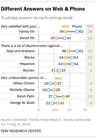
The American Association for Public Opinion Research is having their annual conference, so there’s new and exciting survey research coming out (to the extent that ‘new and exciting survey research’ isn’t an oxymoron). The Pew Research Center took two random groups of 1500 people from one of their panels and asked one group questions over the phone and the other group the same questions on a web form.  For most questions the two groups agreed pretty well: not much more difference than you’d expect from random sampling variability. For some questions, the differences were big:

mode-study-01

It’s not possible to tell from these data which set of answers is more accurate, but the belief in the field is that people give more honest answers to computers than to other people.

May 15, 2015

Useful science/health reporting

As I’ve commented before, most good-quality randomised trials of vitamins in humans have disappointing results. A few don’t, and it’s nice to see these reported accurately.  The Herald tells us about an  Australian trial which has found nicotinamide, a version of vitamin B3, can reduce the rate of new minor skin cancers in people who already have had a lot of them.  This isn’t especially dramatic, but for many older pale-skinned people in New Zealand, Australia, or South Africa it could reduce a recurrent medical annoyance.

The only real omission in the Herald story is the link to the research: there’s a conference abstract for a talk to be given at the American Society for Clinical Oncology conference later this month.


Update: yes, this sort of story is less impressive and has less public health significance than claiming WiFi causes brain cancer in children, but it does have the advantage of being true.

May 13, 2015

Briefly

  • Rating systems are the popular way to scale ‘reputation’ statistically so it works for internet transactions between people who don’t know each other. Tom Slee has a couple of pieces (via Cosma Shalizi): Some Obvious Things About Internet Reputation Systems  and In praise of fake reviews:So the reviews that a restaurant owner believes are most likely to be fair are precisely the ones that Yelp judges to be untrustworthy….Unfortunately for restaurateurs, their opinions on trustworthy reviews are irrelevant. The company is not legally bound to be fair in its filtering and sorting activities,
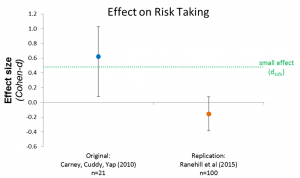
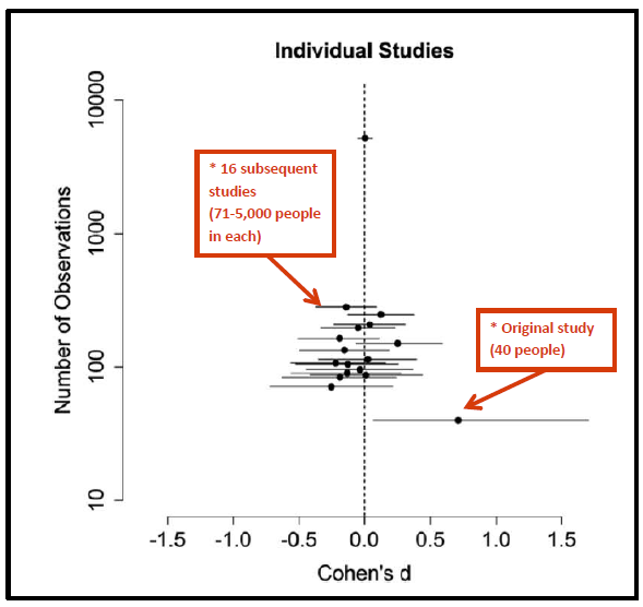
  • Another example of interesting results failing to replicate, this time from a popular TED talk about posture. As the post at Data Colada points out, this is a strong non-replication: it’s not just that they didn’t see they effect, they ruled out even much weaker effects. There’s a reason statisticians go on and on about over-interpretation of single, small studies.
    3-risk
  • Looking at the Census data on religion, a map and set of stories from Lincoln Tan and Harkanwal Singh at the Herald
  • A rather different form of data journalism, reported at Buzzfeed (or the original paper report here). The Telegraph had a ‘tactical voting tool’ that said who you should vote for if your goal was a Labour or Tory government.  It was mostly honest, despite the paper’s well-known preferences. However, as Buzzfeed’s headline says: “The Telegraph’s Tactical Voting Tool Was Coded To Never Recommend The SNP”
  • From the LA Times, Wylie Burke on “Why whole-genome testing hurts more than it helps” (disclosure: I once co-supervised a student with Prof Burke)
  • A Slate article by a lawyer says Wyoming has ‘criminalized citizen science’ by creating a law against collecting and reporting environmental data. Now, Wyoming has created crimes of “unlawful collection of resource data” and “trespassing to unlawfully collect resource data”, but I’m pretty sure the Slate article exaggerates them.  “Unlawful collection” can only happen on private land, which the article clearly gets wrong. “Trespassing to unlawfully collect” can happen on public land, but I’m not convinced that in the National Park example there isn’t the necessary authorisation to enter the land. Presumably the law does something or they wouldn’t have bothered passing it, and it’s probably something evil, but a better article would have been nice.
May 10, 2015

The problem with medical progress

Stuff says:

There has been an alarming upward trend in the costs of similar treatments, as more drugs are developed and come on to the market, new Pharmac figures show.

I would argue that this is almost precisely not the problem. The story covers two important issues, but doesn’t distinguish them well.

The first issue is that many expensive new drugs aren’t very good. To get a drug approved for marketing you don’t need to show it’s better than the current stuff, and it often isn’t. Similar treatments might still be useful to have, if they give other options for people with side effects or have more convenient dosing, but they are often more expensive.

The United States is very bad at not using treatments that are similar (or worse) but more expensive, so these drugs are a problem there. Here, we’re quite good at not using them, so they don’t matter all that much. As long as Pharmac enjoys popular support and the media doesn’t buy into too many drug-industry publicity campaigns, we can ignore the expensive new drugs that aren’t worth the cost.

A second issue is that a subset of the expensive new drugs aren’t similar. The story quotes the price differences for ‘anthracycline’ (doxorubicin or epirubicin) and two newer breast cancer drugs, docetaxel and trastuzumab, as evidence of increases over the years.

Anthracyclines haven’t gone away. In fact, they’re quite a bit less expensive now than they were in 2002. The reason Pharmac now buys docetaxel and trastuzumab is that they’re worth the extra cost for at least some women. The existence of trastuzumab is not a problem for the healthcare system, it’s an opportunity.

There is a problem coming, though: many of the new drugs have names ending in ‘mab’.

Monoclonal antibodies, ‘mab’s, are one of the classes of ‘biologics’: big, complex molecules made by living cells. Making and testing generic versions of biologics (called ‘biosimilars‘) is much harder than running up off-brand doxorubicin. Even when the patents run out on the ‘mab’s and ‘ept’s, a competitive market might be a while in developing and prices will stay higher.  It’s not so much the expensive on-patent drugs that are a worrying change, it’s the prospect of expensive off-patent drugs in the future.


May 9, 2015

Briefly

  • Nate Silver Ben Lauderdale carefully examines how his predictions (and everyone else’s) were so staggeringly wrong in the UK election. More people should do this sort of thing.
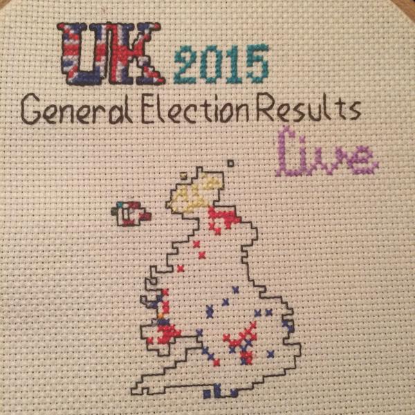
  • So, in a different way, did Tom Katsumi
    CEc6KbeWAAID0cl
  • There’s a US court case on whether FDA restrictions on ‘off-label’ drug advertising (ie, advertising a drug for uses it hasn’t been approved for) violates the 1st Amendment. There’s a definite chance the FDA will lose, which would strengthen the incentives to find new uses for drugs, but weaken the incentives to collect good evidence that the drug is actually effective for these uses.
  • Just over half of Tindr users are single, but that’s ok because the company “never intended it to be a dating platform.” Maybe people are just using it for the articles.
  • How lucky do you have to be for it to be evidence of insider trading? Especially when you consider what some traders will call a “once in 3 billion years” event. What isn’t mentioned here but is important is the idea of likelihood ratios: we’re not just looking at whether an event is unlikely, but whether it becomes much more likely under the alternative hypothesis that you’ve got an inside source.
  • Player characters in role-playing games accept unreasonable risks:
    Someone, we’ll call that person the Game Master, wants you to accept a single D8 die roll, with death no resurrection on a 1. But as a sweetener, if you roll 2-8 you’ll get…something nice! What would the something nice have to be for you to agree to make that roll? 
May 6, 2015

All-Blacks birth month

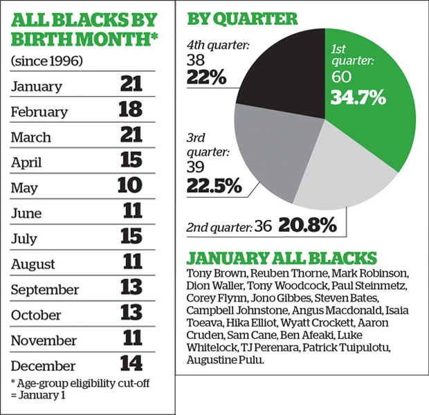
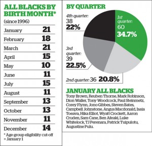
This graphic and the accompanying story in the Herald produced a certain amount of skeptical discussion on Twitter today.
AB2

It looks a bit as though there is an effect of birth month, and the Herald backs this up with citations to Malcolm Gladwell on ice hockey.

The first question is whether there is any real evidence of a pattern. There is, though it’s not overwhelming. If you did this for random sets of 173 people, about 1 in 80 times there would be 60 or more in the same quarter (and yes, I did use actual birth frequencies rather than just treating all quarters as equal). The story also looks at the Black Caps, where evidence is a lot weaker because the numbers are smaller.

On the other hand, we are comparing to a pre-existing hypothesis here. If you asked whether the data were a better fit to equal distribution over quarters or to Gladwell’s ice-hockey statistic of a majority in the first quarter, they are a much better fit to equal distribution over quarters.

The next step is to go slightly further than Gladwell, who is not (to put it mildly) a primary source. The fact that he says there is a study showing X is good evidence that there is a study showing X, but it isn’t terribly good evidence that X is true. His books are written to communicate an idea, not to provide balanced reporting or scientific reference.  The hockey analysis he quotes was the first study of the topic, not the last word.

It turns out that even for ice-hockey things are more complicated

Using publically available data of hockey players from 2000–2009, we find that the relative age effect, as described by Nolan and Howell (2010) and Gladwell (2008), is moderate for the average Canadian National Hockey League player and reverses when examining the most elite professional players (i.e. All-Star and Olympic Team rosters).

So, if you expect the ice-hockey phenomenon to show up in New Zealand, the ‘most elite professional players’, the All Blacks might be the wrong place to look.

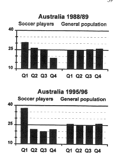
On the other hand Rugby League in the UK does show very strong relative age effects even into the national teams — more like the 50% in first quarter that Gladwell quotes for ice hockey. Further evidence that things are more complicated comes from soccer. A paper (PDF) looking at junior and professional soccer found imbalances in date of birth, again getting weaker at higher levels. They also had an interesting natural experiment when the eligibility date changed in Australia, from January 1 to August 1.
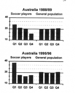
soccer

As the graph shows, the change in eligibility date was followed by a change in birth-date distribution, but not how you might expect. An August 1 cutoff saw a stronger first-quarter peak than the January 1 cutoff.

Overall, it really does seem to be true that relative age effects have an impact on junior sports participation, and possibly even high-level professional acheivement. You still might not expect the ‘majority born in the first quarter’ effect to translate from the NHL as a whole to the All Blacks, and the data suggest it doesn’t.

Rather more important, however, are relative age effects in education. After all, there’s a roughly 99.9% chance that your child isn’t going to be an All Black, but education is pretty much inevitable. There’s similar evidence that the school-age cutoff has an effect on educational attainment, which is weaker than the sports effects, but impacts a lot more people. In Britain, where the school cutoff is September 1:

Analysis shows that approximately 6% fewer August-born children reached the expected level of attainment in the 3 core subjects at GCSE (English, mathematics and science) relative to September-born children (August born girls 55%; boys 44%; September born girls 61% boys 50%)

In New Zealand, with a March 1 cutoff, you’d expect worse average school performance for kids born on the dates the Herald story is recommending.

As with future All Blacks, the real issue here isn’t when to conceive. The real issue is that the system isn’t working as well for some people. The All Blacks (or more likely the Blues) might play better if they weren’t missing key players born in the wrong month. The education system, at least in the UK, would work better if it taught all children as well as it teaches those born in autumn.  One of these matters.


May 5, 2015

Civil unions down: not just same-sex

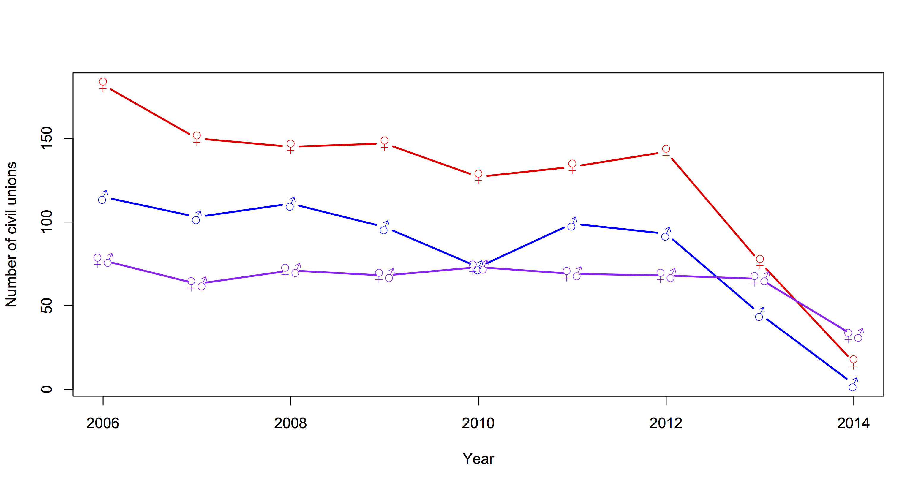
The StatsNZ press release on marriages, civil unions, and divorces to December 2014 points out the dramatic fall in same-sex civil unions with 2014 being the first full year of marriage equality. Interestingly, if you look at the detailed data, opposite-sex civil unions have also fallen by about 50%, from a low but previously stable level.

union

May 4, 2015

On algorithmic transparency

An important emerging area of statistics is algorithmic transparency: what information is your black-box analytics system really relying on, and should it?

From Matt Levine

The materiality standard that controls so much of securities law comes from an earlier, simpler time; a time when reasonable people could look at a piece of information and say “oh, yes, of course that will move the stock up” (or down), and if they couldn’t then they wouldn’t bother with it. Modern financial markets are not so intuitive: Algorithms are interested in information that reasonable humans cannot process, with the result that reasonable humans can’t always predict how significant any piece of information is. That’s a world that is more complicated for investors, but it also seems to me to be more complicated for insider trading regulation. And I’m not sure that regulation has really kept up.


US racial disparity: how do we compare?

There’s a depressing chart at Fusion, originally from the Economist, that shows international comparisons for infant mortality, homicide, life expectancy, and imprisonment, with White America and Black America broken out as if they were separate countries.

Originally, I was just going to link to the chart, but I thought I should look at how Māori/Pākehā  disparities compare. European-ancestry New Zealanders and Māori make up roughly the same proportions of the NZ population as self-identified White and Black do in the US. The comparison is depressing, but also interesting: showing how ratios and differences give you different results.

First, infant mortality.  Felix Salmon writes

A look at infant mortality, a key indicator of development, is just as grim. Iceland has 1.6 deaths per 1,000 births; South Korea has 3.2. “White America” is pretty bad — by developed-country standards — with 5.1 deaths per 1,000 births. But “Black America,” again, is much, much worse: at 11.2 deaths per 1,000 births, it’s worse than Romania or China.

According to the Ministry of Health,  Māori infant mortality was 7.7/1000 in 2011 compared to 3.7/1000 for non-Māori, non-Pacific. According to StatsNZ, the rate for Māori was lower in 2012 (the numbers don’t quite match: different definitions or provisional data).  So, the Māori/Pakeha ratio is similar to the Black/White ratio in the US, but the difference is quite a bit smaller here.

Incarceration rates show a similar pattern. In the US, the rate is 2207/100k for Blacks and 380/100k for Whites.  In New Zealand, the rates are (about) 700/100k for Māori and 100/100k for European-ancestry. The NZ figures include people on remand; I don’t know if the US figures do. The ratio is a bit lower in New Zealand, but the difference is dramatically lower.

Homicide rates are harder to compare, because New Zealand only started collecting ethnicity of victims last year, and because NZ.Stat will only show you one month of data at a time. However, it looks as though the ratio is a lot less than the nearly 9 in the US. More importantly, the overall rate is much lower here: our rate is 0.9 per 100k, the overall US rate is 4.5 per 100k.

If the Māori/Pākehā disparities are slightly less serious than US Black/White disparities as ratios but much less serious as differences, which comparison is the right one? To some extent this depends on the question: risk ratios may be more relevant as indicators of structural problems, but risk differences are what actually matter to individuals.

Briefly

  • From the Guardian, in an otherwise-sensible piece talking about decreases in infant mortality “So things are getting better. The small wrinkly proto-Royal that just emerged from the national womb will have thrice the chance of surviving that her father and I did, just through the privilege of being born in 2015.” It’s pretty obvious this is wrong.  If you use the numbers in the previous paragraph, the change is from 98.9% to 99.6%, which isn’t a threefold increase.
  • From Mashable: “Facebook turns the London Eye into big UK election pie chart”. Not only is it a pie chart, it’s a pie chart of Facebook mentions, positive or negative, for each party

facebook-election

  •  Terry Burnham writes about a neat cognitive hack: using fonts that are too small, in order to make people concentrate and learn more. There’s even evidence that it works; it’s just there’s a whole lot more evidence that it doesn’t. Dramatic small-sample experimental findings really can be misleading, it isn’t just statisticians being gratuitously cynical
    png_base64db8e9525745b448