Posts written by Thomas Lumley (2645)

avatar

Thomas Lumley (@tslumley) is Professor of Biostatistics at the University of Auckland. His research interests include semiparametric models, survey sampling, statistical computing, foundations of statistics, and whatever methodological problems his medical collaborators come up with. He also blogs at Biased and Inefficient

November 18, 2014

Cholesterol is bad for you

That doesn’t sound like a very interesting headline, but an important clinical trial whose results were released today has made definite steps towards re-convincing researchers on this point.

The trial, IMPROVE-IT, looked at adding a new drug, ezetimibe, to one of the standard statin drugs for cholesterol lowering, in people who had previously had a heart attack. Ezetimibe works by blocking cholesterol absorption in the gut, a completely different mechanism to the statins, which block cholesterol synthesis. The drug had previously shown unconvincing results in a preliminary study, made even less convincing by the behaviour of the manufacturer. There was increasing uncertainty that the cholesterol-lowering effect of the statins was really how they prevented heart disease, since no other drug appeared to be able to do the same thing.

Now, IMPROVE-IT has found a reduction in heart attacks and strokes. It’s very small — only 2 percentage points, even in this high-risk group of patients — but it looks real. Given the price of ezetimibe it probably won’t be widely used immediately, but it comes off patent in a few years and then use might spread a bit.  The results are also encouraging for dietary approaches to lowering cholesterol by reducing absorption: some cereals, and spreads with plant sterols.

Other stories: Forbes, New York Times 

November 16, 2014

John Oliver on the lottery

When statisticians get quoted on the lottery it’s pretty boring, even if we can stop ourselves mentioning the Optional Stopping Theorem.

This week, though, John Oliver took on the US state lotteries: “..,more than Americans spent on movie tickets, music, porn, the NFL, Major League Baseball, and video games combined. “

(you might also look at David Fisher’s Herald stories on the lottery)

November 14, 2014

Motion and context in graphics

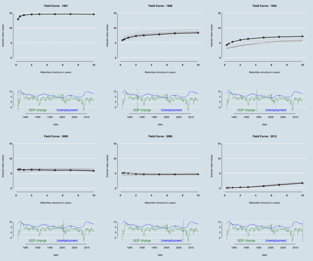
Via Michael Toth  I found this animated GIF from isomorphismes, showing the ‘yield curve‘ for Federal Reserve bonds

tumblr_na17r44bUx1qc38e9o1_400

Michael modified the curve to make it prettier — alternatively, more similar to the style of The Economist.  In both cases, though, I felt the time context was missing.  Using animation rather than multiple plots lets you get a lot more on a page, but you can’t see what’s happening as clearly.

One possibility is to make a separate graphic that shows where you are in time; another is to keep some history by letting the graph leave shadows. In the graph below (based on both the linked examples), there are 12 months worth of shadow lines trailing the solid line, and a grey indicator bar showing where we are in history, with GDP growth and unemployment as context.

yield curve evolution

Even better (though not embeddable in WordPress) would be to make the time axis able to both autoplay and be controllable by the user, as in this example from the R animint package.


(update: the code)

November 13, 2014

School deciles

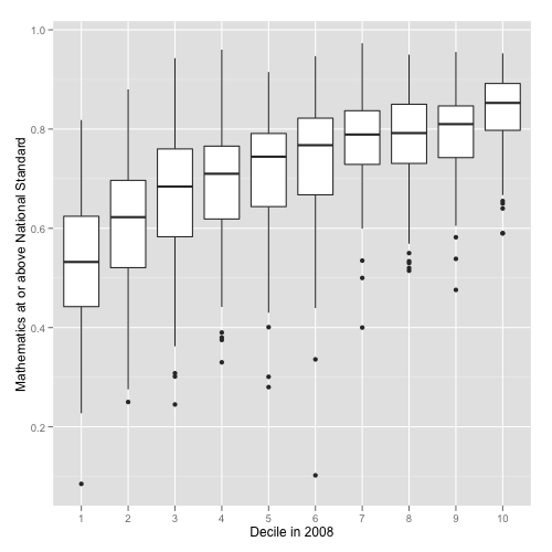
New Zealand has a national school funding system that allocates money to schools based on socio-economic data about students.  This isn’t self-reported individual-level data, but is at the level of Census meshblocks (details here.) Schools are divided into ten deciles, and more funding given to lower-decile schools.  Despite the higher funding, lower-decile schools, on average, have poorer results on standardised assessments.  You can see good visualisations of this from Luis Apiolaza,

mathOK

There are less-good ones at Stuff: dot plots aren’t ideal for this, and it really is better to look at cumulative categories (‘at standard or better’) rather than individual categories (‘at standard but not better’). Unfortunately, these graphs tell you almost nothing about the policy question of whether there are better ways to target the funding. There might be; there might not be.

One advantage of the current system is its automatic stabilisation. The Herald, earlier this week, had a good story about changing ethnic profiles of schools, with the sort of combination of data and individual stories it would be nice to see more often.  It turns out the low-decile schools are seeing fewer students of European ethnicity, and more Māori and Pasifika students. The phrase ‘white flight’ was used, but because of the funding system this isn’t the same sort of problem as the original ‘white flight’ from US inner cities.

In the US, a lot of public school funding comes from local government. When more-affluent families leave an area, the government funding for education goes down.  In New Zealand, when more-affluent families leave an area, the government funding for education goes up.  There’s still a concern about diversity, but not the same sort of vicious circle that was seen in the US.

November 12, 2014

Africa? Can you be more precise?

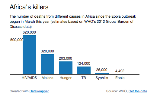
From the Telegraph (via many people on Twitter)

ebola


Seeing this at the same time as hearing about Bob Geldof’s Band-Aid reboot really emphasises the point that Africa isn’t a single place. The first Band-Aid recording was intended to help people in Ethiopia; the new one is for the Ebola-stricken regions of West Africa. The distance from Freetown to Addis Ababa is about the same as Auckland to Dili in East Timor, or Los Angeles to Bogota (or Addis Ababa to Prague).

On the other hand, the graph does make an important point. Syphilis, starvation, and TB are all very inexpensively treatable. Malaria and HIV are largely preventable, also at low cost. An effective treatment for Ebola will help, especially for medical personnel who are otherwise at very high risk, but in the long run it isn’t going to be enough. If we can’t deliver penicillin effectively, we won’t be able to deliver Ebola drugs. To make a real difference, we need a vaccine that’s good enough to prevent outbreaks.

November 9, 2014

The world’s most profitable crop?

pot

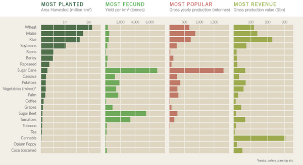
This chart is from a beautiful infographic about cash crops.  I don’t believe the cannabis revenue number. That’s partly because I read Keith Humphreys and Mark Kleiman on the subject.

Keith Humphreys takes apart a claim of $120 billion for the total value of the US marijuana market, showing that it can’t be anything near that much.

Current pot smokers report that they use marijuana an average of 60 days a year. Using our current example, 40 ounces/60 days of use means that the average user would have to go through 2/3 of an ounce of marijuana on each day that they used marijuana. That’s .67 X 50 or 33.5 joints per day of use. And there’s a terrific bridge for sale in Brooklyn too.

Even then, the purported $120 billion was the price to the consumer.  That’s not what was used for the legal crops, and it makes a big difference.

Suppose we agree use consumer price rather than farmer revenue because the data are slightly more reliable. I don’t really believe a number above about $12 billion for the US.  The US has about 1/5 of the world GDP. If the US spent $12 billion/year on cannabis, the rest of the world would need to spend almost $300 billion, or more than six times as much as a fraction of their income.  A lot of the world would need to spend more on pot than on basic carbohydrates.

It’s not inconceivable that the number is right — maybe cannabis is really big in, say, Brazil or India and I just don’t know about it — but it’s surprising enough that I’d want a lot more detail to justify it.

November 7, 2014

What overdiagnosis looks like

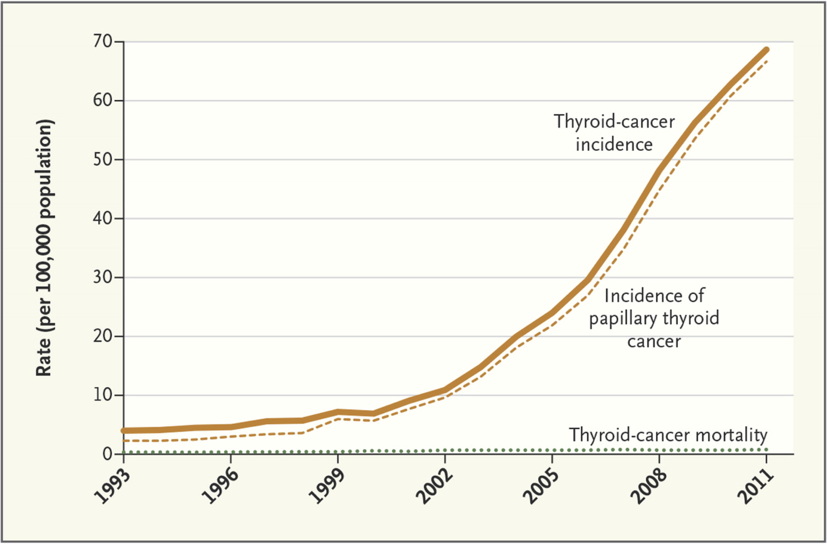
An article in the New England Journal of Medicine talks about screening for thyroid cancer in South Korea. There has been a massive increase in diagnosis, mostly of very small tumours that are probably harmless — there was been no change in the thyroid cancer deaths.

thyroid

As the authors say:

Thyroid-cancer surgery has substantial consequences for patients. Most must receive lifelong thyroid-replacement therapy, and a few have complications from the procedure. An analysis of insurance claims for more than 15,000 Koreans who underwent surgery showed that 11% had hypoparathyroidism and 2% had vocal-cord paralysis.


Graphics: automate, then individualise

From James Cheshire, a lecturer in geography in London

The majority of graphics we produced for London: The Information Capital required R code in some shape or form. This was used to do anything from simplifying millions of GPS tracks, to creating bubble charts or simply drawing a load of straight lines. We had to produce a graphic every three days to hit the publication deadline so without the efficiencies of copying and pasting old R code, or the flexibility to do almost any kind of plot, the book would not have been possible.  So for those of you out there interested in the process of creating great graphics with R, here are 5 graphics shown from the moment they came out of R to the moment they were printed.

That is, good graphics rely on both soulless automation and creative design flair. Graphic designers shouldn’t need to put the data in by hand; they should be starting with the output of well-designed software and working from there.

Measuring what you care about

From the Herald

According to co-founder Jackson Wood, many workplaces today use drug testing as a proxy for impairment testing. However, these are generally arbitrary or ineffective and not always reflective of potential employee impairment at the workplace.

Wood’s startup, Ora, is aiming to build a system that tests reliably for impairment. If it can be done, this would be valuable in NZ industries, and might well also attract interest from the US.  With the increasing number of states legalising cannabis, it is increasingly a problem that there is no simple and reliable proxy for driving impairment.


November 6, 2014

State lines

Two very geographical graphics:

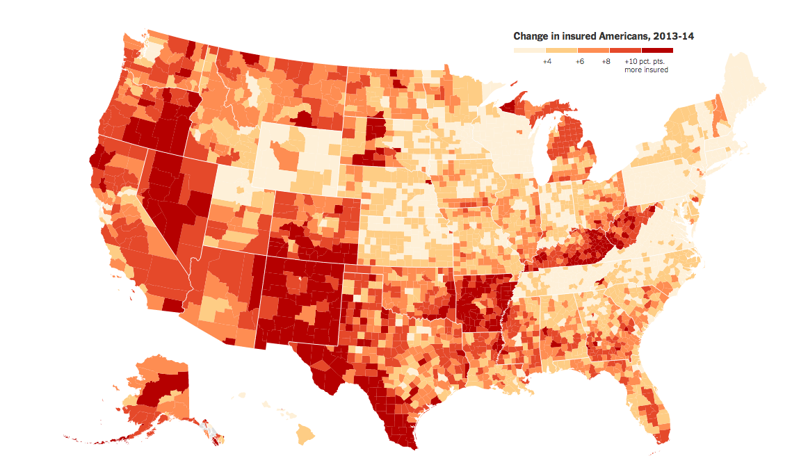
From the New York Times (via Alberto Cairo), a map of percentage increases in number of people with health insurance in the US.

insured-map

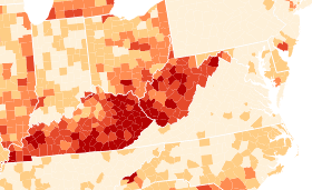
This is a good example of something that needs to be a map, to demonstrate two facts about the impact of Obamacare. First, state policies matter. That’s most dramatic in this region from the right-hand side, about halfway up:

insured-highlight

Kentucky and West Virginia implemented an expansion in Medicaid, the low-income insurance program, and had a big increase in number of people insured. Neighbouring counties in Tennessee and Virginia, which did not implement the Medicaid expansion, had much smaller increases.  The beige rectangle at the top left is Massachusetts, which already had a universal health care law and so didn’t change much. (Ahem. Geography and orientation apparently not my strong points. Massachusetts didn’t change, but that’s Pennsylvania, which only just started Medicaid expansion)

Second, there was a lot of room for improvement in some places — most dramatically, south Texas. The proportion of people with health insurance increased by 10-15 percentage points, but it’s still below 40%.


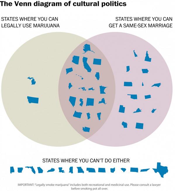
As a contrast, the Washington Post gives us this,

venn

which is, hands-down, the least readable marriage equality map I’ve ever seen.