Posts written by Thomas Lumley (2645)

avatar

Thomas Lumley (@tslumley) is Professor of Biostatistics at the University of Auckland. His research interests include semiparametric models, survey sampling, statistical computing, foundations of statistics, and whatever methodological problems his medical collaborators come up with. He also blogs at Biased and Inefficient

March 25, 2014

An ounce of diagnosis

The Disease Prevention Illusion: a tragedy in five parts, by Hilda Bastian

“An ounce of prevention is worth a pound of cure.” We’ve recognized the false expectations we inflate with the fast and loose use of the word “cure” and usually speak of “treatment” instead. We need to be just as careful with the P-word.


Political polling code

The Research Association New Zealand  has put out a new code of practice for political polling (PDF) and a guide to the key elements of the code (PDF)

The code includes principles for performing a survey, reporting the results, and publishing the results, eg:

Conduct: If the political questions are part of a longer omnibus poll, they should be asked early on.

Reporting: The report must disclose if the questions were part of an omnibus survey.

Publishing: The story should disclose if the questions were part of an omnibus survey.

There is also some mostly good advice for journalists

  1. If possible, get a copy of the full poll  report and do not rely on a media release.
  2. The story should include the name of the company which conducted the poll, and the client the poll was done for, and the dates it was done.
  3.  The story should include, or make available, the sample size, sampling method, population sampled, if the sample is weighted, the maximum margin of error and the level of undecided voters.
  4. If you think any questions may have impacted the answers to the principal voting behaviour question, mention this in the story.
  5. Avoid reporting breakdown results from very small samples as they are unreliable.
  6. Try to focus on statistically significant changes, which may not just be from the last poll, but over a number of polls.
  7. Avoid the phrase “This party is below the margin of error” as results for low polling parties have a smaller margin of error than for higher polling parties.
  8.  It can be useful to report on what the electoral results of a poll would be, in terms of likely parliamentary blocs, as the highest polling party will not necessarily be the Government.
  9. In your online story, include a link to the full poll results provided by the polling company, or state when and where the report and methodology will be made available.
  10. Only use the term “poll” for scientific polls done in accordance with market research industry approved guidelines, and use “survey” for self-selecting surveys such as text or website surveys.

Some statisticians will disagree with the phrasing of point 6 in terms of statistical significance, but would probably agree with the basic principle of not ‘chasing the noise’

I’m not entirely happy with point 10, since outside politics and market research, “survey” is the usual word for scientific polls, eg, the New Zealand Income Survey, the Household Economic Survey, the General Social Survey, the National Health and Nutrition Examination Survey, the British Household Panel Survey, etc, etc.

As StatsChat readers know, I like the term “bogus poll” for the useless website clicky surveys. Serious Media Organisations who think this phrase is too frivolous could solve the problem by not wasting space on stories about bogus polls.

On a scale of 1 to 10

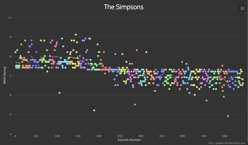
Via @neil_, an interactive graph of ratings for episodes of The Simpsons

simpsons


This comes from graphtv, which lets you do this for all sorts of shows (eg, Breaking Bad, which strikingly gets better ratings as the season progresses, then resets)

The reason the Simpsons graph has extra relevance to StatsChat is the distinctive horizontal line.  For the first ten seasons an episode basically couldn’t get rated below 7.5, after that it basically couldn’t rated above 7.5.   In the beginning there were ‘typical’ episodes and ‘good’ episodes; now there are ‘typical’ episodes and ‘bad’ episodes.

This could be a real change in quality, but it doesn’t match up neatly with the changes in personnel and style.  It could be a change in the people giving the ratings, or in the interpretation of the scale over time. How could we tell? One clue is that (based on checking just a handful of points) in the early years the high-rating episodes were rated by more people, and this difference has vanished or even reversed.

March 24, 2014

Briefly

  • Data visualisation: summary of  street grid angles in various US cities. The Houston one is a bit misleading because the highways are so dominant in reality but not in the summary.
March 22, 2014

Facts and values

In a rant against `data journalism’ in general and fivethirtyeight.com in particular, Leon Wieseltier writes in the New Republic

Many of the issues that we debate are not issues of fact but issues of value. There is no numerical answer to the question of whether men should be allowed to marry men, and the question of whether the government should help the weak, and the question of whether we should intervene against genocide. And so the intimidation by quantification practiced by Silver and the other data mullahs must be resisted. Up with the facts! Down with the cult of facts! 

There are questions of values that are separate from questions of fact, even if the philosopher Hume went too far in declaring “no ‘ought’ deducible from ‘is'”.   There may even be things we should or should not do regardless of the consequences. Mostly, though, our decisions should depend on the consequences.

We should help the weak. That’s a value held by most of us and not subject to factual disproof.  How we should do it is more complicated.  How much money should be spent? How much should we make people do to prove they need help? Is it better to give people money or vouchers for specific goods and services? Is it better to make more good jobs available or to give more help to those who can’t get them?  How much does participating in small social and political community groups or supporting independent radical writers and thinkers help versus putting the same effort into paying lobbyists or donating to political parties or individual candidates? Is it important to restrict wealth and power of small elites, and what costs are worth paying to do so? How much discretion should be given to police and the judiciary to go lightly on the weak, and how much should they  be given strict rules to stop them going lightly on the strong? Is a minimum wage increase better than a low-income subsidy? Are the weak better off if we have a tax system that’s not very progressive in theory but it hard for the rich and powerful to evade?

As soon as you want to do something, rather than just have good intentions about it, the consequences of your actions matter, and you have a moral responsibility to find out what those consequences are likely to be.

Polls and role-playing games

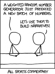
An XKCD classic

sports


The mouseover text says “Also, all financial analysis. And, more directly, D&D.” 

We’re getting to the point in the electoral cycle where opinion polls qualify as well. There will be lots of polls, and lots media and blog writing that tries to tell stories about the fluctuations from poll to poll that fit in with their biases or their need to sell advertising. So, as an aid to keeping calm and believing nothing, I thought a reminder about variability would be useful.

The standard NZ opinion poll has 750-1000 people. The ‘maximum margin of error’ is about 3.5% for 730 and about 3% for 1000. If the poll is of a different size, they will usually quote the maximum margin of error. If you have 20 polls, 19 of them should get the overall left:right division to within the maximum margin of error.

If you took 3.5% from the right-wing coalition and moved it to the left-wing coalition, or vice versa, you’d change the gap between them by 7% and get very different election results, so getting this level of precision 19 times out of 20 isn’t actually all that impressive unless you consider how much worse it could be. And in fact, polls likely do a bit worse than this: partly because voting preferences really do change, partly because people lie, and partly because random sampling is harder than it looks.

Often, news headlines are about changes in a poll, not about a single poll. The uncertainty in a change is  higher than in a single value, because one poll might have been too low and the next one too high.  To be precise, the uncertainty is 1.4 times higher for a change.  For a difference between two 750-person polls, the maximum margin of error is about 5%.

You might want a less-conservative margin than 19 out of 20. The `probable error’ is the error you’d expect half the time. For a 750-person poll the probable error is 1.3% for a single party and single poll,  2.6% for the difference between left and right in a single poll, and 1.9% for a difference between two polls for the same major party.

These are all for major parties.  At the 5% MMP threshold the margin of error is smaller: you can be pretty sure a party polling below 3.5% isn’t getting to the threshold and one polling about 6.5% is, but that’s about it.

If a party gets an electorate seat and you want to figure out if they are getting a second List seat, a national poll is not all that helpful. The data are too sparse, and the random sampling is less reliable because minor parties tend to have more concentrated support.   At 2% support the margin of error for a single poll is about 1% each way.

Single polls are not very useful, but multiple polls are much better, as the last US election showed. All the major pundits who used sensible averages of polls were more accurate than essentially everyone else.  That’s not to say experts opinion is useless, just that if you have to pick just one of statistical voodoo and gut instinct, statistics seems to work better.

In NZ there are several options. Peter Green does averages that get posted at Dim Post; his code is available. KiwiPollGuy does averages and also writes about the iPredict betting markets, and pundit.co.nz has a Poll of Polls. These won’t work quite as well as in the US, because the US has an insanely large number of polls and elections to calibrate them, but any sort of average is a big improvement over looking one poll at a time.

A final point: national polls tell you approximately nothing about single-electorate results. There’s just no point even looking at national polling results for ACT or United Future if you care about Epsom or Ohariu.

March 21, 2014

Common exposures are common

A California head-lice treatment business has had huge success in publicising its business with the claim that selfies are causing a  rise in nits among teenagers. The Herald mentions this in Sideswipe, the right place for this sort of story, but other international sites have been less discriminating.

There are no actual numbers involved, and nothing like representative data even if you’re in the South Bay area of central California. More importantly, though, there is no comparison group. The owner of the business, Mary MacQuillan, says “Every teen I’ve treated, I ask about selfies, and they admit that they are taking them every day.”  That’s probably only a slight exaggeration at most, but every teen she hasn’t treated has also probably been taking photos that way. It’s something teenagers do.  Common exposures are common.

So, why were news organisations around the world publicising this? The fact that it’s about teenagers and the internet goes a long way to explaining it.  It doesn’t need evidence because teenage use of technology is automatically scary and newsworthy: as Ms MacQuillan says ” I think parents need to be aware, and teenagers need to be aware too. Selfies are fun, but the consequences are real.”

You get the same thing happening with ‘chemicals’, as the dihydrogen monoxide parody website loves to point out

A recent stunning revelation is that in every single instance of violence in our country’s schools, …, dihydrogen monoxide was involved.


March 20, 2014

Beyond the margin of error

From Twitter, this morning (the graphs aren’t in the online story)

Now, the Herald-Digipoll is supposed to be a real survey, with samples that are more or less representative after weighting. There isn’t a margin of error reported, but the standard maximum margin of error would be  a little over 6%.

There are two aspects of the data that make it not look representative. Thr first is that only 31.3%, or 37% of those claiming to have voted, said they voted for Len Brown last time. He got 47.8% of the vote. That discrepancy is a bit larger than you’d expect just from bad luck; it’s the sort of thing you’d expect to see about 1 or 2 times in 1000 by chance.

More impressively, 85% of respondents claimed to have voted. Only 36% of those eligible in Auckland actually voted. The standard polling margin of error is ‘two sigma’, twice the standard deviation.  We’ve seen the physicists talk about ‘5 sigma’ or ‘7 sigma’ discrepancies as strong evidence for new phenomena, and the operations management people talk about ‘six sigma’ with the goal of essentially ruling out defects due to unmanaged variability.  When the population value is 36% and the observed value is 85%, that’s a 16 sigma discrepancy.

The text of the story says ‘Auckland voters’, not ‘Aucklanders’, so I checked to make sure it wasn’t just that 12.4% of the people voted in the election but didn’t vote for mayor. That explanation doesn’t seem to work either: only 2.5% of mayoral ballots were blank or informal. It doesn’t work if you assume the sample was people who voted in the last national election.  Digipoll are a respectable polling company, which is why I find it hard to believe there isn’t a simple explanation, but if so it isn’t in the Herald story. I’m a bit handicapped by the fact that the University of Texas internet system bizarrely decides to block the Digipoll website.

So, how could the poll be so badly wrong? It’s unlikely to just be due to bad sampling — you could do better with a random poll of half a dozen people. There’s got to be a fairly significant contribution from people whose recall of the 2013 election is not entirely accurate, or to put it more bluntly, some of the respondents were telling porkies.  Unfortunately, that makes it hard to tell if results for any of the other questions bear even the slightest relationship to the truth.


March 18, 2014

Your gut instinct needs a balanced diet

I linked earlier to Jeff Leek’s post on fivethirtyeight.com, because I thought it talked sensibly about assessing health news stories, and how to find and read the actual research sources.

While on the bus, I had a Twitter conversation with Hilda Bastian, who had read the piece (not through StatsChat) and was Not Happy. On rereading, I think her points were good ones, so I’m going to try to explain what I like and don’t like about the piece. In the end, I think she and I had opposite initial reactions to the piece from on the same starting point, the importance of separating what you believe in advance from what the data tell you. (more…)

Briefly

  • At Pantheon, a visualisation of globally known people over time

[Update: Just had to add this one from a Huffington Post surveyNearly a quarter of Americans know what we should do about the Ukraine Administrative Adjustment Act of 2005]