On a scale of 1 to 10
Via @neil_, an interactive graph of ratings for episodes of The Simpsons
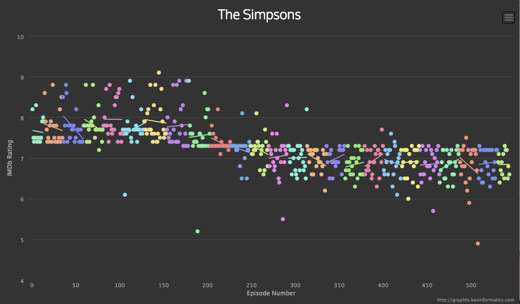
This comes from graphtv, which lets you do this for all sorts of shows (eg, Breaking Bad, which strikingly gets better ratings as the season progresses, then resets)
The reason the Simpsons graph has extra relevance to StatsChat is the distinctive horizontal line. For the first ten seasons an episode basically couldn’t get rated below 7.5, after that it basically couldn’t rated above 7.5. In the beginning there were ‘typical’ episodes and ‘good’ episodes; now there are ‘typical’ episodes and ‘bad’ episodes.
This could be a real change in quality, but it doesn’t match up neatly with the changes in personnel and style. It could be a change in the people giving the ratings, or in the interpretation of the scale over time. How could we tell? One clue is that (based on checking just a handful of points) in the early years the high-rating episodes were rated by more people, and this difference has vanished or even reversed.
Thomas Lumley (@tslumley) is Professor of Biostatistics at the University of Auckland. His research interests include semiparametric models, survey sampling, statistical computing, foundations of statistics, and whatever methodological problems his medical collaborators come up with. He also blogs at Biased and Inefficient See all posts by Thomas Lumley »
The pattern of improving with the season as seen with Breaking Bad looks to be common to these long-form dramas. It is the same with The Wire, Mad Men, Deadwood, Game of Thrones, The Killing, The Hour. The only one I found without this pattern is The Sopranos.
I guess these series do become more compelling as the story line builds to a climax within each season. Then it takes a while to get over the fact the focus has changed at the star of the next season.
12 years ago